
21 Top Tips From Farrow & Ball’s Creative Director
What’s the inspiration behind the new colour range?
It’s from myriad subjects. Every update to our core palette begins with the intention to fill any gaps we’ve spotted in our range, and this year’s new colours are no exception. Paean Black, for example, is a black for red tones, something that was missing from our palette until now. Jitney is a warmer, softer brown based neutral and a nod to consumers’ move away from grey, while Sulking Room Pink is an update of the newly archived Smoked Trout, tweaked ever so slightly to bring it up to date.
De Nimes is taken from the colour of traditional workwear, while Treron is our new take on the popular colour Pigeon, and so takes its name from beautiful green member of the pigeon family. Each of our colours has a raison d’être, and we hope these demonstrate our expertise and passion for bringing all kinds of homes to life.
What are the key colour palette trends for this season?
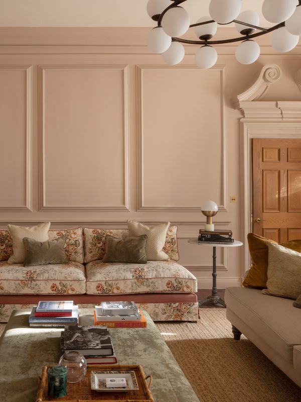
We’ve seen a real move towards using more colour in the home and our nine new colours definitely showcase that. Greens, blues and pinks are all good contenders for a contemporary scheme and a shift towards darker tones such as Paean Black will also be popular, although neutral shades such as School House White will still hold their place within the market – and rightly so!
Is grey over?
No – we’ve noticed that people are starting to move on here in the UK, but I don’t think you can ever truly see the end of a classic! Grey has gone from a bit of a cult shade to a really popular feature in homes over the past few years, and it certainly still has its place in our palette.
In fact, two of our new shades offer a twist on grey: Sulking Room Pink’s dose of grey is what makes it so softly intriguing and keeps it from looking overtly pink, while Treron is a dark grey-green that partners perfectly with our Traditional Neutrals. Although for those looking for a new kind of neutral, I would recommend Jitney – its brown base makes it a little warmer than the classic grey.
What about millennial pink?
That’s a tricky one, because everyone has a different opinion on what millennial pink actually is! There’s no denying that pink is extremely popular at the moment and has been for the last few years, and I’m sure that will continue, however we don’t follow trends. Rather, we like to think our palette is forward-thinking and trustworthy. Our new shade Sulking Room Pink has the perfect mix of pink and grey, while Rangwali offers a more vibrant take on pink and creates a scheme with real impact.
How often should you redecorate? How long does it take a room to look dated?
I don’t think there is a set time frame on redecorating as everyone’s lifestyle is different. Some customers feel like a change after two years and others will love a colour so much it could stay on the walls for years. Colour is very personal, and trends tend to come back around so quickly.
When it’s a bigger project, such as a whole house, which room should you start with?
The hallway is a great place to start. We like to think of it as the spine of the home – because it’s the first glimpse your guests get of your decorating personality, it starts the story for the rest of your home.
What one room should people invest in if they're on a budget?
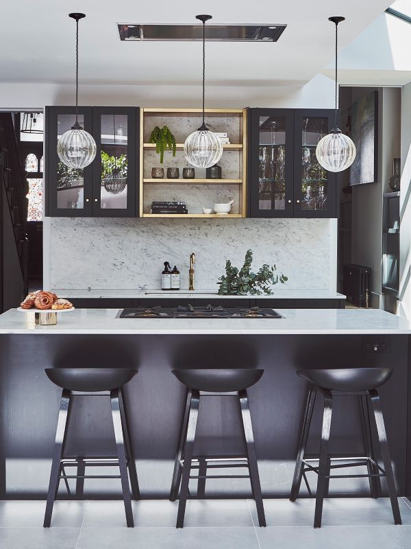
I would suggest investing in the most often-used room as you will gain the most enjoyment from the space. Kitchens tend to be the busiest room in the home, so that’s a good place to start.

What are the best paint colours to go for if you're after a good night's sleep?
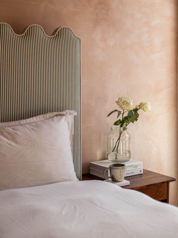
We all react to colour very differently, so it would depend on the person. Blues such as Skylight and Borrowed Light can be very relaxing and clean feeling, which is perfect for a restful atmosphere, but others may prefer darker, more warming tones to create a cocooning interior. Elephant’s Breath and Sulking Room Pink would be excellent for the latter.
Can you ever use darker shades in a small space?
Absolutely! Draw the eye to the colour rather than the size. If a small space is lacking natural light, using darker shades like Paean Black or Preference Red, which have warm, red undertones, will create a cocooning interior.
Should you get people in to do it, or can you get painting yourself?
This completely comes down to the individual and their own personal constraints like time and budget, but you can absolutely do it yourself!
If you do go for the DIY approach, what can you do to prepare your walls before you start painting? Should you always use an undercoat and primer?
We always recommend following the Farrow & Ball system to get the best finish. Our primers and undercoats have been specially formulated using the same quality ingredients as our topcoats and they work beautifully together to create long lasting results and a perfect, even finish (just be sure to get the right colour for your topcoat).
Give your walls a good clean prior to painting, and then apply one coat of primer and undercoat, followed by two topcoats of your favourite colour. If you’re painting on fresh plaster we would suggest diluting the first coat of primer and undercoat, followed by a full coat after. Our showroom teams are fantastic at answering any questions, so pop in and see them if you’re stuck.
When should you use paint, and when should you opt for wallpaper?
It would depend on the person and the project. Our handcrafted wallpapers are made using our paints so they’re perfect for creating a feature within a painted scheme in a similar shade. Wallpapers are also great for creating interest in a space that’s a little lacking in personality. Equally, paint will do the same.
How can you incorporate wallpaper and paint in a room and make it look modern?
Opt for more contemporary prints such as geometrics. Designs like Enigma and Lattice look amazing in a more modern scheme. Florals are really having their time now too – try Helleborus or Wisteria for a look that feels really current and timeless all at once.
When should you go for a gloss option, and when does matte work best?
Again, I would say this is very subjective. Gloss is associated with being very traditional, but it can create a very contemporary look used on the walls or ceiling, or even just on woodwork in a bold colour such as Rangwali or Bancha. Our Estate Eggshell and Modern Eggshell are extremely popular as they create a more matte finish – you could say this look is more modern but in certain colours this finish can look very traditional. My advice? Grab a sample pot and see what works!

What colours will appeal to the broader market when it comes to reselling your property?
Neutral palettes will always be very appealing when selling a property as they allow buyers to easily visualise what they might do with the space. If you intend to sell a property quite soon after purchasing, use colour on the furniture and neutrals such as School House White and Jitney for the walls.
Are there any rules when it comes to the number of paints used in one room?
Three is a good number but definitely do what you want. If you want five colours, use five colours!
Tips for testing colours before you paint the whole room?
I would advise to paint a sheet of card, applying two solid coats for lighter colours and three for darker colours. Move your tester card around the room as each wall will attract different light. Also, look at the colour in the morning and afternoon with the artificial light on and off.
How do you tie the furnishing and soft furnishing into the wall colour?
I would always suggest making a mood board. You don’t have to stick everything down, but once everything is laid out on the table you will definitely start to see what works and what doesn’t. If your style is more discreet, using shades in the same palette as the wall colour will create a soft look, while using contrasting tones will give you more drama.
Any tips for painting wood panelling, door frames, etc?
Think about whether you want the woodwork to stand out or disappear into the wall colour. Painting the woodwork the same colour as the walls will create a softer finish and create the illusion of more space, while contrasting the woodwork and walls will draw the eye to the different surface details and create visual interest.
What shades look good on a front door?
The front door can sometimes be the hardest choice as it will be the colour you see every day when you leave the house and come home. Look at the architecture of the house, the brick or masonry colour and what your neighbour has next door – you don’t want to clash! Overall, I think you should express your personality in the colour choice, just remember that all colours will appear at least two shades lighter outside.
Painted ceilings are a big trend right now – any tips for getting it right?
Painted ceilings have become increasingly popular, and you can do this trend in so many ways. If you have a high ceiling, try using a bold colour such Bancha or Rangwali with a softer neutral on the walls. Another option, if you have a low ceiling or an uneven line between wall and ceiling, is to take the wall colour up and over the ceiling.
Visit Farrow-Ball.com


more from
Home


DISCLAIMER: We endeavour to always credit the correct original source of every image we use. If you think a credit may be incorrect, please contact us at info@sheerluxe.com.