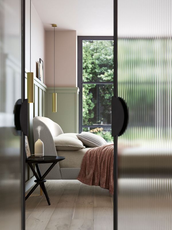
Get Expert Tips In Our Colour Masterclass: Dusty Pink
Pashmina, Matt Emulsion, from £14 for 2.5L
Judy Smith, Colour Consultant, Crown
“Dusty pinks look particularly sophisticated when used as a backdrop to contemporary materials like concrete and metal, and modern furniture designs. Combining pale pink tones such as Crown’s Pashmina, with harsher, more industrial materials instantly softens a space. A look I’m enjoying at the moment is combining blush pink with rich charcoal or even black if you’re feeling brave. The stark contrast brings the softer tone of the pink more into focus, keeping the whole scheme fresh and modern. A soft pink such as Crown’s Pashmina can work in every room of the home. It adds warmth to a north-facing room but also looks clean and refined with the brightness of a south-facing one.”
Setting Plaster, Modern Emulsion, £46.50 for 2.5L
Charlotte Cosby, Head of Creative, Farrow & Ball
“Setting Plaster is a wonderfully versatile shade. Its dose of yellow pigment brings warmth to north-facing rooms, while creating a relaxed feel in south-facing rooms full of light. A perfect alternative to grey in both sitting rooms and kitchens, it’s an ideal backdrop for favourite pieces of art or standout accessories. Pair with warm tones like Dimity to create a soft and considered look.”

Light Peachblossom, Intelligent Matt Emulsion, £50 for 2.5L
Ruth Mottershead, Marketing Director, Little Greene
“Light Peachblossom is a classic dusky pink which is created using a hint of black pigment, making it a soft shade that is feminine without being overwhelming. It is perfect for use in a contemporary kitchen, juxtaposed with units painted in Grey Teal or Grey Stone, cooler tones that bring balance to the scheme. It also sits beautifully in the bedroom alongside warm greys and neutrals like Joanna and Rolling Fog – for a more restful finish.”
Plaster V, Pure Flat Emulsion, £49.50 for 2.5L
Andy Greenall, Head of Design, Paint & Paper Library
“The Plaster Architectural Colours are subtle variations of a beautiful tea rose pink. Plaster I and II are delicate tones which are perfect for use in a child’s bedroom. Plaster V is a stronger, elegant shade suitable for living spaces and kitchens. Use the family in combination for a tonal scheme or alongside one of the Paint & Paper Library Original Colours, such as Spur, a powder blue, for a sophisticated contrast.”


Canyon Hush, V700 Premium Walls and Ceilings at £28 for 2.5L
Sue Kim, Senior Colour Designer, Valspar
“Pink is available in such a wide spectrum of shades that it’s actually a very versatile colour to work with. The combination of chic dusky pinks, such as Canyon Hush, with soft greys is extremely popular in interiors right now and is a great decorating option for bedrooms, or a modern home office environment. It’s a grown-up take on the colour and can easily adapt to the changing environment of your home.”
Floating Petal, Easycare Washable & Tough Matt, £35.71
Marianne Shillingford, Creative Director, Dulux
“Grown-up pink conjures thoughts of fondness and nostalgia. Be bold and go all out in a small room, like a spare bedroom or bathroom, and paint all the walls, woodwork and ceiling. Floating Petal is part of our new Colour of the Year Palette 2019 and is the latest way to use pink in your home.”

more from
Home


DISCLAIMER: We endeavour to always credit the correct original source of every image we use. If you think a credit may be incorrect, please contact us at info@sheerluxe.com.