
The Paint Colour To Know
The Palette Colour Experts Love
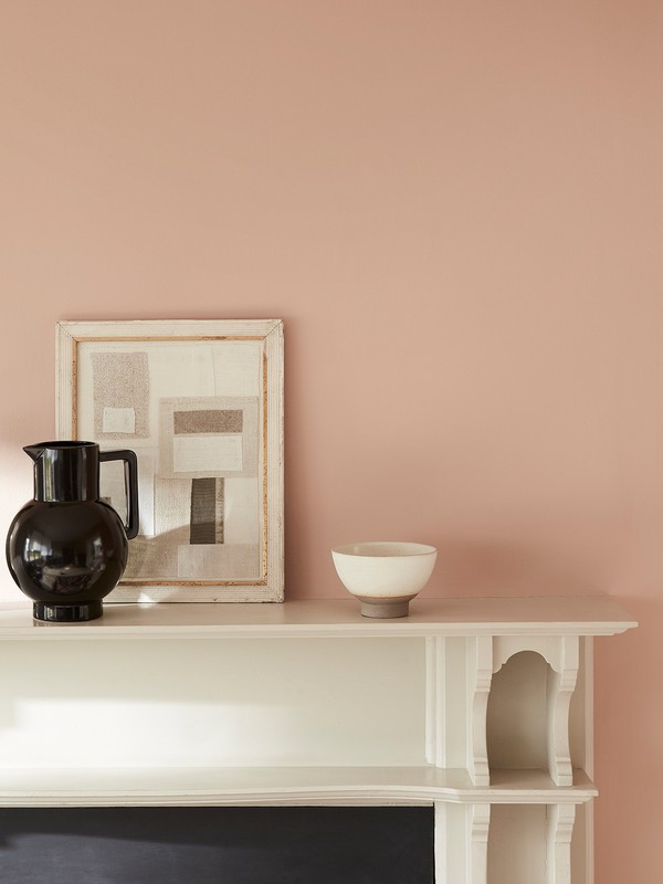
Many paint brands already have a similar shade in their range, from Farrow & Ball’s Jitney to Valspar’s Brown Bunny and Benjamin Moore’s Weimaraner. Joa Studholme, renowned colour expert and Farrow & Ball’s colour curator, says: “The palette of colours we want to use in the home has expanded, and we’re looking to introduce warmer tones to add personality and elegance, while still remaining comfortable. Surrender to the urge to escape and find refuge in the beauty of nature by using the colours of the earth.” Sue Kim, Valspar’s senior design expert, agrees: “Neutral tones are restful, yet stimulating, and help to create a clean and balanced design. Chalky whites also blend quietly with these colours so you’re left with a calming effect at the end of a busy day.”
That said, it's possible to use as a striking accent colour as well. Helen Shaw, Benjamin Moore’s UK director says: “The understated shade complements wood textures and organic materials, and can look especially effective when paired with saturated colours. One of our favourite pairings is burnt oranges with honey tones, which will only add to the warm feel.”
CAFEINE
The Shade Interior Designers Turn To
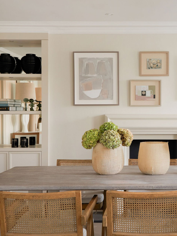
Interior designers are also on board – indeed, Anna Hewitson is happy to see grey take a back seat. “It’s nice to see a warm, earthy tone take over from the usual grey,” she says. “It has a softness to it which is very appealing and calming. The beauty of neutral tones like this is they work well with almost everything, and act as a great base on which to layer colour or other neutrals.”
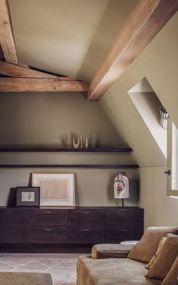
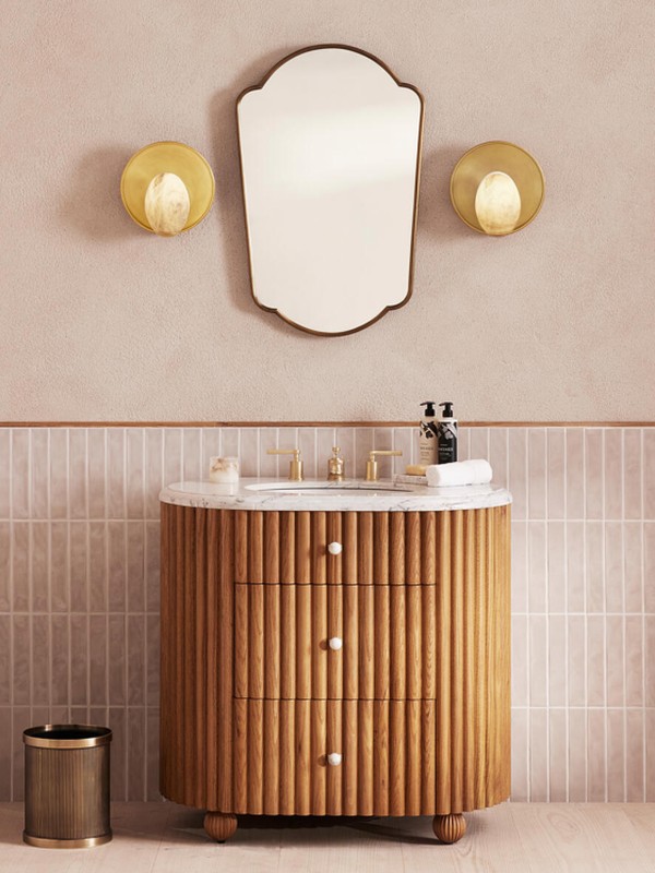
Laura Butler Madden is a fan of its elegant, grown up properties. “Keep it clean with white skirtings, architraves and ceilings for added contrast. In terms of décor in the space – textured creams, hints of black and brass tones will compliment it perfectly.”
CAFEINE

GODDARD LITTLEFAIR
Its rich tone means it works with many other colour palettes, such as blues, pinks and other neutrals, suggests interior stylist Julia Alexander. “Even so, it's best to keep it simple and pair it with white or black accents and layers of texture – think wood, vintage leather and other textiles.”
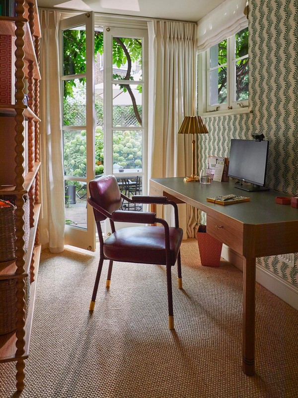
If you want to add interest to a darker room, this kind of colour is ideal, say the experts. “Think basement bathrooms, dark corridors and rooms without natural daylight,” advises Irene Gunter. “Pair it with navy blue, a warm burnt orange or ochre to add more depth, and add white and black accents.”
Alice Leigh also likes the idea of harnessing its darker qualities: “Use it in a masculine scheme, an office perhaps or a room that gets limited natural light where you could embrace the more tobacco tones and enhance everything with good lighting. It would be stunning with navy blue and off-white fabrics, rich toned leathers and marble and bronze accents to give it a luxe feel.”
For more information on Brave Ground, click here.
more from
Home


DISCLAIMER: We endeavour to always credit the correct original source of every image we use. If you think a credit may be incorrect, please contact us at info@sheerluxe.com.