Debit/Credit: How To Style A Chic Living Area
On the paint colour…
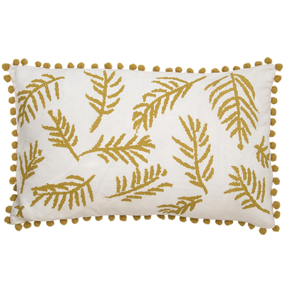
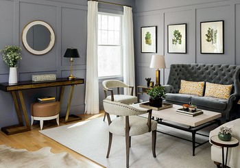
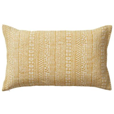
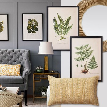
“My client should take full credit for the wall colour. They selected this Behr paint before they even hired me. It was my job to come up with a scheme that worked with the colour – which is soft and saturated at the same time. It actually offers a great foundation to be paired with contrasting hues to pop against it – fresh whites and creams, moss greens and a little hint of saffron, which really sings.”
On the furniture...
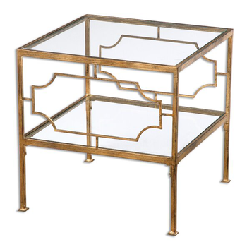
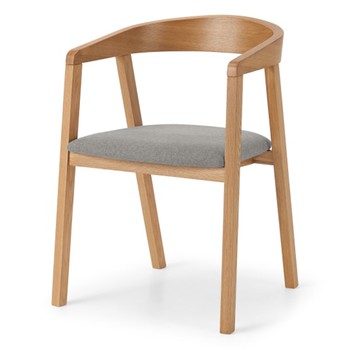
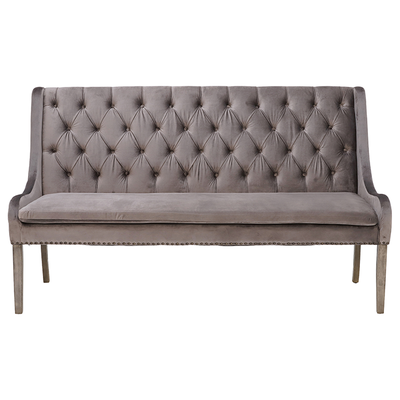
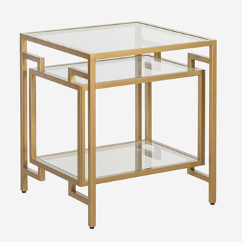
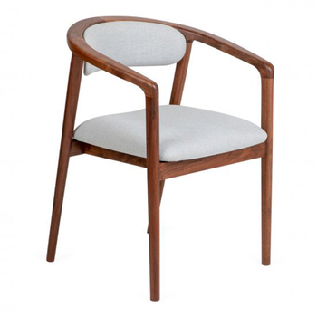
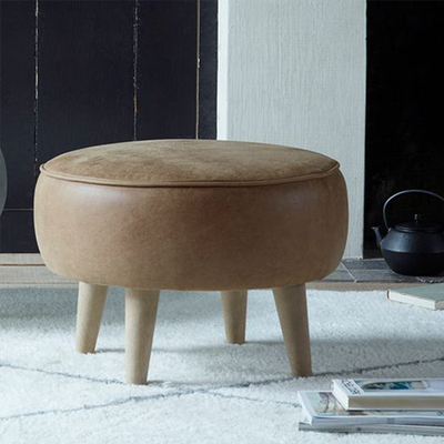
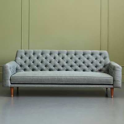
“The client had some specific pieces in mind – namely the velvet settee. My goal was to mix in some other seating elements with more of a plush feel to contrast the elegant curves, as well as a pair of side chairs with more open wooden frames.”
On the ambience…
“When faced with a large, empty white room, a darker wall colour can be the solution to create a more liveable and intimate space. Even when the room is small, it still creates a little jewel box feeling and makes it feel more comfortable.”
Finally, Chauncey’s top design tip…
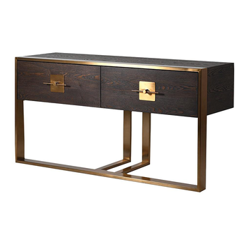
“Mix and match your styles, as we did with the chairs here. My biggest pet peeve is when you see a space where all the furniture clearly came from the same place. An eclectic assortment of furniture will help it look like the pieces have been acquired over time and thoughtfully curated. Just be sure the wood finishes all relate nicely – they don’t have to match, but they do need to speak to one another.”
Debit
Credit
Visit ChauncyBoothby.com
DISCLAIMER: We endeavour to always credit the correct original source of every image we use. If you think a credit may be incorrect, please contact us at info@sheerluxe.com.
