

Take A Look Around This Family Home In London
All products on this page have been selected by our editorial team, however we may make commission on some products.
The Interior Designer
We’re an interior design and architecture studio based in London. Our overall style is reflective of my architectural background – we think it’s important that the decorative architectural features are undistracted and therefore typically we use restrained colour palettes of warm neutral tones.
Our interest is in the play of surfaces, scale and natural/living materials, such as wood, stone and linens, which add warmth and texture to spaces. This forms the base of the overall design, which is then layered with thick velvet upholstery, silk curtains, carefully selected antiques (from 1950s lights to 19th-century French consoles), pairing them with contemporary art. The key furniture pieces are typically designed by us in detail to ensure the overall proportions are cohesive with the scale of the spaces.
The Property
This is a double-fronted family home in Notting Hill over five stories with seven bedrooms. The project was a major renovation of the ground floor, redesigning the layout and creating more open-plan living for the growing family, while the rest of the house was mainly decoration work and making use of existing joinery and features from the previous owner.
The Brief
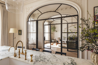
We wanted to accentuate the traditional plaster detailing of the original Victorian architecture, injecting Parisian chic with the introduction of oversized arched doors. We found the traditional enclosed hallway was restrictive for a young family who had come from open-plan living. The introduction of arched doors, often found in European city apartments, allows for better connection of spaces and for the kitchen to be central, which was key for family living and entertaining.
The Vision
The design is anchored by a subtle palette and delicate plaster details which create a feminine execution to bold design features. Joinery and doors in the rest of the living spaces were designed to be hidden flush within the walls, from the TV unit and coat cupboards to even the dining room door. Again, this allows the core architectural features to take centre stage. The kitchen is subtle and gives emphasis to the waterfall island, which is in Breccia Capraia marble and has strong green and purple veining, accented by delicate brass details.

TAKE THE TOUR
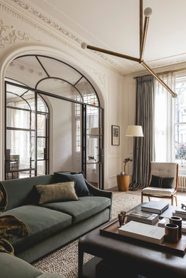
Living Room
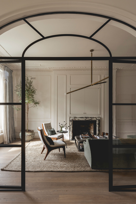
We started by adding new panelling and cornicing as the previous owners had very simple masculine plasterwork that wasn’t in keeping with the age of house. We also wanted delicate plaster detailing to soften the new bold and modern arches – the plaster cartouches around the corners of the arches create a feminine junction between the arch and the angular panelling. We also wanted the arches to have character and texture to them, as if they’d been there for years, so we used historical glass that’s manmade creating air bubbles and slight indentations in the surface, allowing light to reflect irregularly.
The bespoke sofa is flexible, so its proportioned perfectly to push into the corner when entertaining and allow access to the bar behind the timber arched doors. I think the curve of the arms makes the oversized sofa feel less dominating and more feminine.
Our client didn’t want the TV to be on display, so we built out the fireplace to allow a TV to sit within a concealed unit that we beaded to appear as if it’s part of the panelling. The fireplace is purposely wide and short to ensure the TV isn’t too high for viewing.
As a finishing touch, I love how the dynamic armed pendant light creates interest to the scale of the high ceilings, and the modern design contrasts to the traditional details.
WALL & CEILING PAINT: Rose Uniacke
CEILING LIGHT: Apparatus Studio
WALL LIGHTS: Pooky
ANTIQUE FIREPLACE: Jamb
ARMCHAIR: Antique mid-century armchair, upholstered in De Le Cuona fabric
CUSHION 1: De Le Cuona
CUSHION 2: De Le Cuona
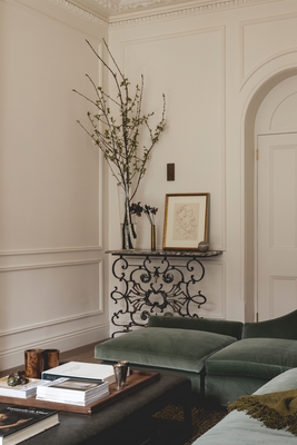
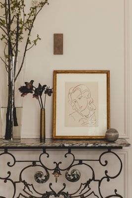
19TH-CENTURY FRENCH BALCONY CONSOLE: Antique, sourced by Crawford Design
LEATHER COFFEE TABLE: Crawford Design
L-SHAPED SOFA WITH EXTENSION OTTOMAN: Crawford Design on Varese Sage by Designers Guild
SIDE TABLE: William Yeoward
FLOOR LAMP: Antique from Christopher Butterworth
ART: Mia Chaplin
RUG: Tim Page
ANTIQUE PLANTER: Petersham Nurseries
INDOOR OLIVE TREE: Underleaf
CURTAINS: De Le Cuona
CURTAIN POLES: McKinney
ARCH HANDLES: Beardmore
BESPOKE BRONZE DOORS: J & Z Construction
Kitchen
We played with lots of layouts but landed on an oversized island with stool seating because it was important to allow the children to do homework at the same time as dinner being made.
The Breccia marble was selected for its intense colour of turquoise and purple veining. Given the scale of the island, we didn’t want it to over-dominate and therefore created a feminine edge in the form of a bullnose and followed this through to the waterfall sides. This was a masterpiece by the makers.
The wall units house the fridge/freezer and pantry but stop short of the ceiling. The door panels have very delicate beading reflective of the scale used on the walls. I like to think of the unlacquered brass ironmongery and ladder as the jewellery to the pared-back kitchen.
WALL & CEILING PAINT: Rose Uniacke
CEILING LIGHT: Rose Uniacke
KITCHEN: Designed by Crawford Design, made by Blakes
WORKTOP: Breccia marble in honed finish
TAP & HOT TAP: Perrin & Rowe
RANGE: La Canche
CURTAINS: Rose Uniacke
CURTAIN POLES: McKinney
VASE: De Le Cuona
FLOWERS: Scarlet & Violet

Dining Room
In keeping with the rest of the ground floor, the furniture pieces are grand in scale rather than a cluster of smaller, bitty pieces. The oversized dining table is a work table and entertaining space. Due to the scale of the table, the interest needed to be in the texture of the piece, so the edges are waney (also called ‘live’) following the veining of the oak and exposing the knots.
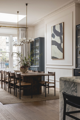
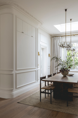
Bespoke display cabinets reduced the cost of finding a pair of units that were exactly the right size for the space. They’re overflow storage for the kitchen so were designed to create capacity for cutlery and entertaining serving sets. The curved wall in the dining room is to conceal a hidden coat cupboard we installed into the corridor.
WALL & CEILING PAINT: Rose Uniacke
CEILING LIGHT: 1950s Murano pendants, sourced by Crawford Design
BRASS WALL LIGHTS: Antique, sourced by Crawford Design
DINING TABLE: Designed by Crawford Design
DINING CHAIRS: Carl Hansen
DISPLAY CABINETS: Designed by Crawford Design
ART: Francis Gallery
RUG: Tim Page

Main Bedroom
A Japanese tapestry picked up on the client’s travels sits pride of place and is complemented by the simple lines of the curved headboard, elongated velvet cushions and honey tones of the lime wash paint. A room for serenity and calm.
WALL & CEILING PAINT: Bauwerk
CEILING LIGHT: Antique found at Kempton Market
TABLE LAMPS: Porta Romana
SIDE TABLES: OKA
BEDHEAD FABRIC: Rose Uniacke
CARPET: Fibre Flooring

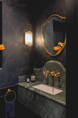
Guest Bathroom
This room is a contrast between the bright living spaces. The client wanted a moody, sophisticated bathroom that reflected one you might find in a cocktail bar. We used Bauwerk paint which has beautiful texture when applied. The marble sink is Emperor Green marble – such a great statement.
WALL PAINT: Bauwerk
MURANO WALL LIGHTS: Antique sourced by Crawford Design
MID-CENTURY BRASS MIRROR: Antique sourced by Crawford Design
SANITARYWARE: Lefroy Brooks
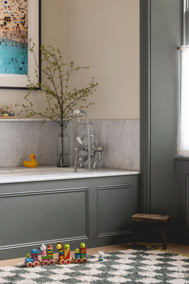
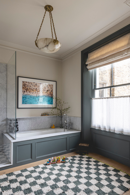
Family Bathroom
We worked with the existing bathroom so there weren’t any major changes here, just a lick of paint, making the woodwork darker to allow the room to still feel bright with neutral walls, new antique lighting, and a marble backsplash with a shelf to the bath. The café sheer was important for the children’s privacy at bath time – and electric blinds just make life easier!
WALL PAINT: Paint And Paper Library
WOODWORK: Farrow & Ball
CARRARA MARBLE BATH & SHOWER SURROUND: Marble City
SANITARYWARE: LeFroy Brooks
WALL LIGHTS: Porta Romana
MIRRORS: Vaughan Designs
ALABASTER PENDANT: Antique, sourced by Crawford Design (similar, Pamano)
ANIMAL HOOKS: Cox & Cox
ART: client’s own, framed by Art Untamed
Children’s Rooms - An Overview
The children’s rooms are a playful transition to a new space in the house. Each room has accents curated to each child – be it an antique Ferrari light and car posters found in Parisian markets, a bespoke colourful string light, antique Murano lights, or a bespoke step integrated into the bottom drawer to access the wardrobe at a young age.
Nursery
The client had always dreamt of a wallpaper nursery. This delicate wallpaper scene is by Isidore Leroy with colours picked out for the woodwork and ceiling. This is boldly clashed by Turnell & Gigon striped curtains and Rose Uniacke dotted sheer curtains behind. Each child has a different sheer dot to continue the language throughout the bedrooms. The nursery is completed by the bold and textured pinch Anders pendant.
WALLPAPER: Isidore Leroy
SKIRTING: Little Greene
SKIRTING: Papers And Paints
CEILING LIGHT: Pinch Design
CURTAIN: Turnell & Gigon
CURTAIN POLES: McKinney
COT: John Lewis
GIRAFFE: John Lewis

Child’s Room One
Naturally, the children were keen to see what we were proposing and keen to use their favourite colours. The string lampshades were chosen by them too, which we love and they’re handmade by Loving String.
We designed a new wardrobe with side shelving and brass ladder to allow for flexible use as the child grows up, and we incorporated steps in the bottom drawers to allow them to reach their rails while they’re young.
WALL PAINT: Little Greene
WARDROBE INTERNAL & SHELVING PAINT: Paint And Paper Library
CEILING LIGHT: Bespoke by Loving String
WARDROBE HANDLES: Matilda Goad
CURTAIN: Rose Uniacke
CURTAIN POLES: McKinney
ART: Sourced by Art Untamed; artist Holly Fream
DESK: Maison du Monde
CHAIR: Royal Design
TABLE LAMP: And Tradition
CUSHIONS: Molly Meg
ACCESSORIES: Ferm Living

Child’s Room Two
This little boy’s bedroom is designed for a child who loves cars! We wanted the design to age with him so found vintage posters and a classic Ferrari light that will still be cool in years to come. The red of the frames, however, are Red Bull red – his favourite racing team.
WALL PAINT: Little Greene
CEILING LIGHT: Caravane
BLINDS: Howe London with Samuel & Sons burgundy trimming
RUG: similar Nordic Knots
VINTAGE CAR POSTERS: Sourced at a Parisian antiques market, framed by Canford Frames
FERRARI LIGHT: Sourced at Kempton Market
BEDDING: Zara Home
Visit CrawfordDesign.co.uk
Contractor: J & Z Construction
Photographer: Billy Bolton
DISCLAIMER: We endeavour to always credit the correct original source of every image we use. If you think a credit may be incorrect, please contact us at info@sheerluxe.com.