
How To Choose A Colour For Your Front Door
Farrow and Ball
Nicole Salvesen, Salvesen Graham
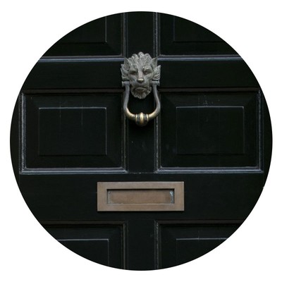
“Front doors should feel strong and give presence, while we find timeless classic colours such as blue, green and black work across the trends,” says Nicole Salvesen. “I recently used ‘Invisible Green’ by Little Greene which is both smart and usable. Other favourites are ‘Hague Blue’ by Farrow & Ball and you can’t go wrong with a really long-lasting classic black, such as Farrow & Ball’s ‘Pitch Black’ – after all, if it’s good enough for Number 10…"
Visit SalvesenGraham.com
Sarah Delaney Designs
Katharine Paravicini
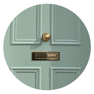
“I prefer classic colours for a front door, and is the decision usually depends on the location of the house and architecture of the building. Also, it ‘s worth thinking about the other colours on the exterior of the house; for example, is the exterior brick or rendered? Farrow & Ball are great as they do an exterior eggshell paint finish and favourites I’ve used are ‘Railings’, ‘De Nimes’, ‘Rectory Red’, ‘Hague Blue’ and ‘Lichen’.”
Studio Peake
Sarah Peake, Studio Peake
“HC9 ‘Pale Egyptian Blue’ by Paint and Papers in gloss looks great with brass hardware, and it’s soft and fresh rather than austere and overly grand. The lighter colour is friendlier and more relaxed. It’s important to have a colour you love on your front door because you interact with it all the time. I also like ‘Studio Green’ by Farrow & Ball, which is very smart, and I absolutely love a red gloss door – I’ve just yet to find a client who will go for one.”
Visit StudioPeake.com
th2 designs
Gail Taylor, Th2 Designs
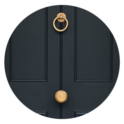
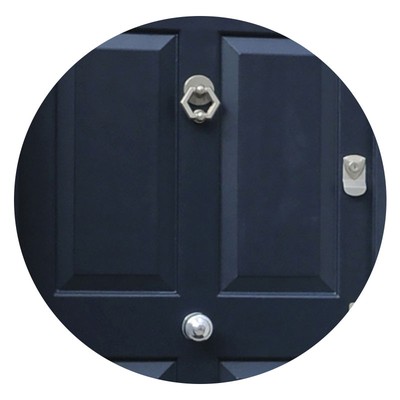
“When I’m working on country homes, I tend to go for more organic colours. I find they work better in a more rural setting and Marston & Langinger have a fantastic range – one of my all-time favourites is ‘Sea Green’. In London and other urban spots, black is a firm favourite as it looks so smart, but I try and give my clients something a bit different and often choose Farrow & Ball ‘Downpipe’, which is a very, very dark grey. In a little house in Chelsea, which was hidden behind a walled courtyard, I wanted the paint for the gate to the courtyard to match the front door. We chose Little Greene ‘Basalt Blue’ – it took a while to find the right colour, but this is a fantastic deep blue. I always paint up a small sample to get the colour just right, often different light can change it, so it’s really important to test it in the location before painting the whole door.”
Visit Th2Designs.co.uk
DISCLAIMER: We endeavour to always credit the correct original source of every image we use. If you think a credit may be incorrect, please contact us at info@sheerluxe.com.