
The Interior Designer Fusing Modern & Classic
Style & Inspiration
An eclectic narrative is at the core of what we do, and our natural instinct is to fuse the modern with the traditional, while retaining some classic touches. Our homes are designed to be an escape from the day to day, but still energized with dashes of wit and glamour. We work extremely closely with our clients through every stage of the process to bring their vision to life.
Certain projects will always stay with me. A ski lodge in Aspen – glamour to the max! What was once a pastiche Colorado townhouse was completely gutted and re-modelled with a light contemporary interior. A family house in San Francisco – a fun and really stylish project, and one which we filled with iconic furniture and bespoke designs. Finally, a series of listed barns in Dorset – we worked our way out of the main house via a series of barns, each of which had its own distinct style depending on its use (think family, guests or parties).
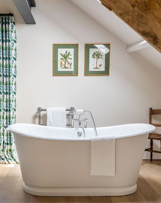
My favourite space to design is bathrooms. I like the idea of making a utilitarian space feel more like a room, rather than just a place to bathe. I like to play with the dress up elements by adding details you wouldn't traditionally expect – like lovely armchairs, curtains and rugs. I also love rooms where you can layer, as well as playing with pattern to add depth and texture.
My childhood, which was spent in the Mediterranean, is a big influence on my work. My time there played an enormous part in my life and the smell of the pine trees and the sea brings to mind an instant sense of homecoming. The colour, light and patterns all feed into our schemes somehow.
I’ve always been a diehard David Hicks fan. And, of course, the doyenne of English design Nancy Lancaster and the fabulous American, Dorothy Draper. On a more contemporary level Alessandra Branca’s work is incredible.
I can’t wait until all the museums are back up and running. Weekend forays through The Wallace Collection, The National Portrait Gallery, the Thyssen-Bornemisza National Museum in Madrid and the Marché aux Puces in Paris are always a tonic. I'm looking forward to revisiting them all as soon as I can.
There are so many designers worth following on Instagram but some of my favourites include: de Gournay, Michael Amato – the incredible creative director of The Urban Electric Co – Alessandra Branca and the lovely Adelaide Bragg in Australia.
Planning & Decorating
Vision is key at the start of any project. Usually, the basic canvas of a house doesn't have much to say for itself. As a studio, we excel at not only addressing the practicality of day-to-day living, but also embedding a sense of style. Start by thinking about what you want your room to say. Decide what your priorities are and what you want the space to do. Then, work in the design details from there.
People can be frightened of small spaces. They tend to paint them white as a failsafe. But you can come at it from a different angle by overloading it, painting it darker, with walls of books and lots of layers. It gives a room more depth and makes it feel like there’s more to it than meets the eye.
Large, open-plan spaces need to be handled in a bold and graphic way. Never be apologetic with scale, add drama, upscale your furniture and enjoy the volume of the space.
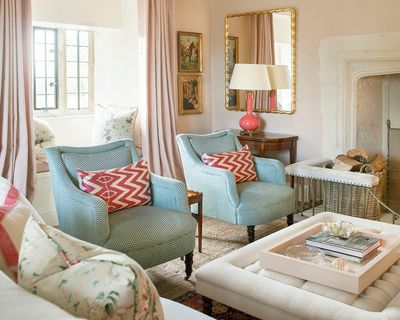
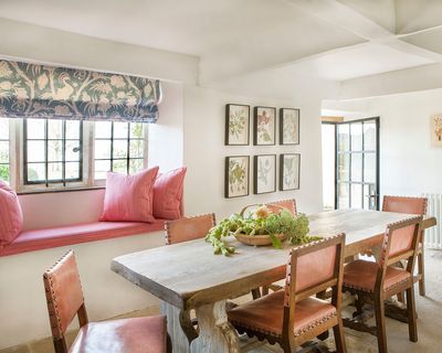
Colour is a very important theme throughout our designs.You have to have a hook to start with – at least one item, which might be a client's existing piece, a much-loved artwork or a fabric with a very definite pattern to work around. Look at all the elements on the table, consider the room and its functionality, and then filter in the client’s needs and desires.
There are no hard and fast rules when it comes to colour. Sometimes, it's wonderful to take several tones and fill a room, and sometimes it's fabulous to clash colours throughout. What works is usually dictated by the room, the light and the client. That said, we are big proponents of experimenting with colour, so we're probably rather maximal in that respect.
Working with pattern requires quite an attuned eye. Understanding what goes with what is not always easy. Pattern is much more interesting when it’s not immediately obvious. For instance, using layers of pattern that don’t conventionally match – the disparity between the two is far more interesting.
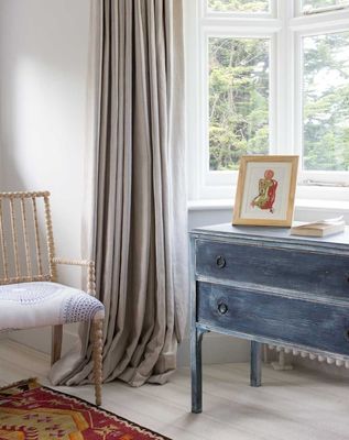
An heirloom or piece of brown furniture can be a godsend. It immediately cuts through a room which is ‘too perfect’ and gives the space more atmosphere and personality. There is nothing more beautiful than a Georgian armoire or an 18th century oil painting sitting in a white modern space. Never be frightened of it. Equally, a very contemporary piece thrown into a more traditional scheme can really inject energy.
That said, try to avoid pairing pieces which are from neighboring periods. For example, you shouldn’t put something Art Deco with something Art Nouveau. Instead, there should be a good gap between periods – think mid-century with 18th century pieces. Mix it all up, so nothing is ever quite matching. Also, use what feels right to balance relaxed informality with elegant sophistication.
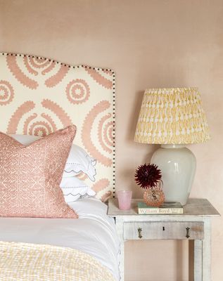
Always splurge on good upholstery. Don't spend a fortune on a rug and cheapskate the sofa, for example. It's always obvious and the upholstery gets much harder wear. Never scrimp on good lighting, either. In a bedroom, good linen is key. With perfect white bedlinen you can leave everything else in the room undone and it just sort of… works. If you have a tight budget, concentrate on building the bones of the space – a good sofa, a great dining table and beautiful occasional pieces.
Rugs are important. You want to be as generous with their size as possible, but they can be an expensive investment, so you need to be clever. Lots Road Auction House is a great place to pick up a bargain, while sisal and jute are both inexpensive ways to make a huge impact.
Kitchens
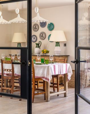
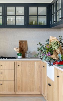
The practical elements of working in a kitchen are crucial. Consider the location of the stove in relation to the fridge, the sink and the dishwasher, for example. You also need to consider where you store the plates, all the way down to where you place the bin. It all needs to seamlessly link together to make the space flow.
You need the floor to be practical. It needs to be able to handle daily wear and spillages, but it also needs to fit the style and feel of the house. For example, in a Victorian terraced house, there may already be a wooden floor, and you should work with it. Try painting it in a colourful marine paint and get it sealed with a proper sealant.
Marble always looks great in kitchens. Suppliers will shower you with caveats and warnings, and Caesarstone or Silestone are great alternatives, but marble just looks better the more you use it. It gains patina with time and settles with the house, too.
Lighting
When planning lighting, balance the phases of the day with what the room demands. Think about how you can transition a space from day to night, or turn a family space to an entertaining space. What elements are required to allow you to set the scene?
Consider adding a little drama. For example, it can be very romantic to spotlight a beautiful object in the corner of a room (or indeed, in all four corners of a room). Consider a large vase of flowers on a console, or paintings on the wall.
Think about the size of the room. For instance, in a room where the ceiling height isn’t great, or if you don’t have space for table lamps on a sideboard, floor lights look great illuminating a corner of a room. Sometimes, they can be an interesting design element in themselves.
As a rule, always go for warm white. That’s around a 2700k colour temperature – this adds a lovely layer of warmth and creates atmosphere in a space. Lighting enhances the colours and feel of a room, and can always be used to highlight its features.
Don’t feel you have to go all out. It’s sometimes the case that a room looks better when it’s under lit. Recessed lighting is often overused, with the ceiling ending up like the runway at Heathrow.
Suppliers
Where to go for:
Furniture: Soane, Samantha Todhunter Bespoke, Thonet, Rupert Bevan, Collier Webb
Fabrics: Christopher Farr, Bennison, Soane, Ian Mankin , Claremont, Pierre Frey, Guy Goodfellow
Joinery: Barr Joinery
Kitchens: Barr Kitchens
Bathrooms: Lefroy Brooks, Waterworks, Drummonds
Wallpaper: Phillip Jeffries, de Gournay
Paint: Benjamin Moore, Farrow & Ball
Lighting: Collier Webb, Lindsey Adelman, Vaughan, The Urban Electric Co
Flooring: The Rug Company, Tim Page Carpets, Dinesen
Tiles: Balineum, Mosaic Factory
Kitchen hardware: Buster and Punch, Armac Martin, Joseph Giles
Visit SamanthaTodunter.com
All Images Samantha Todhunter
INSPIRATION CREDITS: SAMANTHA TODHUNTER
DISCLAIMER: We endeavour to always credit the correct original source of every image we use. If you think a credit may be incorrect, please contact us at info@sheerluxe.com.