An Interior Designer Explains The Brown Trend
What's going on Alice? Why is brown everywhere?
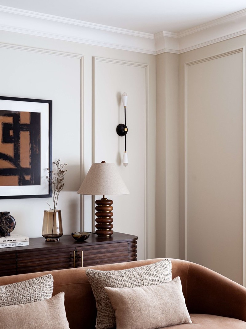
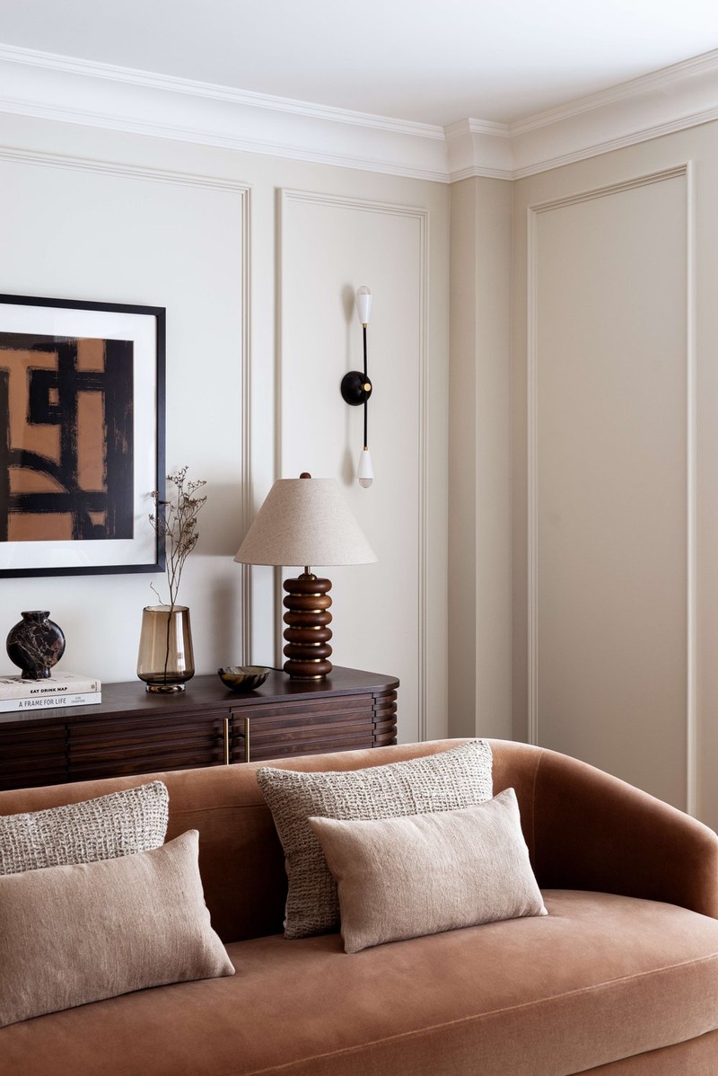
Brown is a very easy colour to work with. It’s warm, it complements virtually every scheme and is part of so many of our interiors, simply because unpainted wood is so often present in our homes. There’s also been a focus on wooden ceilings and the incorporation of beams and stained panels, which I feel has given us more gorgeous, warm, textured interiors that not only lend themselves to both light and dark surroundings but provide a perfect backdrop to popular earthy tones. These are always going to be timeless, easy interiors that feel welcoming, cosy and liveable.
Does brown work better in traditional settings then?
On one level, I’d agree the beauty of brown is that it works well in period settings. A property with features such as elegant cornicing, trimmed window frames and characterful fireplaces can show off rich paint colours beautifully. Picture a dark, moody home office or a library of brown leather-bound books, with walls painted in something like Farrow & Ball’s ‘Pantalon’ – a gorgeous muted tone, this is a brown that doesn’t try too hard but is immediately understated and homely. Recently, in a London Victorian house project, we used Farrow & Ball’s ‘Smoked Trout’ in a bedroom – it’s a beautifully soft, mushroom paint that gently warmed and soothed. It layered well with Fermoie and Lewis & Wood fabrics in various brown and pink tones, and worked easily alongside the client’s various existing pieces.
How does it do in a contemporary setting?
Within my own home, which is a new build, we have painted our new room-dividing wall Etruscan Red (a brown-based red) on one side and Mouse's Back on the other. A larder and bookcase are also both wonderful places to introduce colour in a new build as their impact is softened with the bits and pieces you store on their shelves. These two colours (the Etruscan Red in a north-facing room and Mouse’s Back in a south-facing one) tie in with the tonal brown-y, taupe red-based paints we have running alongside them (Stirabout, London Stone, Joa’s White and Dimity). This is a perfect palette to warm up a conventional new-build home, and can be a great starting point from which to introduce some bolder colours elsewhere in your home.
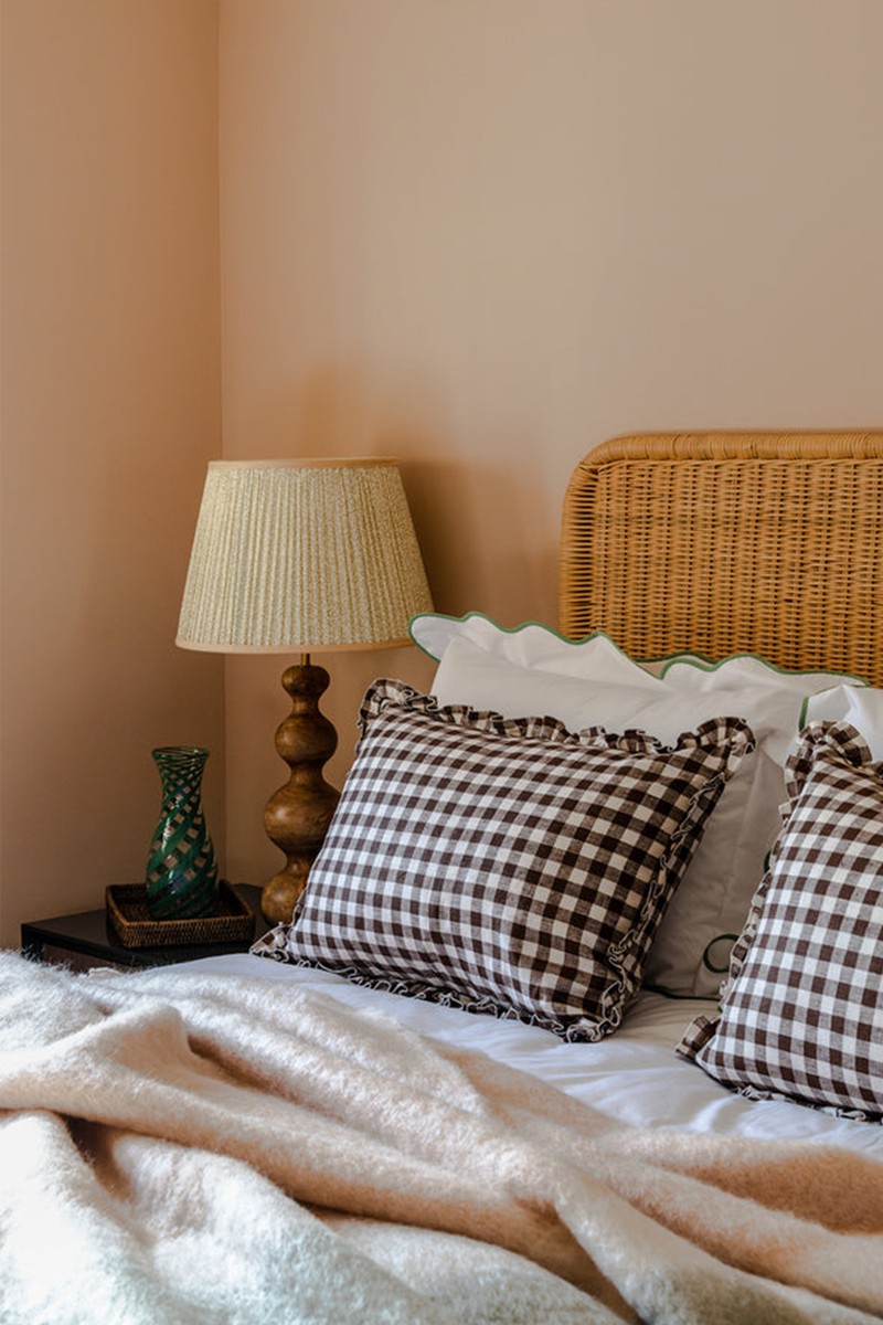
Are there others ways to gently incorporate accents of brown into your interior?
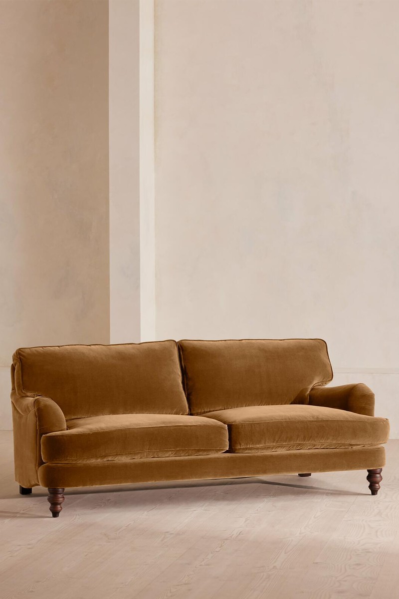
I naturally gravitate to earthy tones, so I have incorporated brown in all aspects of our designs from walls to floors and furnishings. I love to use brown on upholstery which provides you with that wonderful alternative to creams or blues, giving you slightly richer and more durable options for homes with children and pets. Some examples of choices I love include Love Your Home’s Recycled Velvet ‘Caper’, Kid Mohair Velvet in ‘Ochre’, and my absolute favourite Studio Rich Stain Resistant Velvet in ‘Cocoa’. Arlo & Jacob also does some stunning velvets, ‘Burnt Umber’ and ‘Rust’. For those who favour linens, ‘Earth’ and ‘Spice’ are popular choices that give you a gorgeous warm place to start in a room scheme. They sit beautifully on either a brown-based patterned antique rug such as those from Ourika or a textured alternative in jute, sisal, seagrass or wool.
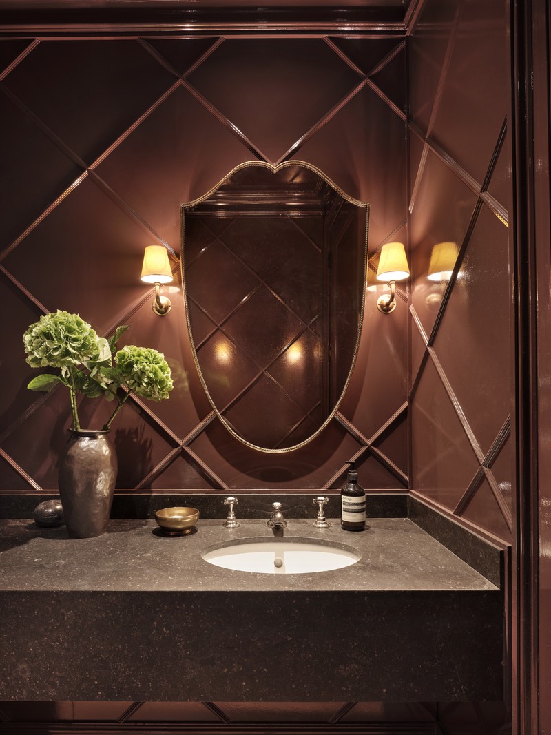
We also love to add texture and pattern to walls in our projects, and often our paper choices centre around brown. We have seen a rise in the popularity of grass-cloth wall coverings. A favourite of ours is Thibaut’s Adriatic in ‘Taupe and Red’, which added such depth to our client’s hallway and paired beautifully with every room paint leading off it – from blue to red to green.
I am also about to add some paper to my own living room: the Scrolling Fern Silhouette in ‘Chestnut’ from Soane. I can’t wait to see this is situ next to our marble fireplace, Otto 'Ecru Rose’ tiles and rosy brown OKA rug.
Visit AliceGraceInteriors.co.uk
Inspired?
Here’s how to add brown into your home…


Or continue to comment as a Guest below
DISCLAIMER: We endeavour to always credit the correct original source of every image we use. If you think a credit may be incorrect, please contact us at info@sheerluxe.com.
/https%3A%2F%2Fsheerluxe.com%2Fsites%2Fsheerluxe%2Ffiles%2Fwebsite-images%2F2025%2F03%2Fsign-up-pop-up.jpg)
