
6 Ways To Decorate Your Ceiling
Jo leGleud from Maddux Creative says…
Think Of The Ceiling As The Fifth Wall
Often overlooked, the ceiling can be a powerful design element. Whether through colour, texture or decorative features like a ceiling rose or cornicing, the ceiling can enhance the overall mood of the room.
Use Light To Your Advantage
In rooms where natural light is scarce, using metallic or glossy finishes on the ceiling can help reflect and disperse light, making the room feel brighter and larger. Similarly, lighter colours can open up a space, while darker shades can add intimacy.
Consider Architectural Features
In more traditional or modern spaces, adding details such as contemporary ceiling roses, mouldings or even murals can give the room an artistic or architectural flair. These details can be subtle or bold, depending on the room’s design, but they always add an extra layer of interest.
Texture & Materials Matter
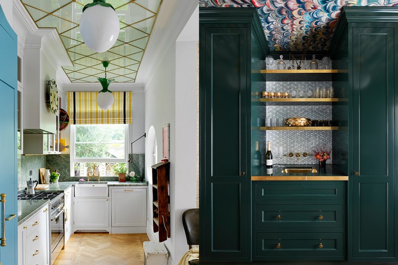
Ceilings don’t always have to be painted. Wood panelling, plaster treatments or even wallpaper can create a unique and visually striking look. Mixing materials like matte finishes with glossy surfaces, as in the use of metallics, also adds richness.
Create Continuity
When decorating ceilings, ensure the design fits with the overall scheme of the room. The ceiling should complement the walls, flooring and furnishings. In this case, the gold metallic finish aligns with both the wall colour and the pendant light, bringing harmony to the space.
Experiment With Colour & Pattern
Don’t be afraid to try bold colours or patterns on the ceiling. Painting a ceiling in a striking hue or applying intricate detailing can make it a focal point and transform the room’s atmosphere.
Visit MADDUXCREATIVE.COM
Now, six interior designers talk us through some recent schemes…
Adam Knight
Nefarious Interior Design
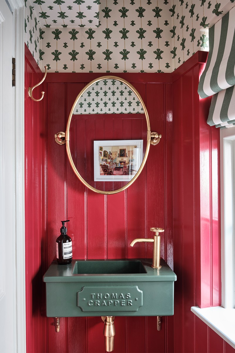
“We believe that ‘the smaller the room, the bigger the personality’, which can certainly be said for this ground-floor cloakroom. When ceiling heights within the space are low, we like to continue the wall finish onto the ceiling to give the illusion of height, rather than sectioning the space with a cornice or different coloured ceiling. Here, we chose to continue the wallpaper onto the ceiling, which is easier if you’re using a non-organic patterned wallpaper with a defined direction.”
Visit NEFARIOUSD.COM
Pandora Taylor
Pandora Taylor
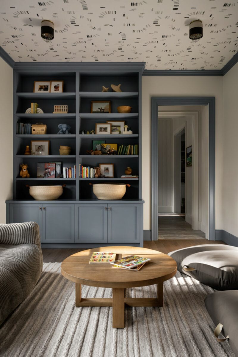
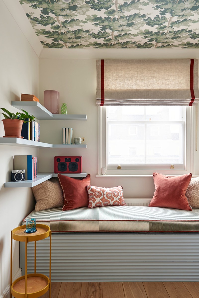
“The client wanted to create a feature in this small room to make it feel cosy. However, because it doubles up as a home office, they were worried a busy wallpaper would feel claustrophobic by the end of the day. Wallpapering the ceiling was an interesting compromise. It works because the pale, white walls mean there is lots of natural light bouncing around the room and the size of the pattern makes it feel cosy rather than ungenerous. Interest from the layers of cushions and shelves help to balance the space, so it’s not too top heavy.
Visit PANDORATAYLOR.CO.UK
Sarah Peake
Studio Peake
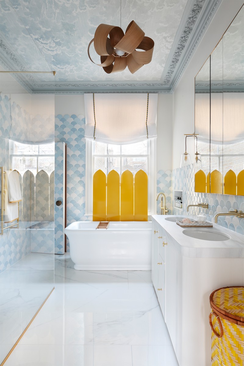
“Many people believe that different rules apply in the bathroom compared to the rest of the home. While they may embrace bold, warm and characterful designs in their living rooms, they often assume that bathrooms must be stark, sterile spaces dominated by minimalist finishes and shades of grey. But this perception is mistaken – bathrooms should reflect the style of the rest of the house, which is why we decided to add a beautiful feature ceiling in this bathroom. A feature ceiling can draw the eye upwards, creating a sense of height and drama, in turn making the space feel more dynamic and expansive. The wallpapered ceiling allows you to introduce texture, pattern or colour in a way that doesn’t overwhelm the room. And most importantly, you can lie in the bath and look at the clouds. One thing to consider is your ceiling hight – this would not have worked with a low ceiling.”
Visit STUDIOPEAKE.COM
Jo leGleud
Maddux Creative
“Decorating the ceiling with Charles Roberson’s ‘Classic Gold’ Liquid Metal was born out of the desire to create a unique, uplifting space that feels both sophisticated and lively. Gold, often associated with warmth and luxury, brings a sense of timeless elegance to any room. In this case, it complements Little Greene’s ‘Salix’ on the walls, blending an organic colour palette with a metallic twist that adds a subtle sense of opulence.“On an aesthetic level, the gold metallic finish injects warmth and subtle drama into the room, reflecting natural light beautifully, especially when paired with the pendant light. The ceiling becomes a statement feature without overwhelming the space, acting as a neutral due to its reflective properties. Functionally, the metallic finish bounces light around the room, helping to make the space feel brighter and more expansive. The combination of a warm ceiling and cooler walls provides contrast, drawing the eye upward and creating visual interest.”
“The height of the ceiling was also a factor. In lower-ceilinged rooms, metallic finishes can make the space feel cosier and more intimate, while in higher-ceilinged rooms, they help to fill what might otherwise feel like an empty, unused space above eye level. Another consideration was how the ceiling would interact with different types of lighting, from natural sunlight during the day to ambient and task lighting in the evening.”
Visit MADDUXCREATIVE.COM
Karen Howes
Taylor Howes
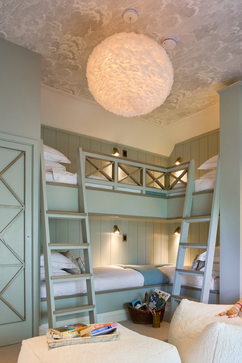
“Decorating a ceiling is a really easy way to elevate a room by doing something a little unexpected. For this particular room, we wanted to create a whimsical feel to the space, which we curated with the Cole & Son Fornasetti ‘Nuvolette’ wallpaper on the ceiling. We exaggerated this playful feel with an overscale ‘Plume’ pendant, complete with creamy white feathers from Restoration Hardware. We liked the idea of having something ethereal and tactile in the space, and played with scale and proportion with a fun jumbo bean bag chair. We wanted the space to feel inviting for all ages, as it is the children’s sleepover room, catering from tweens to teens, and to different genders. The room is fun without being too childish. Never overlook the impact a ceiling can have on your space; even in small rooms you can make them feel bigger by colour drenching. We often use metallic leaf wallpapers or highly polished plaster to add a sense of reflection and height, particularly in powder rooms or coffers. Even adding decorative mouldings can add interest to a ceiling. The art of plasterwork is having a powerful revival and it’s one of the most beautiful incarnations of the decorative ceiling trend."
Visit TAYLORHOWES.CO.UK
Laura Stephens
Laura Stephens
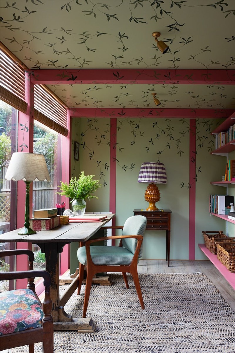
Garden office
“The garden beyond this office was the inspiration behind this design. We wanted to bring the pretty foliage and green into this space to make it feel integral to the garden. The ceiling is low; washing the colour over the ceiling and walls, plus painting the foliage over that, helps to blur the lines between walls and ceilings. We used a specialist decorator here (Eugenia Barrios Osborne) and she was worth every penny. She brought movement and realism to the pretty greenery she painted, making it appear as if it was growing over the ceiling and hanging down the walls. The colour scheme, and particularly the use of taking the scheme over the ceiling deceives the eye into thinking the ceilings are higher than they in fact are. It has created a special place to work.”
Bedroom
“The brief for this space was to turn it into a cocooning guest bedroom. It was previously white-washed, clinical and cold feeling. The room is blessed with high ceilings, so the intention was to create warmth and cosiness. Farrow & Ball’s ‘Dead Salmon’ complements the pale blue walls, but if the ceiling was white, this room could still feel cool. The pink tones of the ceiling paint completely change the feel of the room, creating warmth, depth and interest. We deliberated on whether we should include the cornice in the pink colour here, but taking the pink over this architectural detail drew attention to it and helped prevent the ceiling looking like a pink box. It has given this room an enveloping depth of interest and tranquil energy which would have been totally different with a white ceiling.”
Visit LAURASTEPHENS.CO.UK
DISCLAIMER: We endeavour to always credit the correct original source of every image we use. If you think a credit may be incorrect, please contact us at info@sheerluxe.com.
/https%3A%2F%2Fsheerluxe.com%2Fsites%2Fsheerluxe%2Ffiles%2Farticles%2F2024%2F10%2Fceiling-interiors-advice-maddux-creative-primrose-hill.png)
