How & Why To Use Pink In Your Home
It’s A Hard-Working Neutral
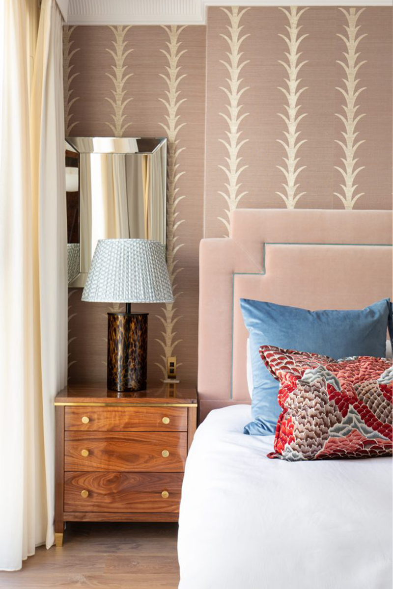
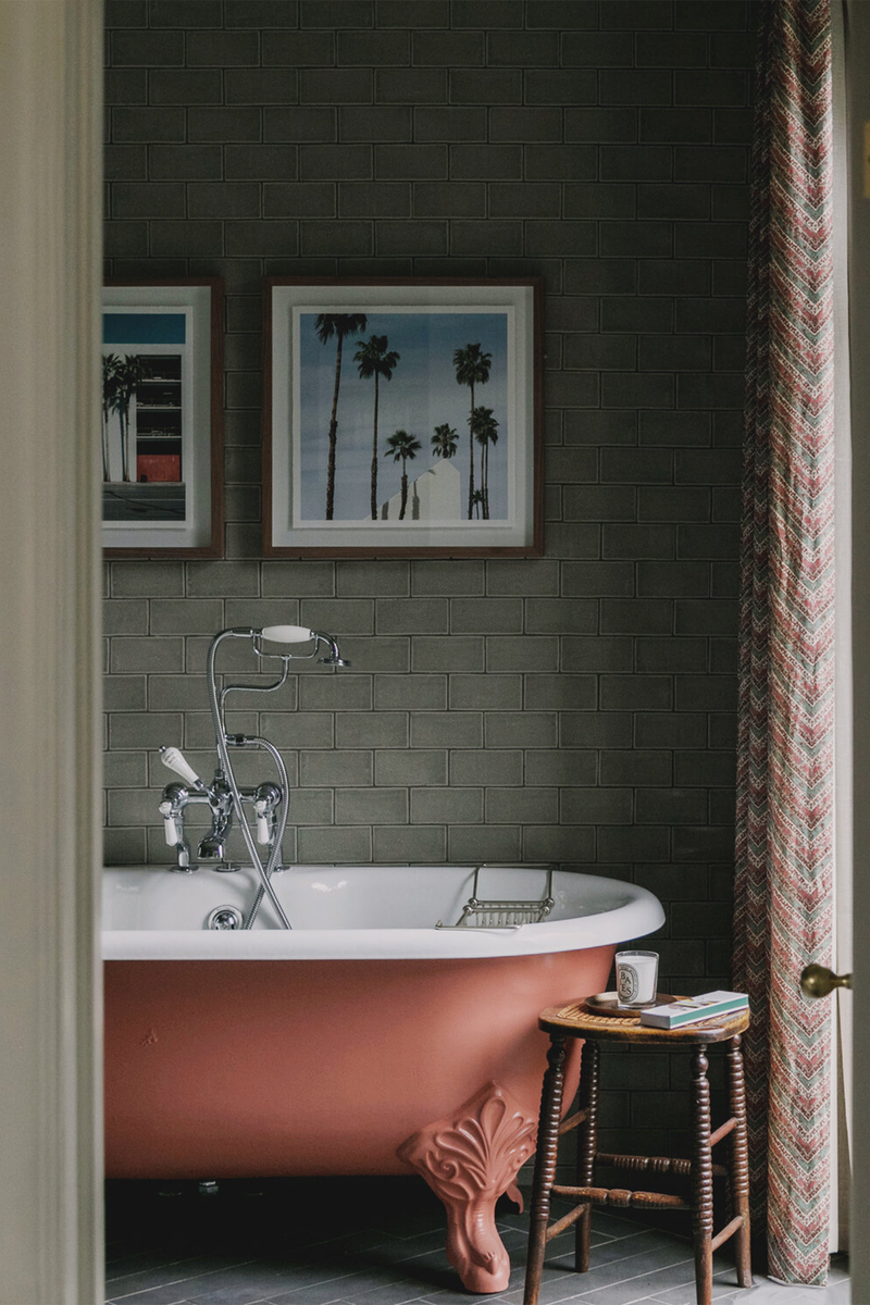
“A soft nude pink is actually one of the most neutral choices for an interior, and is both warm and flattering,” says Tiffany Duggan, director at Studio Duggan. “Try ‘Setting Plaster’ by Farrow & Ball or ‘Jonquil 40%’ by Edward Bulmer for a soft, calming, smart backdrop. For more of a statement, pinky terracotta tones work really well – the orange pigment stops the look becoming too saccharine. In this bathroom, we used ‘Red Earth’ by Farrow & Ball on the bath to make it pop. It works so well with the Soane curtains behind. Personally, I would steer clear of anything too powder pink or Pepto Bismol inspired. Nudes, dirty pinks, lilac pinks and orange-hued pinks are smarter and far easier to use.”
It Grounds A Scheme
One of the most talked about shades from the last year is ‘Mason Pink’ from Edward Bulmer. “Pink is the undercurrent in so many materials used for masonry, from stone to terracotta to brick,” explains Edward. “This is what makes it such a great colour for walls – either in grand or intimate spaces. Good pinks, light or strong, need to be settled down with earth pigment and often a pinch of black. This colour exudes a gender-neutral confidence that flatters and inspires – no wonder you can find it on the atelier walls of Anna Mason.”
Anna, who developed the colour with Edward, adds: “I’d fallen in love with Cuisse de Nymphe - a pink that was just dirty enough not to be sugary and I was equally drawn to the shades of tobacco brown I’ve also used in the Maison for tone and balance.” Edward believes Mason Pink can be used in multiple ways: “Soft, creamy and incredibly gentle on the eye, it helps to bring a sense of calm to any room.”
It Works All Over The House
If you still need some convincing, think of pink as a dupe for creating a classic plaster wall. "Jonquil is our version of plaster pink, which has become a go-to colour for any room in my house, as it’s so versatile,” says Edward. “It’s fantastic in the hallway as a warm and welcoming colour or in the living room with fabrics and furniture of any style. It can easily look 18th century or like it’s from the Art Deco period.”
It Plays Well With Other Colours
“Pink is always a good idea to include in your schemes because it’s so versatile; tried-and-tested combinations include pink and green, pink and blue, and even pink and red,” explains designer Olivia Emery. “Using softer pinks can act well as a neutral, if you want something with a bit more depth and warmth than white or beige. Sometimes, the suggestion of a pink room can feel a bit overwhelming for clients, so I often use a soft pink on the ceiling – it adds a bit of interest and if you get the right shade, it can be calming and peaceful. You can also be creative about working with touches of pink in a scheme, if you don’t want too much of it – think painting the interior of a glass-fronted home bar cabinet, a bathroom vanity, the sides of a freestanding bath or inside the firebox of your fireplace.”
/https%3A%2F%2Fsheerluxe.com%2Fsites%2Fsheerluxe%2Ffiles%2Farticles%2F2023%2F01%2Fturner-pocock.png)
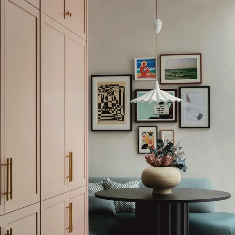
It’s A Good Backdrop For Art
“I've never been a huge fan of 'millennial pink' and always tend to lean towards the warmer, dirtier or bolder pinks instead,” says tastemaker Lucy Williams. “My hallway, for example, is a murky, mushroom-pink lilac by Mylands called ‘Soho House’. I love it teamed with the rich terracotta floor tiles and dark red banister and stairs, which stops it from feeling too sweet. Pink and red is one of my favourite colour combinations; red in all its shades is such a grounding colour, so pink will never feel too girly or saccharine when paired with a bold or rusty red. Pink is a great backdrop for art – anything bold and contemporary, like this Faye Wei Wei piece in my hallway, looks great on a softer pink wall. The two balance each other out and pink really does make things glow. Buchanan Studio does an amazing pink and ruby red stripe fabric I'm currently obsessed with. I also love very bold, Barbie-esque takes on pink right now and have been toying with lacquering our tiny downstairs loo in all-over gloss pink instead of wallpaper for something bold and fun. It's just about finding the right shade that has a bit of a grit to it.”
For more information, visit StudioDuggan.com, EdwardBulmerPaint.co.uk, OliviaEmery.com & follow @LucyWilliams02 on Instagram.
DISCLAIMER: We endeavour to always credit the correct original source of every image we use. If you think a credit may be incorrect, please contact us at info@sheerluxe.com.
/https%3A%2F%2Fsheerluxe.com%2Fsites%2Fsheerluxe%2Ffiles%2Fwebsite-images%2F2025%2F03%2Fsign-up-pop-up.jpg)
