Trend Watch: Wallpaper Borders
Why Borders Are Back
“I grew up with a wallpaper border in my bedroom – they were the height of 80s chic. It went through the middle of my bedroom wall and I remember it vividly. Right now, I'm in the middle of a house renovation and we’ve wallpapered all the bedrooms and the hallway, but have opted for paint in the dining room and living room. We have beautiful Victorian features with a cornice and picture rail in each room, so I was thinking about how to sneak some pattern into these spaces – that’s when I decided to design some borders to sit between the two.” – Annika Reed, printmaker
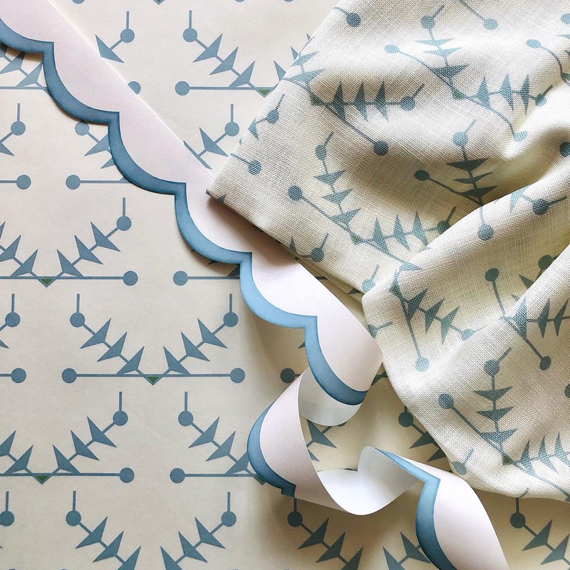
“It was the middle of lockdown and everyone was thinking about new ideas and how we frame (and could potentially reframe) spaces in our homes. Sarah and I are also 80s babies and grew up with Laura Ashley wallpaper borders. It proves everything really is cyclical. First, we felt it was a relatively fresh idea; no one was really doing wallpaper borders and done right, they can be a smart addition. We also felt it was playful and a bit irreverent – let’s be honest, they’ve never had the best reputation! I think they add interest and a sense of fun to a room without being a huge investment. If you’re a bit of a commitment-phobe or you’re worried about changing your mind, borders are a cost-effective way of adding a dash of colour and pattern.” – Kate Hawkins, co-founder of Common Room Co
“The increased layering and bolder use of colour and pattern in interiors meant we were psychologically ready for adding in another visual accent. I looked at photos of my house visits to Strawberry Hill and Ham House, and books on the history of wallpaper. We loved the idea that, historically, borders were integral to hide the nails traditional wallpapers were tacked up with, starting off as complementary and then becoming contrasting. Our inspiration soon rolled from there into a full collection of borders.” – Juliet O'Carroll, co-founder of Parker & Jules
Where To Use Wallpaper Borders
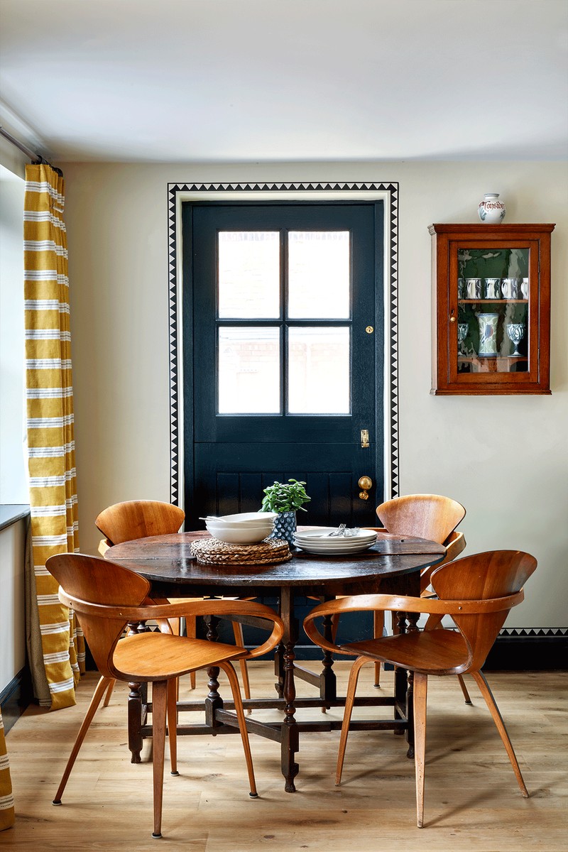
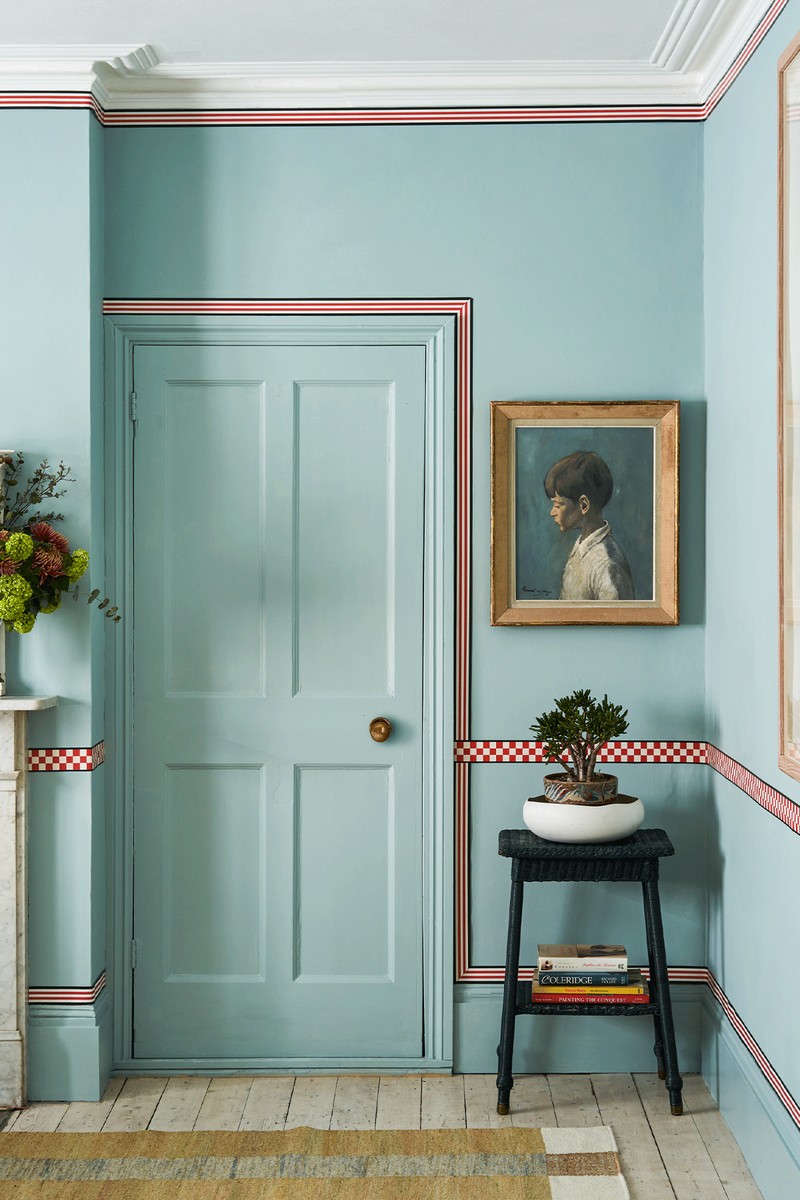
“Traditionally, borders have been used below cornices and sometimes to create dado rails along the top or bottom third of a room. Less conventionally, we’ve experimented with installing them directly above skirtings and around doorways to add more interest. And there are many other places they can work, too – they can highlight any joinery detail or aspect of the room you want to draw attention to. We like to think of them as highlights – the lightest areas added at the end of paintings to give the subject shape and form.” – Kate
“I love using a wallpaper border up the stairs, to frame views or architectural features, or maybe just to distract from wonky proportions. It’s a fun way to frame panels, pictures or mirrors, too.” – Juliet
“Wallpaper borders are the perfect way to add a decorative feature without having to paper the entire room, or they can add focus to a doorway, shelf or even work as a dado rail. If you’re a pattern lover, then why not add a border to break up two wallpaper patterns in a room? Using them on painted walls is my favourite way to use them, especially as an accent to architectural features. You can also use them where the wall meets the ceiling to create extra height.” – Annika
How To Apply Them
“Seeing as they’re smaller than rolls of wallpaper, they’re much easier to hang yourself. Once you’ve decided where to hang your border, measure the length of the walls. Try to avoid joins along the wall and match them into a corner or door frame instead. Cut the paper to size, giving yourself surplus to account for pattern repeat. Paste to the wall and apply as you would any other wallpaper.” – Annika
Finally, The Rules To Remember…
“A lot of it has to do with scale and rhythm, patterns and colour elements that echo each other rather than match, and drawing on a tonal palette in the wallpaper. Using a matching couple is sometimes still best as they will actually jump out at you less and help blend the space together.” – Juliet
“In the past, borders were paired with co-ordinating wallpaper and applied either on top of the paper as an accent stripe or as a stopping point. These days, those rules don’t apply. Do what makes you happy – clash prints, colours, anything goes.” – Annika
SHOP OUR EDIT OF WALLPAPER BORDERS BELOW


DISCLAIMER: We endeavour to always credit the correct original source of every image we use. If you think a credit may be incorrect, please contact us at info@sheerluxe.com.


