The Designer Choosing Interiors Over Fashion
Nowadays, I’m drawn more to interiors than fashion. I’ve always had a passion for both, but it just so happened that fashion became the priority for the last 20 years. But interior design was always there as a part fo my life and an under-the-radar hobby. Behind the scenes, I was very much interested in that world, but it’s only in the last three or four years that I’ve decided to change careers.
Fashion was my training ground for interior design. There are so many similar principles of colour, pattern, texture, scale, perspective in both industries. But the processes are different. For example, in fashion, I didn’t necessarily work for individuals – often I made a collection for a group of buyers – but with interiors I’m often working with clients designing their homes or hotels, so it’s more personal. I like working with an individual and understanding what they’re looking for.
Working in interiors is a different pace compared to fashion. In the end, I just grew so tired of the ‘business’ of fashion. I started at 18, launched my business when I was 24 and I’m 50 this year, so I’d have been doing it for 20 years. The length of a skirt just didn’t excite me anymore, to be honest. Don’t get me wrong – I still love clothes and the way people present themselves, but as it became more about business and sales, it became less about creativity. Conversely, interiors feels like a start-up. It’s a very refreshing reboot and I’m taking all the skills I’ve learnt from fashion and applying them to a new career.
Colour is instinctive. Not to brag, but it’s so obvious to me. If someone is dithering about different swatches of colour, I can say, ‘Well, it’s clearly that third one on the left’. If you don’t have that instinct, looking up a colour wheel is a simple and easy way to start training your eye. Are you drawn to yellows, peaches, or do you find them sickly? Do you like the cooler tones of eau de nil, green and sage? Just to get that in your head can be a good starting point.
That said, colour is like cooking – we’ve all got different tastes. Narrow down what it is you love. I love to mix warm and cool tones together in the same scheme – and I like to do that with my clothes, too. For example, wearing a navy shirt, which is essentially a cool blue with a camel trouser, which is warm. That sharp contrast is a very tried and tested formula. In most spaces there should be a balance of complimentary colours for contrast.
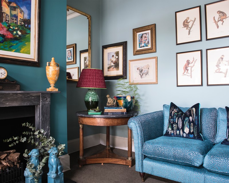
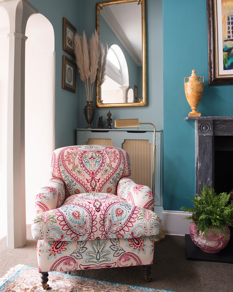
Walking into a colourless space makes me feel quite at sea. I decorate using colour, but with a sense of layering, which is so important. It’s not just about bringing bold, massive swathes of colour in. In my home in London, the shell is quite neutral, be it a dove grey bedroom or a soft blush plaster pink wall in the hallway. It’s the accents that can bring everything together; it’s thinking of those hidden areas where you can introduce pops of colour, like the architrave of a door frame, for example, or a banister on a staircase.
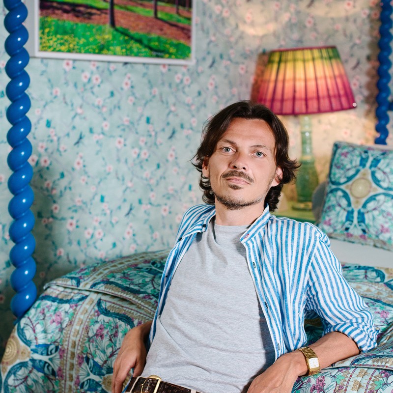
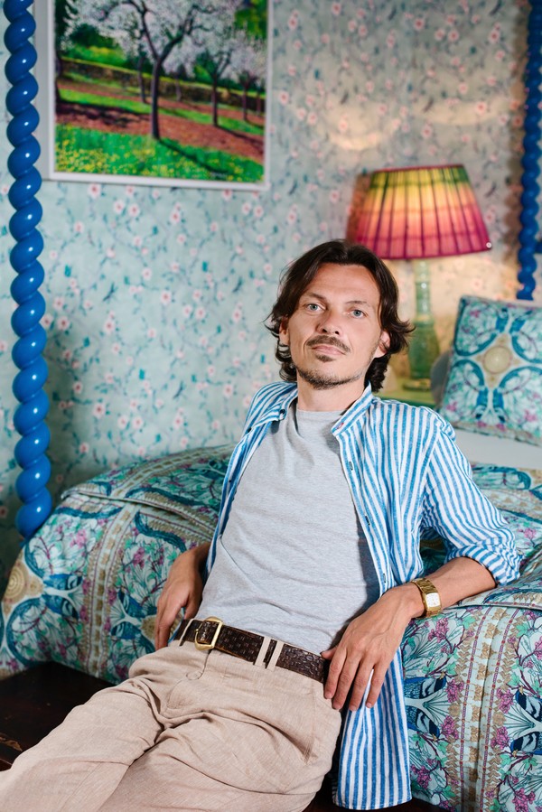
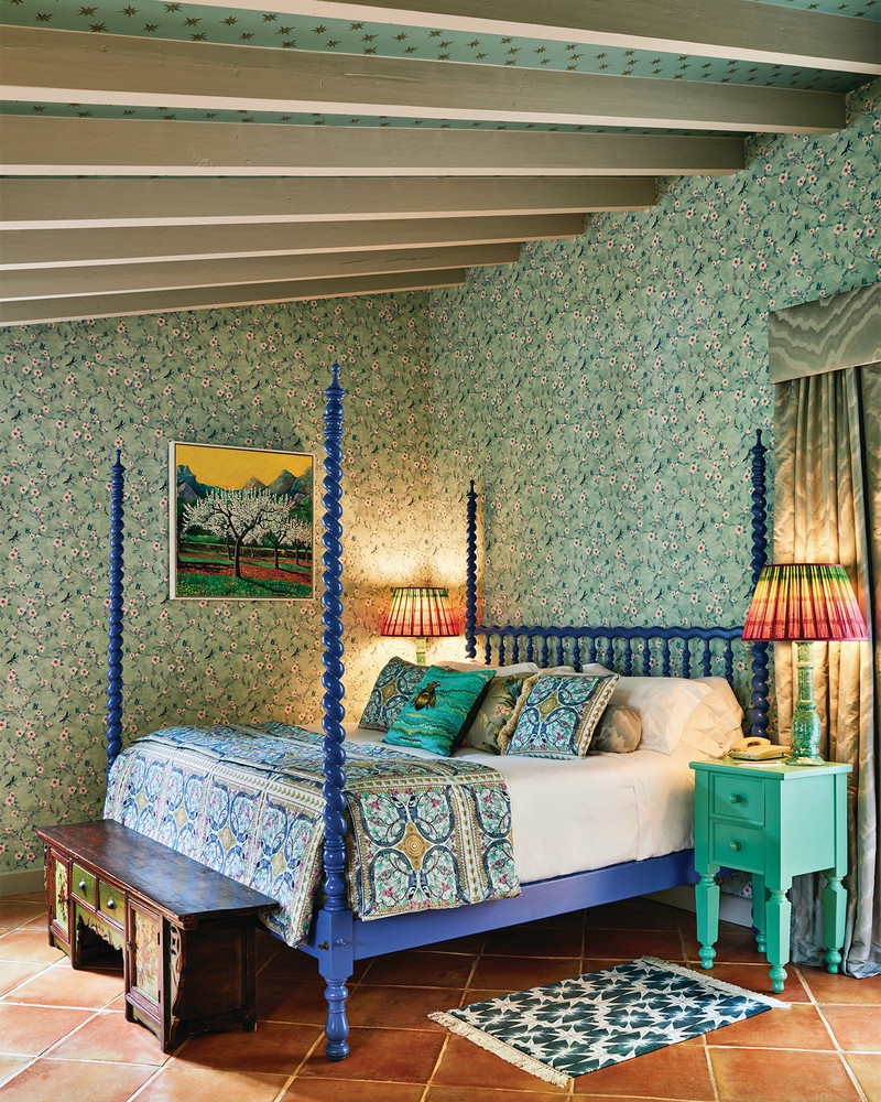
Designing a hotel suite at La Residencia in Mallorca, called for a certain sense of colour, energy and optimism. What’s nice about a hotel suite is there’s no one inhabitant, so you have more freedom. I wanted people to come in and think the space was special, and that every detail had been considered – for instance, there’s wallpaper on the ceilings, in the wardrobes, the cabinets are hand-painted, and the bed is lacquered in blue… it’s quite decadent, but in a rustic way that feels appropriate to the setting.
I’ve lived in Mallorca for five years, so I feel semi-settled here now. I still have a place in London, so I (normally, pandemic aside) go there one week a month to work. My house here is quite traditional. It’s a little finca – a traditional stone-clad building set up in the mountains of Mallorca in a place called Deia. It’s full of colour, but there’s a gentleness to it. It’s decorative, too – it’s got that English eccentricity, but with a rustic handwriting. I’ve picked up lots of Spanish artefacts along the way too. I’ve used tiled floors and local craftsman – it’s right for where it is.
My favourite room is my daughter’s. She’s got a very whimsical, light-hearted happy space with sun mirrors and a canopy over the bed. The living room is lovely, too. It’s very calm and where I spend a lot of my time – it’s currently serving as my office, as well as my dining table. There’s also a mini bar in the corner. I love my bathroom – it has powder pink walls with gilded mirrors, so it feels a bit more decadent.
When you move to a different country, you adjust to seeing new things. What’s been nice here is going to a marketplace or antiques shop and seeing all sorts of things, from old Spanish handprinted beds and floor tiles, to traditional lanterns. I’ve brought them all into my home.
You’ll find more unusual items from an antiques market. But trying to find these sorts of treasures online can be a bit of a labyrinth. It’s good to start by knowing what you like – do you like the 1970s, for example? And if you do, there’s probably a clutch of dealers who focus on that era. Lots of new dealers are shaking up the fuddy, bargain hunting side of antiques – which is also what I’m trying to do – and we’re trying to show these pieces in a way that isn’t some dusty, auction house environment. Draw up a moodboard, too – either on Pinterest or for real. If you can say what you love in a sentence, then that’ll really help edit down your search.
Antiques bring a sense of personality into a space. It’s the same with fashion – if you’re going to wear a dress from the high street, chances are you’re going to see it on other women. If you’re keen to forage for a vintage dress, you’re going to get a deeper sense of ownership, and that applies to interiors, too – I don’t really want to know my mirror is being produced for the masses.
One of my favourite finds is a massive chandelier which hangs in my London home. It’s an upside-down pyramid of amber-coloured lozenges that drop down quite low in the room – it’s from the 1970s, it’s Murano glass and I bought it from an antiques store in New York about 10 or 15 years ago. I love it – the drama, the impact… it’s also on a dimmer, so it’s quite moody at night and feels quite sexy and welcoming. It’s one of those pieces I’ll never get rid of.
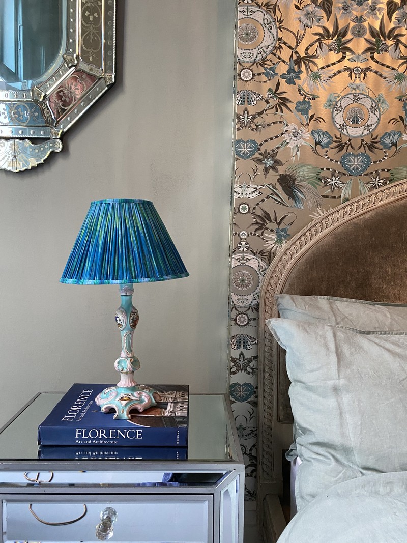
I’m an avid collector of candlesticks, too. I’ve got about 70! I dot them around the house so it’s a bit of a fire hazard, but I do like to have clusters of them in the kitchen or the bathroom. I like that 6pm ritual of lighting them, especially now we’re all at home.
I’ve just launched a new furniture collection. It’s a small, luxury, high-end range of about six pieces of furniture, ornately decorated with silk prints that have been embossed onto the front of the furniture, with brass finishes, in collaboration with Roome London. As for what’s comes after that, I’ve got an archive of about 20 years-worth of prints that which need to see the light of day. So I’m thinking about launching my own wall art – maybe in the spring.
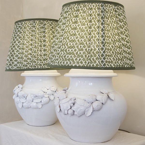
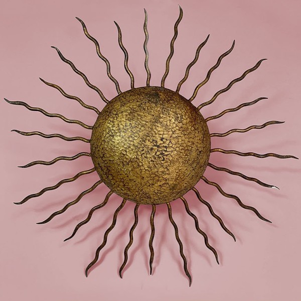
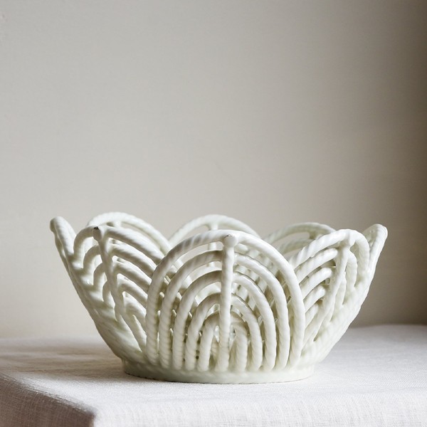
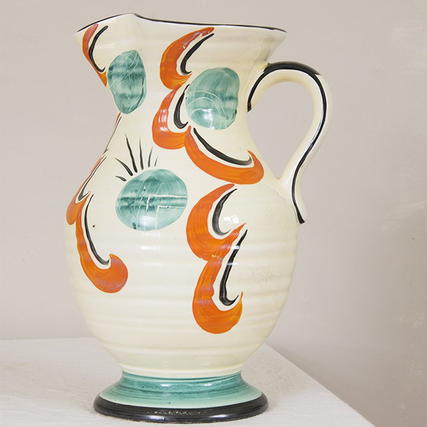
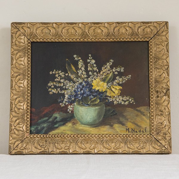
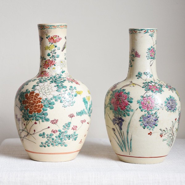
Shop a few of our favorite pieces below...
Visit MatthewWilliamson.com, where you can find Matthew’s edit of vintage and antique furniture and accessories, as well as his latest furniture collaboration.
DISCLAIMER: We endeavour to always credit the correct original source of every image we use. If you think a credit may be incorrect, please contact us at info@sheerluxe.com.
