A Family Townhouse Reinvented
The Property
Our clients – a professional couple with two young daughters – wanted to create an elegant family home that could be used for entertaining but was also child-friendly. The property is a beautiful Georgian building with three storeys. It was habitable when they bought it, but in desperate need of an overhaul: the décor was outdated, and the house had a slightly confused configuration which didn’t suit their lifestyle.
The open-plan kitchen was on the first floor, while a dining room and bedroom took up much of the space on the ground floor. We felt the first floor should be reconfigured to include a main bedroom, an en-suite bathroom and a large drawing room with beautiful triple-aspect windows. The ground-floor bedroom was then converted into the kitchen (with the former en-suite bathroom used as a powder room and a pantry/utility). Finally, the dining room was reconfigured as an informal family living room. The top floor was a little bit easier: the bedrooms stayed as they were, but we did carve out some additional en-suite bathrooms. With a few clever changes, a four-bedroom, three- bathroom house became a five-bedroom, five-bathroom home.
The guiding principle for the décor was elegance, but also ease. The clients specified a colour palette of soft pink and blue but they also wanted each room to have a distinct personality. To that end, we played around with the colour scheme and took it in slightly different directions depending on the use and the aspect of each room. To make sure it wasn't too ‘safe’ we also mixed in some darker, deeper shades to add a little bit of punctuation and contrast.
In the drawing room, for example – which our clients mainly use in the evening after the children are asleep – we used a dark shade for the wall colour and cabinetry, which looks smart during the day but quite dramatic at night. In the family living room we used a creamy off-white on the walls and teamed it with quite a playful shade of blue/green on the woodwork. It’s sunny, bright and very much used as a daytime room. The colours needed to be light and fresh so we were able to incorporate the same palette of pinks and blues that runs throughout the house.


The Hallway
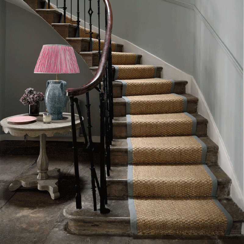
In the entrance hall we kept the original stone flag floors, restoring them to make sure they retained some of their aged patina. We introduced some pattern with a beautiful pale blue wallpaper from Lewis & Wood called Jasper Peony. It set the tone for the entire property. The paint on the walls was chosen to match the wallpaper. We used three shades of white on the woodwork, cabinetry and dado rail to create subtle demarcations between the different architectural elements of the room. We also designed new cabinetry to accommodate cabling and fuse boxes, as well as coats and boots, with a bench seat in between. Wall lights were mounted on the sides of the cabinetry to add ambient light, enhanced by the table lamps which sit on the console table.
We chose a very pretty limewashed oak table from William Yeoward to sit at the bottom of the stairs – the perfect spot for a large table lamp we sourced from Penny Morrison; the bright pink draws the eye in from the entrance hall through to the back of the house. A sisal runner with a smart cotton herringbone trim runs up the stairs to the landing on the first floor, where the same sisal carpet is fitted throughout the drawing room. Brass wall lights from Vaughan are topped off with Fermoie candle shades to add a further splash of colour.
The Living Room
The light-filled living room features a large L-shaped sofa and armchair placed around a fireplace, which is fitted with a club fender seat. We layered lots of cushions in different patterns to create an informal feel – they’re from OKA, Blithfield and Fermoie, and there are a few bespoke ones from Jessica Buckley Interiors too. The sofa sits on a patterned rug by Weaver Green, chosen for its practicality as well as its look: it is made from recycled plastic bottles, so it is incredibly hardwearing and stain proof – perfect for a room used by two young children. The new oak plank floor was supplied and installed by Strathearn Stone & Timber. The ottoman is upholstered in a patterned fabric from Tori Murphy and an armchair is upholstered in another patterned fabric from GP & J Baker. It’s very much a signature look to have lots of different layers – it isn't too overwhelming if the walls and backdrops are neutral.
We designed built-in bookcases either side of the fireplace, with plenty of storage underneath. Due to the proximity of the bookcases to the door (which leads to the new kitchen), the cabinetry was designed to have a trapezoid rather than rectangular footprint. The bookcases, dado and skirting are all painted in Farrow & Ball’s Green Blue. A striking Vaughan Colombier chandelier is reflected in the Flora mirror from Balineum.

The Kitchen
The kitchen was once a bedroom to the rear of the house, and we transformed the en-suite bathroom into a pantry and laundry room. The kitchen came from Neptune with pendant lights from Original BTC above the island. We designed a window seat and the Roman blind is in Gable End by Rapture & Wright, with a smart contrast binding in a navy blue linen from The Cloth Shop in Notting Hill. The laundry room cabinetry is painted dark blue to complement the floor tiles which we sourced from Topps Tiles.
/https%3A%2F%2Fsheerluxe.com%2Fsites%2Fsheerluxe%2Ffiles%2Farticles%2F2021%2F11%2Fjessica-buckley-kitchen-cloakroom_0.png)
The Downstairs Loo
The cloakroom features one of my favourite wallpapers: Seaweed Lace from Soane. A small space allows you to pick a wallpaper at the higher end of the price scale and embrace a bolder pattern than you might do, say, in a bedroom. We love it – it manages to be both elegant and full of character. We teamed it with navy blue woodwork and a brass mirror and wall lights from Vaughan – we purposefully mismatched metal finishes to make it look less curated. The sanitaryware is from Burlington.
The Guest Bedrooms
The guest bedrooms were spaces where we felt a bit freer to add in bold colour and pattern. In one, we used Dahlias by Sarah Vanrenen on a headboard, blue zigzag patterned curtains from GP & J Baker and a selection of pattered cushions and lampshades. Nothing is too perfectly matched, so it has an evolved feel to it. Large Simon lamps from KD Loves were used as bedside lights, accompanied by patterned shades from Vaughan. The bed coverlet is from Birdie Fortescue. The other guest bedroom also has a patterned headboard, upholstered in Oxus from Lewis & Wood. We teamed it with patterned curtains in a naive block-print pattern (again from GP & J Baker) and added some cushions from OKA.

The Family Bathroom
This is painted in one of our favourite colours: Pale Powder by Farrow & Ball. I think it works perfectly in almost any room, and looks good here teamed with tiles from Claybrook and wall lights from Pooky. We chose a tilting mirror so it can be adjusted to suit the height of the children.
The Master Bedroom
The main bedroom was decorated in soft whites, watermelon pinks and slate blues to create a calm and restful atmosphere. Everything is fairly simple and not too over the top: the beautiful headboard is Pineapple Silhouette from Soane; there’s a smart pale-blue woven fabric from Guy Goodfellow on the window seat; and a watermelon pink linen from Claremont on the end of bed stool. Large table lamps from Vaughan sit on the Gustavian-style chests of drawers placed either side of the bed with discreet wall mounted reading lights positioned within easy reach. Opposite the window is a dressing table and large mirror with two further table lamps for lots of soft, ambient light.
The en-suite bathroom is simple and elegant, with a double basin vanity placed against a dividing wall. The freestanding oval bathtub is in the window, with privacy afforded by the house’s unique position and elevation.


The Drawing Room
This is on the first floor. As it’s designed to be used predominantly in the evening, the colour scheme was darker than other rooms in the house – the bold wall colour looks incredible in soft light at night. As ever, the key is to mix the scale of the patterns and use a harmonious colour scheme to bring everything together – this is why a lot of the patterns and fabrics are repeated.
We also married traditional shapes and styles (for example, on the sofas and armchairs) with more contemporary ones (the ceiling light and coffee table) and added a Berber-inspired rug from Luke Irwin. We try to avoid having furniture from just one era and love to embrace contrasting styles.
We designed a large bookcase and desk after our clients requested a space to occasionally work from home – it’s had far more use over the past 18 months than anyone expected! We painted the bookcases the same colour as the walls, so they didn’t dominate the room.

Visit JessicaBuckley.co.uk
Photography by ZacAndZac.co.uk
DISCLAIMER: We endeavour to always credit the correct original source of every image we use. If you think a credit may be incorrect, please contact us at info@sheerluxe.com.
/https%3A%2F%2Fsheerluxe.com%2Fsites%2Fsheerluxe%2Ffiles%2Fwebsite-images%2F2025%2F03%2Fsign-up-pop-up.jpg)
