
An Expert Guide To Designing Spaces For The Senses
Our approach to design is inherently inclusive – we design for everyone. This means we consider the needs of neurodiverse individuals, including those with autism, ADHD and sensory processing differences. Importantly, we’ve found that this sensitivity to the human experience benefits all users, not just those who identify as neurodivergent. Our design philosophy is deeply rooted in the senses. We engage all five – sight, touch, sound, smell, and taste – to inform more thoughtful and intelligent decisions around interiors. This includes careful choices in materials, colour palettes, textures, fragrances and curated soundscapes.
We start every project by asking what we want people to feel. From this emotional foundation, we analyse each of the senses and apply evidence-based principles, such as colour psychology and the neuroscience of touch, to guide our material and spatial decisions. Our aim is to align every element of the space with the desired emotional outcome, whether that’s calm, focus, joy or comfort. A key part of our approach is avoiding sensory overload. Instead, we focus on subtlety, sophistication and sensitivity. Each environment is carefully curated to gently support emotional and sensory wellbeing – especially for those who are more attuned to their surroundings.
To minimise sensory overload, take a considered approach to every element in the space. From materials and colours to fragrances, textures and soundtracks, each choice should be made with intention and backed by science. For colour, we focus on hues that are known to have positive neurological effects, always introduced in a subtle, nature-inspired way to avoid overstimulation. Texture is used to influence behaviour – softer, warmer finishes in lounge areas create comfort and encourage people to dwell, while harder, cooler materials in high-traffic zones promote movement. Fragrance and sound are treated with equal care: both are chosen to sit quietly in the background, never dominating, but gently enhancing the overall atmosphere. Our goal is always to create spaces that feel intuitive, calm and human-centric – where every element works together to positively shape how people feel, think and behave. By applying a combination of neuroscience, design expertise and natural inspiration, we create environments that restore rather than exhaust, ensuring people leave feeling better than when they arrived.
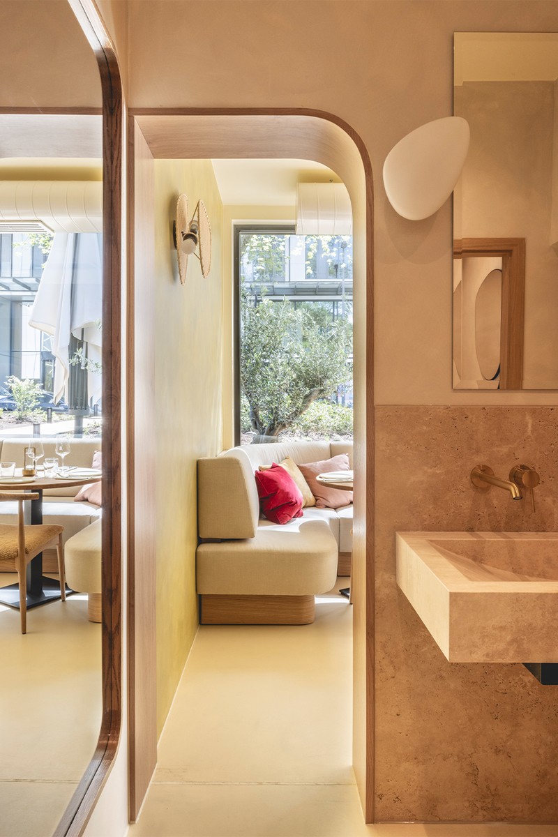
Lighting plays a vital role in shaping a space. For neurodivergent individuals, it can be a powerful tool for enhancing focus or encouraging relaxation. The key is to use lighting in a subtle, layered and flexible way, allowing for comfort, control and personal choice. Three core aspects of lighting should be considered: temperature, brightness and quantity. Cooler light temperatures can help stimulate alertness and focus, while warmer tones tend to promote calm and relaxation. Equally, overly bright or harsh lighting can lead to sensory overload.
A layered lighting scheme is especially supportive. This involves combining different sources – such as overhead lighting, spotlights, table lamps and floor lamps – to offer varying levels and types of light. The goal is to create an adaptable environment where individuals can adjust lighting to suit their specific cognitive or emotional needs at any moment. Directional track lights can be particularly effective when used creatively. Instead of casting direct, downward light, they can be angled to softly wash across walls or highlight objects, reducing glare and creating a gentler visual experience. This approach helps support concentration by subtly guiding attention to specific areas, while also avoiding visual overstimulation.
In contrast, soft, warm-toned table lamps add a calming, ambient layer to a space. With a glowy, diffused quality, they introduce warmth and intimacy – often essential for winding down. When used alongside directional or task lighting, they provide valuable choice, allowing individuals to tailor the lighting to their current emotional or sensory state. In summary, thoughtful lighting design – layered, adjustable and attuned to sensory needs – can be a powerful and empowering tool for neurodivergent individuals.
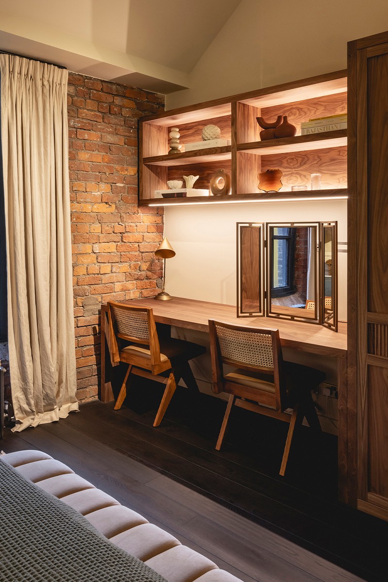
It matters how materials align with the intended function and emotional feel of the space. Rather than ruling certain things out, we focus on avoiding a misalignment between sensory experience and spatial purpose. For example, in areas designed for relaxation, cold, hard surfaces like expansive stone floors or marble tables can feel uninviting and make individuals want to move through the space rather than settle in. Extensive use of cold materials such as marble, stone or steel may feel harsh in spaces meant for rest. Instead, we recommend incorporating warm, soft textures to create comfort and ease. However, harder materials can still be used effectively in areas intended for energy and movement. Crucially, wherever skin comes into contact, such as seating, handles, or tabletops, materials should be soft, smoothed, and sensitive to touch. Rough or cold surfaces in these areas can lead to discomfort and a negative sensory experience.
/https%3A%2F%2Fsheerluxe.com%2Fsites%2Fsheerluxe%2Ffiles%2Farticles%2F2025%2F06%2Fsl-jolie-studio-fb.jpg)
For noise-sensitive individuals, sound dampening is best achieved through soft furnishings and smart wall treatments. Don’t underestimate the power of sheers and curtains – not only do they reduce sound transmission, but they also introduce visual softness and a sense of comfort. When used extensively, even across full walls, they can significantly enhance both acoustics and atmosphere. To further support sound absorption, prioritise tactile materials throughout the space. Soft elements such as rugs, cushions and upholstered furniture help absorb ambient noise, while natural materials like timber and leather can provide a balanced blend of warmth and acoustic performance. It's best to avoid overly hard or reflective surfaces, as these tend to bounce sound and increase echo. It’s also essential not to overcorrect. A completely ‘dead’ space, with no reverberation, can feel unnatural and even heighten anxiety.
For those who struggle with focus or task initiation, the right environment can reduce cognitive friction. Warm, grounding tones such as navy blue or rich burgundy can help focus the mind, while acoustically balanced spaces minimise distractions and support mental clarity. Practical elements, like appropriate lighting, easily accessible plug points and clearly defined resource zones, are essential, but so too is the overall atmosphere they help create. When people feel overwhelmed, anxious, or disconnected, carefully chosen sensory elements can support mood regulation and restore balance.
Grounding scents such as juniper berry or Ravensara can promote a sense of calm and mental clarity. These details ensure that a space supports not just productivity, but also emotional wellbeing. Designing with intention allows us to embed operational support directly into the environment. By integrating sensory awareness, emotional comfort and functional design, we create spaces that encourage engagement, support daily routines and ultimately help people thrive.
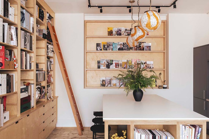
To reduce visual clutter without creating a space that feels sterile, choose warm, characterful storage solutions that combine practicality with a homely aesthetic. Vintage sideboards in rich wood tones or well-crafted contemporary units can enhance the space rather than dominate it, striking a balance between form and function. Curtains also offer a flexible and visually softer alternative for zoning off storage areas, whether in residential or office settings. Used in pantries, behind desks or around open shelving, they provide easy access while softening the visual lines of a room, offering a less permanent and more adaptable solution than solid doors or partitions. Soft storage baskets are another effective option, particularly on open shelving. Positioned at lower levels, they can discreetly house books, paperwork, or daily essentials, allowing decorative items and favourite objects to be displayed at eye level.
Texture is another next layer of consideration. We like to incorporate soft, warm materials that feel comforting and secure. Weighted blankets and enveloping upholstery – particularly around the shoulders and upper body – can help lower heart rate and support both physical and emotional relaxation. Spatial layout is equally important. We design quiet, contained retreat areas that offer a sense of safety and control, ideal for anyone in need of moments of calm, including those on the neurodiverse spectrum.
It's essential to do a quarterly clear-out across all areas of your life – whether that’s your wardrobe, kitchen, living space or office. It’s helpful to keep frequently used or seasonally relevant items visible and easily accessible – such as on open shelving, kitchen islands or the tops of credenzas. In a wardrobe, this might mean maintaining a curated, neatly arranged capsule collection to minimise visual clutter and reduce anxiety. Additionally, having a layer of semi-closed storage nearby is valuable for items you might need once or twice a month. Even within closed storage, organisation remains crucial – using baskets or dividers to compartmentalise and maintain order helps keep things manageable. Finally, for items not needed during the current season or quarter, completely closed, higher-level storage works best – simply tuck them away, knowing you’ll revisit them during your next quarterly refresh.
We’ve conducted extensive research to understand where every colour falls on the spectrum – from soft pastels to deep tone, and from high to low pigmentation. Each shade within the colour wheel has its own emotional impact. For instance, reds evoke competitive spirit, fierceness, energy and enthusiasm. Periwinkles and purples convey prestige and quiet confidence, while oranges are among our most creative colours. For calmer, nature-inspired environments, greens and blues are ideal, especially in lighter, buttery pastel tones that promote calm while still adding colour to a space.
To avoid overstimulation, it’s crucial to use colour thoughtfully and sparingly; applying bold colours across large surfaces can sometimes cause anxiety instead of comfort. There is a current trend called colour drenching, which should be used with caution – without fully understanding a colour’s psychological impact, drenching an entire space can negatively affect your mood. If you choose to embrace colour drenching, select a colour that works well on a large scale by looking at its softer appearances in nature and opting for less intensely pigmented tones. This approach allows you to enjoy vibrant colour without risking overstimulation or overwhelm.
Choose patterns and artwork that are visually supportive rather than distracting. It’s great to allow patterns and artwork to have their moment – for example, if you introduce a beautiful oil painting or a boldly patterned upholstered chair, keep the surrounding environment relatively calm to focus the mind. Galleries are a great example of how the human brain responds to art: the spaces tend to be very neutral, so the pieces can shine. If there’s too much visual activity in a space, high-value art can get lost and the mind can become overwhelmed. There’s no right or wrong, but it’s fundamental to consider how patterns interact with everything else around them.
When considering longevity and future-proofing a space, taking a sensory-led approach ensures it transcends trends and inherently carries lasting value. By selecting colours for their neurological benefits rather than following the colour of the year or passing fads, the design remains relevant and effective both now and ten years from now. Even if the needs of the space evolve over time, the colours chosen will continue to have a profound impact on the user without feeling dated or out of place. Of course, if the function of the space changes significantly, it may be necessary to adapt the atmosphere accordingly to better suit its new purpose.
Visit JOLIESTUDIO.CO.UK
Or continue to comment as a Guest below
DISCLAIMER: We endeavour to always credit the correct original source of every image we use. If you think a credit may be incorrect, please contact us at info@sheerluxe.com.
/https%3A%2F%2Fsheerluxe.com%2Fsites%2Fsheerluxe%2Ffiles%2Fwebsite-images%2F2025%2F03%2Fsign-up-pop-up.jpg)
