The Decorating Trend That Could Transform Your Home
What do you think is driving the rise of colour capping right now?
“Following on from the popularity of colour drenching through the early 2020s, the colour capping technique embraces colour families, incorporating the walls and ceiling in a tonal wash that deepens the further up it goes. At its heart, this trend is driven by a growing desire for personal expression in the home. It’s a natural evolution for those who may not feel fully colour confident but still want depth and design interest in their home.” – Helen Shaw, director of marketing (international) at Benjamin Moore
“People want to create rooms that feel intentional and considered – one of the first steps to creating this is moving away from stark white ceilings or ’the fifth wall’, a trend we have been talking about for some time. While the technique of using multiple tones is a classic approach, the term colour capping offers an alternative to the colour drenching technique. The main difference is that a singular colour is used to drench a space across walls, ceilings and woodwork whereas capping applies different, complementary tones from the same colour family to create a soft, gradient effect.” – Laura Jolly-Yan, colour expert for V&CO
“It’s also the result of growing confidence with colour. People are no longer just decorating rooms, they’re designing experiences, and colour capping is a brilliant way to make a space feel cocooning. After years of neutral walls and white ceilings, it feels like a natural next step for those wanting something bolder but still beautifully considered.” – Marianne Shillingford, creative director & colour expert at Dulux
Which spaces are well-suited to it and which aren’t?
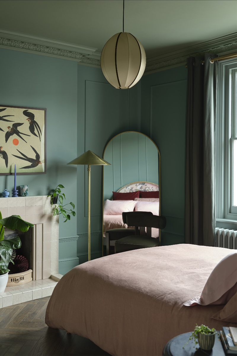
“Colour capping works well in rooms where comfort and intimacy is key, like living rooms and bedrooms. By carrying colour onto the ceiling in a slightly deeper tone, the room feels cosseting and inviting. It also unifies the design in these spaces, ensuring the ceiling feels like an intentional element rather than an afterthought. Avoid using this technique in low ceiling rooms where using a deep ceiling colour could feel overly enclosed – unless you’re specifically after a moody, intimate vibe.” – Helen
“Hallways, entry and stairwells would benefit from colour capping as it turns often forgotten spaces into bigger design moments. Living and dining areas, especially those enhanced with period features, naturally take on the look very well as you get an instant injection of cosiness. We would tend to avoid more modern, open plan spaces, creating definition here can be a little be more challenging.” – Laura
“It works wonderfully in spaces where you want atmosphere rather than airiness – bedrooms, dining rooms, snug living rooms and hallways are perfect candidates. I’d be more cautious in rooms that rely heavily on light and clarity, like very small bathrooms or kitchens with limited daylight.” – Marianne
How does colour capping affect the perceived proportions within a room?
“By extending the wall colour onto the ceiling in a slightly darker shade than the walls, it draws the eye upward and can celebrate a room’s height. This creates a seamless, enveloping effect that gives flat surfaces a sense of dimension, though in rooms with low ceilings, a deep colour may feel more intimate than spacious, so it really depends on the feeling you want to evoke.” – Helen
“Going darker on the ceiling tends to bring the ceiling down but this is not necessarily a bad thing, as it can create more intimacy and depth. Carefully thought through tonal gradients create the best combinations to complement the rooms proportions.” – Laura
“Used thoughtfully, it can make a room feel more grounded and elegant, rather than boxy. The key is proportion: bringing the colour slightly down the wall can create a more balanced, architectural feel.” – Marianne
Are there particular shades or colour families that work especially well for colour capping?
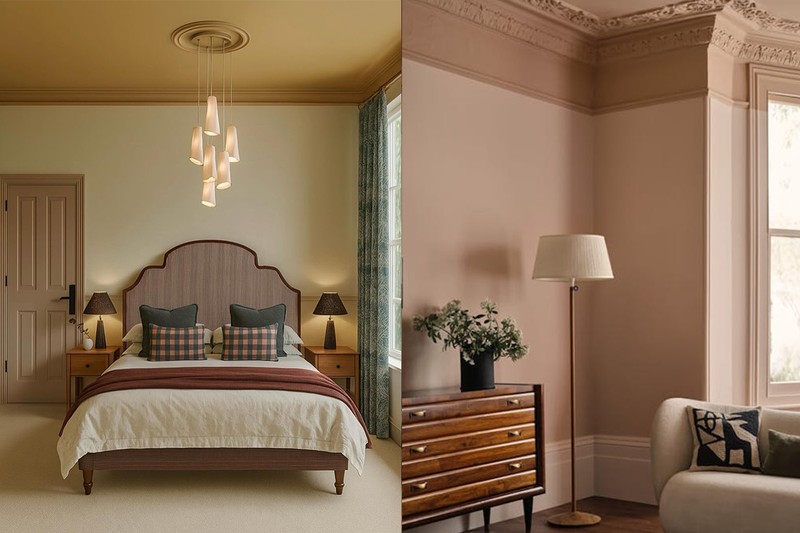
“As colour capping works with tones from the same colour family, the risk of clashing is low, so whether you’re a minimalist or after a bolder look, this technique can work for you. Even in a palette of neutrals, colour capping can elevate a space. An off-white wall colour like a creamy beige capped with a slightly more saturated pinky-orange neutral, gently draws attention to the ceiling. Keep the rest of the scheme simple so as not to distract from the main focal point.
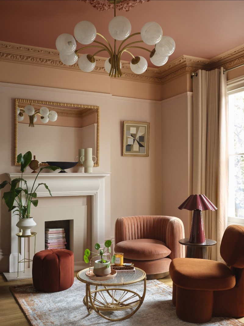
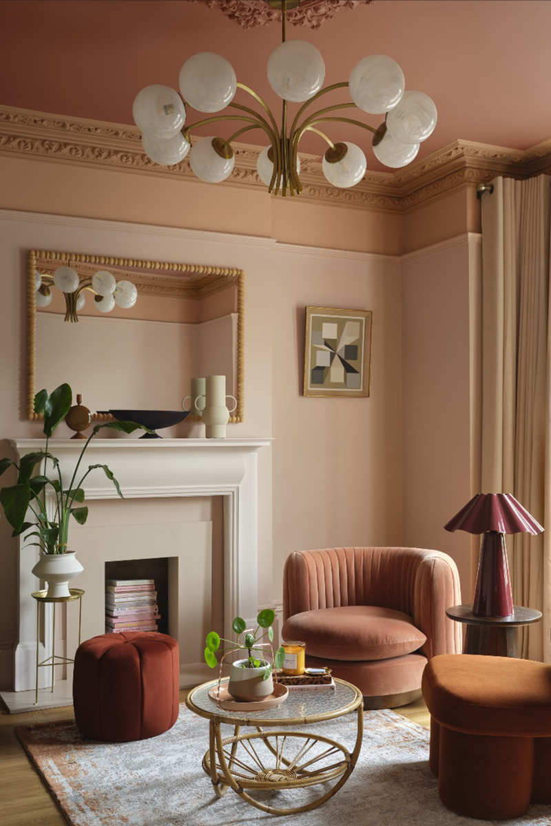
“If you're after a richer look, it also works with knocked-back jewel tones or a palette of warming earth tones, from buff through to rust. A soft hue for walls, moving into a mid-tone for cornicing and just below, topped by a warm terracotta ceiling, creates an instantly pulled-together, cocooning feel. Following through via soft furnishings and window treatments creates a fully cohesive look.
“Avoid using clashing colours or strong contrasts that lack harmony. The transition between wall and ceiling shades should feel intentional and cohesive, not accidental or mismatched. Sticking with tones within the same colour family or hues that naturally complement each other on the colour wheel will ensure the look feels balanced and considered.” – Helen
“We gravitate towards earthy such a soft clays, mushrooms and taupes. Pairing colours that have a dusty undertone will also work well for the colour capping technique. We tend to avoid overly bright shades as they can add too much intensity. We would also advise against grey tones as it can really flatten the result and this is all about adding layers and depth.” – Laura Jolly-Yan
“Mid-tone colours are your best friend here – earthy greens, warm neutrals, inky blues and soft terracotta shades are especially good. I’d approach very bright or icy tones with caution, as they can feel overwhelming when wrapped around a space.” – Marianne
What role does light play in the overall result?
“The appearance of colours tends to shift throughout the day depending on the amount of both natural and artificial light sources. For colour capping, more natural light allows the complexity and undertones of hues to be fully appreciated. This means you can experiment with nuanced shades without the space feeling overwhelming or saturated. In rooms with limited natural light, using stronger tonal variations can instantly create a glamourous, cocooning sensation, something that works particularly well in small bathrooms or dining rooms. Extending a rich colour to the ceiling, such as plum or dark green, can make a particularly striking statement. Layering artificial lighting, from wall sconces to table and floor lamps, allows you to sculpt the mood, creating a warm, inviting ambiance – ideal for a candlelit dinner or intimate gathering.” – Helen
“In north-facing rooms, colours can read deeper and cooler, so go slightly warmer than you think. For south-facing, richer or slightly greyed-off tones will work well. Application tip – tester pots will be important to use here as colours will look slightly different on the walls compared to the ceiling.” – Laura Jolly-Yan
Can you mix finishes and how does that impact the final look?
“Mixing finishes is a fantastic way to enhance the overall effect of a room. Pairing a matte finish on the lower walls with a luminous semi-gloss higher up is ideal for highlighting woodwork and adding dimension. In older properties, this technique can accentuate architectural details such as cornices and picture rails, bringing depth and character to the space.” – Helen
“Mixing finishes can be really effective. Using a matt on the walls and a soft sheen on the ceiling can subtly lift the space without breaking the colour story. It adds depth and sophistication, especially in rooms where you want a refined, layered look.” – Marianne
What are the most common mistakes people make when attempting colour capping?
“A common mistake it not assessing the space itself. Colour capping may not be the best choice in spaces with overly complex ceiling structures or when there’s already a lot of visual noise from architectural features, patterns or textures. In such cases, the added layers might feel too busy.” – Helen
“A common mistake is not creating enough of a colour contrast, that the differentiation becomes undetectable. A level of boldness is required to be able to achieve a clear colour break. Also, forgetting about woodwork – trims, architraves and doors need to be factored into the room plan from the beginning, not an afterthought. Also, only painting the ceiling, not dropping slightly down the wall when needed – the slight drop really helps to balance proportions and create a more cohesive look.” – Laura Jolly-Yan
“The biggest mistake is not testing the colour properly. Light changes everything, especially
when colour wraps around a room. Another is forgetting about the rest of the room, furnishings, flooring and lighting all need to work with the colour choice.” – Marianne
Do you see colour capping as a lasting design approach or more of a trend?
“Its versatility is what gives it its staying power. Bolder, high-contrast applications may feel trend-driven initially but the technique can easily be applied in softer hues or layered neutrals, providing a timeless way to frame architectural features in period homes and add depth to more modern spaces. We do see it evolving as many trends do. The concept will remain rooted in its origins but may perhaps evolve into more subtle, considered expressions, such as opting for two-tone rather than three-tone schemes, making it adaptable to changing tastes.” – Helen
“It’s less about a look and more about a feeling and that never really goes out of style. Once people start to integrate intentional colour into their homes, they never go back to plain white walls.” – Laura Jolly-Yan
“It’s more of a mindset shift. We’ll probably see it evolve into softer, more nuanced applications but the idea of using colour to fully shape a space is here to stay. Once people experience how transformative it can be, it’s hard to go back.” – Marianne
Or continue to comment as a Guest below
DISCLAIMER: We endeavour to always credit the correct original source of every image we use. If you think a credit may be incorrect, please contact us at info@sheerluxe.com.
/https%3A%2F%2Fsheerluxe.com%2Fsites%2Fsheerluxe%2Ffiles%2Fwebsite-images%2F2025%2F03%2Fsign-up-pop-up.jpg)
