

The Wallpapers Interior Designers Love
Alice Leigh
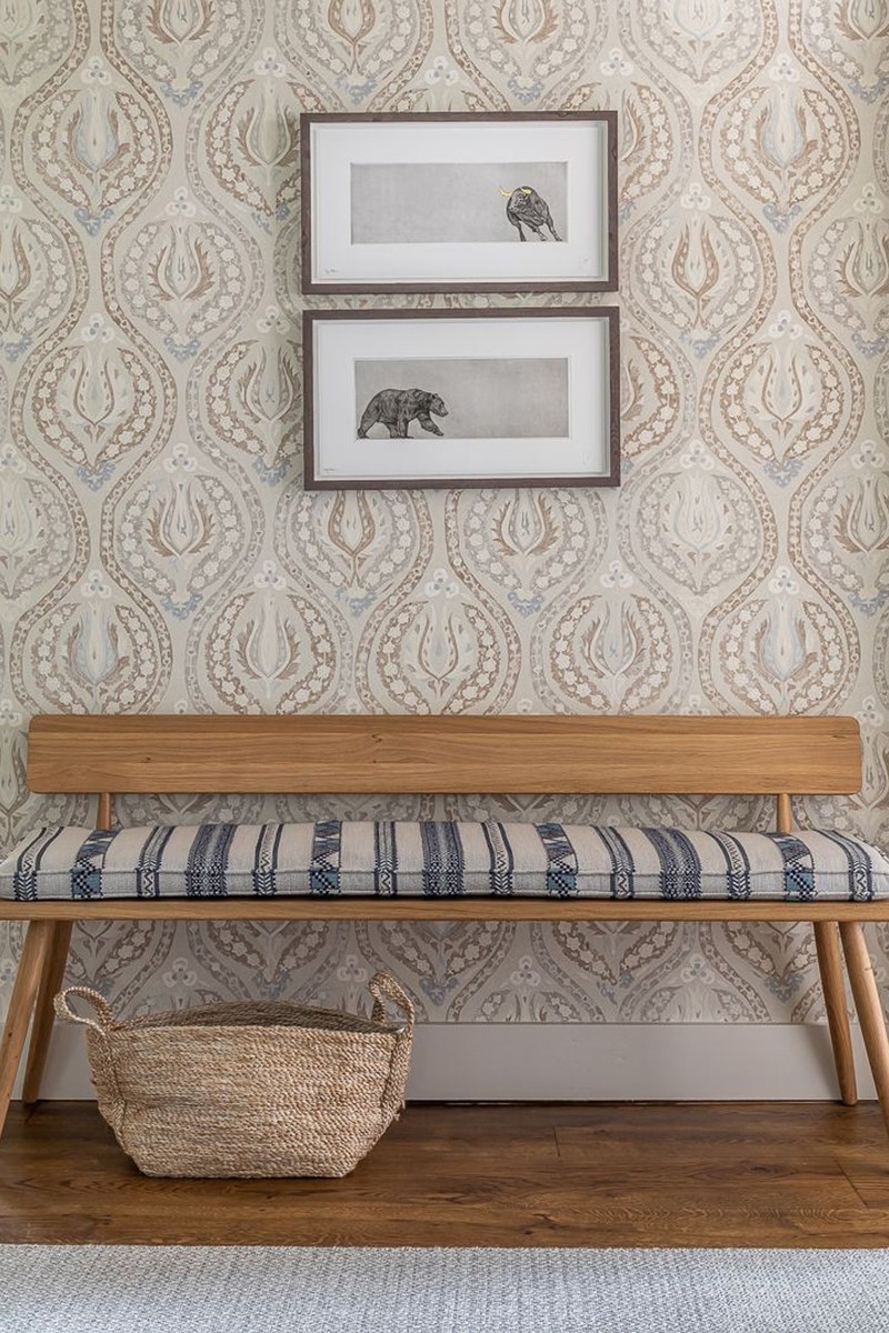
Lewis and Wood Benaki in Blue Mink
I love this wallpaper by Lewis & Wood. The gentle undulating pattern and soft colours make it really adaptable. It's restful enough to use in a bedroom and yet also works really well in a hallway. The palette has plenty of warm colours to pick up on accents, either towards the lovely blue/grey or the neutrals for a more tonal effect.
Visit LewisAndWood.co.uk
Guy Goodfellow Fez Wallpaper in Sea Foam
This wallpaper is a really useful design, taken from traditional Moroccan embroidery. It feels like a stripe and therefore it's easy to pair with artwork and other patterns in a room, yet it has intricate details which adds interest without being overbearing. I love the ‘Sea Foam’ colourway we used here and I’m also looking forward to using ‘Cocoa' soon which we will team with some burgundy accents for a more masculine look.
Veere Grenney
Schumacher Belvedere in Straw
In this guest bedroom, we put a fresh take on the traditional decorating trick of using the same pattern on the walls and the bed. Our Belvedere Straw Yellow for Schumacher fills the north-facing space with sunshine whatever the season. We love it because it feels modern and elegant, with an updated trellis pattern that's handsome yet delicate.
Visit FSchumacher.co.uk
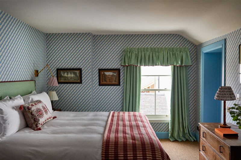
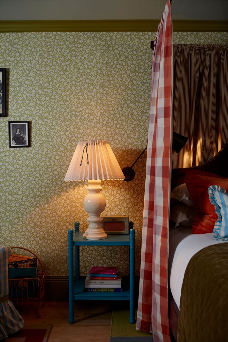
Veere Grenney Folly in Blue
We have surrounded this cosy bed with our Folly wallpaper in Peacock Blue that we designed with Schumacher. The all-over, coral-like pattern can stand alone or will layer beautifully with just about any style or motif. A charming and versatile pattern.
Visit VeereGrenney.com
/https%3A%2F%2Fsheerluxe.com%2Fsites%2Fsheerluxe%2Ffiles%2Farticles%2F2024%2F01%2Fnew-veere-wallpaper.jpg)
Ottalie Stride, Albion Nord
Veere Grenney, Temple Pink
We love to use Veere Grenney’s wallpapers in spaces such as this children’s bedroom. The small-scale design adds interest and colour without being overbearing, and the colour palettes of all his wallpapers are dusty and soft and therefore easy to use.
Visit VeereGrenney.com
Stereo Newport Linen
We used a linen wallpaper by Stereo for this bright master bedroom. The linen adds subtle texture to the space, enriching the walls.
Visit StereoInteriors.co.uk
Laura Stephens
Ussé Chinoiserie Fleur Wallpaper
A wallpaper we used in a recent project is one I’ve been longing to try for years – it’s a chinoiserie from Watts. We don’t think chinoiserie should be confined to bedrooms, so we used it in a beautiful kitchen diner space to really bring the outside in (this room overlooks a garden) and to conceal a hidden door leading to the utility room. This was a new extension (something we wanted to disguise) and this wallpaper gives the room so much character and charm.
Visit Watts1874.co.uk
Cathy Nordstrom Stig Stripe in Mint
I love this stripe, which comes in several colour ways, from Cathy Nordstrom. This would work well in most rooms but here we used it to add interest to this London hallway and its landings. The ceilings are quite low and the stripe really helps to elongate them and deceive the eye. We teamed it with a plain panel with eggshell paint under the dado for practicality – a necessity to deal with hallway traffic.
Visit CathyNordstrom.com
/https%3A%2F%2Fsheerluxe.com%2Fsites%2Fsheerluxe%2Ffiles%2Farticles%2F2024%2F01%2Fnew-laura-stephens-wallpaper.jpg)
Octavia Dickinson
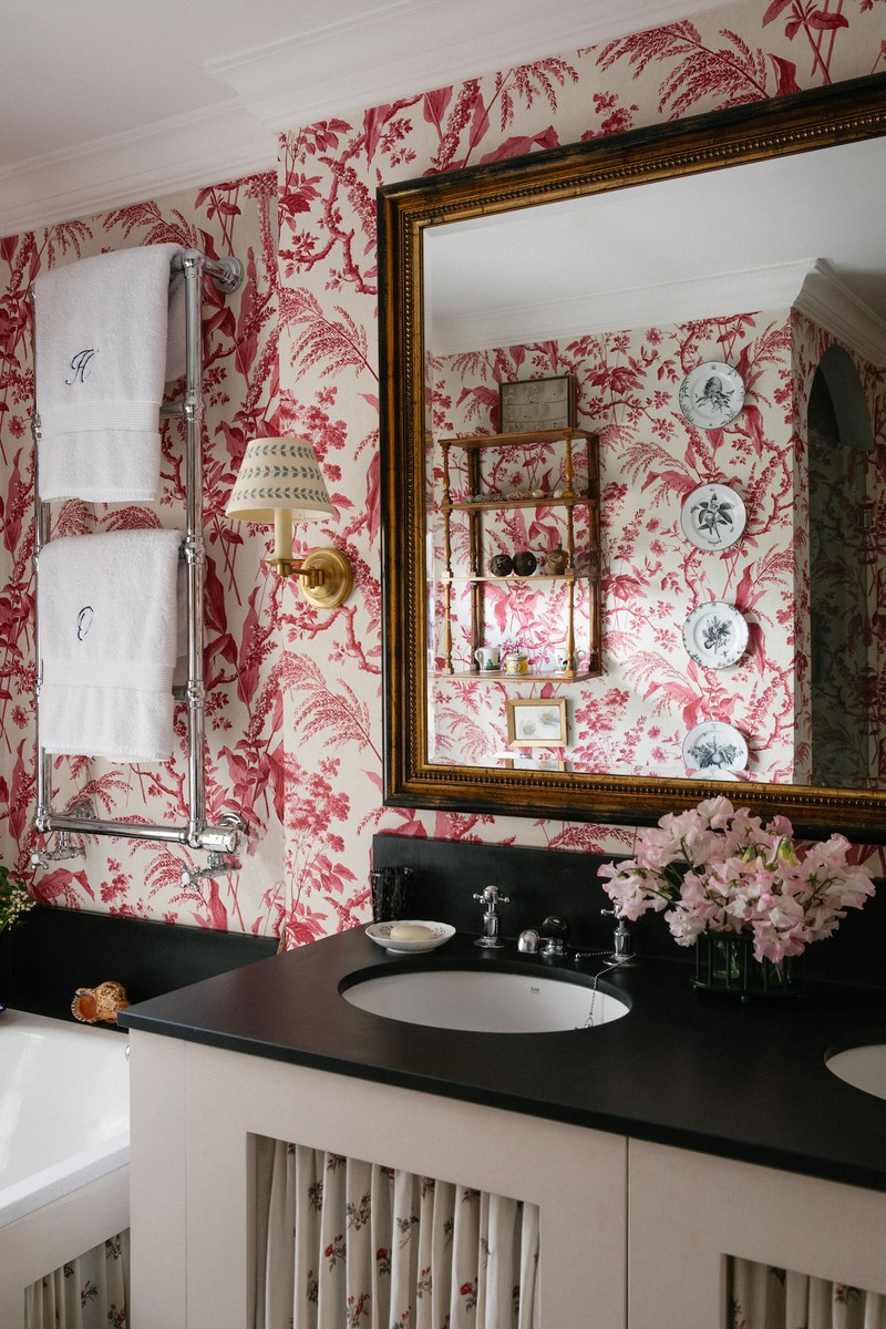
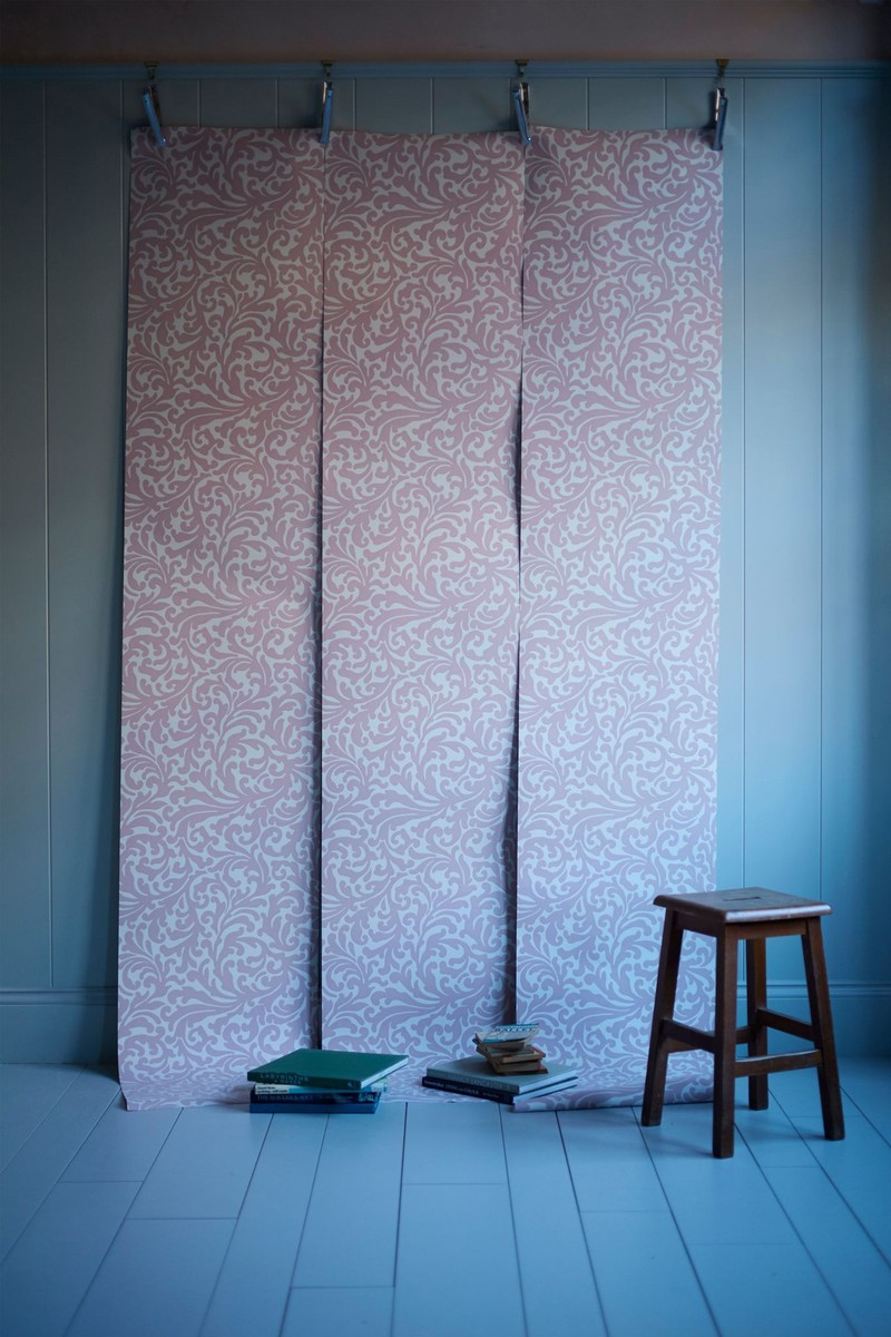
Sarah Vanrenen Aspa in Raspberry
This wallpaper has a nostalgic feel to it that I love. It is very delicate and feminine, but the colour is punchy and works beautifully in this bathroom alongside the slate bath top.
Visit SarahVanrenen.com
'Blue Ribbon' Folies Bergère
I love the vibrancy of this Howe wallpaper. It comes with a matching fabric, but I have used it here alongside Howe’s Mr Men clover which together gives a rather Fifties feel to the room. It is such a happy wallpaper.
Visit 36BourneStreet.com
Alice Palmer
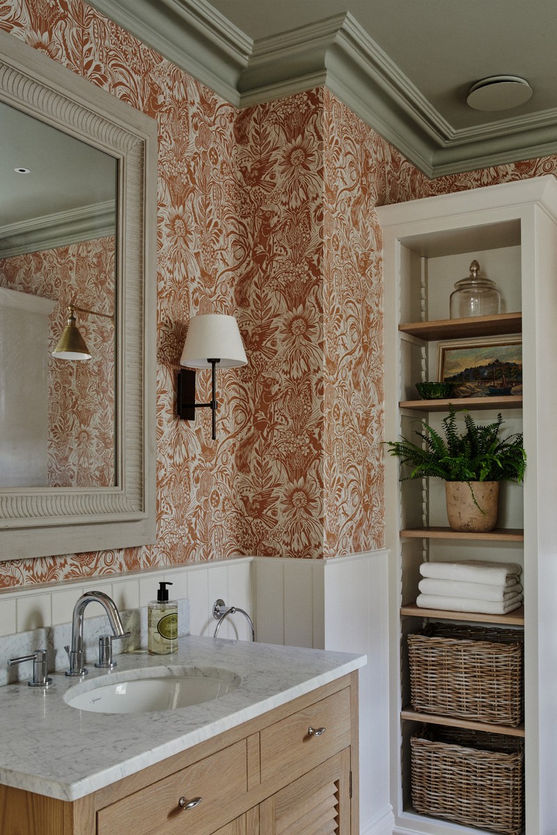
Okra Poppy in Poppy & Petrol
I love our Okra Poppy in Poppy & Petrol wallpaper. It is a busy pattern and does a wonderful job of making a space feel cosy without overpowering it. When applied to the ceiling as well as walls, it offers a lovely cocoon-like warmth and a number of our clients have used the pattern this way. I particularly like the design in bedrooms and bathrooms as well as in the hallway, where pairing it with Farrow & Ball’s Incarnadine and Slipper Satin works wonderfully. It is also great for punctuating overlooked areas – for instance, I have used it behind cupboards at the studio and it has made a huge difference to the feel of the space.
Visit AlicePalmer.co
Tangier in Red Stripe
This is one of our most popular designs. It is such a versatile way to add pattern and has a timelessness that means you really can’t go wrong. The smart red against a creamy background has a painterly texture that ensures it doesn’t feel flat. I love it in areas like the downstairs loo, laundry room or boot room. These spaces can feel rather bland or utilitarian and the Tangier Stripe can be so transformative.
Visit AlicePalmer.co
/https%3A%2F%2Fsheerluxe.com%2Fsites%2Fsheerluxe%2Ffiles%2Farticles%2F2024%2F01%2Fnew-alice-palmer-wallpaper-main.jpg)
Amy Dalrymple
Pierre Frey Sur Le Nil
We love the Pierre Frey Sur Le Nil wallpaper – it’s playful but elegant and, with its beautiful blue and rusty tones, it works in any space around the house. We used it in a client's powder room and loved it so much we have it in our son's nursery at home too.
Visit PierreFrey.com
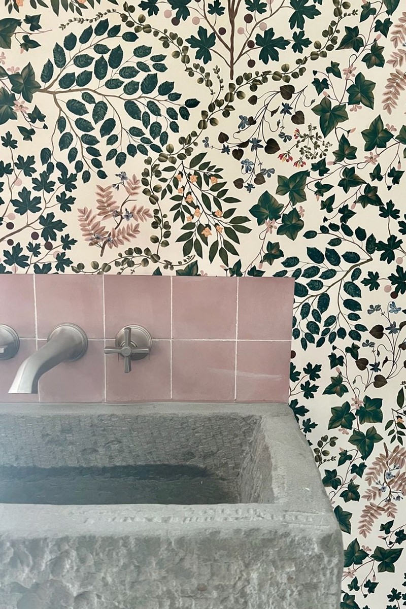
Living Quarters Sibylla
My second favourite wallpaper is Sibylla by Living Quarters. We have used it in a chalet project powder room, paired with pink splash back tiles to bring through the earthy tones. It’s got a whimsical charm without being too overpowering.
Visit Living-Quarters.co
Katharine Paravicini
Antoinette Poisson Baies
I adore all the wallpapers by Antoinette Poisson and, in this room, I have used one called Baies. The pretty small-scale wallpaper suited this attic spare bedroom, and we used it on the walls and ceilings giving character and charm to this tiny space.
Visit AntionettePoisson.com
Pierre Frey La Comedie Printemps
Pierre Frey has a great range of wallpapers and, in this main bedroom in London, we used La Comedie Printemps. This is a soft and restful bedroom, but the wallpaper adds interest and an extra level of prettiness.
Visit PierreFrey.com
/https%3A%2F%2Fsheerluxe.com%2Fsites%2Fsheerluxe%2Ffiles%2Farticles%2F2024%2F01%2Fnew-katharine-paravincini-wallpaper.jpg)
Emma Sims-Hildtich, Sims Hilditch
St. Judes Squirrel and Sunflower by Mark Hearld
The perfect cloakroom wallpaper from St. Judes. We love this beautiful colourway that adds an element of fun and warmth with the sophistication of a traditional linocut design.
Visit StJudesFabrics.co.uk
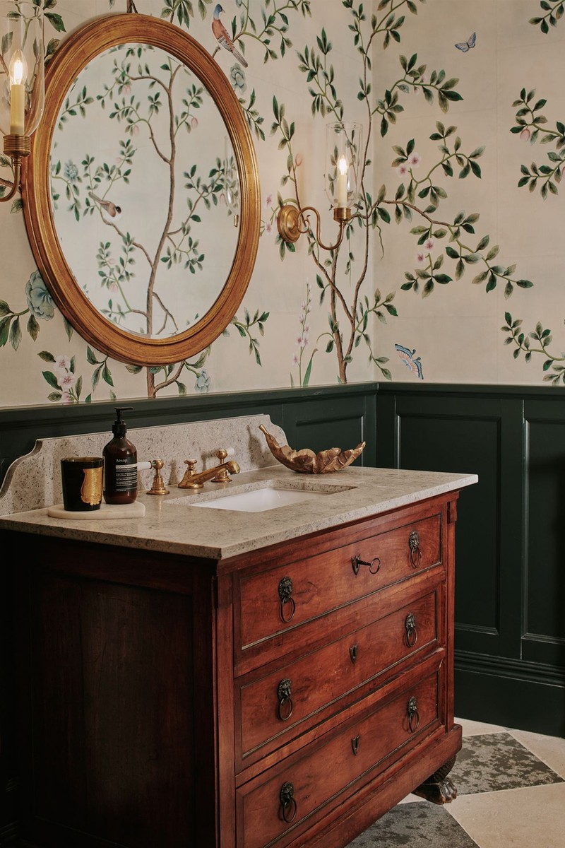
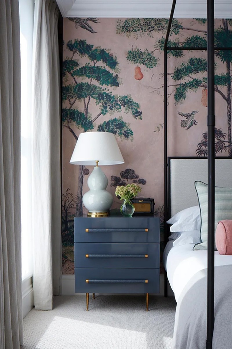
De Gournay Nordic Garden
We recently use this classic muted chinoiserie on a mottled Indian tea paper base to bring elegance to the powder room in a heritage property. Its sits elegantly against the traditional masculine wood finish.
Visit DeGournay.com
Anna Hewitson
Robert Kime Sunburst in Terracotta
I’m such a fan of Robert Kime’s Small Print wallpaper collection, particularly this design called Sunburst in the Terracotta colourway. It’s got a lovely warmth to it and isn’t overly busy for a small print, so it adapts well in large or small spaces. I love its timeless feel, it’s one that I’d never tire of!
Visit RobertKime.com
Stereo Paper Weave ‘Bali’ col. 2323
I love using a textured wall covering to add depth and subtle interest to a room. I particularly like Stereo’s range as they have such a lovely colour range. The one I used here has a gorgeous neutral tone which provides warmth and acts as an easy backdrop for artwork and furniture.
Visit StereoInteriors.co.uk
/https%3A%2F%2Fsheerluxe.com%2Fsites%2Fsheerluxe%2Ffiles%2Farticles%2F2024%2F01%2Fnew-anna-hewitson-wallpaper.jpg)
Emma Deterding, Kelling Designs and Kelling Home
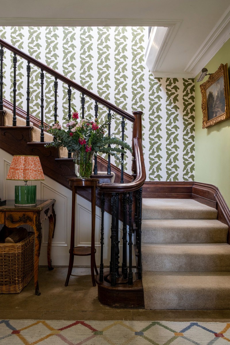
Kelling Home Oak Leaf in Peridot
We used our own Kelling Home collection Oak Leaf wallpaper in Peridot which is one of my favourites from the wallpaper collection. It's versatile and brings a nature-inspired feel to any space. The hallway featured an antique mahogany banister and this wallpaper not only looked fabulous but gave the whole hallway a modern twist. People often neglect the hallway and entrance to a home but, for me, these are spaces anyone coming into your home sees first, so it should be a true reflection of your personal style and set the tone for the rest of your home.
Visit KellingHome.com
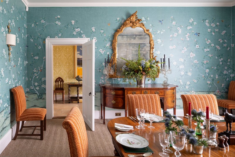
The Mural Source Picardy Emplastro in Adriatic
For this country home project, we wanted to make an impact in the dining room, and it was the perfect place to use a wall mural. The clients had inherited some beautiful antique furniture and already had dining chairs in a beautiful orange tone. We wanted to pick something that complemented the existing pieces, while still making a statement. The Picardy Emplastro mural from The Mural Source was the perfect fit – the Adriatic colourway with pops of orange complemented and tied in perfectly with the chairs. The result is a truly beautiful and elegant dining space with that extra wow factor!
Visit TheMuralSource.com
Anouska Cave, Cave Interiors
Antoinette Poisson Grand Pavots
The rich yet soft pigments and organic shapes in this Antoinette Poisson paper almost have a three-dimensional feel which were perfect for this tiny under-the-stairs cloakroom. We paired it with a very dark green used on the panelling and a chequered floor to create a jewel box effect.
Visit AntoinettePoisson.com
Morris & Co Mallow in Dusky Rose
Although not one of its most recognisable designs, this Morris & Co. wallpaper felt fitting for the master bedroom of this Arts & Crafts house, where the clients were after something calming and subtle. It has a lovely hand printed quality, and the colour is so gentle.
Visit Morris&Co.com
/https%3A%2F%2Fsheerluxe.com%2Fsites%2Fsheerluxe%2Ffiles%2Farticles%2F2024%2F01%2F2new-anouska-cave-wallpaper.jpg)
Nicola Harding
Nix By Nicola Harding Ginko Wallpaper in Moss Green
Wallpaper often presents challenges because it’s too busy to layer with other things – such as other patterns and colours in your choice of fabrics and painted elements or, simply, the shape of furniture or style of art. For some time, I have been looking for simple designs that work as an easy foil for the other elements I want to combine them with. This Ginko leaf pattern is simple and small in scale, making it easy to mix with just about anything. It works as a feminine contrast to the checks and stripes in this bedroom scheme I have done for the latest opening at the Beaverbrook Estate in Surrey. I wanted to create something that has the romance of the countryside without feeling too twee.
Visit NicolaHarding.com
Nix By Nicola Harding Filigree Wallpaper in Rose Pink
This design is uncomplicated but bolder because of its scale. I want to use it in a hallway, where a smaller scale would get lost, or it would also be fun to use it in a small room on both the walls and the ceiling. Using a large-scale design in a small space is a clever way of making something out of not very much. Because it isn’t specific, the pattern will layer well with art and antique pieces and won’t fight with them. It would also be forgiving on uneven walls.
Visit NicolaHarding.com
Henriette von Stockhausen, VSP Interiors
Robert Kime Gilly Flower in Terracotta
I love to use any of the Robert Kime small-scale wallpapers as they can transform any room without being overpowering, thus creating the comfort feeling of a gentle country house. They also work with almost any existing fabrics for a quick new year refresh.
Visit RobertKime.com
Hamilton Weston Richmond Trellis
I like the Richmond Trellis design by Hamilton Weston, particularly because it allows me to customise the colour, while seamlessly integrating it with the overall scheme in the adjacent room. It is actually the background to a floral design found in a late 17th-century house on Richmond Green in southwest London – the wallpaper fragment had been pasted onto a newspaper dated Tuesday 6th May 1840. Interestingly, this design was once commissioned by Buckingham Palace, too.
Visit HamiltonWeston.com
/https%3A%2F%2Fsheerluxe.com%2Fsites%2Fsheerluxe%2Ffiles%2Farticles%2F2024%2F01%2Fnew-henrietta-von-stockhausen-wallpaper.jpg)
Martin Waller, Andrew Martin
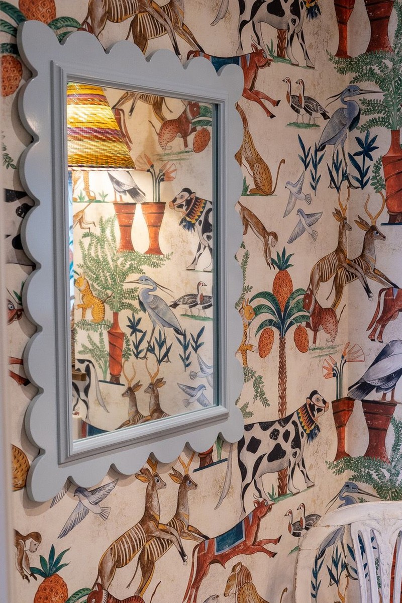
Kit Kemp x Andrew Martin Mythical Daybreak
Loved by interior designers and consumers alike, our collaboration with renowned artist Kit Kemp has been our bestselling wallpaper for several years and is now available in a number of new colourways. Daybreak is a mural-style design depicting American folk-art storytelling. This whimsical wallpaper is so intricate and detailed, it should be somewhere everyone who visits can see. We love this as a feature wall in the living room or dining room for it offers a distinctive and playful way to express your individual style.
Visit AndrewMartin.co.uk
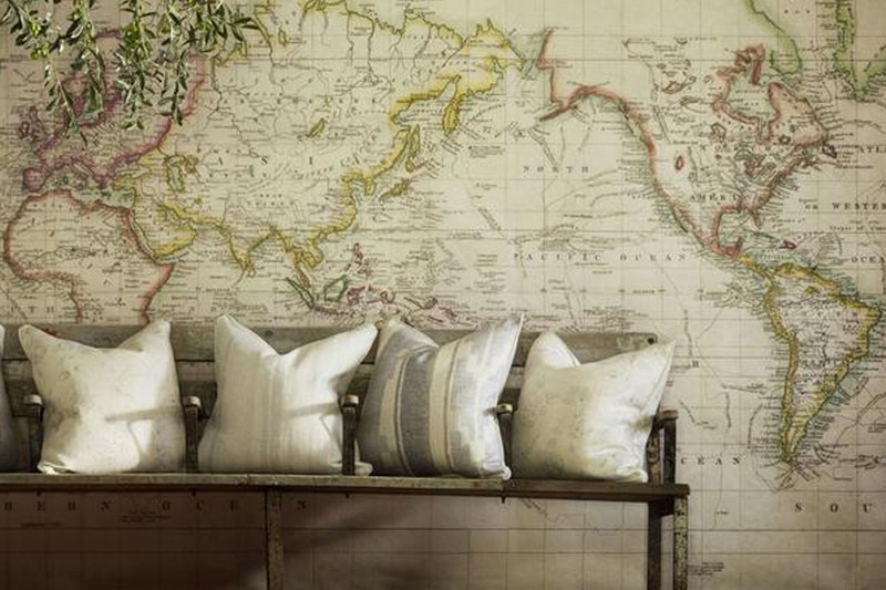
Andrew Martin Latitude Wallaper
People are inspired by travel and wish to have permanent reminders of where they’ve been or would like to go. A vintage map will bring inspiration for new and exciting travels to faraway places! The beige background is the perfect neutral to not overwhelm the centrepiece. This wallpaper is a classic style that will make a statement in any space.
Visit AndrewMartin.co.uk
DISCLAIMER: We endeavour to always credit the correct original source of every image we use. If you think a credit may be incorrect, please contact us at info@sheerluxe.com.
/https%3A%2F%2Fsheerluxe.com%2Fsites%2Fsheerluxe%2Ffiles%2Fwebsite-images%2F2025%2F03%2Fsign-up-pop-up.jpg)
