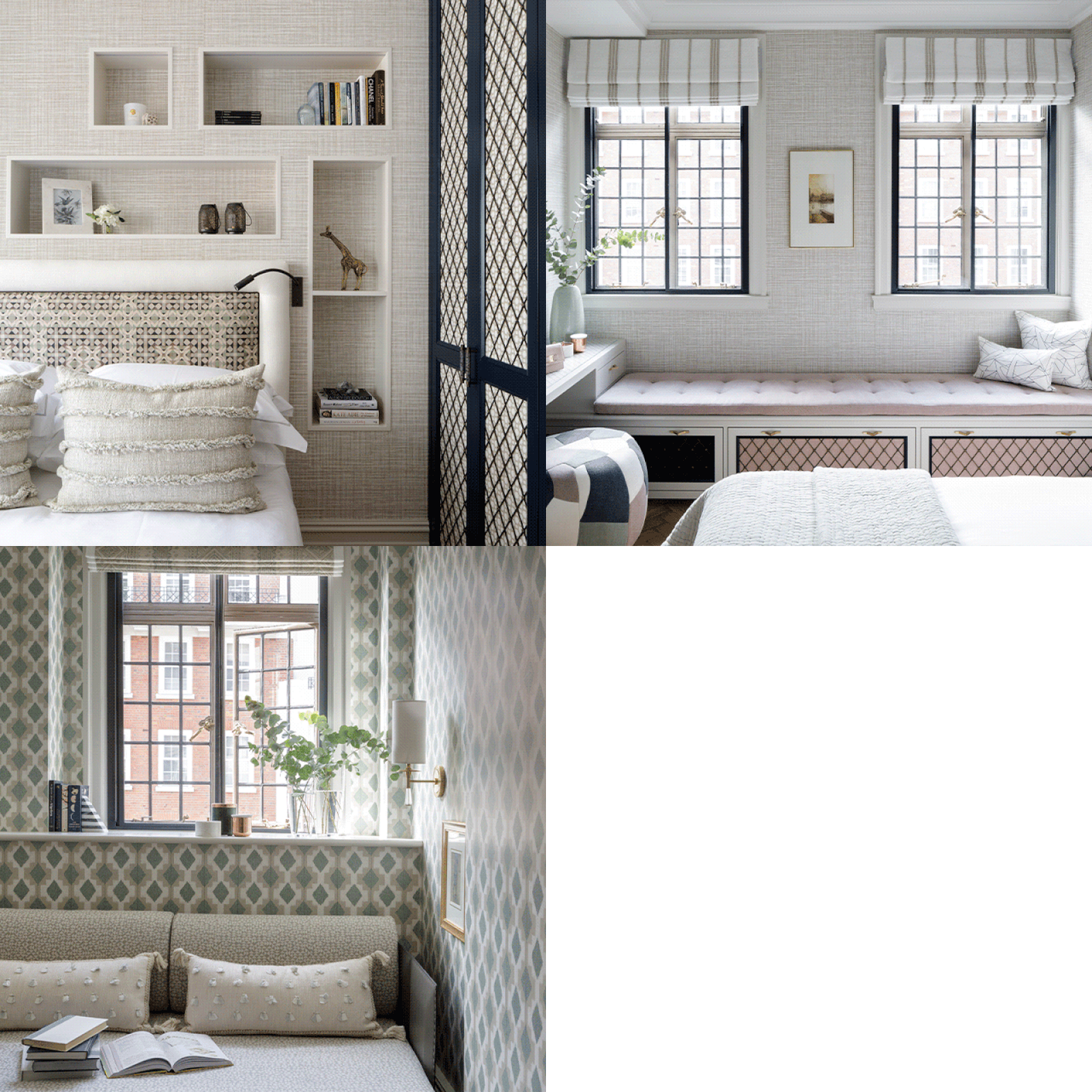
Interior Designer Irene Gunter Shares Her Favourite Projects

Style & Ethos
Our goal is always the same: for each design to honour the history, location and architecture of the property, but still with plenty of modernity, organic forms and materials. With an eye for a more playful and understated style, Gunter & Co makes luxury design feel personal, considered and full of energy.
Design & Inspiration
My favourite projects are the ones when I work hand-in-hand with our clients, not just for them. I get to know each one personally – how they live their life and what their values and priorities are – to create a space that works for them. Even when designs have been signed off by a client, I will continue to develop new ideas – I’m surrounded by expert suppliers and a great team who are always driving new ideas to the forefront.
Inspiration for each project comes from a range of sources: from historical, architectural details to contemporary building materials or even vintage furniture or contemporary sculptures. Our designs often revolve around organic forms and regular repetition – it’s the tension between the two which creates eye-catching, thought-provoking spaces. The best client relationships are those which mirror a real love for design and when clients are happy to be challenged and inspired by the creative relationship.
Colour & Materials
As far as colours and materials go, it’s easier to say what I don’t like than what I do. As a studio, we don’t work with a specific colour palette, as each project’s location and each client’s preferences drive us in a different direction. I suppose if I could draw a red line through our work, then natural materials (rich marbles, woods and metals) as well as natural colours are a common starting point.
To us, blues and greens are almost ‘neutrals’ and we love injecting a bit of warmth through terracotta, warm yellows and delicate blush tones, too. You won’t see me pull out a lime-green fabric or fuchsia pink paint swatch, but it’s often a struggle to create tone-on-tone interiors in grey or beige – for me, it’s almost impossible to leave my love of colour behind entirely.
Finishing Touches
Using a client’s existing artwork or treasured heirlooms is something we consider early on in any project, however when there’s nothing to work with, we’re more than happy to get stuck in. We rely on a wide network of artists, from up and coming students to fully established galleries we collaborate with closely. It’s so important for us to be able to be involved with the finishing touches, as they can make or break a project – designing bespoke cushions is one of my favourite things to do.
It gives me such pleasure to put these schemes together to really transform a room. Using plants is also a big focus and we often think the larger the better – we’ve inserted quite a few indoor trees and living green walls into various projects to lift the space and give it an instant sense of ‘home’.
Finally, a home full of brand-new pieces never feels quite right; incorporating antiques is a big part of what we do and whether we can use key pieces of antique furniture or finishes like reclaimed floor tiles, it always gives a home that instantly lived-in feel. Creating that feeling is so important – no-one likes to go over to a friend’s house and be worried about touching or damaging anything; even visiting Kempton Market for some finishing touches like picture frames and plant pots can make a real difference.
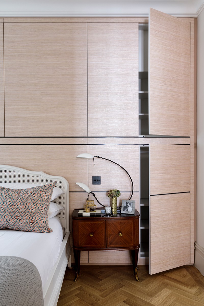
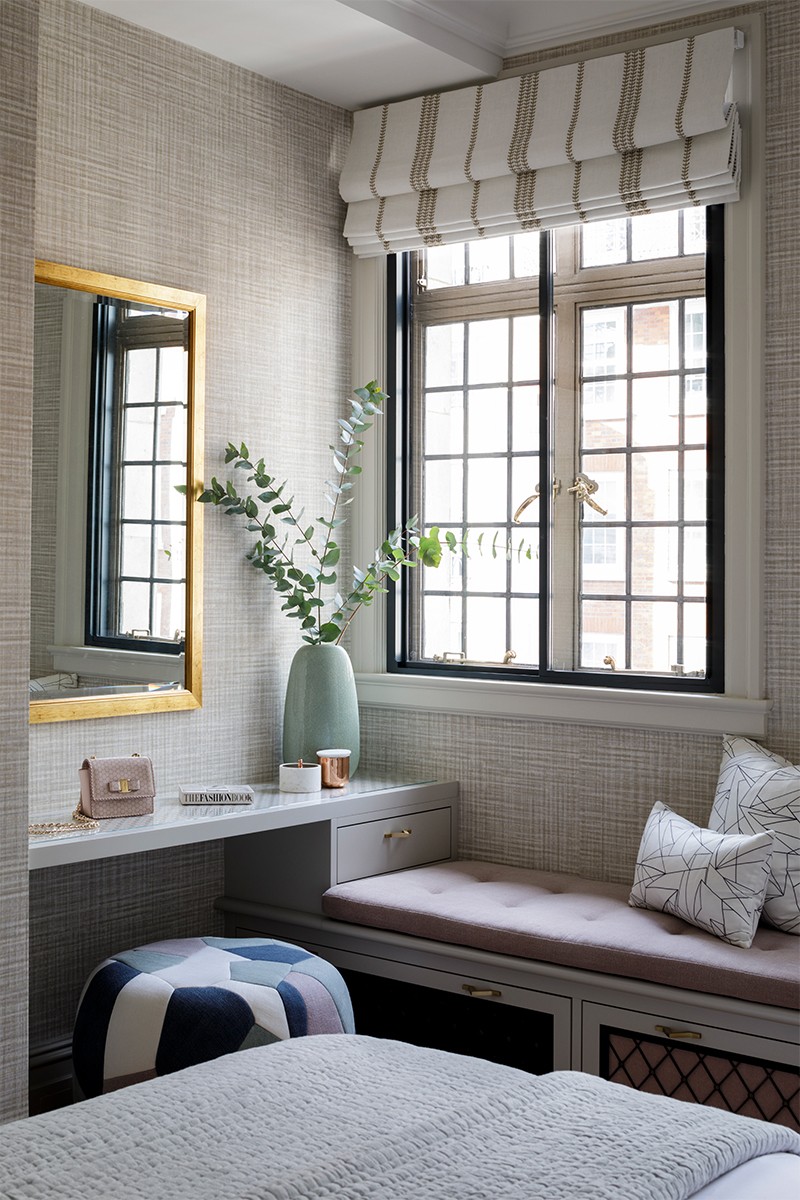
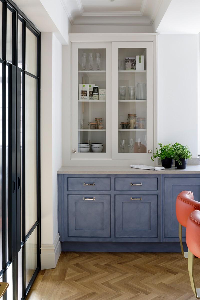
Who Inspires You
Even though our studio is known for its clean, linear style, I adore Steven Gambrel. His use of colour and pattern is a never-ending inspiration, and my love for a well-designed Hamptons home is never-ending. Another American designer I love is Thomas Pheasant. His architectural detailing is something to aspire to, and I love learning why other designers decide to keep their schemes clear of colour.
I love buying design books, too. Rather than looking at photographs online, learning about the philosophy behind a project and how it came to be is often far more stimulating. On the European side, I can’t resist anything Jean Louis Deniot puts together, and Joseph Dirand perfectly represents my own love of classical interiors with contrasting modern furnishings. I discovered both of them early on when they showed at the annual AD Interieur exhibition in Paris.
Instagram Inspiration
That’s a big ask – I follow about 1,400 people! Aside from key suppliers who provide lots of inspiring content, I love looking at what other designers are up to, such as @LiljenCrantzDesign in Sweden, @Dactylion_Design in Norway and I recently started following the owners of my French dream home, @ProvencePoiriers. It’s a very different style to what people might associate us with, but that’s the beauty of my job.
Each project we design is so different and I quickly get tired of looking at the same thing, so we rarely use the same fabric, material or fixture more than once. Looking at designers who are a force in their own right, be it across hotels, retail or various local styles, is a sure-fire way for me to find inspiration for our residential designs. We’re currently in talks to design two country homes and a home in California, and there’s nothing that excites me more than thinking of new ways to approach design in unique settings.
01 MARYLEBONE APARTMENT
Inspiration & Planning
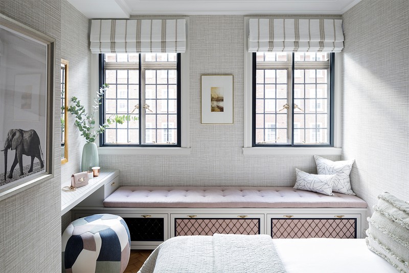
The property’s original architecture and the client’s love of quirky and unusual design was a key driver behind the diverse selection of cheerful and uplifting colours and patterns in this project. Overcoming spatial challenges was also a genuine source of inspiration, whereby many of the solutions we came up with have now become typical Gunter & Co trademarks.. To me, the sign of a really successful project is when you look back and are so proud of it you can use it as an example to show your next client.
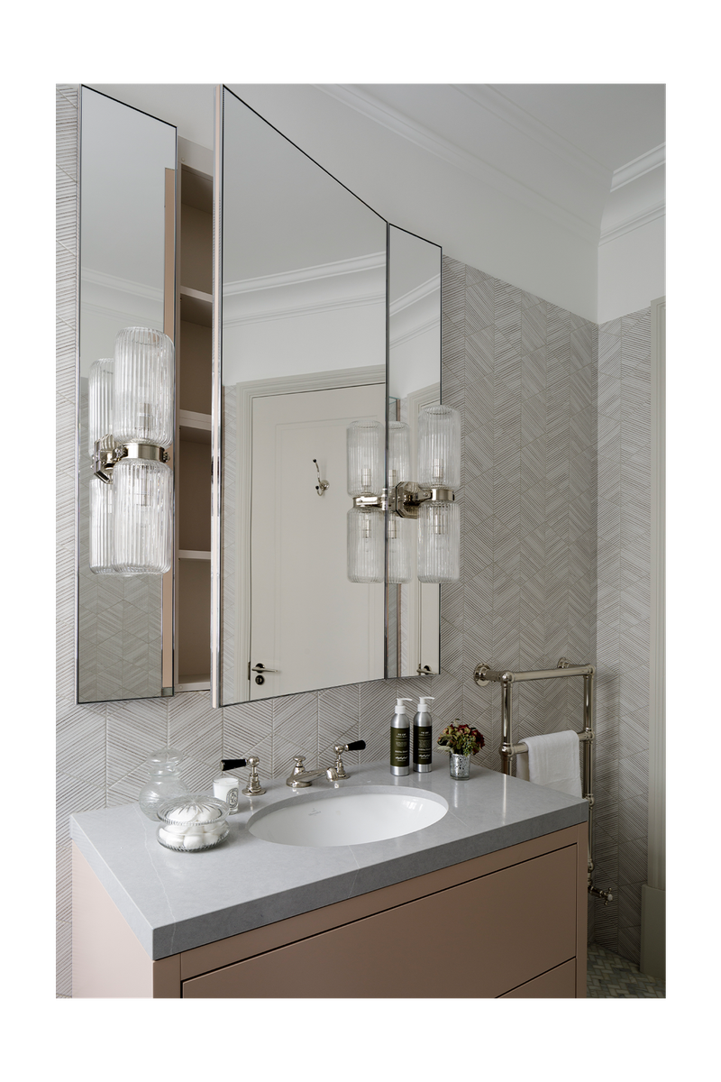
As the property is part of a classical mansion block, we had to be mindful of not disrupting the existing services which ran throughout, while still updating the layout to suit the client’s lifestyle. It was a real labour of love to get all the details right and what was previously an un-coordinated mishmash of rooms with visually cumbersome plumbing now feels like a lovely home with some unique built-in details. The master bathroom was a real challenge; we tried numerous ways to install a separate bath and shower but in the end, we went for a shower bench by overlapping the bath and shower – a choice we’ve come to rely on across several projects since.
Colour Palette
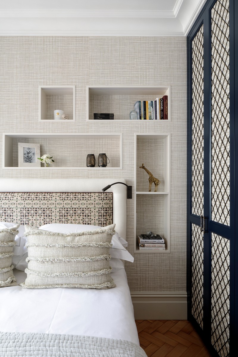
The client loved pale pastel shades and cheerful uplifting tones like yellow and orange. Against a background of crittal external windows, this was quite unusual, but we rose to the challenge – the result being a happy home full of personal touches and heirlooms.
Materials
The client loved some fabrics we showed her Christopher Farr and De Le Cuona, so these formed the backdrop for the design, and a lot of our other choices were based around them. In terms of the hard finishes, we used timeless, classic materials with cheerful details, like the coloured porcelain taps.
Lighting
The hallway was tricky as it was a long corridor without any natural light. We discovered a brilliant fitting by Vibia which provided a lovely, scattered glow throughout the space and it was very shallow, so it didn’t protrude too much into the hallway. Again, it’s a fitting we’ve come to rely on in terms of other finishes.
/https%3A%2F%2Fsheerluxe.com%2Fsites%2Fsheerluxe%2Ffiles%2Farticles%2F2021%2F07%2Firene-gunter-marylebone-apartment-04.jpg?itok=0AG5Cz_-)
02 COTSWOLD COTTAGE
Inspiration & Planning
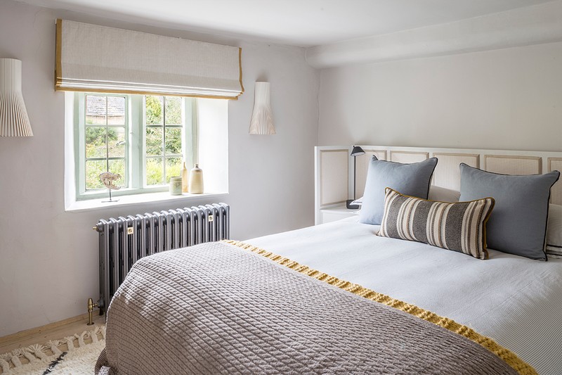
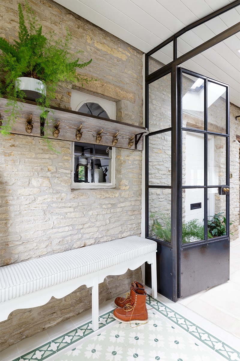
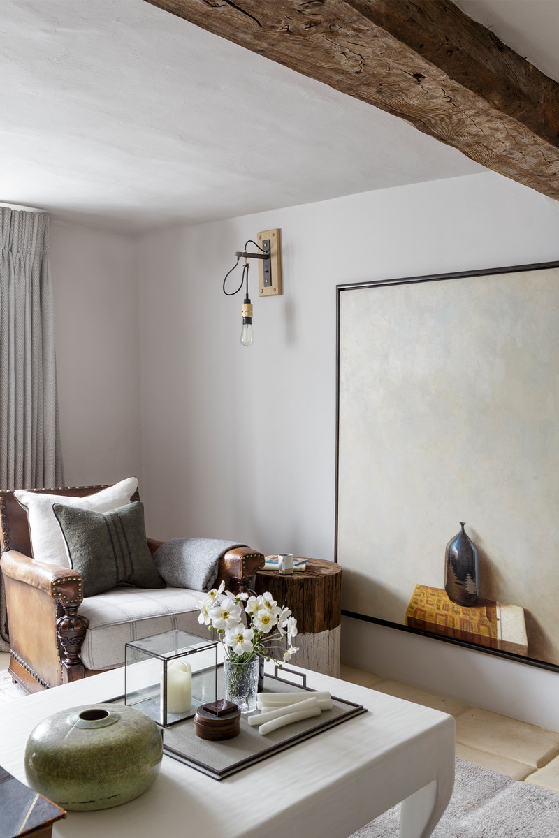
Here, two adjoining 16th-century cottages had been sympathetically transformed by their owner, who was keen to preserve their sense of history. Located in a Cotswolds village and surrounded by an acre of garden, the original cottages were built in traditional local stone, and this heritage had to be preserved during the renovations. Even the paint colour on the exterior windows and doors – inspired by a shade seen at nearby Daylesford Farm – had to be approved by the listed buildings authority. The owner and I had many discussions about wood and stone, and about the finishes that would ensure the interiors felt authentic.
Colour Palette
Throughout the project we used a selection of neutral shades, rich earthy tones, navy blues and pale greens.
Materials
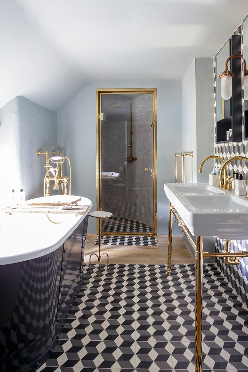
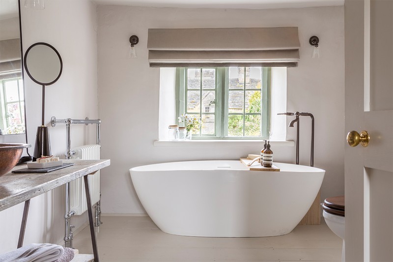
Early on, we decided to apply new lime plaster in the traditional way, with undulating edges and curved outlines to expose beautifully restored elements of the stone walls. Together with re-claimed solid oak floorboards, fixed with the traditional solid steel nails, this became the core backdrop of the house. Using carpet or wallpaper in such a restrained colour palette didn’t feel right, so instead we learned all about limewash paints from Earthborn and used their subtle colour palette in different shades throughout. Pure wool served as a comfortable runner on the wonky staircase and in the bathrooms, we felt zellige tiles were the most appropriate finish thanks to their raw edges and uncalibrated shapes.
We took a consistent approach to the metal finishes, using un-lacquered brass which would easily patina and age to sit more comfortably with the rest of the house over time. The extension had a new limestone floor from a quarry very local to the property, but we were never quite satisfied with the finish on the edges of the tiles, so the client took it into his own hands to sand down the edges of one of the sample tiles to show off the pillowed effect we were keen to create. It’s one of the many details which took a long time to perfect, but that marries the new interior so well with its centuries-old environment.
Lighting
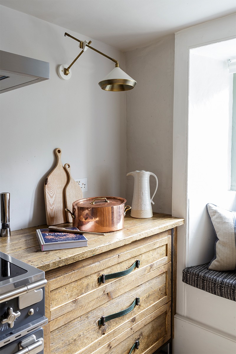
Because the house was Grade II-listed, we had to be very mindful of using lighting that wouldn’t puncture the ceilings, using table, floor and wall lights instead. Some of our favourite fittings were the Bert Frank wall lights in the kitchen, and the Original BTC lighting in the angled window reveals of the landings.

03 HAMPSTEAD PENTHOUSE
Inspiration & Planning
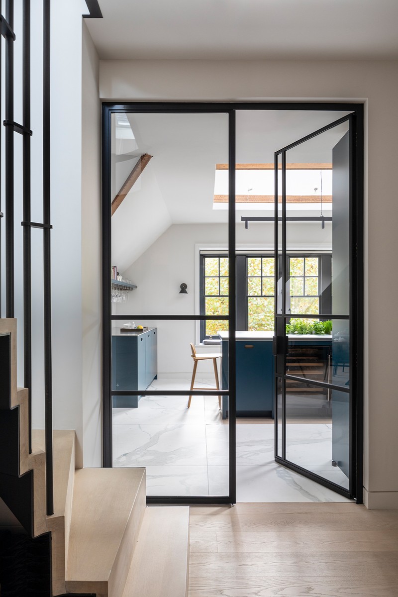
The original penthouse had a very awkward layout and was filled with yellow-stained pine – it felt like an old-fashioned Austrian chalet. Thankfully, the clients saw past this when they purchased it as it had huge potential thanks to its generous size and beautiful windows, which overlook the tree-lined avenues of Hampstead Village. The angled ceilings leant themselves to a cleaner aesthetic without elaborate mouldings and covings, and the clients also said they preferred clean lines. This became our guiding framework for the entire project; every choice we made, we asked ourselves first: “Is this as clean and simple as possible, without taking away a sense of homeliness and warmth?”
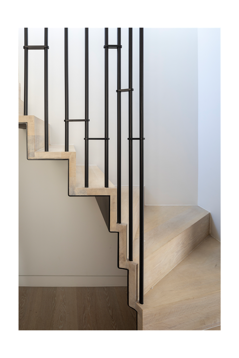
We turned the entire layout of the property around – the kitchens and bathrooms moved locations and we had to think carefully about how to make the services work. A step separates the bedroom quarters from the living spaces, which feels very natural but took a long time to detail, as it also hides the plumbing for the property’s three en-suite bathrooms. The re-positioning and new design of the staircase was quite complex, but it allowed us to create a much brighter entrance, with lots of light spilling from the living room above into the hallway below.
/https%3A%2F%2Fsheerluxe.com%2Fsites%2Fsheerluxe%2Ffiles%2Farticles%2F2021%2F07%2Firene-gunter-hamstead-penthouse-02.jpg?itok=0qWkITCR)
Colour Palette
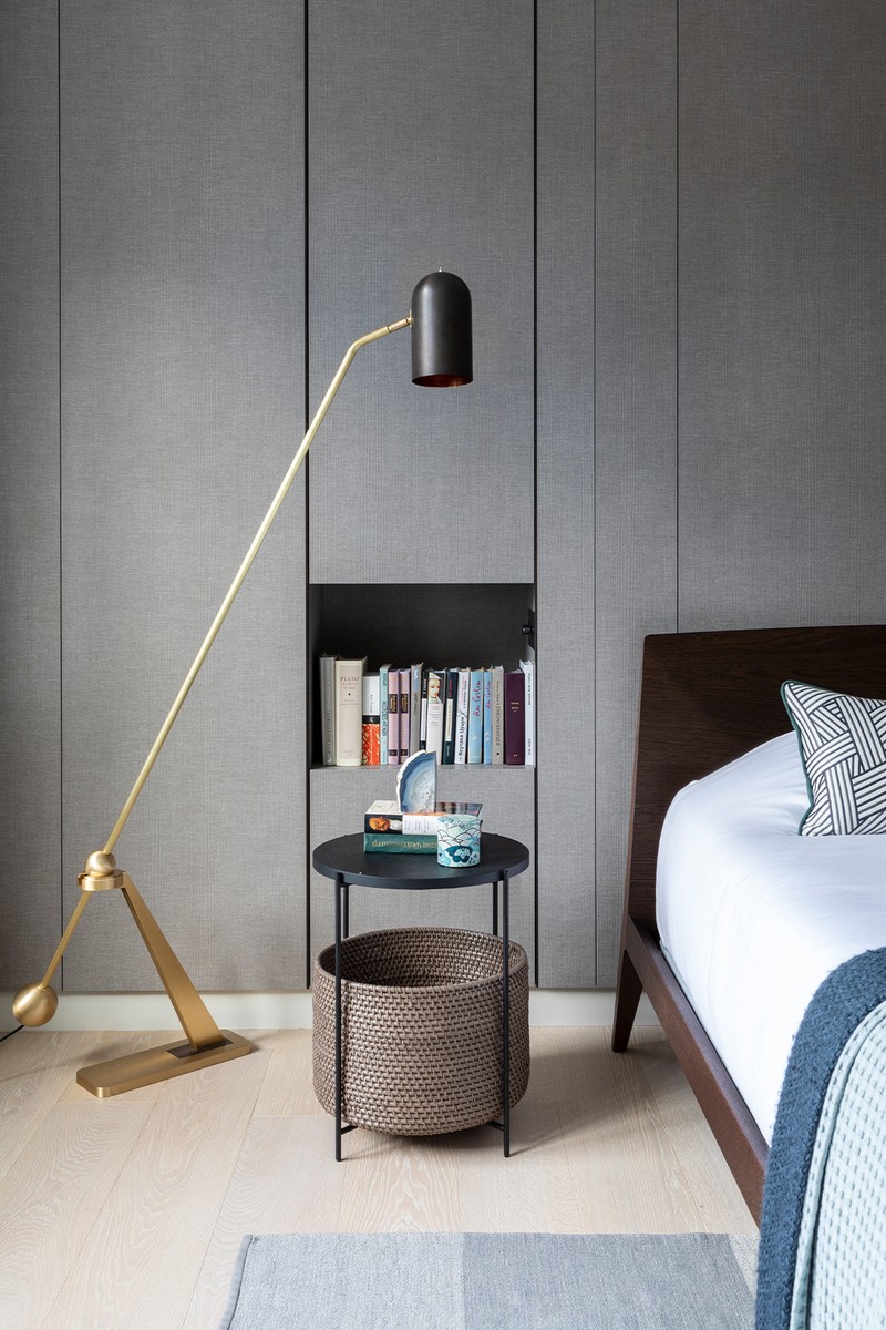
The clients were quite keen to keep the palette as clean as possible, so pale walls, white-washed oak floors and touches of marble run throughout – only with splashes of colours in various rooms. In general, we wanted the space to feel calm and peaceful, hence the overall lack of pattern and window treatments. The black finish on the doors and windows was a conscious choice to frame the trees just outside the property.
Materials
During the course of this project, we discovered quite an array of new materials – from the waterproof plaster in the study en-suite bathroom, to the pre-scratched stainless-steel worktop in the kitchen. It was also our first project featuring black windows – something we’ve continued to specifiy in many projects since.
The carrara marble slabs in the master bathroom were beautifully complimented by small carrara hexagonal mosaics in the anti-slip floor covering. The children’s bathroom features a cement tile, which was a real labour of love for our builder – we never like to make it easy, but this was quite the challenge, as we insisted on having plasterboard trim all around the hexagonal tiles for the neatest finish. It was a project of many ‘firsts’, which is a testament to how courageous and trusting the clients were in our vision.
Lighting
We used trim-less black recessed downlights and magnetic track lighting throughout to keep a consistently clean and coherent feel throughout, with a few select decorative pendants in the dining room and one of my favourite Bert Frank wall lights in the main bathroom.
Visit GunterAndCo.com
Photography by Mark Bolton
DISCLAIMER: We endeavour to always credit the correct original source of every image we use. If you think a credit may be incorrect, please contact us at info@sheerluxe.com.

