Meet The Designer: Charu Gandhi
The Background
I had an innate interest in design growing up, something that was fuelled by my parents’ decision to build a home in India. They hired a female architect who would bring along the most beautiful models and drawings to the design meetings. Watching her work confirmed to me what my future career path would be.
I studied at the Architectural Association in London, and practised architecture for several years at Allies & Morrison before moving onto interior design at Candy & Candy. There, I worked for the private commissions team on projects in India and Africa, as well as residences in the prestigious One Hyde Park development in London.
A couple of clients really believed in my vision and spurred me on to set up Elicyon. Within six weeks, I pulled together a small team. I saw Elicyon as a chance to combine the rigours of my architectural training with a strong passion for design.
Design Philosophy
Our work is inspired by the property and the people that live in it. We always aim to create something that speaks to the client’s aspirations, is full of personality and evokes a very particular feeling. Above all, it must feel authentic to the client. To be a good designer, serving the kind of clientele we work with, you need to have an innate interest in people and the way in which they live, or want to live, in their home. The process of working with people to bring out their individual expression is one of the most rewarding aspects of my work.
Inspiration
My architectural background is a constant source of inspiration – I’m mainly inspired by 20th-century architects, ranging from Carlos Scarpa to Tadao Ando and people like Oscar Niemeyer. I often find myself returning to the mid-century, art deco and Biedermeier periods, especially when it comes to furniture. That said, I do dip into other eras and global styles from time to time.
Approach To Colour
Right now, we’re being quite playful with colour – one combination I’m enjoying is ivory with egg yolk yellows and hints of navy. They look great mixed with copper accents and other metallics. Old rose pink, nude and orangery tones – specifically a dirty coral – is another palette we’ve been working with. The combination of these more muted shades creates a calming, but still sumptuous atmosphere.
We’re also using more pastel lilac and lavenders in our designs and pairing it with a pistol or thistle green and soft amber – the visual harmony is lovely. Then, for bolder more adventurous schemes, we’re using bright pops of colour, like acid yellow, aqua green and deep blue, against lots of white.
A lot of our clients like ‘new neutrals’ so these feature heavily on our mood boards – we typically start with a muted ivory base and then add a smattering of additional tones which might include rusts, pinks, beiges, mustards, terracotta or burnt orange. These shades allow you to build interest, particularly when you incorporate them via textured pieces like cushions, rugs and chairs


Use Of Materials
Blonde timbers are really popular at the moment, and they work well in fresh, white schemes. We’re also using lots of woven leather and hung tapestries, and I’m very partial to bouclé and suede for upholstery – they are very different in terms of texture, but both create a sense of richness. I love their tactile nature.
We always want to highlight the architectural details in our designs – be it a shadow gap or a beautifully lit corner. It’s important to elevate these details rather than hide them away. I also like to make sure any fine craft details are left exposed, such as hinges or junctions in a joint. It’s about finding the beauty in the everyday. I am also exploring handmade glass finishes and the work of some amazing textile designers right now. I love the element of surprise – for example, the furniture piece may appear formal on the outside, but it’ll have a pop of colour on the inside. As a designer, you want to be playful and push the boundaries, so clients really enjoy the unique parts of their homes.
Who To Follow On Instagram
I love following a large mix of designers of Instagram, all of whom are leaders in their respective creative fields. I recommend the following accounts:
@CeciliaHalling
@Nowness
@PaulinPaulinPaulin
@ChairishByDesign
@Charles_Zana
@Max_Rollitt
@Dactylion_Design
@ArchDigest
@VikramGoyalStudio
01: A Riverside Home
Photographer: Patrick Williamson
/https%3A%2F%2Fsheerluxe.com%2Fsites%2Fsheerluxe%2Ffiles%2Farticles%2F2021%2F12%2F01-one-casson-square-southbank-place-c-patrick-williamson-6_0.png)
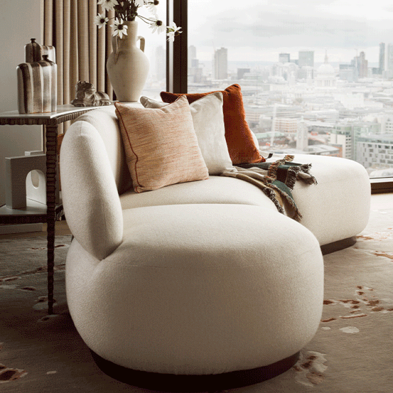
Taking inspiration from the South Bank’s industrial heritage, we incorporated materials, textures and colours that spoke to the creative history of the local area. The apartment features a range of bespoke furniture pieces and specially commissioned artwork, including a striking handmade geometric woven cord piece by UK-based artist Jo Elbourne. Other accessories include earthy artisanal sculptures and natural materials such as agate rock.
A ‘new neutrals’ colour pallete created a warm ambience, combining soft ivory and sandy tones, autumnal burnt oranges and ochres, flashes of gold and calming dark teal. Rich woven and natural textures were used throughout, alongside sumptuous velvet and leather.
The furniture pieces are stylish, yet also comfortable. They include a striking marble and oak console table by a Portuguese maker and a bespoke blonde timber dining table that was designed in-house. The living space also includes two statement curved sofas upholstered in a light cream fabric and with a dark base plinth – it’s perfectly positioned for the owners to sit and look out across some of the finest views of the city. Completing the living space is a hand-knotted, Himalayan wool and bamboo silk rug.
02: Chelsea Apartment
Photographer: Patrick Williamson


Last year we saw a lot of requests for wall coverings in strong geometric patterns and retro colours. The pinks and greens of the 1960s proved very popular and we worked with these references on this private London apartment.
The popularity of today’s ‘new neutrals’ comes largely from the natural world – emulating the olive greens and terracottas typically found outside helps us feel grounded in our homes. Here, we started with a muted base and built up layers of colour and texture. You’ll also see additional tones, including rust, pink, beige, mustard and burnt orange, in the bedroom and living spaces.
Having noticed the sudden demand for antique furniture, we incorporated a bespoke small chest of drawers with an adjoining upholstered bench – think of it as a contemporary take on the traditional telephone table. It’s a really special part of the design
/https%3A%2F%2Fsheerluxe.com%2Fsites%2Fsheerluxe%2Ffiles%2Farticles%2F2021%2F12%2F02-project-moss-c-patrick-williamson_0.png)
03: Knightsbridge Townhouse


The overall aesthetic in this apartment is akin to a lofty, sophisticated European residence where high ceilings, white stucco frontages and a sensibility of scale typify the design. The influences largely came from Madrid, Rome and Paris – where drawing rooms play host to a lot of the entertainment – as well as the deep-rooted history of the architecture found in Knightsbridge and Kensington.
The elegant and sculptural furniture reinforces the symmetry of the rooms, while the style is pared-back with lots of texture and geometry. In the bedrooms, expansive headboards are a focal feature while the throws, rugs and abstract artwork throughout help pull everything together.


One of my favourite features is in the drawing room of one of the show apartments. The lighting pieces purposefully grow in scale towards a large chandelier in the final section of the space, drawing the eye to this dramatic focal point. It’s an example of how we use visual style to create highly engaging living spaces.
Visit Elicyon.com
DISCLAIMER: We endeavour to always credit the correct original source of every image we use. If you think a credit may be incorrect, please contact us at info@sheerluxe.com.
/https%3A%2F%2Fsheerluxe.com%2Fsites%2Fsheerluxe%2Ffiles%2Fwebsite-images%2F2025%2F03%2Fsign-up-pop-up.jpg)
