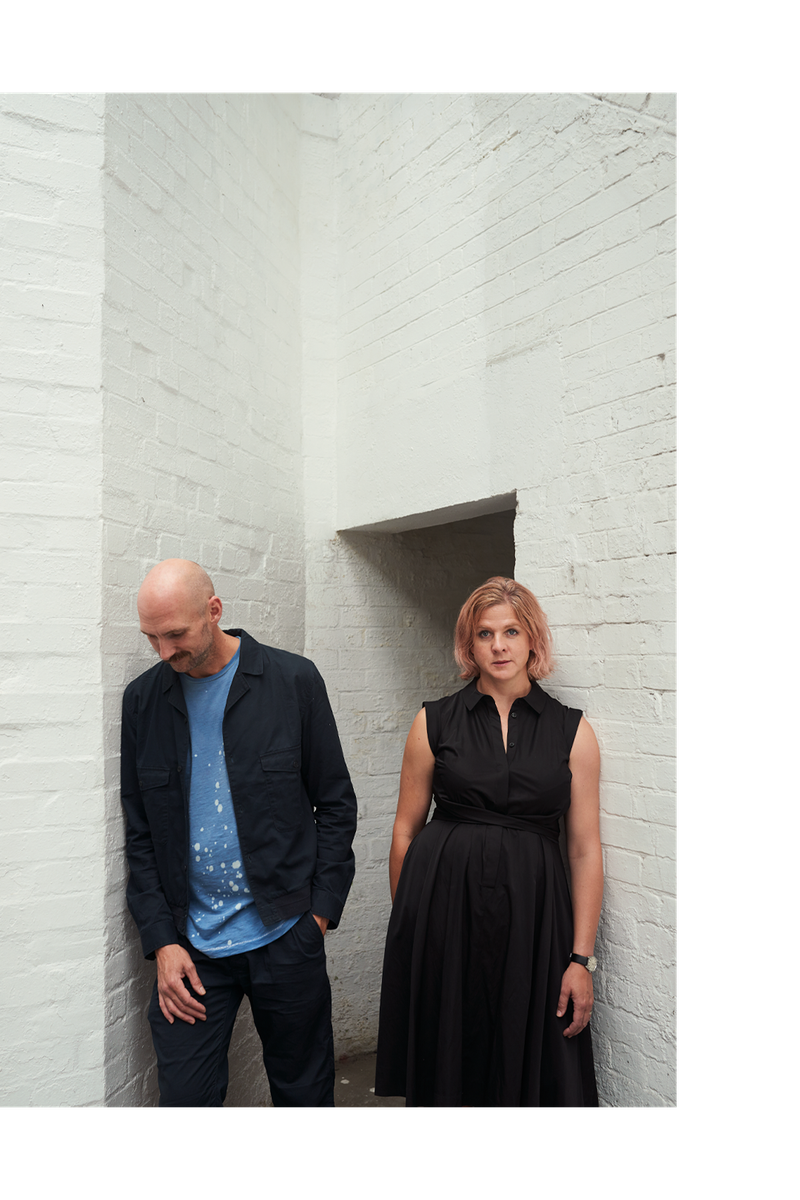
Meet The Interior Designers: Maddux Creative
The Founders
Jo Le Gleud started her professional career in fashion as an embroiderer. After a spell working in events, Jo met Scott Maddux in the mid-90s and bonded over a shared love of bold colour – something that led to the creation of Maddux Creative in 2011. Jo’s talent for sourcing the perfect piece, coupled with her skill at making her own unique pieces, has helped the two create a studio that delivers multi-layered spaces for their clients.
Interior designer and Tennessee native Scott Maddux uses form, texture and colour in considered yet unexpected ways. Having studied architecture, his design solutions are forward-thinking and unmistakable. To date, the Maddux Creative team has worked on high-value projects across the globe, with current projects in progress in London, LA and Geneva.
Style & Ethos
While Jo and Scott develop inspiring and visually appealing concepts and ideas, they also make sure they work practically with the homeowner in mind. “Being predominantly client-led means our work doesn’t follow trends and that our projects do not have a repeated narrative,” they explain.
“We go out of our way to avoid repeating design solutions, so each project is fresh and individual. We also believe in repurposing pieces where possible and encourage our clients to invest in ‘future heirlooms’. That often involves commissioning contemporary makers to make custom pieces that will stand the test of time or scouring markets (in person and virtually) for antiques. We strive to create projects with relevance, depth and warmth. It’s not just about what you see, but also what you feel: the power of good design can usually induce emotion.”
Inspiration
Scott: “Carlo Scarpa is a go-to for me. There is such poetry in his clean and contemporary work, yet it still has so much soul. Ben Nicholson’s complexly layered compositions have a timeless appeal and work in almost any context, and Dries van Noten’s sense of colour and (sometimes challenging) combinations of fabrics, cuts and patterns is so original. I also enjoy how Villa Necchi Campiglio, Milan’s work is both severe and elegant; it’s one of the finest and most complete expressions of an architect’s vision.
Jo: I like how Matty Bovan approaches each collection: he has a real punk attitude to clothes and puts together incredible catwalk shows (or other visual presentations) and everything is gender neutral. The Minerals Gallery at the Natural History Museum is also so inspiring. Finally, vintage textile dealer Jennifer of Starched and Crumpled has such a brilliant eye.
Colour
Colour is integral to the way a space is enjoyed and lived in, the two designers explain. “Colour can’t be over-planned. It’s instinctual and a response to the surroundings: the location, quality of light, and the site conditions of the building are all huge considerations. It’s also about being open to what is around you: fashion, literature, dance, music, art – we feel it’s important to be aware of these trends and where they come from. We must be aware of and responsive to what we are being told but we’re never led by these things. Instead, we’re tuned into them and challenge them to ensure they fit with the property and our clients.”
Materials
Light, air and space are all so important in the projects Scott and Jo create. “We like to combine softness through our use of materials and also add lots of texture. There’s such beauty in nature – we love using characterful timbers and dramatically veined marbles or heavily fossilised stones. We temper these with simpler materials like Venetian plaster or natural fibre wall coverings like silk, linen or grass cloth.”
“We definitely prefer natural materials over industrially produced lookalikes. Even a small amount of a natural material, used sparingly and treated correctly, adds so much. Right now, there are some very exciting new products being made from recycled materials – innovative technology in material production is one way we’re going to save our planet, so it’s imperative to champion these materials whenever possible.”
Finishing Touches
Jo and Scott almost always have a specialist painter come in to add some final touches, be it a hand-painted mural or ceiling fresco. “A subtly applied gilt edge, on a skirting or cornice or door panel, is an instant lift to any room. We used this in on a dining room cornice recently, to offset a nearby fresco.”
These Are The Instagram Accounts Jo And Scott Follow And Recommend:
@1stDibs
@Sarah_Balineum
@Paolo_Abate
@Okolo_Architecture
@Unreliable.Narrators
@MoncXIII
@M.A.R.C.C.O.S.T.A
@CristinaCelestino
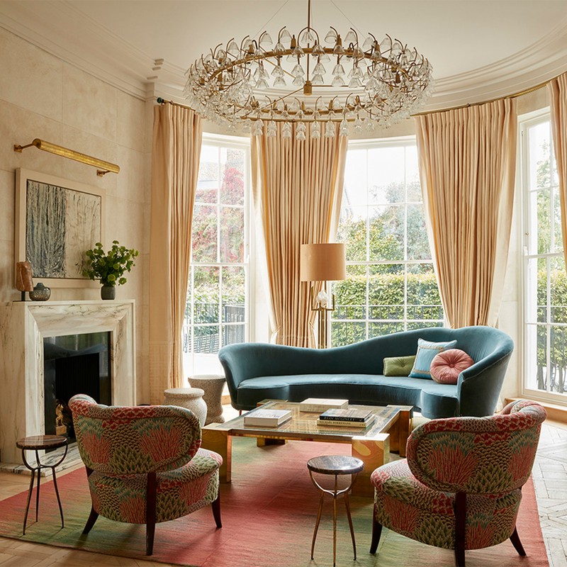
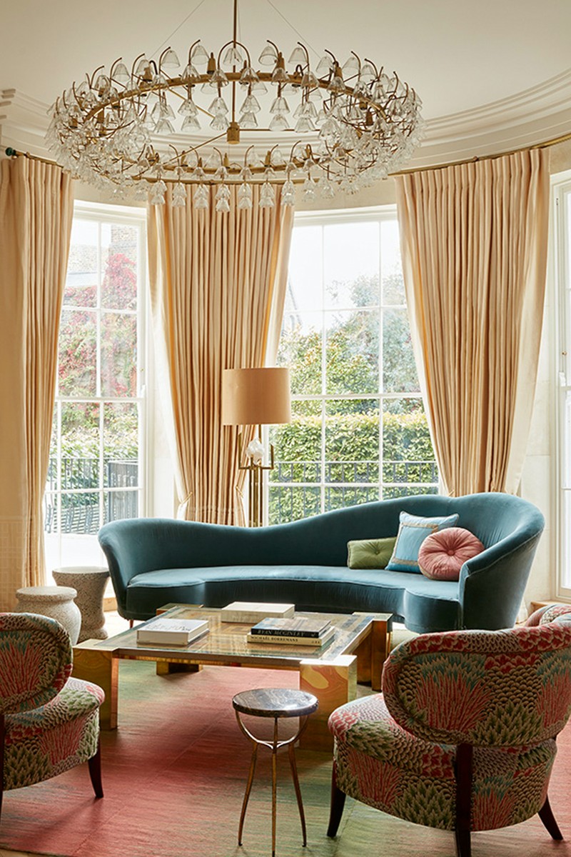
01: Holland Park
Photography: Ricardo Labougle
/https%3A%2F%2Fsheerluxe.com%2Fsites%2Fsheerluxe%2Ffiles%2Farticles%2F2022%2F01%2Fladbroke-3-ricardo-labougle_0.jpg?itok=S995QQpL)
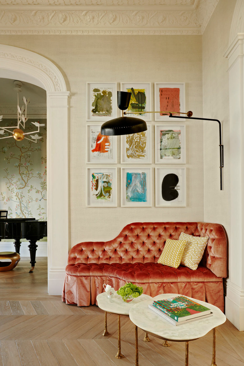
“The owners of this house are avid art collectors, so much of the inspiration came from the art and objects they already owned,” explain Jo and Scott. “The client brief was to employ a ‘frivolous’ use of colour, which we did mainly via the fabrics for the upholstered pieces. Where colour was used, it was mostly confined to the ceilings.
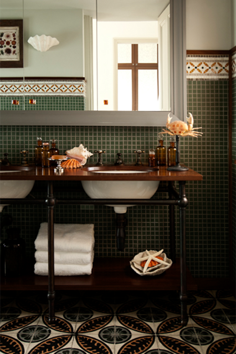
“The materials here are mostly neutral in colour, but with lots of texture, character, and interest. The timber floor is as close to raw oak as possible – its rustic finish makes it softer and more forgiving, though. We chose heavily veined and unusually coloured marble for the master bathroom walls; they were the last slabs from an extinct quarry, which makes them almost collectibles!
“The furniture is an eclectic mix of French art deco, Italian and Scandinavian mid-century, with a mix of 70s and 80s pieces and the best contemporary designers. We designed several pieces ourselves, notably the double-facing amorphic buttoned sofa. The open-floor plan was an inherent challenge; there are no internal doors on the entire ground floor, so the entrance hall, triple reception and library all opened onto one another. Similarly, on the lower ground floor only the kitchen can be closed off, so the dining area, informal seating area and home office are essentially in the same space, united by the ceiling mural above.”
02: Notting Hill
Photography: Ricardo Labougle
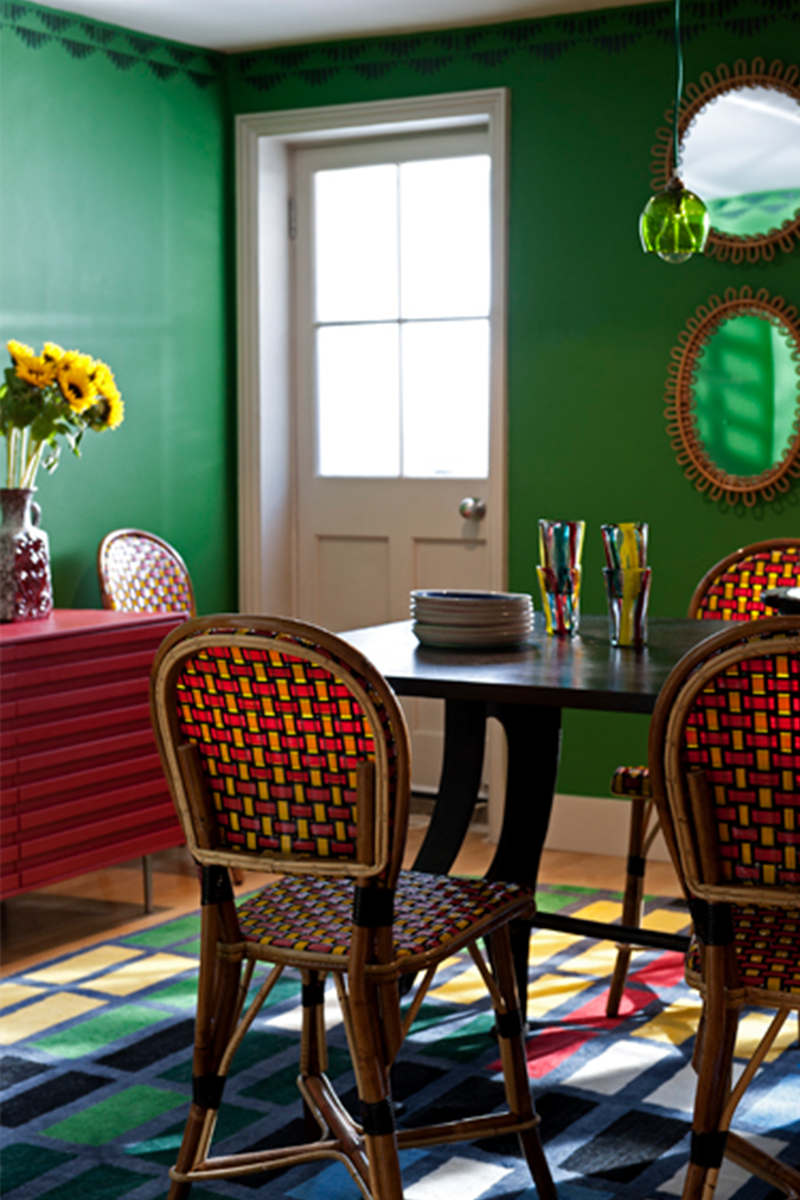
For this property in Notting Hill, a lack of light and a complex floorplan proved challenging for the two designers. “It required unusually shaped furniture with careful placement. The client, realising the real lack of sunshine in the UK, also wanted to bring the light in through vibrant colours in the furnishings.”
“We kept the core materials light in colour but added accents of gold to mimic the glint of sunshine and were also clever with our use of mirrors. Lighting was used like jewellery in this project. It provided the perfect finishing touch in all the rooms. The clients had a wonderful collection of contemporary artwork, all of which was quite strong on colour, including pieces by Harland Miller, Rachel Howard and Sebastian Helling.”
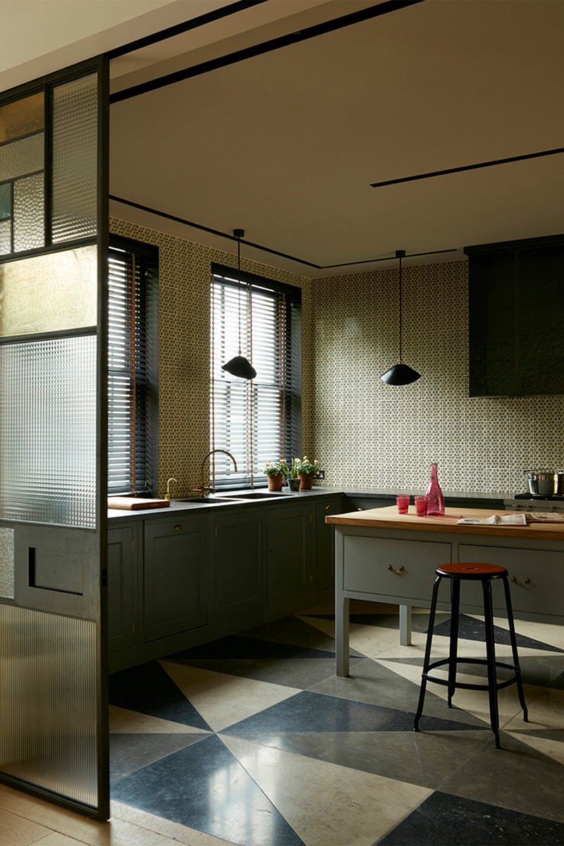
03: Islington
Photography: Brotherton Lock
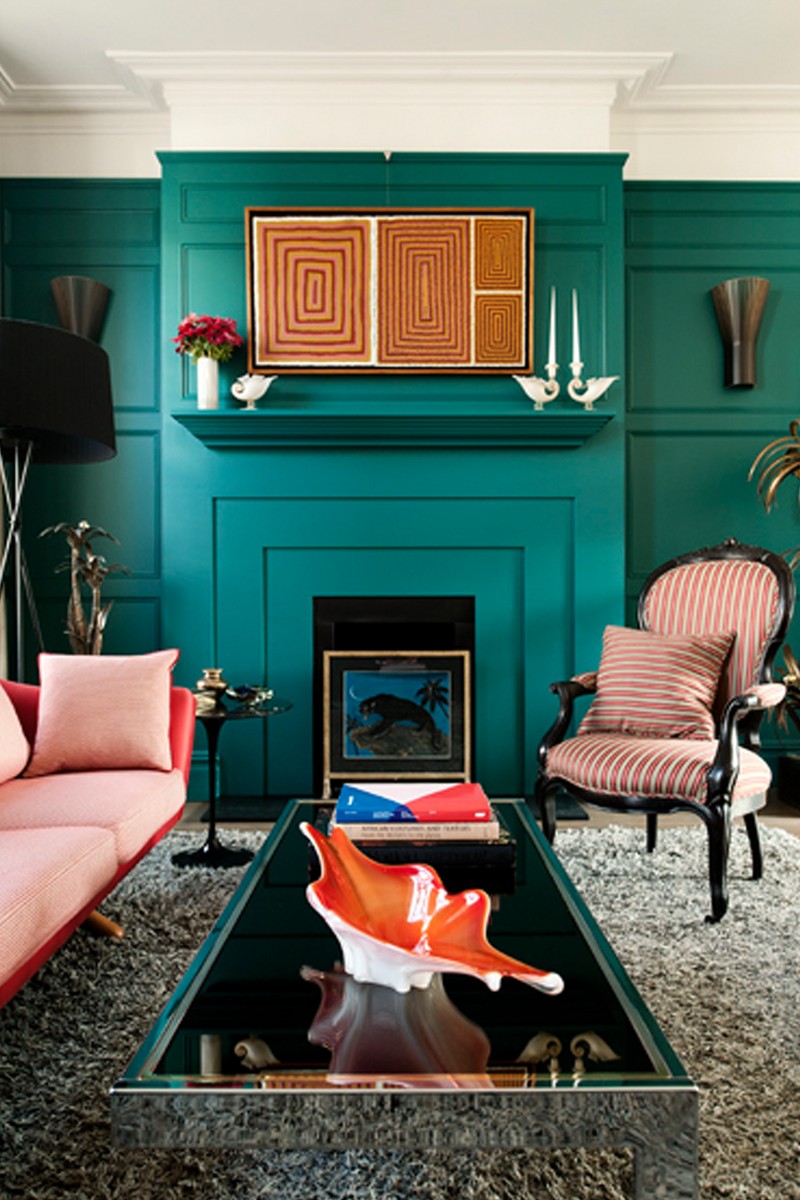
The brief for this project was ‘eclectic vintage’, but the limited budget and clients’ preference for pieces that have a story are what defined it. “The house was north facing and was never going to feel overly bright, so we chose a deep and invigorating shade of teal for the new cabinetry and panelling,” explain Jo and Scott. “In this instance, using a strong colour can act as a kind of substitute for natural light. The teal was also the perfect foil for the warm earthy colours of our clients’ collection of aboriginal paintings.”
“The furniture is an eclectic mix of 50s, 70s and industrial antiques found in various markets and vintage shops around London and Europe. We used reclaimed materials where possible – the bathroom surfaces were all made from reclaimed school laboratory worktops. In the living room, we remade the lampshades from a pair of lights which the clients brought back from Vietnam, using hand-painted chinoiserie silk from Fromental to great effect.”
“Our biggest challenge was budget. We had to source creatively, using markets and vintage shops rather than more established galleries and suppliers. Having the time to source thoroughly helped, as we built on this project floor by floor, so they could live in the house during the renovations.”
Visit MadduxCreative.com
DISCLAIMER: We endeavour to always credit the correct original source of every image we use. If you think a credit may be incorrect, please contact us at info@sheerluxe.com.
/https%3A%2F%2Fsheerluxe.com%2Fsites%2Fsheerluxe%2Ffiles%2Fwebsite-images%2F2025%2F03%2Fsign-up-pop-up.jpg?itok=zlMvamfa)