
Check Out The Bestselling Colours From The UK’s Top Paint Brands
HERITAGE BY DULUX
Creative director Marianne Shillingford introduces the top three shades:

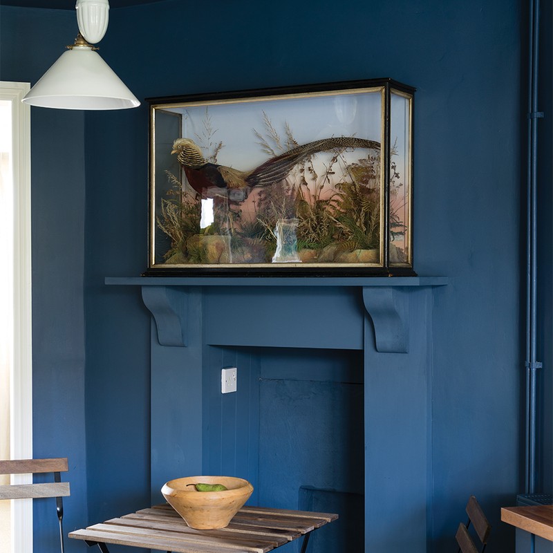
DH Oxford Blue
DH Oxford Blue is the deepest shade of sumptuous inky blue that instantly adds a premium look to rooms where you want to completely relax and unwind. It’s perfect for a grown-up bedroom or living room and for revamping kitchen units. If you tend to be a little nervous about using dark colours there simply is no need to be – you can team it with Quartz Grey or Romney Wool, or just try it in the smallest room of the house and you will instantly realise why this colour is a true classic.
Shop here

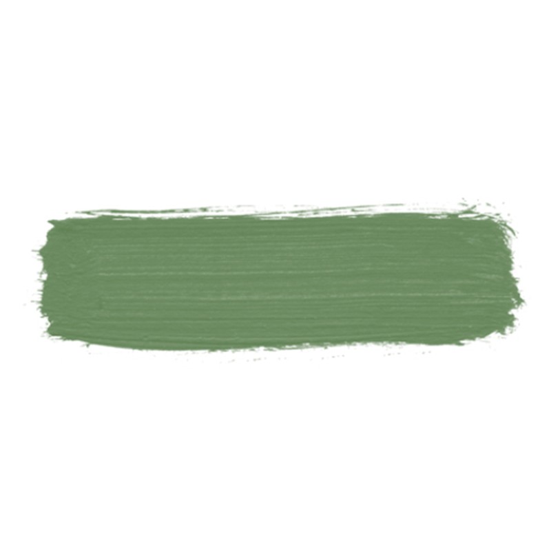
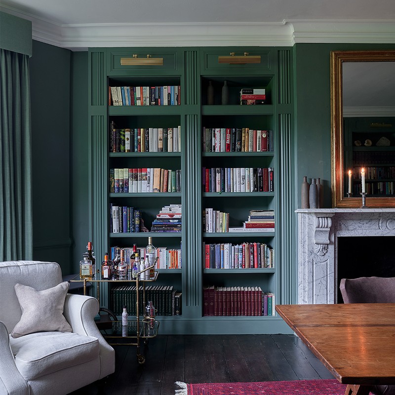
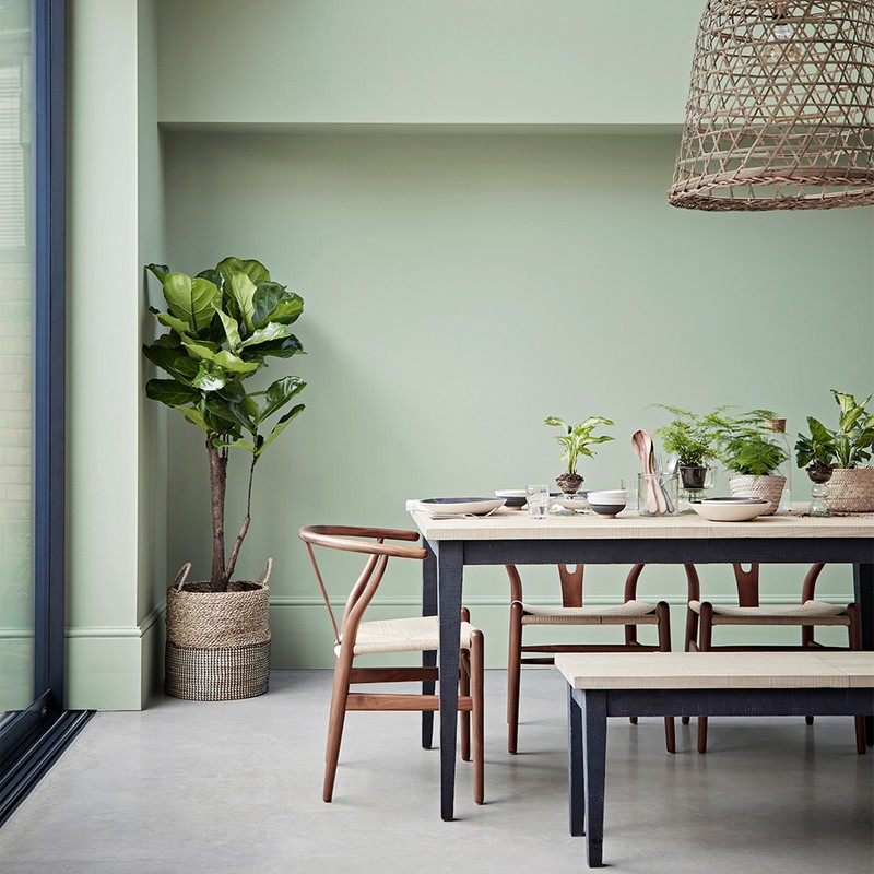
Sage Green
Sage Green is the perfect all-round colour for rooms of every aspect and looks equally good in north and south-facing interiors. Because green is a neutral colour it works like foliage in a flower arrangement, making a hero of everything you place with it. This is a mid-green with a tiny hint of gold that works perfectly with delicate plaster pinks like Powder Colour for a truly modern take on Georgian splendour in a living/dining room.
Shop here

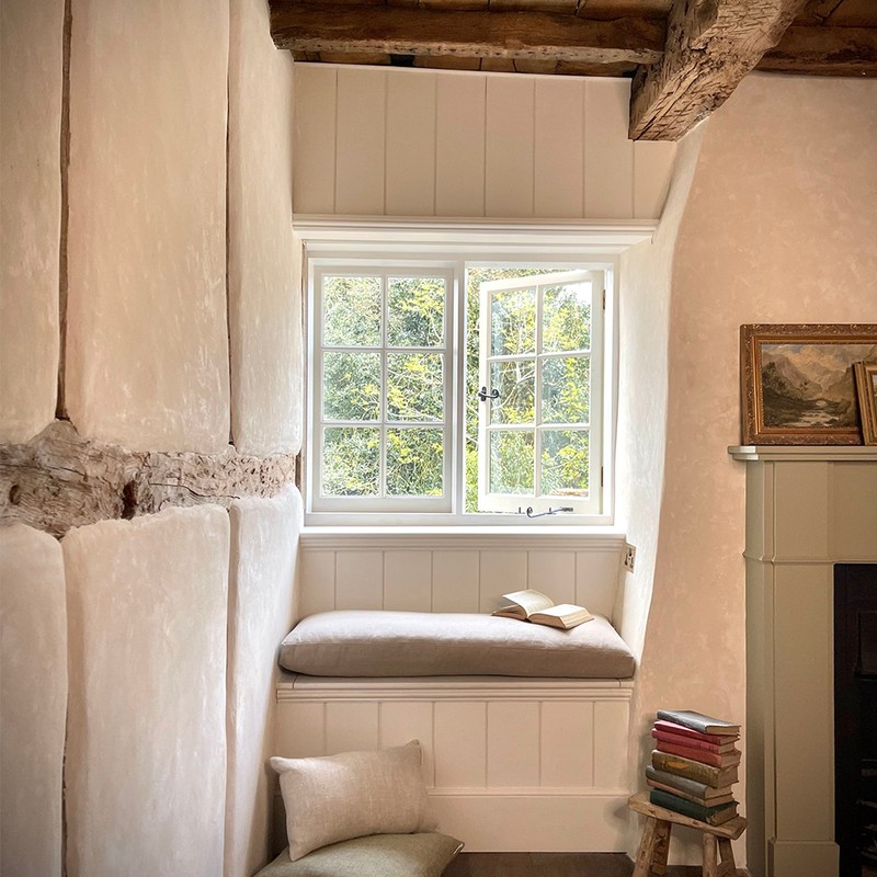
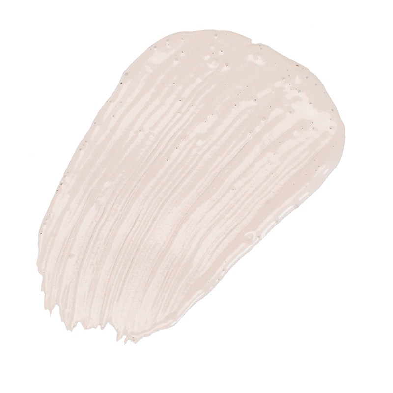
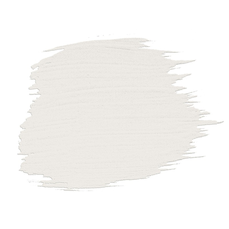
Romney Wool
Inspired by the famously fine fleeces produced by Romney sheep, this creamy off white is elegant and hugely versatile. It is the perfect partner to earthy sophisticated shades like Terra Ombre and Mauve Mist, and looks great as an alternative to white. Use on the walls in bedrooms and hallways where you want a gallery feel and a little more light, then paint the ceiling in a colour like Country Sky or Lavender Grey to add a contemporary twist.
Shop here
Visit DuluxHeritage.co.uk
CA’ PIETRA PROPER GOOD PAINT
Marketing manager Grazziella Wilson introduces the top three shades:
Ander’s Rock
Ander’s Rock is a deep, moody green. While it’s a statement colour, it’s wonderfully restful too, which means it works in any room in the home. Its rich shade adds depth to more contemporary homes and adds drama to more traditional properties. We particularly love it teamed with pops of pink, black metal accents and dark wooden furniture. From dressing rooms to bedrooms, this colour is impactful but incredibly calming too, which is why it has sold so well.
Shop here
Amara’s Slipper
If you’re looking for a soft neutral but want a shade that is delicate and welcoming, Amara’s Slipper is a beautiful alternative to cool whites and warm creamy shades. It looks calming and ethereal in bedrooms thanks to its muted palette. Keep things tonal by painting your walls and skirting boards in the same colour. Keep your interiors really muted when bringing a room together with this shade – think bouclé armchairs, textured throws, vintage rugs and antique terracotta pots.
Shop here
Carter’s Rose
Carter’s Rose is a warm and versatile dusky pink. We love it in bathrooms the most. It’s popular because it teams so well with our Carter Rose tile, but also because it has the contemporary appeal of a pink neutral shade. We like to say it’s a little ‘dirtier’ and warmer, meaning it doesn’t feel too feminine. We love it with soft wooden furniture, crisp white freestanding baths and touches of green – both in terms of tiles and plants, in a bathroom.
Shop here
Visit Capietra.com
EDWARD BULMER
Founder Edward Bulmer introduces the top three shades:
Jonquil
Jonquil seems to carry the most universal appeal – any interior style, any room and by anyone, it’s a true timeless classic. It can be a superb entrance hall colour, softly very inviting as a warm and welcoming colour; or use it in the sitting room with layers of colour and fabric prints, and with furniture of any style. Then there are lots of people who save it for their favourite place in the bedroom and bathroom, where it has been catapulted to ‘most flattering paint colour’ stardom.
Shop here
Azurite
This blue is a real pick-me-up, packed with pigment to give strength and depth, but with earthy warmth. A great choice for repainting kitchen cupboards paired with lighter walls. Azurite brightens up any dining and living spaces, turning jewel-like at night and colourful during the day. You can lighten it with off-white woodwork or embrace the warmth by painting it all Azurite. Add bold patterns and colour to create a vibrant and exotic scheme.
Shop here
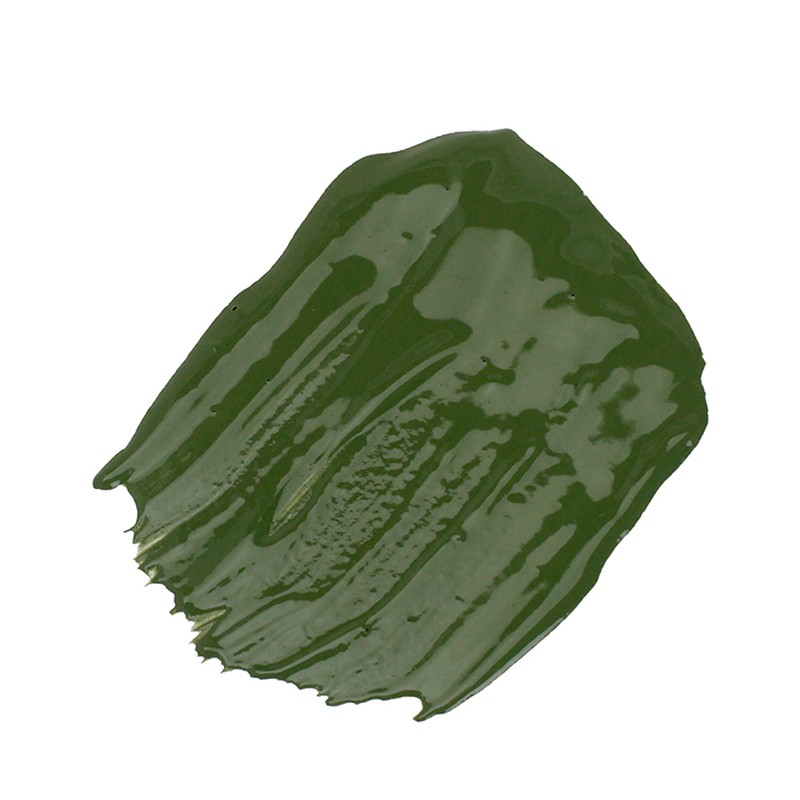
Invisible Green
With its energy and positivity, this is such a versatile colour. It can zhuzh up kitchen cabinets, create fun in a snug or become the most elegant study – mostly it seems to be used in living spaces. A happy hue, it is bold yet it has an unrivalled soft calmness. You can really play with colour, texture and print – there is nothing this colour cannot carry. Top tip: if you don’t want to go all green but are hankering after bringing the outside in, frame your views with Invisible Green on windows and woodwork.
Shop here
Visit EdwardBulmerPaint.co.uk
FENWICK & TILBROOK
Brand director Anna Hill introduces the top three shades:
Oyster
Oyster is the perfect warm white. It is very versatile and avoids the clotted cream undertones many people don’t like when wanting something “warm but not yellow”. It’s perfect for cooler, north-facing rooms lacking natural light. It is still a pale off-white but Oyster’s warmth comes from its subtle peachy undertone. For a neutral scheme, pair Oyster with Collared Dove. For something a little bolder, try a muted green such as Oregano.
Shop here
Woodland Jay
Inspired by the bird, this soft dirty pink has been very popular because it isn’t sugary sweet. It’s a more grown-up take on the pink interiors trend. Woodland Jay works anywhere but is especially popular for bedroom walls. Consider taking it down onto the skirting board and across doors to get the full impact.
Shop here
Seal Pup
This is a really popular mid-neutral. It’s a gentle grey, warmed up with yellow undertones, working especially well as a woodwork colour to take throughout the home as part of a tight colour palette. Seal Pup is a great all-rounder but try pairing it with deep inky blues such as Magpie, or more muted blues like Burnham Overy and Norfolk Flint.
Shop here
Visit FenwickAndTilbrook.com
MYLANDS
CEO Dominic Mylands introduces the top three shades:
Threadneedle No.262
A refined and subtle pale pink, white with a hint of orange and umber, Threadneedle No.262 is the perfect colour to make other hues pop while adding a hint of rosy warmth in the process. This bestseller will leave your interior looking light, fresh and welcoming.
Shop here

Pure White No.1
A brilliant blend of pure white pigment, China clay and crushed marble, Pure White No.1 has been a bestseller for numerous years. It works brilliantly on its own – an uncomplicated white decor scheme can bring you peace and serenity as a visual palette cleanser – or it can complement any colour on the spectrum.
Shop here
Brompton Road No.205
Retrieved from the Mylands archive, this colour was originally supplied to a house on the street its named after. Brompton Road No. 205 is particularly popular for kitchens, where it brings a timeless style. It’s the ideal shade of green to make a statement.
Shop here
Visit Mylands.com
FARROW & BALL
Colour curator Joa Studholme introduces the top three shades:
Stiffkey Blue
This velvety navy blue is both dramatic and optimistic. When used in well-lit areas of the home it will appear much bluer, working wonderfully in contrast with Ammonite or All White for freshness.
Shop here

Hague Blue
A sophisticated dark blue for a glamorous and cocooning feel, we love Hague Blue for its inky undertones. Dark blues are a universally flattering option for rooms both large and small, and great for rooms with cooler light.
Shop here
Railings
Railings is a complex black blue that can create a modern and dynamic space in the home. Dark tones look great when used as one colour in the whole room, often flattering the proportions of a room and blurring its boundaries. It’s great for hallways as it makes the rooms off the hallway seem lighter and airier.
Shop here
Visit Farrow-Ball.com
CROWN
Colour consultant Judy Smith introduces the top three shades:
Sail White
Elegant and warm, Sail White helps to create a cosy and inviting atmosphere while maintaining a fresh and bright look. Because of its warm undertone, Sail White works best in a south-facing room, where it will shine with natural light and create a lovely creamy background for furniture and flooring in neutral and warm colours. It works with virtually any colour, although I’d recommend pairing it with earthy shades, warm terracottas and deep greens to really bring out its undertone.
Shop here
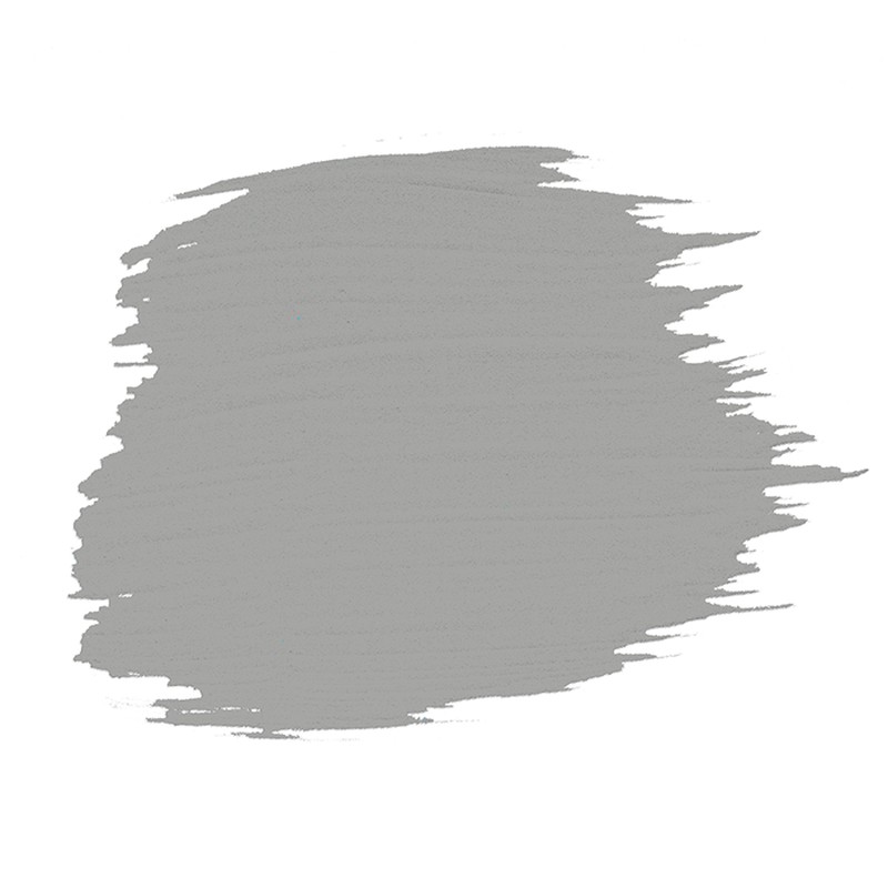
Granite Dust
Granite Dust is incredibly versatile – it’s the perfect mid-grey colour with hints of cool blue. It is the ideal background for all styles, from the latest fashion for bright furniture and pattern to a starker design-led look or an eclectic mix of modern and traditional. Granite Dust can offset the hottest and most vibrant tones of orange and deep yellow to add balance and a calming feel. It can also blend with soft and watery turquoises and purples, metallics and glass for a hazy look.
Visit CrownPaints.co.uk
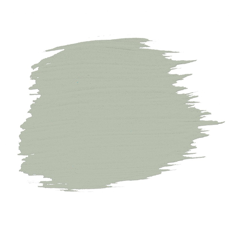
Mellow Sage
Natural, soothing and calming, Mellow Sage creates a space that’s full of life while still being very easy to live with. Whether cool or warm, white enhances the brighter and fresher tones of Mellow Sage. The result is a relaxing space that looks balanced and inviting. Alternatively, baby pink or lavender add an unexpected touch and enliven the space. If you’re looking for a bolder scheme, tones of darker forest or emerald creams will create a sophisticated scheme that makes you feel like you’re surrounded by nature.
Shop here
Visit CrownPaints.co.uk
ANDREW MARTIN
Design director David Harris introduces the top three shades:
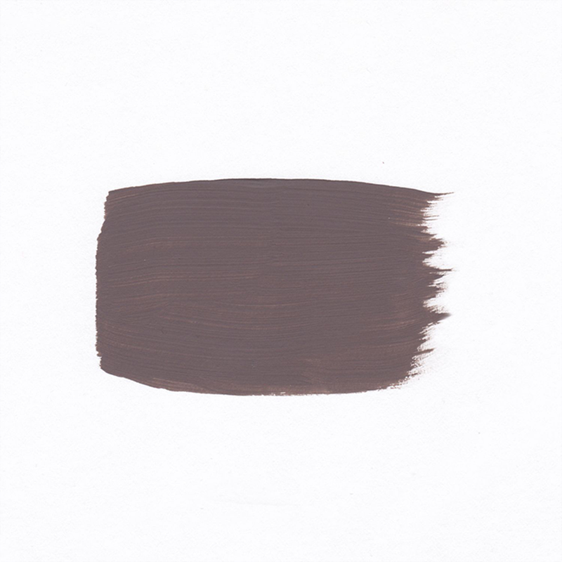
Wild Truffle
A versatile hue, Wild Truffle is a velvety brown shade that can be used alongside other warm neutrals for a beautiful tonal scheme or partnered with red and ochre for a livelier feel. I’d use this colour in a living room for an intimate, calming environment. Paint colours like Wild Truffle are strong dark shades but they help ground a room, confidently sinking into the background to let other colours and textures shine.
Shop here
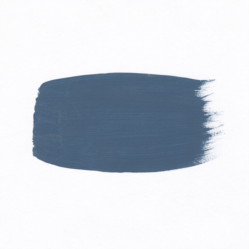
Skipper
This deep navy has strong maritime connections. A multifaceted blue, it can be combined with an array of prints and fabrics. The muted quality of Skipper offers an effortless approach to colour. Despite having darker pigments, this blue shade inspires a relaxed and calming atmosphere that suits a range of spaces from kitchens or bedrooms to downstairs loos. For a relaxed and eclectic feel, layer with earthy yellows or reds and ethnic-inspired prints.
Shop here
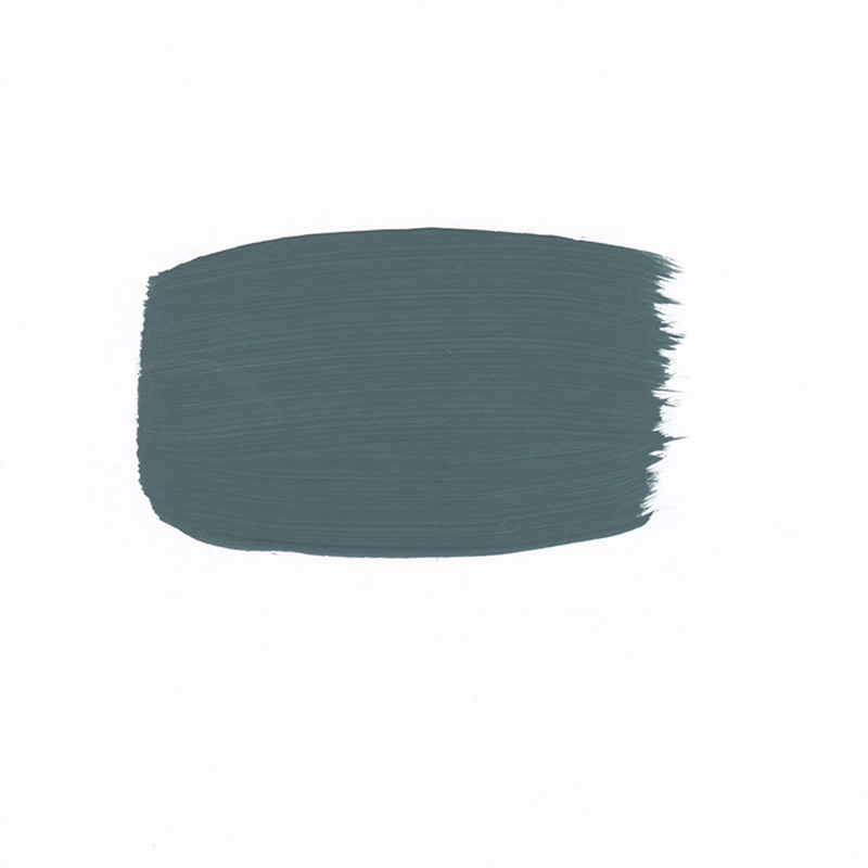
Canopy
A deep green that gets its name from the intricate overlapping branches of the Amazon rainforest, Canopy has a muted quality which helps to create a sense of balance and calm. It takes on a more adventurous feel when paired with bold prints on wallpaper and fabrics. If you are still hesitant about using a dark colour, start your transformation in a cloakroom or small bedroom, since richer colours work well in such spaces, despite the accepted wisdom that white paint makes a room seem larger.
Shop here
Visit AndrewMartin.co.uk
DISCLAIMER: We endeavour to always credit the correct original source of every image we use. If you think a credit may be incorrect, please contact us at info@sheerluxe.com.
/https%3A%2F%2Fsheerluxe.com%2Fsites%2Fsheerluxe%2Ffiles%2Fwebsite-images%2F2025%2F03%2Fsign-up-pop-up.jpg)
