A Cool Interior Designer Shows Us Her London Home

The Property
I live in south London with my partner Gareth and our Sealyham terrier, Mr Bingley. When we bought it, the property looked extremely tired. The same couple had lived there for decades and at one point it had even been split into flats. I don’t think anything had been touched in about 40 years – all the windows were rotten, there was severe subsidence on one side and a lot of damp as there was no central heating. The kitchen was tiny, and in a small room at the top of the house, and there was one bathroom with a water tank from the 1960s.
My aim was to keep as many of the original features of the house as possible – not least for budgetary reasons – while also creating spaces that felt comfortable and warm. It took nine months and lots of site visits. People still ask me whether it is finished three years later and, honestly, I'm not sure. A creative mind never rests – I’m always thinking of things I can add.
The Kitchen
Downstairs we kept the original floorboards exposed; overall, they were in pretty good condition – remarkable considering the house is about 150 years old. We also opened the two main living spaces and made the front room, with its large bay window, the kitchen. It has the most natural light, as well as space for a large dining table. I wanted the room to feel bright and open – I love blue, so I chose Farrow & Ball Parma Grey. It makes the strong black granite worktop slightly less severe.
To highlight the architectural details of the room, I used reclaimed scaffolding boards for shelves instead of bulky kitchen cupboards, which would have felt awkward with the chimney breast. I also did away with any kind of backsplash, so the room feels more flexible. My favourite part is the original timber shutters on the bay window which tuck away neatly.
Living Room
I wanted the living room to be the opposite to the kitchen, so I painted the walls in Farrow & Ball De Nimes and added lots of rich blues and greens. I also used Zardi & Zardi’s tapestry wallpaper in the niches and installed a bespoke marble fireplace. I designed the sofa in this angled curve, so the two spaces flow together and feel more connected. The maroon fabric hides a lot of spills! All the lighting in here is low level – the vintage lamps give off such a warm glow, perfect for evenings. The curtains are in my favourite fabric, Fez Weave by Guy Goodfellow Collection. Instead of having a coffee table, I designed these fun foot stools which I now sell on my website – they also double up as extra seating – and used antique side tables at either end of the sofa.
/https%3A%2F%2Fsheerluxe.com%2Fsites%2Fsheerluxe%2Ffiles%2Farticles%2F2022%2F03%2Fpandora-taylor-house-tour-living-room-3.jpg)
Entrance Hall
Most of the rooms are bright and light, so I wanted the connecting corridors and entrance hall to feel totally different. The walls are painted in De Nimes again, and the woodwork in Off Black. Everything is lifted by the pink elements – you can just see the vintage Murano glass chandelier in the mirror. The mirror is from Wayfair, and we painted it white with Tat London vintage sconces either side.


Utility Room
We didn’t really touch the ground-floor rooms, aside from a fresh layer of paint. We use this space as a utility room – mainly because it had this original built-in cabinet. For the floors, we used affordable vinyl flooring which I laid myself – it wasn't actually that hard!

Main Bedroom
This room started with the Lewis & Wood Wild Thing curtain fabric and was joined by walls painted in Farrow & Ball Skylight. It’s all punctuated by this strong rust orange velvet headboard. The room is very generous in size, so I wanted a headboard that could be a bit dramatic. I made the bespoke bedside tables. The table lamps are by one of my favourite British companies, Bert Frank. They don’t fight for attention, which I love and I also asked for a switch on the base of the lamp rather than it being on the cord – usability is everything!
En-Suite Bathroom
Function was key here. I knew storage would be important, as well as having two sinks. I never like to do anything expected, so I designed the cabinet to look like a vintage set of drawers with reclaimed handles. The limed oak is a softer texture compared to the hard lines of the marble and tiles. I saw these tiles at a design fair and loved them immediately.
The walls are Farrow & Ball Oval Room Blue. I took the tiles and the paint sample to the marble yard and tried them with all sorts of stones. Strangely, they sat brilliantly next to green prima vera marble; the colours work off each other in an interesting way. The mirrors are by Balineum with Lefroy Brooks sanitaryware and more lights from Rich Brilliant Willing.
Guest Bedroom
This was the last room I designed, and I admit I was feeling a bit drained of ideas – until I found this vintage brass bed. It fulfilled a childhood fantasy and made me want to create this rich, old-world room around it. The Zak + Fox wallpaper complements the brass perfectly, while the woodwork is painted in Little Greene Jewel Beetle, a rich earthy green. I added a mantelpiece to the chimney breast to hide the radiator and love how it takes the room back to its Victorian roots. The bedside table is a bespoke one I made for another project. I loved it so much I had another one made. The deep red table lamp is from Pooky.

Guest Bathroom
This is a house we will live in for the foreseeable future, so I had a children’s bathroom in mind when I designed this space. I have always loved Zellige tiles and to emphasise their natural tone, I used three different colours to create a herringbone stripe. The bath top and floor are a white terrazzo with small blue flecks and the whole thing is balanced by Farrow & Ball Setting Plaster walls and ceiling. All the accents are white including this oversized basin by Lefroy Brooks, the wall light is by Rich Brilliant Willing, and it’s contrasted by a vintage mirror. I made these café blinds myself with cheap rods from Amazon and the Scrolling Fern Silhouette in Linen Lawn by Soane. They’re one of my proudest achievements. The whole effect is bright and joyful.
/https%3A%2F%2Fsheerluxe.com%2Fsites%2Fsheerluxe%2Ffiles%2Farticles%2F2022%2F03%2Fpandora-taylor-house-tour-guest-bathroom-guest-room.jpg)
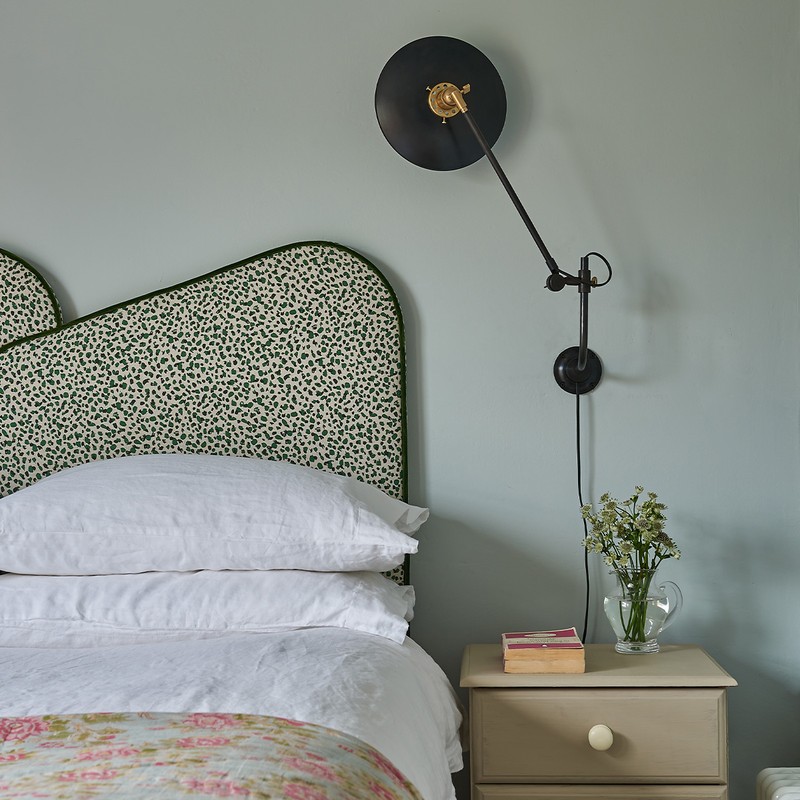
Second Guest Bedroom
This is a small room, so I used this asymmetric headboard from a previous project and emphasised it with a wall light on one side only – it’s by Wo&We – which make the room feel larger. The walls and ceiling are painted in Farrow & Ball Skylight again and the bedside table is one I had as a child and upcycled by painting it a muted pink. Eventually, this might become a nursery, so I didn't want to go too far, only to change it again in a few years’ time.

Visit PandoraTaylor.co.uk
Photography: Mike Garlick
DISCLAIMER: We endeavour to always credit the correct original source of every image we use. If you think a credit may be incorrect, please contact us at info@sheerluxe.com.
/https%3A%2F%2Fsheerluxe.com%2Fsites%2Fsheerluxe%2Ffiles%2Fwebsite-images%2F2025%2F03%2Fsign-up-pop-up.jpg)
