
6 Key Colour Trends & How To Use Them In Your Home
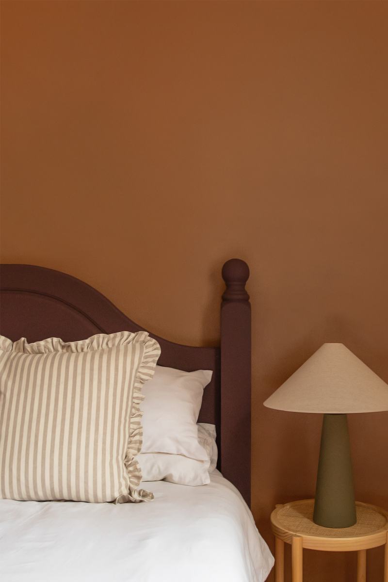
The Return Of Brown
I saw ‘sexy brown’ in Milan last year and it’s a colour I’ve been talking about ever since. While it’s walnut that’s having the moment, it’s actually various pairings that make it feel new and cool – think soft blues, purples and chrome.
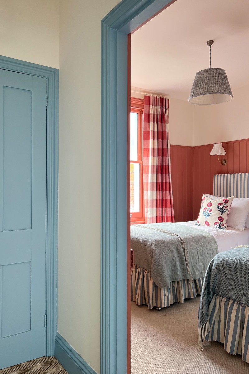
Red With Blue
Rusty reds and terracotta are still big news but now we’re seeing them paired with blues (Red 03 and Blue 04 are a popular pairing) because contrasting primary colours immediately elevate a room. Let’s say someone has always loved a blue bedroom, why not add a rusty red velvet headboard to switch it up? For clients, I like to create a palette of eight colours either to use throughout their house or just as a source of inspiration for the furnishings, floor and so on.
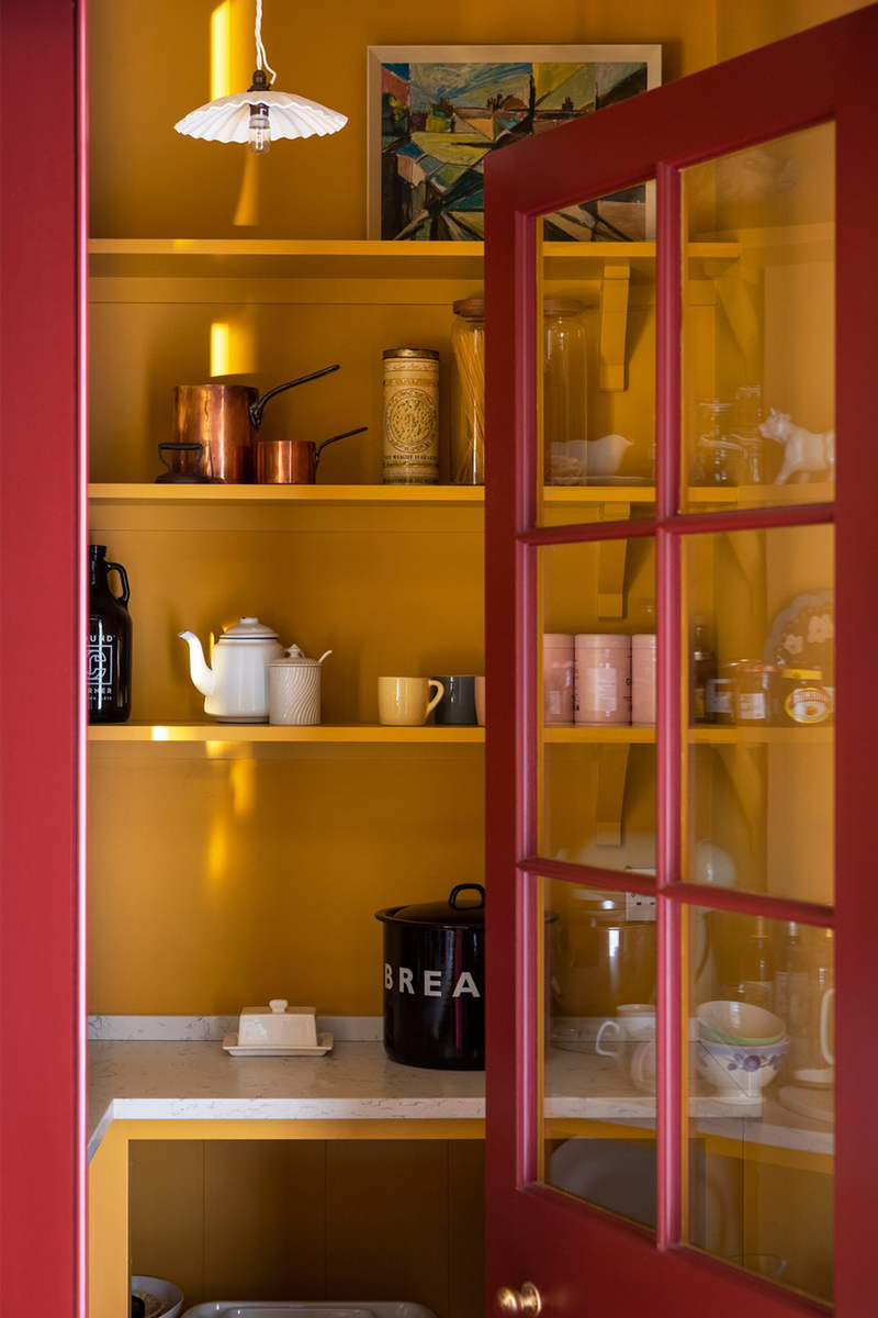
Bold Colour Accents
People are being braver, especially with painting things to add contrast. We’re seeing people using contrasting colours on doors, inside cupboards, on the wardrobes and in pantries. Which colour you choose comes down to whether you want a space to feel calmer or, say, the accents to feel exciting compared to what’s on the walls.
Tonal Palettes
Sticking to one colour and dialling it up or down is becoming more popular. If you are decorating but feel nervous, using a colour you love but with different gradients will guarantee a great result.

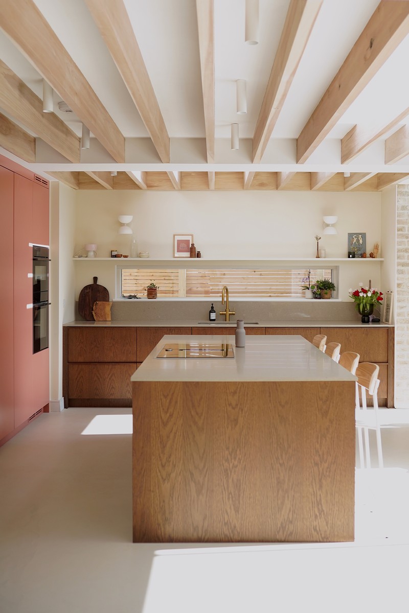
Colour Drenching
This works brilliantly in snugs, bedrooms, bathrooms and studies, where painting every surface in the same colour blurs the boundaries of the room. I always say to my clients, if you are going for a mid or darker tone colour, take it onto the ceiling – it really makes a statement.
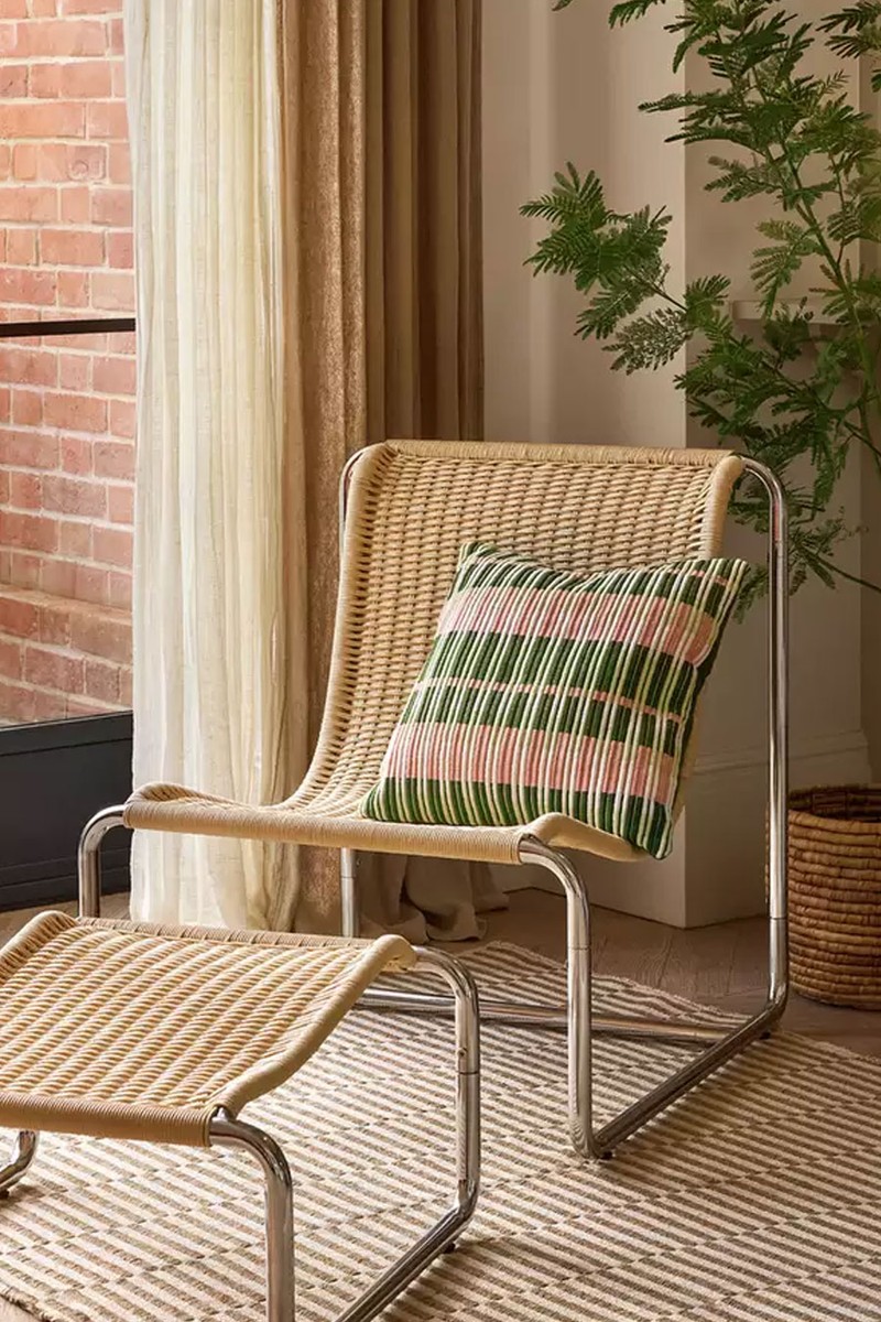
Hello Chrome
While this isn’t a colour trend, it is influencing the colours we’re choosing. For the last few years, we’ve been obsessed with brass, but now it’s the combination of cool metals, like chrome and stainless steel, with warmer tones that works. If everything in a room was cool, it would be too cold, but pairing chrome and steel with a colour like the purple we created for Dumbo House New York, or a brown, makes it fashionable.
How To Introduce A Trend
I tell clients to start with Pinterest but don’t get obsessed with it. Look at your edit and start understanding what it is you like – perhaps every image has a red sofa, or the same colour on the walls? Once you’ve unlocked what you like, come back and decide what you want to achieve in your own home.
Paint is the easiest way to change up a room – if you don’t have a big budget, the paint will do a lot of the hard work. The colour is the easy bit. It’s the tone that matters, so you need to think about the light. If you want to keep it light, go for a light colour, but bring in something stronger with the furniture. In a darker room, go for a mid tone. Don’t fight it, lean into it. I don’t think it matters what tone you have and what direction the room faces – the only exception is a north-facing room, where you should avoid a grey or blue base. It will feel too cold because we live in the northern hemisphere, so go for a blue with a yellow undertone instead.
Accessories make all the difference. For example, rugs are a great way to bring in colour and pattern, and in any room, go as big as you can. It’s also a great way to hide a horrible floor. You can change your hardware – let’s say you change it to chrome – and then add your statement chair from the high street or Facebook Marketplace. Finally, keep your artwork if you can – it’s important to have pieces that follow you through your life.
Visit LICK.COM
Or continue to comment as a Guest below
DISCLAIMER: We endeavour to always credit the correct original source of every image we use. If you think a credit may be incorrect, please contact us at info@sheerluxe.com.
/https%3A%2F%2Fsheerluxe.com%2Fsites%2Fsheerluxe%2Ffiles%2Fwebsite-images%2F2025%2F03%2Fsign-up-pop-up.jpg)
