
How To Get The ‘Kitschen’ Look
Start With Traditional Units
“Traditional shaker-style kitchens are incredibly timeless and work with a majority of home styles. They’re versatile, warm, welcoming and often feel very familiar, which makes them a really appealing option. As the cabinetry does not have any decorative features (other than handles), it means there is nothing which will date. How you finish the shaker kitchen is what makes it feel more up to date.” – Sarah Stemp, founder, Sascal Studio
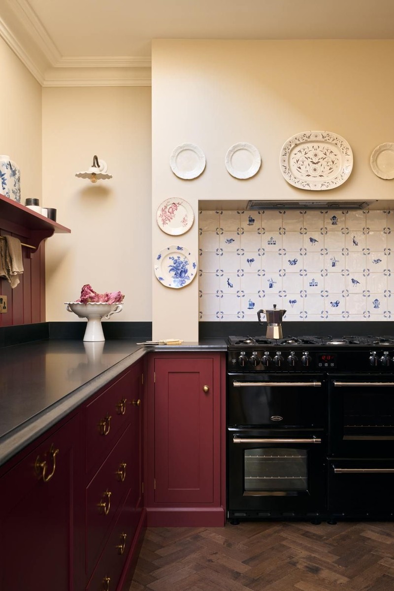
“Traditional elements, such as classic cabinetry and timeless materials, evoke a sense of comfort. This helps create inviting, lived-in spaces that prioritise character and personal touch. We find that incorporating contemporary elements such as marble countertops, modern appliances and more unusual cabinetry colours bring a new feel to a traditional kitchen. In a recent kitchen, we balanced classic features with modern details such as open shelves and statement lighting. Combining different textures and materials ensures that, while the overall design remains traditional, it still feels fresh and current.” – Angelica Squire, co-founder & creative director of Studio Squire


Add Decorative Lighting
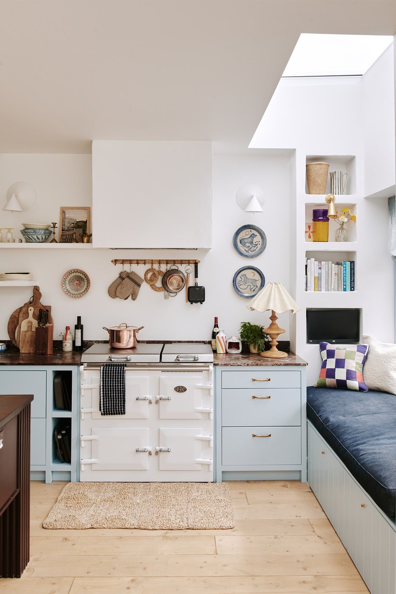
“Interesting lighting can definitely make spaces feel more welcoming. Incorporating a vintage wall light or an interesting ceramic lamp with a gathered lampshade can make a huge impact.” – Sarah


Use Pretty Patterns
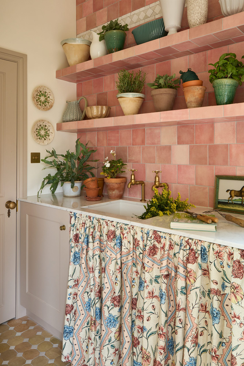
“Patterned fabrics tend to be saved for ‘softer’ rooms like living rooms and bedrooms, as there’s not always an obvious place to use them in kitchens. We do, however, always try to incorporate some sort of patterned fabric into our kitchen designs, as it can really soften the space and break up the block colours of the cabinets and worktops. Recently, we found a lovely multicoloured patterned cloth fabric which worked so well with the scheme that we decided to use it for the pendant light lampshades above the kitchen island. Likewise, we used a dark red and white checked fabric as the bar stool cushions to add interest and cosiness – pattern can really help make functional spaces feel like cosy living spaces.” – Sarah


Inject Bold Colour
“We love using warm, vibrant, and earthy colours in kitchens – deep yellows, olive greens, terracottas – as we find they create very inviting spaces. Kitchens are the heart of the home and using cheerful colours is how you make spaces feel uplifting. We tend to go more neutral on the walls to create a soft and clean backdrop, and inject colour through the cabinetry – in a recent kitchen we used Farrow & Ball’s ‘Pointing’ on the walls and Devol’s ‘Scullery Yellow’ on the cabinetry.” – Sarah
“In a recent project, we used a deep burgundy for the cabinetry to add depth and elegance, making the space feel warm and welcoming but still sophisticated. When using deep colours, it is a good idea to complement them with neutral tones and natural materials – like the marble and wood used here.” – Angelica


Caitlin Rounds Antiques,

Invest In Accessories
“Unlike accessories for other rooms, which tend to be more decorative, accessories in kitchens need to be both decorative and super functional as they’ll get used almost every day. We encourage our clients to splurge on kitchen accessories – whether it’s a beautiful fruit bowl for the kitchen island which could double up as a serving dish or a striking pepper mill. We actually created our own collection of stripy wooden salt and pepper mills as we found it very hard to find a stylish one we liked.” – Sarah
“Having open shelving, artwork and softer window treatments help finish the space. The open shelves can also be a nice place to add a small painting or decorative vase to break up the room’s formality. The accents of the brass fittings are small but beautiful details that attract the eye and give a cohesive finish.” – Angelica


Incorporate Artwork & Antiques
“The easiest way to incorporate vintage/antique pieces is through artwork. Propping up an antique piece of art on an open shelf alongside more typically functional items really elevates a space and adds interest.” – Sarah
“Open shelving is a great platform for showcasing an ever-changing display of collected pieces, sentimental items and vintage finds. Look out for interesting plateware, vases and even small sculptural pieces that can be displayed among your more everyday items.” – Angelica


Visit SASCALSTUDIO.COM & STUDIOSQUIRE.CO.UK
Inspiration credits: @LUCYWILLIAMS02; @LAURASTEPHENSID
DISCLAIMER: We endeavour to always credit the correct original source of every image we use. If you think a credit may be incorrect, please contact us at info@sheerluxe.com.

/https%3A%2F%2Fsheerluxe.com%2Fsites%2Fsheerluxe%2Ffiles%2Farticles%2F2024%2F09%2Fsl040924-kitchen-trend-watch-lights2.png)

/https%3A%2F%2Fsheerluxe.com%2Fsites%2Fsheerluxe%2Ffiles%2Farticles%2F2024%2F09%2Fstudio-squre-photo-credit-geordie-barrie.png)

/https%3A%2F%2Fsheerluxe.com%2Fsites%2Fsheerluxe%2Ffiles%2Farticles%2F2024%2F09%2Ftrend-watch-antiques.png)

