How To Use Tongue & Groove
It’s Equally Traditional & Contemporary
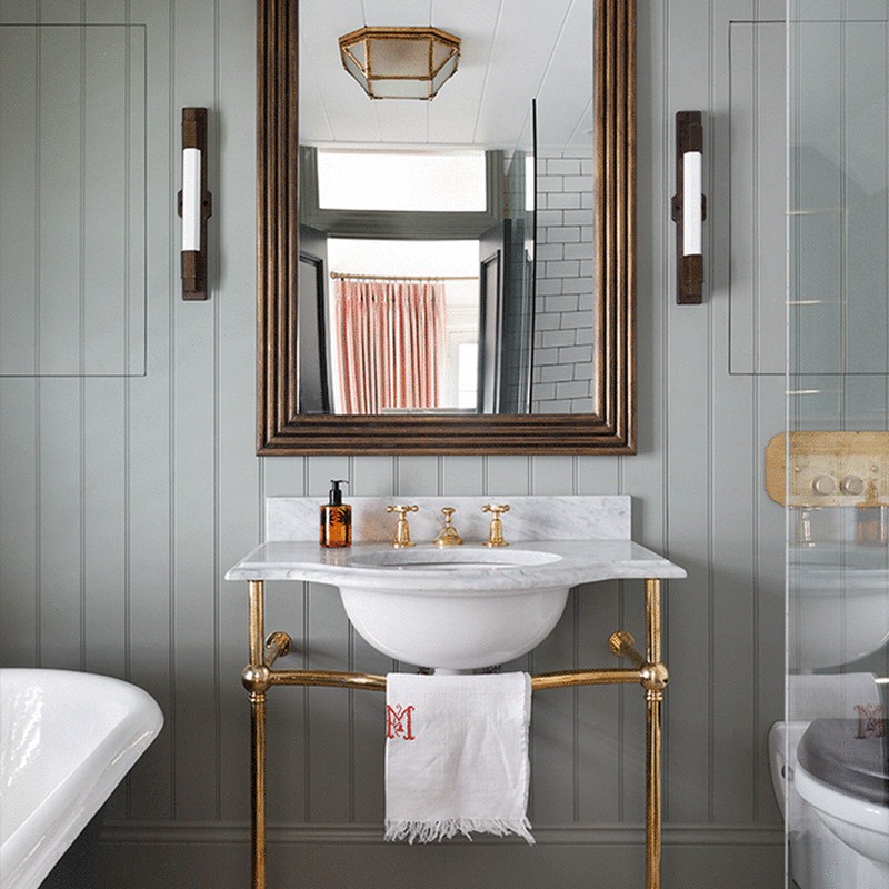
A tongue and groove finish on walls is a traditional look that’s been popular in country homes for centuries, but these days, interiors experts agree it can be successfully incorporated into contemporary settings, too. “This style of panelling is a lovely way to add an element of country style into both city and country homes,” says interior designer Emma Sims Hilditch. It works well in new properties, too, as Kate Cox from Ham Interiors explains: “We use this effect a lot in new build properties where inherent character may be lacking. It can be playful, contemporary or traditional depending on how it’s used. In a contemporary setting, we’ll often use a wider board, for instance a 300mm wide, which offers a cleaner, calmer feel. The colour also plays an important part in the overall feel; in more contemporary schemes we tend to use a calmer palette which then flows throughout the property.”
It Offers Versatility
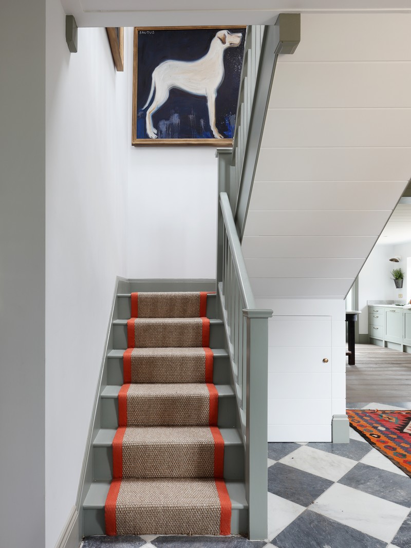
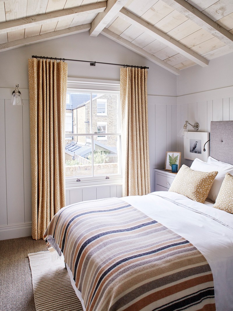
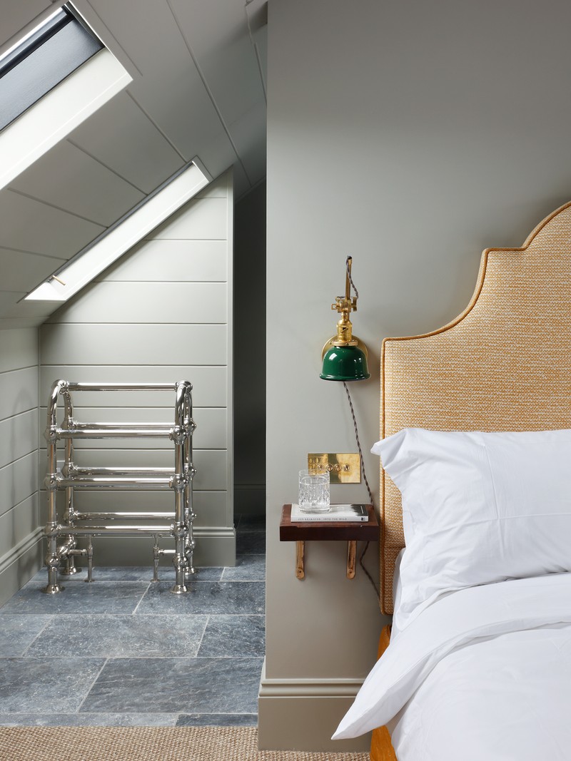
Designers love to use tongue and groove in kitchens, bathrooms, boot rooms and pantries, and it also works well in children’s rooms and hallways. Kate, however, prefers to use it unexpectedly. “We use tongue and groove in a variety of ways, however one particular place we love to use it is on ceilings – the forgotten fifth wall. In loft spaces where the ceiling height and shape is somewhat compromised, using tongue and groove panelling can create a great atmosphere in an awkward space.” It’s also an interesting way to decorate awkward corners which have been converted to storage space in order to incorporate it into the rest of the design, says Emma. For example, the triangle between the top of a wardrobe and a sloping ceiling.
For Texture & Interest
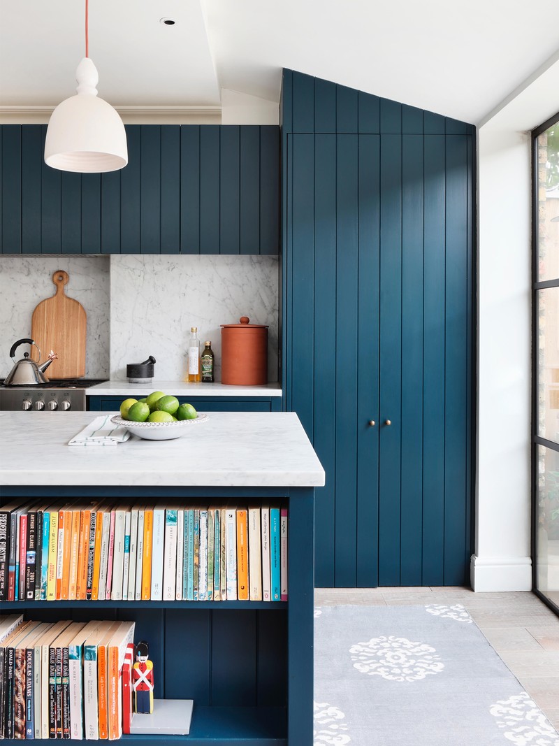
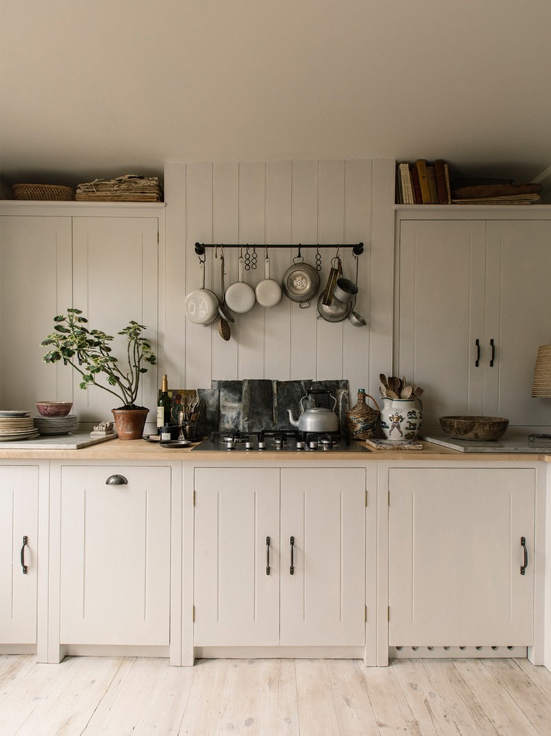
Kitchen brand British Standard by Plain English have noticed more of its customers are including tongue and groove panelling in their kitchens than ever before – “the natural and tactile design helps to achieve a cheerful splashback, elegant seating area or adds drama to a room when used right up to the ceiling,” says design director Merlin Wright. It also offers a surprisingly adaptable finish, despite its linear design. “We use it in a variety of ways – rough boarding can give even more texture and works well in character properties, while a neater, finer board width can offer an elegant feel in London properties,” explains Kate. “We recently created a tongue and groove effect from old scaffolding boards in our design studio, a look that is both industrial and rustic all at once, and one that’s well-suited to a large warehouse space.”
There Are No Set Rules
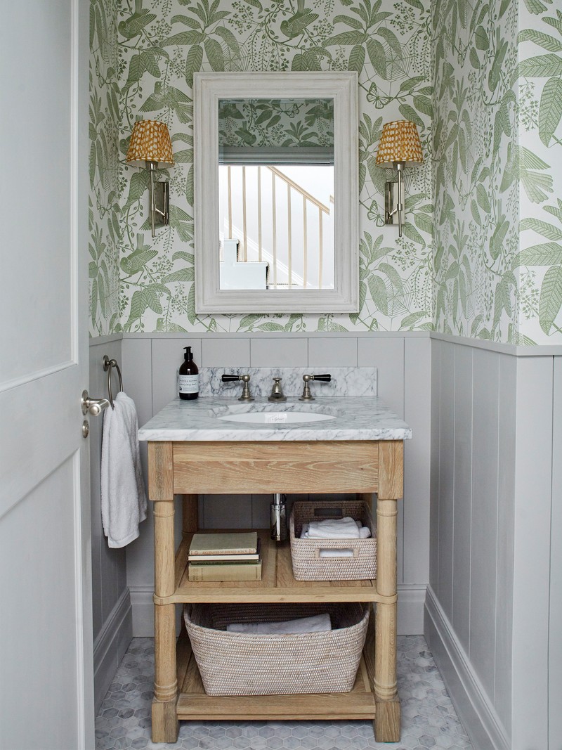
Whether you go full- or half-height depends on the look you want to achieve and how you finish it. “For a traditional look, you might consider installing floor-to-ceiling tongue and groove panelling in a bedroom, bathroom or cloakroom, or to create an attractive ‘modern country’ contrast, you might pair half-height panels with fun, patterned wallpaper,” explains Emma. But proportions do still need some consideration – ideally a third (to a dado rail) or two thirds (to a picture rail or shelf) as this looks better, explains Jon Madeley of The English Panelling Company. “Halfway up or full-height in bathrooms is the exception to this rule as a third rarely works with bathroom fittings. Full height makes a great statement and can give the illusion of higher ceilings if they are low.”
This Easy Cheat Is Worth It
Tongue and groove joints allow two flat pieces of wood to be joined together to make a single flat surface, which can then be used on a wall, floor or ceiling. The English Panelling Company can do the hard work for you, creating a ‘butt and bead’ effect on MDF boards to mimic the look. “MDF panelling can considerably enhance the interest of the even most boring of spaces, plus it’s easy to do and costs a fraction of the price of traditional wood panelling. Yet, it looks almost identical once painted. And, of course, the advantage over expensive real wood panelling, apart from the fact that it won’t warp or shrink, is that you can change the colour if you want a quick update.”
Imperfections Are Covered
“Tongue and groove panelling is an ideal way to disguise a less than perfect wall, as it’s a solid board, so it will cover any uneven/cracked surfaces,” Jon continues. “The wall should be reasonably sound, however, and free from any serious damp issues. It can also be put onto battens to create wiring/plumbing ducts behind it, and fixed directly to masonry to avoid the need to plaster.” MDF panelling can be tackled by a handyman or anyone with reasonable DIY skills – you don’t need to use a highly skilled carpenter. Traditionally Eggshell looks best on woodwork but a matte emulsion can also look very smart.
INSPIRATION CREDITS: Ham Interiors
DISCLAIMER: We endeavour to always credit the correct original source of every image we use. If you think a credit may be incorrect, please contact us at info@sheerluxe.com.
