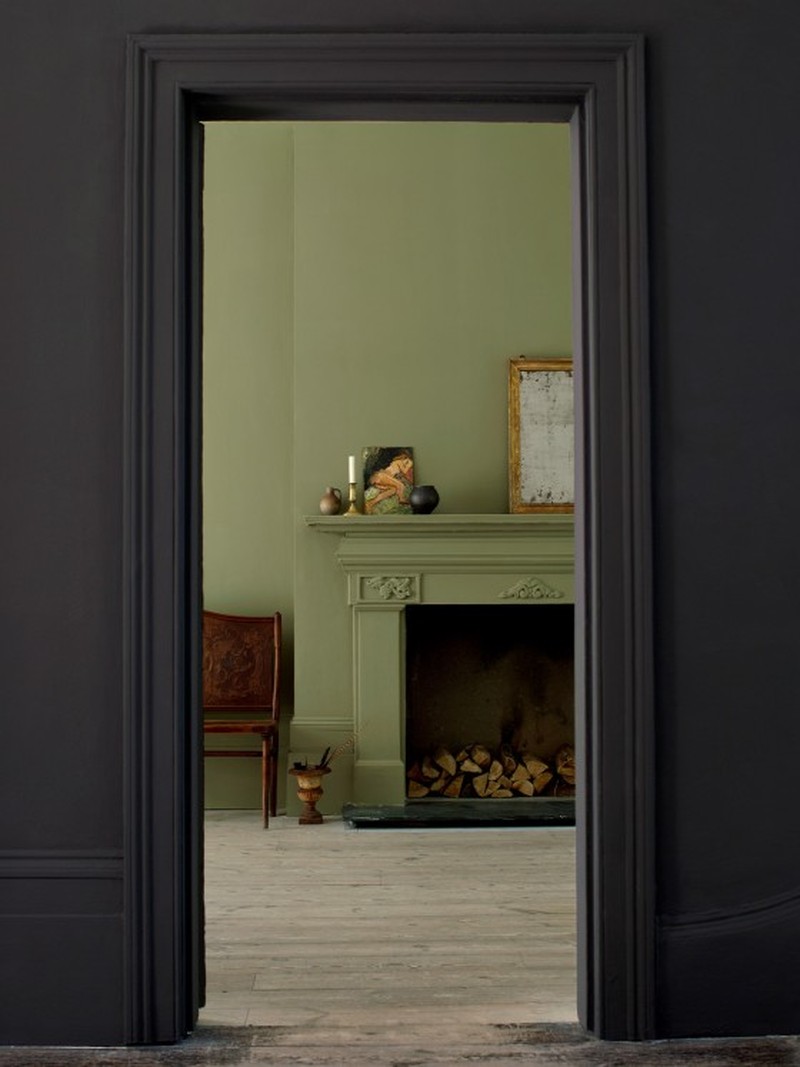
How & Why You Should Be Decorating With Dark & Earthy Colours
How Would You Describe These Kinds Of Colours?
“I like to think of them as ‘human’ colours. At Atelier Ellis, we intentionally use an umber base with a variety of natural pigments to make our colours, and it creates a much more nuanced and balanced end result. It also means you use a larger variety of pigments to create a ‘dirtier’ hue, which in turn makes them more special.” – Cassandra Ellis, founder of Atelier Ellis
“The Americans call earth ‘dirt’, and sludge is ultimately wet earth, and from the earth we harvest key pigments that underpin the tones that we tend to associate as sludgy, earthy and dirty – these being red, yellow ochre and black.” – Edward Bulmer, founder of Edward Bulmer Natural Paint
Why Are They So Popular?
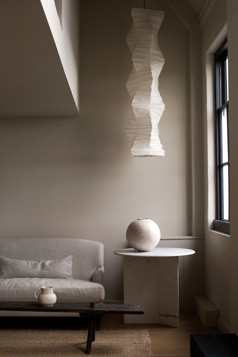
“They’re easier to live with, both visually and emotionally. They look and feel like nature – real living resources rather than manufactured palettes. Colours are often tied to whatever is happening in the world, and when the world is in chaos, we feel a need to balance our own lives with simplicity. It doesn’t have to be white – it just needs to feel real and human.” – Cassandra
“One reason may be that they can work especially well in smaller, darker rooms. But whatever the size of room or period of the property, every good colour needs a dash of these pigments. Through the ages, people have come to understand this and we’ve actually used these sorts of colours for a very long time – not least because the pigments are cheap and readily available.” – Edward

Are They More Accessible For People Who Are Nervous About Using Colour?
“They may feel more approachable – and familiar. That’s why you can look at our palette and immediately feel comfortable. Frankly, I can’t imagine choosing colours any other way.” – Cassandra
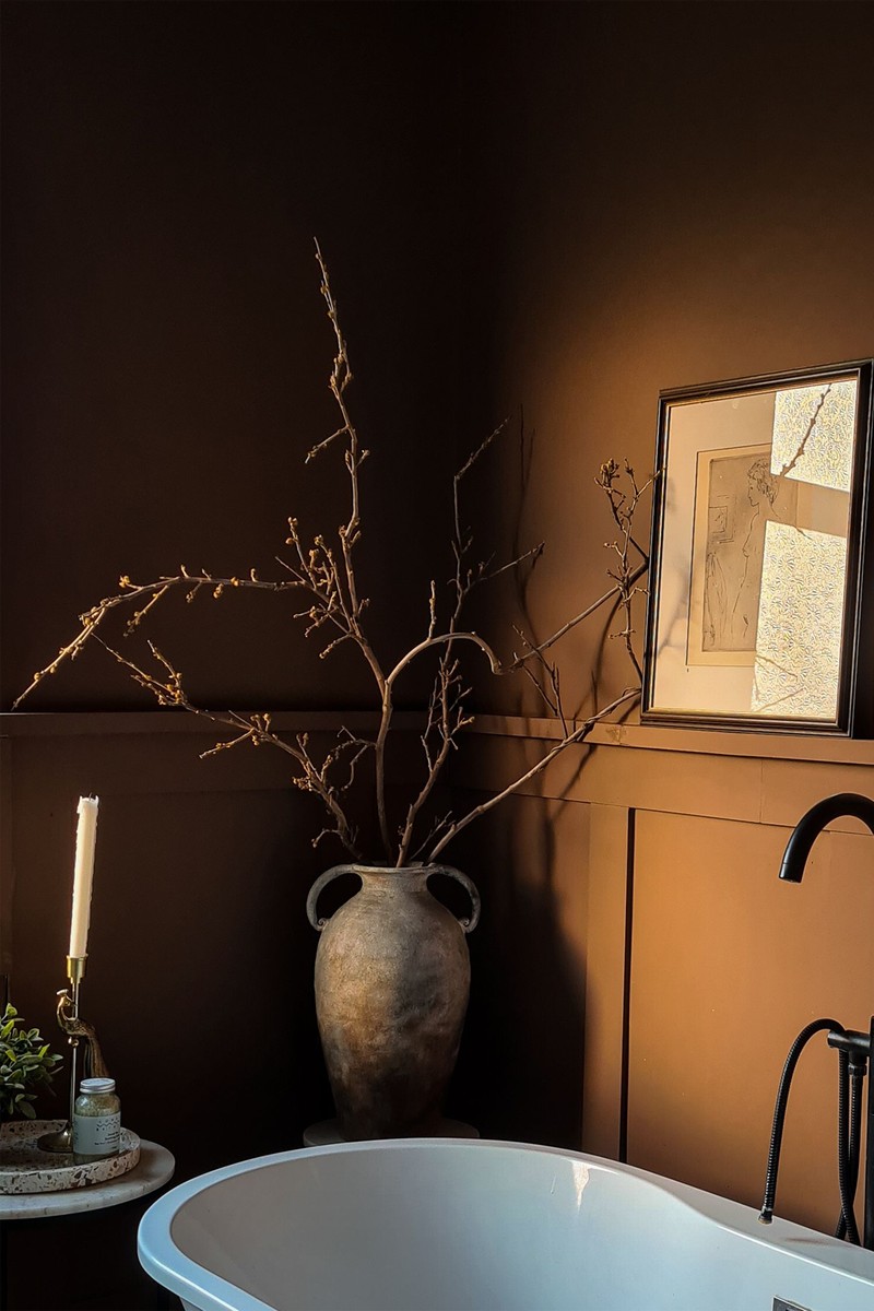
“Colours such as these are both underpinning and grounding; they reassure you but are also capable of creating modern interiors with more intrigue and drama. The fact that all our paints are made from earth and mineral pigments, as well as plant-based binders, gives the wall colours a superior level of refraction, so the ‘dirty’ colours come alive instead of looking flat or lacklustre.” – Edward
How Would You Advise Using These Colours?
“Try not to brighten spaces devoid of natural light with lighter colours, as they will just end up looking grey and dull. Instead, these warmer, earthier colours will create proper ambience, ooze sophistication, and they’re even capable of dressing a room with some kind of artificial light.”– Edward
WHAT PAIRINGS WORK BEST?
According to Cassandra:

Cotta & Cedric

Tea & Toast & Amrita’s Green
Tea & Toast is a hug – it would be perfect in a kitchen with Amrita’s Green on the kitchen cabinetry. It has a wide variety of earth pigments in it, so it works perfectly in a room where you prepare and enjoy food.

Cass & Aged Black
A classic pairing, Cass is a fantastically elegant neutral to use anywhere you like, and Aged Black is our favourite dark neutral. In our old apartment, we painted our living room in Cass, with Aged Black on the windows.
According to Edward:

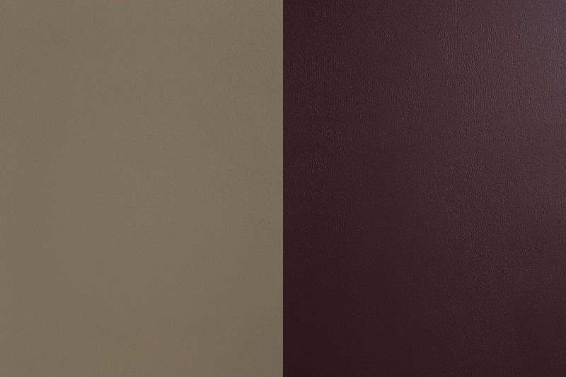
Drab Green & Aquatic
Drab Green is a dirty brown/green shade but it's actually far from drab! It pairs beautifully with Aquatic – a combination that's guaranteed to bring sophistication to your space.

Mummy & Cerullian Blue
Mummy is a unique khaki brown with some serious weight to it. It carries blue/green tones within it that sit naturally alongside some of our earthier blues like Cerullian Blue. Great for adding a bit of drama.

Flaxen Grey & Etruscan Brown
A grey like Flaxen Grey pairs perfectly with other pigment rich shades like Etruscan Brown. This grey and red-brown combination evokes hues of nature in the greys of stone and reds of clay.

Visit AtelierEllis.co.uk and EdwardBulmerPaint.co.uk.
DISCLAIMER: We endeavour to always credit the correct original source of every image we use. If you think a credit may be incorrect, please contact us at info@sheerluxe.com.
/https%3A%2F%2Fsheerluxe.com%2Fsites%2Fsheerluxe%2Ffiles%2Fwebsite-images%2F2025%2F03%2Fsign-up-pop-up.jpg)
