A Chelsea Townhouse With A Clever Layout
The Property
On Cadogan Street in Chelsea – just a few minutes’ walk from Sloane Square – this five-bedroom home is set across five storeys. In the basement, there’s a guest bedroom with an en-suite, a cloakroom, utility and a cinema room. On the ground floor there’s a study, open-plan kitchen, and a dining and living space, which spills out onto the external courtyard. On the first floor you’ll find a more formal living space and a double bedroom with a large en-suite bathroom. The main bedroom comes with a dressing room and bathroom that spans the entire second floor, while on the third, there are two further bedrooms with a Jack and Jill bathroom. This was the first redevelopment project my husband Sol and I took on as part of Fiona Barratt Projects, and the renovations were completed in spring of this year.
The Brief
Originally, the property was a dentist’s studio and individual flats above. Over the course of a year, we renovated the entire building to turn it back into one home. We carried out a lot of structural work – restoring the façade but then demolishing and reconfiguring a lot of the internal structures. We widened the entrance hall, extended out the back and added a skylight to the guest bedroom to let in more natural light. I prefer ‘broken plan’ rather than fully ‘open plan’, and I wanted to create a central hub – but one that was cleverly divided so different members of a family could use it flexibly.
Overall, we wanted to create a home that balanced aesthetics with functionality, using luxurious artisan finishes to create a sumptuous and welcoming atmosphere. As a mother of four, I understand a house needs to function and be very adaptable, while also being a beautiful space to live in. We chose quite a neutral colour palette to make it feel light and airy. This was offset by statement pieces from my own furniture collection, FBC London. Texture, colour and contrasting materials all combine to add depth and definition to an otherwise neutral backdrop. We also worked with specialist wall finishes and bespoke wallpapers to add more interest.
The Kitchen
This bespoke kitchen revolved around the marble. We sourced a striking Calacatta Viola from Italy for the kitchen island, the worktop and the splashback – so it is really the centrepiece of the space. The specific type of polish also means it’s more resistant to stains and marking. The kitchen has an incredible amount of storage, with many of the spacious, deep drawers concealed by the sleek cabinetry and hidden finger pulls. We wanted to soften the space and used very neutral, warm tones for the cabinetry and open shelving, as well as on the upholstery of our Edesia bar stools. The floor is a light timber in a chevron pattern, which also has underfloor heating.

/https%3A%2F%2Fsheerluxe.com%2Fsites%2Fsheerluxe%2Ffiles%2Farticles%2F2022%2F08%2Fsl150822-fiona-barratt-campbell-contentmain-2.jpg)
The Snug & Dining Room
Here, we wanted to create two separate spaces that still felt connected. The furniture was chosen carefully, as we had to account for the scale and size. I chose a banquette for one side of the dining table and chairs on the other so they could be easily moved, and the space opened up if needed. The dining chairs are Fiona Carver and the sofa is Pax.


The Hallway
We widened the hallway to create a more welcoming feel. Choosing the artwork was something we really enjoyed – for the whole house, but especially the hallway. It’s all about that first impression. We worked with a local art curator and chose two statement pieces. My favourite is the large Moroccan tapestry by textile studio LRNCE TEXTILE, which is based in Marrakech. The Byethorne wall sconces from our new collection feature brass surrounds with recycled glass.

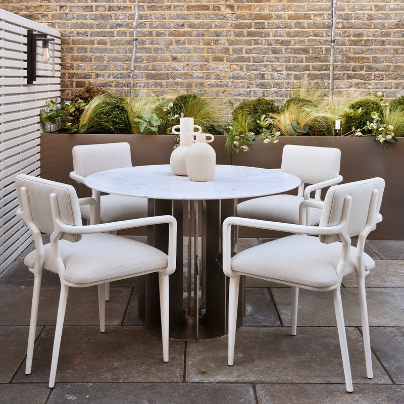
The Garden
We wanted the courtyard garden to feel like an extension to the house and to have a Mediterranean aesthetic. I love the contrast between the white walls, fencing and the brick wall – it gives the courtyard a fresh and summery feel even when the sun isn’t out. Almost all of the furniture came from my recent outdoor collection, including the sofa, the dining table and the dining chairs. Most of our outdoor pieces are upholstered in white and other neutral colours to make the space feel fresh.
/https%3A%2F%2Fsheerluxe.com%2Fsites%2Fsheerluxe%2Ffiles%2Farticles%2F2022%2F08%2Fsl150822-fiona-barratt-campbell-contentmain-6.jpg)
The Drawing Room
This is the more formal entertaining space – it also pays homage to the original layout of the house as this is where the formal drawing room would have been. I love the floor-to-ceiling sash windows. Again, the colour palette is pretty neutral, but we wanted to create one textured statement wall – the bespoke wall covering is made of moulded plaster and that’s our Aspectu mirror. It’s one of my favourite pieces and is made from layers of a semi-reflective transparent mirror with a scattering of gold leaf. It’s attached by a bronze planished rod, which adds a more industrial feel.
We designed bespoke joinery for this room and chose open shelving so the clients could display their family photos and other pieces. The accent chairs are Angelina armchairs – I chose the fabric, which has a beautiful luminescent, almost golden sheen and sits so well against the more neutral tones in the room. They’re such a focal point but still sit well alongside our London sofa. There are a lot of curved lines in this room, as we wanted to soften some of the harsh angles. Finally, our Byethorne chandelier has a simple metal circular frame interspersed with a combination of white onyx and handcrafted bubbled glass.
/https%3A%2F%2Fsheerluxe.com%2Fsites%2Fsheerluxe%2Ffiles%2Farticles%2F2022%2F08%2Fsl150822-fiona-barratt-campbell-contentmain-7.jpg)
The Upstairs Guest Bedroom
We added a very large skylight to this room to flood it with natural light. The oversized headboard is upholstered, and the two mounted lights come in a hammered metal which acts as a great contrast. There’s also a built-in vanity area and a marble-clad en-suite.
/https%3A%2F%2Fsheerluxe.com%2Fsites%2Fsheerluxe%2Ffiles%2Farticles%2F2022%2F08%2Fsl150822-fiona-barratt-campbell-contentmain-8.jpg)
The Main Bedroom
The second floor is given over to the master suite – including a bedroom, connecting dressing room and a large bathroom. I created a bespoke wall covering for the bedroom to add a sense of softness and luxury. This is our Byethorne bed and the matching wall pendant lights hang on either side. The built-in storage is all bespoke, although the handcrafted natural silky oak veneer is a signature of the Byethorne collection. We then applied a whitewash over the top to emphasise the smooth rippling waves in the wood.


Further Bedrooms
On the fifth floor there are two bedrooms – one double and one twin – with a Jack and Jill interconnecting bathroom. There is a real cosiness up here, as we’re in the eaves of the house. The colour palette is neutral again, but we chose some colourful artwork and accessories, including these ceramic table lamps from Tyson London.
The Upstairs Bathroom
I had a monochromatic vision for the bathrooms, so we sourced quite a bold marble with strong veining in predominantly white, black and grey. This is offset by the white bath and the accessories.

The Basement Guest Bedroom
On the lower ground floor, we created an additional bedroom with its own bathroom, utility room and a small kitchenette. This space has its own entrance so it can be used as an annexe – perhaps for guests or lodgers. I sourced a few interesting pieces for this space, including a lovely chair from Eicholtz and a floor lamp from Jim Lawrence.
/https%3A%2F%2Fsheerluxe.com%2Fsites%2Fsheerluxe%2Ffiles%2Farticles%2F2022%2F08%2Fsl150822-fiona-barratt-campbell-contentmain-12.jpg)
The Cinema Room
This is one of the only rooms where we worked with a darker colour palette. We wanted to create a space that enveloped you – the darker walls and flooring create a real cocooning effect. We also went for bespoke joinery, so the room had plenty of storage, while the bespoke banquette connects the two cupboards and adds extra seating.
DISCLAIMER: We endeavour to always credit the correct original source of every image we use. If you think a credit may be incorrect, please contact us at info@sheerluxe.com.
/https%3A%2F%2Fsheerluxe.com%2Fsites%2Fsheerluxe%2Ffiles%2Fwebsite-images%2F2025%2F03%2Fsign-up-pop-up.jpg)
