How This Designer Injected Colour & Character Into This Family Home
The Property
This Victorian semi-detached house in west London was originally four bedrooms and two bathrooms, but we redesigned it to be five bedrooms and three bathrooms. The property was unloved, with limited character and no 'flow'. Following a big renovation and extension (including a total gutting of the house, new electrics and plumbing, kitchen, back and side extension, and a loft conversion), we reinstated a lot of the original features the previous owners had removed, including fireplaces, cornices and ceiling roses. We also took the lighting back to a more traditional look, with limited spotlights and more pendants, wall lights and lamps.
The Brief
The owners are a young family with two children, and they have international roots – the mother grew up in Kenya and the father in Australia. With family abroad, it was very important to the clients to create a UK base for their young children, with enough room for entertaining local friends and having overseas family stay. As they are both from sunnier climes, they were keen to embrace some of the colours, textures and patterns that reflected their upbringings.
The main aesthetic is a traditional one, overlayed with contemporary fabric and wallpaper designs in strong colours – you’ll see lot of greens, earthly pink tones and blues flowing through the house. The furniture is traditional, but up to date and we also sourced a lot of antique items before having them reupholstered. They give the house that lived-in family feel as opposed to turning it into a show home. With young children in tow, the house had to function on a practical level. We spent a long time thinking about the flow of the house and how to open up the space.


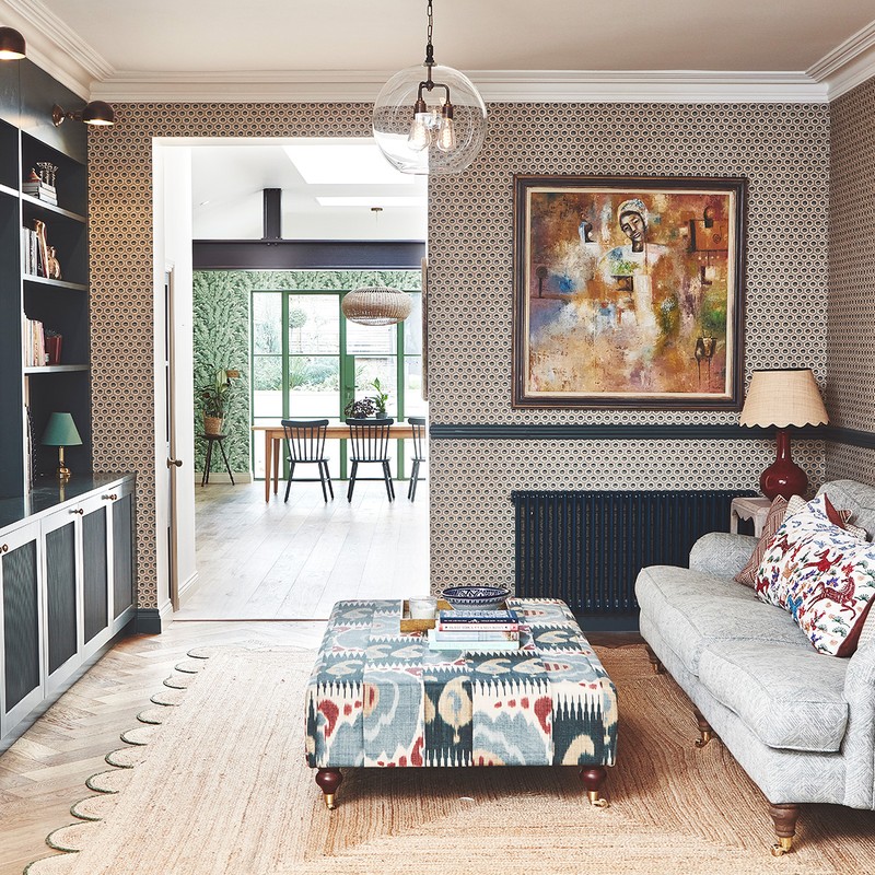
The Living Room
This was designated to be a grown-up space, so we used Farrow & Ball’s ‘Joa’s White’ as the base, with earthy greens and pops of pink. There are lots of lighting layers, from the ceiling (Fritz Fryer) to wall lights (Pooky and Alice Palmer shades) and lamps (Porta Romano and vintage). We also used a mix of textures and patterns, including statement chairs in Linwood Palmette, with a tropical palm pattern, Blithfield cushions and a Christopher Farr cloth footstool – all inspired by the Kenyan forest and the green tones in the oil painting above the fireplace.
/https%3A%2F%2Fsheerluxe.com%2Fsites%2Fsheerluxe%2Ffiles%2Farticles%2F2022%2F12%2F1living-room-and-snug.png)
The Snug
This room was always going to be dark, as it’s in the middle of the house, so we embraced that by marrying Robert Kime Sunburst Wallpaper with Farrow & Ball's ‘Inchyra Blue’ on the joinery and woodwork. To give the space a more traditional feel, we opted for Mullan library-style wall lights over the cabinetry. The large bespoke footstool, covered in Lewis & Wood ‘Kimono’, pulls in the colours from the room and acts as a centrepiece.
/https%3A%2F%2Fsheerluxe.com%2Fsites%2Fsheerluxe%2Ffiles%2Farticles%2F2022%2F12%2Fkitchen.png)
The Kitchen
We knew this space needed to work hard – and it does. The bright green Crittal doors were the starting point; the clients requested them right at the beginning. The DeVol kitchen is painted in Bake House Green and the brass accents work well with the green and Carrara marble surfaces. As the family doesn’t have a separate dining room, we wanted to section off the dining area and create a garden room feel with the Cole & Son foliage wallpaper and Soho Home rattan pendant.
/https%3A%2F%2Fsheerluxe.com%2Fsites%2Fsheerluxe%2Ffiles%2Farticles%2F2022%2F12%2Fmain-bedroom.png)
The Main Bedroom And Ensuite
This space was designed to be its only little world away from the children. Everything stemmed from Edward Bulmer's ‘Clove’ which is on the bathroom walls. This soft earthy pink, is interesting, but also provides a great base for the raspberry red accents in the bedroom. From the Guy Goodfellow striped curtains to the punchy Lee Jofa modern floral pattern on the giant super-king headboard, it’s a room that celebrates colour and pattern without feeling too busy. The joinery blends in with the wall and, to add an extra layer of texture, we papered grasscloth onto the wardrobe panels. For the window treatment, the Catchpole & Rye fixtures and fittings in an unlacquered brass felt natural and understated, working perfectly with the wall colour and natural marbles.


The Guest Room
This bedroom is intended to act as a home away from home for the family’s overseas guests. A calm relaxing space away from the family noise, it’s painted in Little Green's ‘Bone China Blue’ – the soft tone is the perfect base for the pretty, sophisticated fabrics we used elsewhere. The en-suite, in contrast, is painted in Edward Bulmer's ‘Etruscan Brown’, which is warm, inviting and really pops against the blue. The wicker stool is a real find from a Kempton antiques market.
The Kids’ Bathroom
In this bathroom, we went for Bert & May tiles because they’re always fun, then we tucked the bath into the eaves to save on space.


The Boy’s Room
The Robert Kime ‘Galaxy’ wallpaper was our starting point here. Fun, but not too childish – ready for when the clients’ sons grow up – it was matched with Oval Room Blue on the tongue-and-groove joinery.
The Girl’s Room
The architect created a great little nook which, from the start, we wanted to turn into a mini dressing room for the clients’ daughter. She wanted pink in her room, so we opted for Farrow & Ball ‘Setting Plaster’ as it’s not too sugary and she’ll hopefully continue to like it as she gets older. The scalloped curtain pelmet is the best bit about this room – it’s so pretty.


Visit PollyAshman.com @pollyashman_design
Photography by Malcolm Menzies, @82mmPhotography.
DISCLAIMER: We endeavour to always credit the correct original source of every image we use. If you think a credit may be incorrect, please contact us at info@sheerluxe.com.
/https%3A%2F%2Fsheerluxe.com%2Fsites%2Fsheerluxe%2Ffiles%2Fwebsite-images%2F2025%2F03%2Fsign-up-pop-up.jpg)
