A Look Around An Innovative Family Home
The Property
This Edwardian villa in Essex is home to a family with three young boys. There are five bedrooms and three bathrooms, with a main living space consisting of four reception rooms as well as a large open-plan kitchen, living, dining area. There’s also a gym, a sauna and an outdoor pool and pool house.
The Brief
The property needed modernising. While it had wonderful proportions in the front two living rooms and entrance hallway, the couple wanted to extend it to create more communal living space for their growing family. We doubled the size of downstairs and extended into the loft space. We also built a new garage and a dressing room above it. The building work created more reception rooms downstairs as well, which allowed for a very large open-plan extension across the whole back of the house – plus, additional reception rooms for a playroom, gym, sauna and large pantry. In the loft, we added a large bedroom, bathroom and storage area.
There’s a real mix of contemporary and more traditional elements in the design. We weren’t afraid to embrace bold colours in some rooms, but equally allowed for more delicate choices and softer tones in others. Morris & Co wallpaper sits comfortably next to contemporary furniture design from Pinch and artisan lighting from Naomi Paul. A statement cast-iron basin next to the terrazzo flooring works well in the bathroom. In the open-plan living area, modern poured concrete flooring and glass doors create a great backdrop for the iconic Mario Bellini sofa, which blends beautifully with the traditional, bespoke crafted kitchen.


Kitchen & Living Room
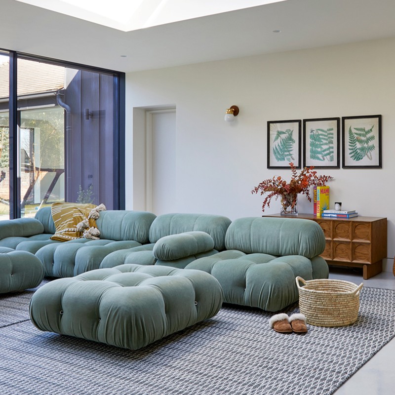
The new extension spans the entire back of the property and down one side. We kept the front reception rooms quite traditional in style and layout but decided to go contemporary here. Floor-to-ceiling sliding doors wrap around the whole extension, and large roof lights flood the space with airiness. The starting point was the floor. We looked at several options but went for poured concrete to give it a seamless feel. Along with the modern glazing, this acted as a wonderful base layer, while a modern fireplace links the areas together, and large rugs and oversized planting add instant warmth. When deciding on a kitchen style, we opted for a mix of wood and painted wood. The artisan design instantly makes the space feel welcoming. Finally, a large walk-in pantry provides an enviable amount of floor-to-ceiling storage.
/https%3A%2F%2Fsheerluxe.com%2Fsites%2Fsheerluxe%2Ffiles%2Farticles%2F2022%2F05%2Ffiona-duke-230522-living-area.jpg)
Playroom
We wanted a dedicated playroom to house lots of toys and games. We toyed with the idea of adding a sliding door to this room but decided to leave it as is. It enables the children to feel as if they are very much in the open living area, but still in their own space. The steps leading up into this room are a great way to zone this area, while the mustard stripe wallpaper gives it a personality.

Boot Room
This room needed to work hard. Maximum storage was a priority and it needed to be hardwearing, too. We chose the terracotta hexagon tiles, as they're a good rustic base layer and you don't need to be too precious about them. We then installed a full wall of bespoke storage so that each child has his own place for school bags, shoes, coats etc. The remaining walls were clad in tongue-and-groove panelling and painted in a deep blue tone, ready to take any scuffs and bumps along the way.
Utility Room
This was originally going to be a room off the main entrance hallway, but we made the decision to use a wooden partition to zone the space instead. This gives it a unique feel and creates a much better walkway through to the boot room. We colour-drenched the entire space in a soft blush tone, leaving only the mid to top part of the room more neutral. Bespoke joinery throughout gives it an artisan feel, while the terracotta hexagonal flooring is both practical and beautiful.


Hallway
The starting point for this area was the vintage chandelier from Pure White Lines. It's a fantastic statement piece. We knew we didn’t need storage because we were able to create a small cloakroom to the side, just near the downstairs cloakroom. This meant we could leave everything quite minimal and allow the artwork and lighting to steal focus. It also allows for a wonderful view of the open-plan living area to the back of the house as you walk through the front door.
/https%3A%2F%2Fsheerluxe.com%2Fsites%2Fsheerluxe%2Ffiles%2Farticles%2F2022%2F05%2Ffiona-duke-230522-hallway-01.jpg)
Living Room
The large bay window is a real feature in this room and gathered headers for the window dressing worked well to give a more relaxed feel. Initially, we considered removing the fire surround but we then realised it was marble! We carefully removed layer after layer of paint and exposed the gorgeous dark marble which worked so well with the wooden flooring. Careless Whispers by Benjamin Moore on the walls softened the dark marble and dark flooring, and the large corner sofa is perfect for a large family.


Main Bedroom
The dark wooden flooring guided the choice of a large dark sleigh bed. Conscious that these were quite heavy in tone, we wanted to lift the walls and felt this Morris & Co wallpaper design did the trick. Despite being quite a busy design, it feels really calming and refreshing en masse. Gathered heading on the window dressing gives a light, relaxed feel and prevents it all feeling too 'serious'. The beautiful Pinch armchair covered in Rose Uniacke velvet sits majestically in the bay window, while Naomi Paul's artisan lighting hangs effortlessly in the centre.

Dressing Room
The dark wooden flooring continues from the landing through to the dressing room. We really wanted to use a deep dark red, so Sang de Boeuf from Edward Bulmer was the starting point for the design. Open bespoke wardrobes and storage fills one side of the room, but still left enough space to accommodate a vintage dressing table and stool by the tall windows, which are dressed in handcrafted linen. Vintage lighting and a bespoke floral ottoman add a little luxury to the space.
En-Suite Bathroom
The clients wanted a large walk-in shower and freestanding bath, as well as a statement American-style trough cast-iron basin. The taps were also really important, and we had seen some we liked but they weren’t available in the preferred brass finish. In the end, we sourced the ones we wanted in a different finish and used a specialist to strip them back before treating them. There was quite a lot of work involved, but it was worth it. Delicate vintage pendant lights worked well with the basin and behind the mirrors are two good-sized kitchen carcass units, which brilliantly hide all the bathroom clutter. We used a bespoke vintage lace to dress the windows, terrazzo tiles for the flooring and deep green metro tiles for the walls. The latter pulled everything together.
/https%3A%2F%2Fsheerluxe.com%2Fsites%2Fsheerluxe%2Ffiles%2Farticles%2F2022%2F05%2Ffiona-duke-230522-dressing-room-ensuite.jpg)
First Children's Room
The treehouse bed was the genesis for this concept design and it was something the child really wanted. The soft green tone sits nicely against the dark green of the walls. We used a lot of dark wooden flooring in this renovation, but for the children's bedrooms, we decided carpet was a little kinder for playing. Striped curtains dress the large windows in this bedroom and a yellow accent on the woodwork adds interest.


Second Children's Room
This was the bedroom for the youngest member of the family. We wanted an element of fun but nothing he would grow out of too quickly. The dinosaur wallpaper from Sian Zeng matched the brief as its vintage style doesn't feel too 'nursery'. Soft green was used on all the woodwork, and we continued this to the top walls and ceiling, so it all felt seamless. A rattan pendant shade adds a little more texture, and the light grey curved bed can expand as he grows.

Family Bathroom
A bathroom was essential for the boys but we also wanted a large walk-in shower so it would work as they grew up. The client wanted it to feel as designed as the other rooms, but it also had to be practical. The green and cream floor tiles were where we started. The beautiful encaustic flooring laid in herringbone was a great central feature and it instantly brought a 'fun' element into the room. Given the flooring was quite strong, we kept the rest of the design relatively muted, which allowed the artwork, rattan furniture and curved oversized basin to shine.
Visit FionaDukeInteriors.com
Photography by Anna Stathaki
DISCLAIMER: We endeavour to always credit the correct original source of every image we use. If you think a credit may be incorrect, please contact us at info@sheerluxe.com.
/https%3A%2F%2Fsheerluxe.com%2Fsites%2Fsheerluxe%2Ffiles%2Fwebsite-images%2F2025%2F03%2Fsign-up-pop-up.jpg)
