

Take A Tour Of This Bright & Bold Seaside Home
All products on this page have been selected by our editorial team, however we may make commission on some products.
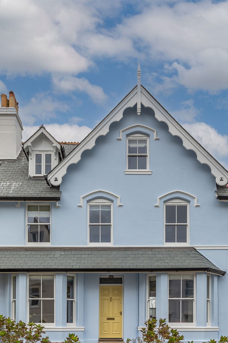
The Property
My clients bought this Victorian townhouse in Salcombe on the Devon coast as a family home for themselves and their two children – they got married in Salcombe and it holds a special place in their hearts.
The Brief
My brief was to design the ground and top floors, including the kitchen, living room, pantry, utility room, main bedroom and a bathroom. We wanted to transform the house to create a versatile space that was practical for family life. It needed to cater for their children and their dog, so the design had to be functional and fun. We wanted to create a space where they could entertain easily – they tend to have lots of people wanting to come and stay – and I can see why, it’s in a stunning location with an amazing view down the creek.
The owners love colour, and they wanted to take a playful approach to the interiors. I’m so grateful to them for trusting me with colour. The blue woodwork on the glazed doors on the ground floor makes a real statement. Again, the bright blue panelling (paired on the top floor with a yellow and white striped sofa) is a brave, bold choice.
The clients and I share a love of antiques so, from the outset, mixing old and new was going to be key. Together, we sourced antique lighting and furniture, such as the pendant in the living room and the dining table. It’s nice to have subtle nods to the seaside location, such as the coral tiles above the aga, and I also designed a bespoke wavy ottoman for the living room.
The Renovation
Spatial planning was key to getting the best out of the light and space on the ground floor, and exploring the potential of reconfiguring the space. The kitchen and living room were originally divided by a dark, narrow corridor that not only wasted valuable floor space but also blocked natural light. By removing the wall between the kitchen and living room, and installing new wooden and glass partition doors, we created a bright, open area perfect for entertaining when the doors are open, while still allowing for privacy and quiet when they were closed.
During the renovation, the roof was retiled and insulated, and all 22 of the wooden sash windows were replaced – one of which was a floor-to-ceiling picture window incorporated into the design of the main bedroom to highlight the views out to the sea and beyond.
TAKE THE TOUR
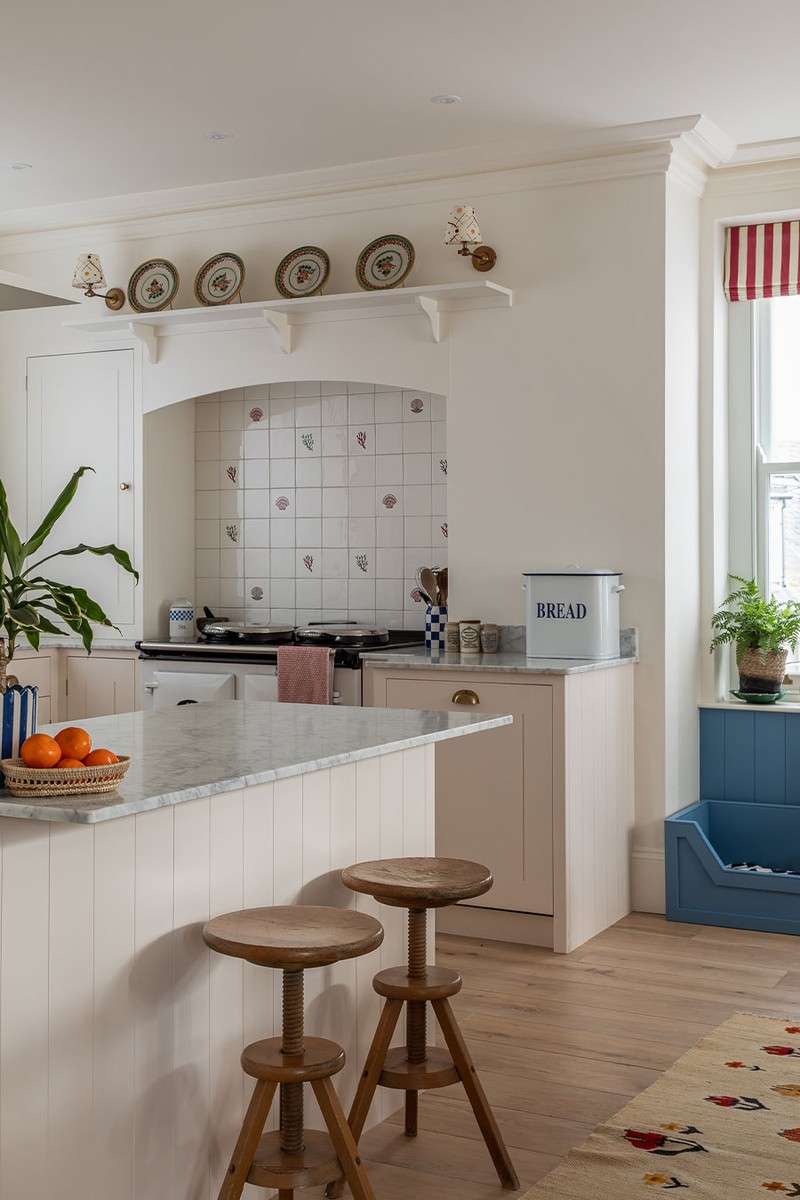
The Kitchen
The kitchen layout was completely redesigned and the original kitchen door blocked up and replaced with a run of units. We sourced marble for the worktops and decided on a white Aga for practicality. I wanted to incorporate some signature stripes (as I do in all my projects) but particularly in this one as a nod to the seaside. The client chose pink for the units and the contrasting blue for the pantry ties nicely into the living room doors.
Kitchen: Plain English
Cupboards: painted in Tailor Tack, Farrow & Ball
Marble: Bristol Marble
Taps: deVOL
Sink: Shaws
Tiles above Aga: Balineum
Lights: Pooky
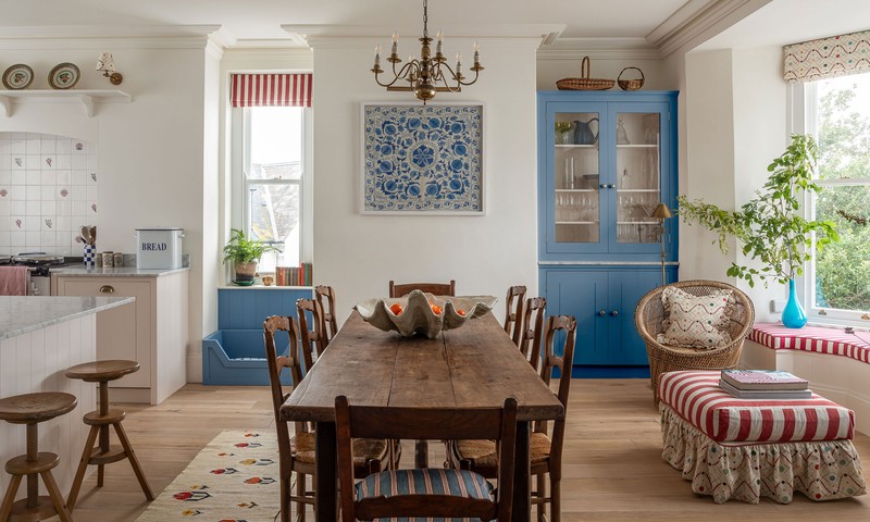
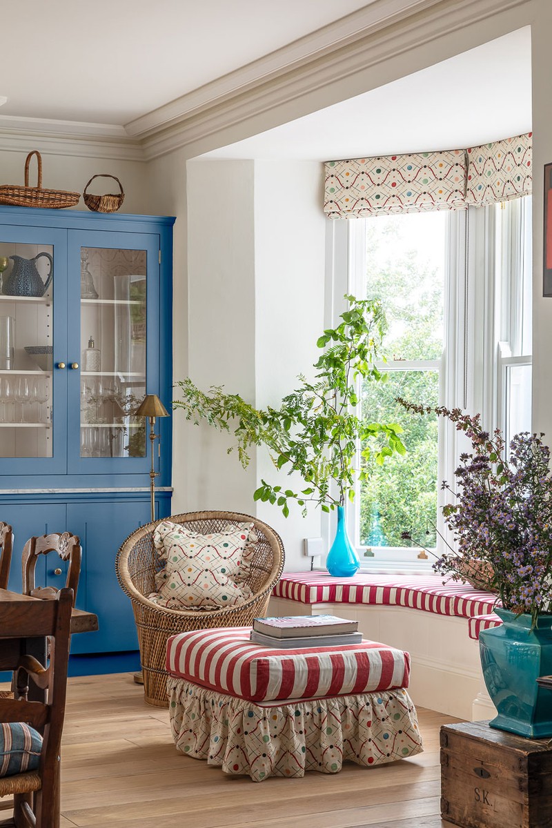
The Dining Room
The antique table was sourced locally with the client and really pulls the room together. The window seat area is a lovely place to look out through the new south-facing bay windows. The light in this room opens it all up and makes a huge difference to the feel of the space.
Rug: Swedish antique, Natalia Violet Antiques
Antique dining table: Mark Davis Antiques
Dresser units: Plain English
Painted in Cook’s Blue, Farrow & Ball
Ottoman & window sea fabric: Flora Soames & Ottoline
Blinds: Flora Soames
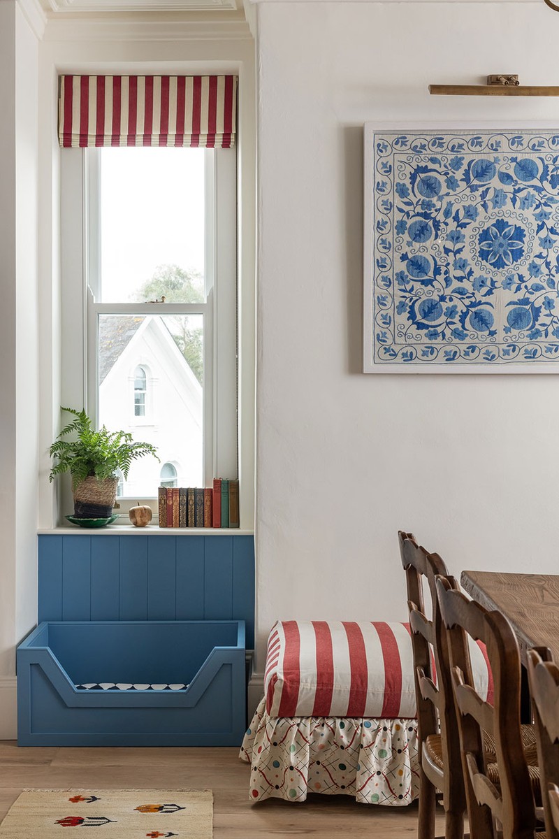
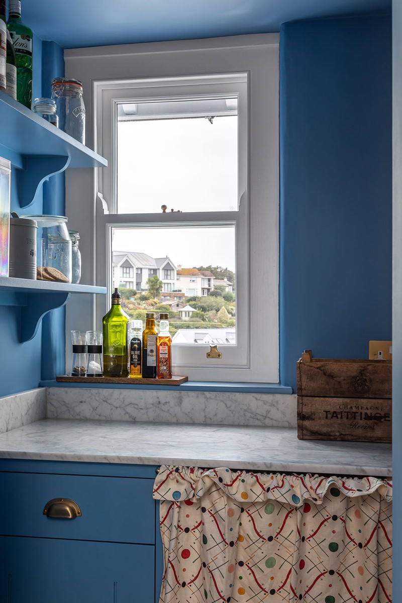
The Pantry
Shelves were installed with a marble top and a cheerful undercounter curtain to cover the white goods. The flooring is all reclaimed – we went for something that wasn’t too dark to keep the light in the room. The coral tiles are a subtle nod to the seaside location.
Units: painted in Cook’s Blue, Farrow & Ball
Tiles: Balineum
Fabric Skirt: Ottoline
Marble: Bristol Marble
The Living Room
The joinery on either side of the fireplace was the starting point for this scheme, which is painted in the same colour as the doors and the dresser. The contrast against the pink walls really makes this room special. The bespoke ottoman is a central feature, as is the painting by a local artist. Antiques line the shelves from auctions and flea markets. In this project, we bought pre-loved as much as we could to be sustainable – and the family’s favourite chair was reupholstered to give it a new lease of life.
Ottoman: designed by Sarah Southwell, fabric Ian Mankin Ticking
Mirror & Chandelier: antique
Wall lights: Pooky
Fabric: Ottoline
Rug: Dunelm
Sofa: Ikea in Bemz cover
Painting: Greg Ramsden at Tonic Gallery
/https%3A%2F%2Fsheerluxe.com%2Fsites%2Fsheerluxe%2Ffiles%2Farticles%2F2025%2F01%2Fsl-sarah-southwell-interirors-sitting-room.jpg)
The Utility Room
We took out a shower and put in units to fill the space but also provide lots of storage. I added a bit of fun with the warm yellow paint, Mr Men fabric and wallpaper, and the sweet lampshades that will brighten up any dull laundry day.
Marble: Bristol Marble
Fabric Skirt: 36 Bourne Street
Units: painted in Dayroom Yellow, Farrow & Ball
Taps: deVOL
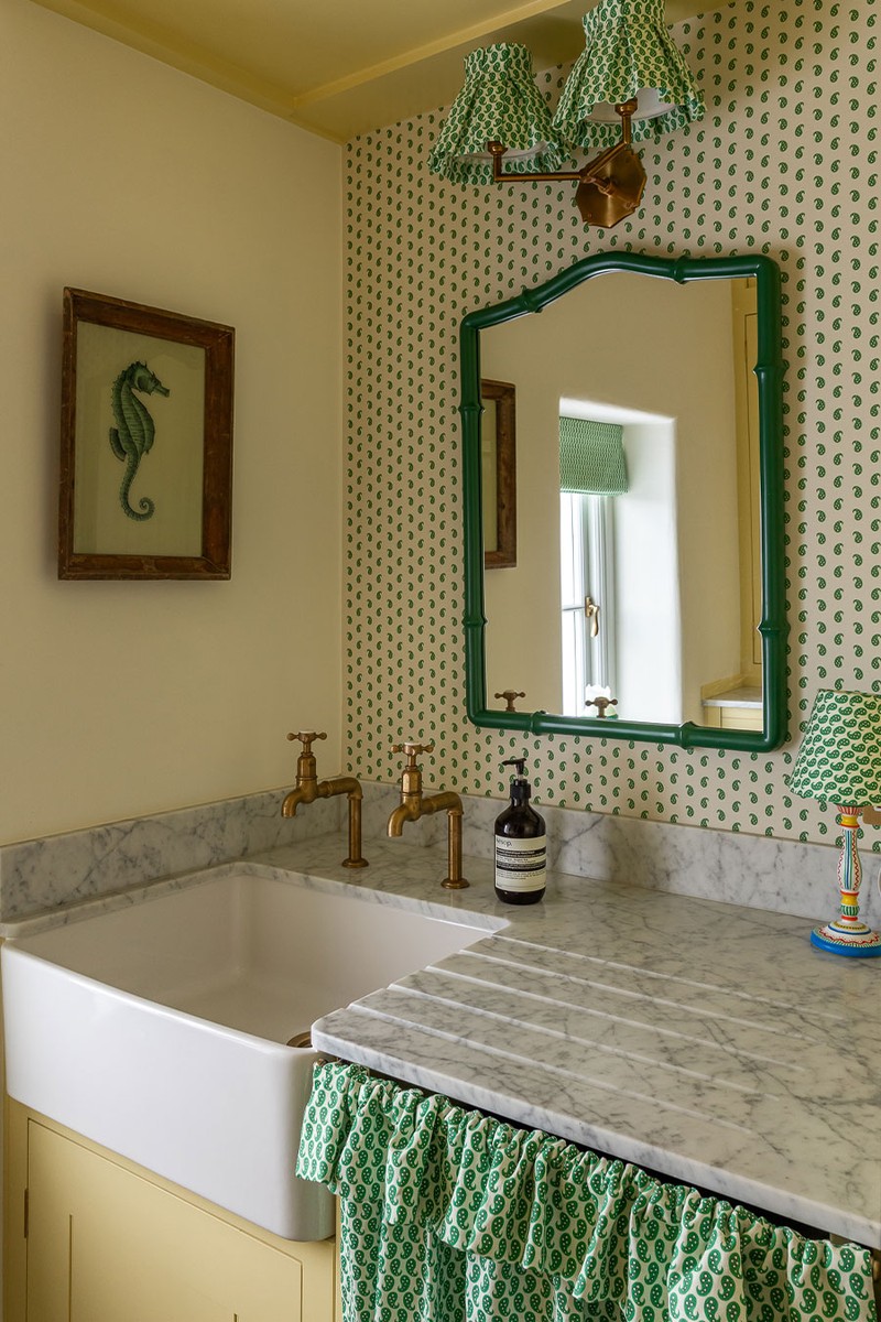
The Cloakroom
The cloakroom continues the ‘fun’ theme through the choice of wall lights and wallpaper – plus, a painting sourced in a French flea market.
Wallpaper: Pierre Frey
Mirror: Anthropologie
Sink: Burlington
The Main Bedroom
The starting point here was the picture window and the pattern used on the fabric and wallpaper. The panelling is painted in a blue that matches the headboard and wallpaper on the wardrobe inserts and lampshade. The yellow striped sofa against the cobalt panelling is one of my favourite colour contrasts in the whole project. The antiques also blend seamlessly with the bold colour and pattern to ground the room.
Panelling: painted in Pea Flower Tea, Farrow & Ball
Antique wing chair: re-upholstered in fabric, Colours of Arley
Rug: Anthropologie
Fabric on Headboard & wallpaper: Pierre Frey
/https%3A%2F%2Fsheerluxe.com%2Fsites%2Fsheerluxe%2Ffiles%2Farticles%2F2025%2F01%2Fsl-sarah-southwell-interirors-main-bedroom-fb.jpg)
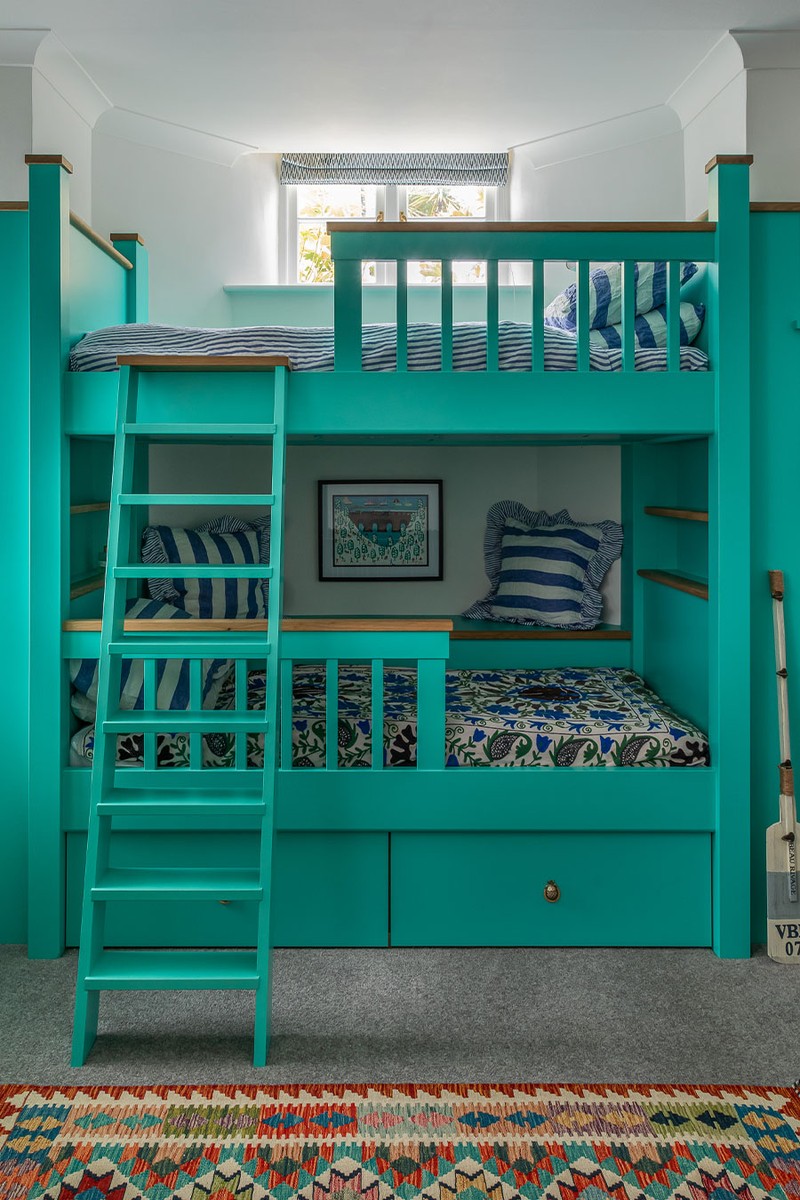
The Kids’ Room
The joinery in this room was already here and we brought it to life with this bold colour choice. By adding lots of patterned cushions, deckchair-inspired bedding and some accessories, including an oar and a giant seashell, we definitely embraced a seaside theme.
Bed: painted in Giddy Green, Protek
Cushions and bed linen: Secret Linen Store
Antique suzani on the bed: Make
Visit SARAHSOUTHWELLDESIGN.COM & follow @SARAHSOUTHWELLDESIGN
Photography: Jonathan Bond
Or continue to comment as a Guest below
DISCLAIMER: We endeavour to always credit the correct original source of every image we use. If you think a credit may be incorrect, please contact us at info@sheerluxe.com.
/https%3A%2F%2Fsheerluxe.com%2Fsites%2Fsheerluxe%2Ffiles%2Fwebsite-images%2F2025%2F03%2Fsign-up-pop-up.jpg)
