Take a Look Around This Hard-Working Family Home
The Property
This Edwardian terraced house in Putney was originally split over three floors with four bedrooms. The owners – who have four children aged 12, seven, three, and six months plus a dog – moved into the house a few years earlier from a smaller flat, and this was to become their long-term family home.
One of the principal improvements was around the ground-floor layout and what to do with the often tricky and dark ‘middle room’. We ended up dividing the space into three. To the front of the house, the living room was increased into part of it, and a separate TV area created with a custom-fitted L-shaped sofa under a dropped ceiling with library-style joinery installed around the rest of the room. To the rear, the space was divided again into a new ground-floor loo accessed from the hall, and a fully equipped utility accessed from the kitchen behind. The old doorway into the middle room, rather than being sealed off, was made into a shallow storage bookcase for keys, letters, charging phones and other everyday items.
The ground floor now has an entrance hall, living room, WC, coat storage, kitchen, dining room, family area, and utility. The first floor has three bedrooms (one single teenage room, one twin bedroom and one nursery/study/guest bedroom) and a family bathroom. A new half landing has a study and wardrobe area, and the top floor has the master bedroom and shower room.
The Brief
The aim was to create a vibrant home for a growing family in need of inventive solutions to maximise the comfort, practicality and potential of the house. With a large young family, we needed to avoid the house being bland with spaces that would be restricted in use. That’s why every room has a specific daily function with clever storage in every possible nook and cranny – you can find it in an old doorway, underneath the built-in sofa, hidden behind jib doors on the landings, tucked behind the master bedroom headboard, and full height in the utility, with higher storage accessed by a ladder on a rail.
Certain rooms have become multifunctional too, particularly the nursery-cum-home office and guest bedroom. I like to give every room its own story, so each one is designed for a specific reason with furniture layout and colour palette chosen specifically. All the rooms feel different, with bold colour schemes paired with the wallpaper chosen for the bedrooms and the living room. The areas that tie the whole house together are the staircase and landings, which are pared back but still with their own design elements to make them stand out.
/https%3A%2F%2Fsheerluxe.com%2Fsites%2Fsheerluxe%2Ffiles%2Farticles%2F2023%2F03%2Fhenry-prideaux-west-london-terrace-living-room-2.png)
The Living Room
When I started on the project, the room felt poorly laid out with bad access around the furniture as you moved through the space. It was important to have a library element to the room, which is seen flanking the fireplace and either side of the double doors. These are symmetrical, creating a nice language with one another and zoning the front seating area of the room. The area at the back of the room is a dedicated TV space with comfortable lounge seating (storage underneath) but crucially can also join together with the front of the room when more people are using the space.
WALLS IN WALLPAPER: Altfield, Grasscloth, Vanilla Bean
FLOORING: Engineered European oak planks in ‘Nordic White’ from Ecohardwood Flooring
RUG: Scallop in Duck Egg by Jennifer Manners
SHELVING: Handmade Kitchens of Christchurch and then customised with ribbed timber door inserts and a raised parapet under the cornice for the addition of the picture lights, all painted in Paint and Paper Library, Steel V, 605 Architects Eggshell
MIRROR ABOVE FIREPLACE: Reid and Wright, ‘Decorated Orb’, with flat antique mirror glass, painted in Little Greene, Bronze Red
PENDANT LIGHT: Visual Comfort, Simple Scallop large hanging shade in soft brass with silk shade
WALL LIGHTS OVER BOKKCASES: Visual Comfort, Cabinet Maker’s picture light in hand rubbed antique brass
CHECK ARMCHAIR: Robert Langford, Lola chair, covered in Susie Atkinson, Checkerboard in Taupe
COFFEE TABLE: custom made travertine coffee table inspired by a vintage piece, available to buy from Henry Prideaux Interior Design
SOFA: David Seyfried Aubrey sofa, covered in Pierre Frey, Pampelune F3441012 Aqua, piped in Samuel and Sons 1/4” French piping
CURTAINS: Fermoie, Chiltern 18, with Harbour Linen Brush Fringe in Sail on leading edge, all handmade by Daniel James
CUSHIONS: Andrew Martin
/https%3A%2F%2Fsheerluxe.com%2Fsites%2Fsheerluxe%2Ffiles%2Farticles%2F2023%2F03%2Fsl-home-tour-tv-area.png)
The TV Area
The often dark and unused ‘middle room’ in these types of houses, this is the TV area. It creates a more cosy, separate space for watching TV while still being connected to the rest of the room by the same wallpaper and paint colour on the joinery.
CORNER SOFA: Custom made by WMPM with seat and back cushions made by KLS Interiors, all covered in Fermoie Abbey Stripe 009 and piped in Samuel and Sons 1/4” French piping.
CUSHIONS: Jennifer Manners and Andrew Martin
WALL LIGHTS ABOVE SEATING: Visual Comfort, French Cuff Sconce in soft brass with silk shade
OTTOMAN: David Seyfried, Oakley Stool covered in G P & J Baker, Ikat Bokhara in Sand
WALLl LIGHT ON SIDE OF BOOKSHELF: Visual Comfort, Fliana tail sconce in gild with linen shade
SMALL TABLE WITH PLANT: Robert Langford, Brockwell side table with rattan top
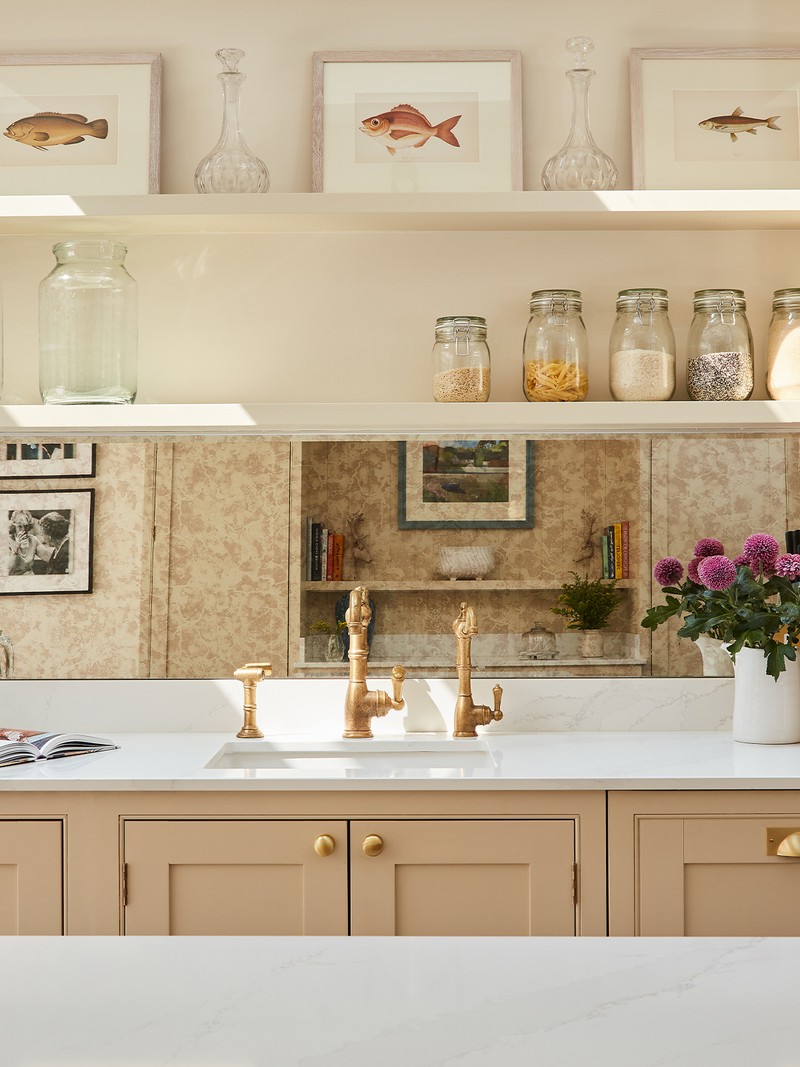
/https%3A%2F%2Fsheerluxe.com%2Fsites%2Fsheerluxe%2Ffiles%2Farticles%2F2023%2F03%2Fsl-home-tour-kitchen.png)
The Kitchen
For such a busy family, I wanted the kitchen to be a calm space, hence the more muted and natural tones with the flash of colour appearing on the island. Not wanting to lose any decorative element to the room, there are areas with open shelving for displaying dried goods and artwork, with additional high-level storage and a dedicated laundry space in the new utility tucked in the corner of the kitchen – a space again carved out of the old ‘middle room’.
WALLS: Little Greene, Stock 37, Intelligent matt emulsion
CABINETS: Handmade Kitchens of Christchurch painted in Little Greene, Travertine Mid 273, Intelligent eggshell
Splashback in antiqued mirror glass
FLOOR: Vetro Tiles, VT4839, Externo Beige
SINK: Caple Leesti 600 1.0 Bowl Chalk White Granite Undermount Kitchen Sink
TAP: Perrin & Rowe, Aquitaine
CEILING LIGHT: Visual Comfort, Darlana Medium Linear Lantern in Gilded Iron
TABLE: West Elm, Mid-Century Expandable Dining Table - Pebble
CHAIRS: Uish by Sklum
ISLAND UNIT: Painted in Farrow & Ball, India Yellow 66, estate eggshell
WORK SURFACE: Silestone, Eternal, Calacatta Gold Quartz worktop by GlobalTopz
SIDEBOARD: Graham and Green Momoka Carved Sideboard

The Landing
At the base of the stairs leading up to the top floor, the landing wasn’t large enough for a decent-sized piece of furniture – a writing table or seating corner, for example – but it did need something decorative in the area. The wall-mounted bracket adds that decorative flourish and doesn’t take up floor space, which is crucial for allowing free access around it. The horizontal line of the shelf helps to ground the painting in its space, provides space for a small lamp that can act as a nightlight outside the children’s bedrooms and has curved corners to make movement around it easier.
WALLS ABOVE DADO: Little Greene, Stock 37, Intelligent matt emulsion
WALL PANELLING BELOW DADO: Little Greene, Light Beauvais 323, Intelligent eggshell
LION WALL SCONCE: Bought on Etsy in raw timber and painted Little Greene, Stock 37, Intelligent matt emulsion
LIGHT ON SCONCE: Pooky with ikat shade from Pooky
/https%3A%2F%2Fsheerluxe.com%2Fsites%2Fsheerluxe%2Ffiles%2Farticles%2F2023%2F03%2Fhenry-prideaux-study-main.jpg)
The Study
This is the room that needed most thought to ensure it became a sanctuary for the couple. My task was to create the right design for an all-encompassing experience, and we found a wonderful William Morris scenic wallpaper with matching fabric. A secondary brief that it should be like Miss Marple’s study meant I often found myself asking what she, in particular, would like! When in use, the window seat has become a great space to lay out papers near the desk, and the open space for baskets below with shaped supports is great additional storage. We thought Miss Marple would likely have had an open fire in her work space. Because this was a brand-new room as part of the roof extension with no existing chimney breast, we created a fake one and installed a faux fireplace with mantlepiece that looks like it has been there for a long time. Combined with an antique desk and antique artworks, the whole room has become an immersive retreat.
WALLPAPER: Morris & Co, The Brook Linen, 214888
BLINDS: Morris & Co, The Brook Tapestry Linen, DCMF226708/C
SHEER BLIND BEHIND: GP&J Baker, Baker Lifestyle, PV1005 120, KELSO, Cream
BENCH: Fermoie, Tented Stripe 002
WALL LIGHT: Pooky, Elbow wall fitting in antiqued brass with 18cm pendant shade in Crimson Tulasi
DESK: Solid Mahogany William IV Writing Table by Mayer & Stephenson c.1830 sourced from The Old Cinema
CHAIR: David Seyfried, the Editor’s Chair (small), upholstered in George Spencer Design, Cosmos 389/06 khaki and trimmed in Samuel and Sons 1/4” French piping
DESK CHAIR: The Dormy House, Somersby Occasional Chair in Solid Ground with fabric seat cushion from Pierre Frey, Gordes, Padoue
FIREPLACE: Painted in Little Greene, Cordoba 277 with tiles by Balineum, Mottled Square 126 (S9), colour M8

The Landing
This space on the landing is ‘his’ dressing area, with a fitted wardrobe, hidden clothes storage in the wall behind a wallpapered jib door, and personalised artwork. The main feature is the red and brown striped paper that gives a more masculine feel. The paper is hung in such a location that it helps define this space as an additional room rather than part of the staircase which has its own separate colours.
/https%3A%2F%2Fsheerluxe.com%2Fsites%2Fsheerluxe%2Ffiles%2Farticles%2F2023%2F03%2Fhenry-prideaux-west-terrace-boys-bedroom.png)
The Boy’s Bedroom
I wanted to create a cosy nook for the eldest boy. In a small space, the best solution was a fitted wall of joinery including high-level shelf storage, a small wardrobe, and the bed all along one wall, leaving the rest of the room for a desk and chair. We lined the walls in a faux linen wallpaper to make it feel more grown up and framed some artwork of his favourite film and computer game characters.
WALLPAPER: Borastapeter, Linen, 4415, Swedish Grey
WALL AND JOINERY PAINTED IN: Little Greene, Juniper Ash 115, Intelligent Eggshell
HEADBOARD: Nile & York, Small Linen Prints, Track, Denim

The Guest Room
This room is a nursery, study and guest bedroom (using a sofa bed). We enlivened it with a lemon tree wallpaper the client fell in love with – and it works well in this multipurpose space.
SOFABED: Aissa from Sofa.com covered in Fermoie, Plash 003
CURTAINS: NH Design Midday Lace, 02, available at Jean Monro trimmed in Samuel And Sons Aurelia Fringe is Sage
WHITE BUREAU: Client’s own
LAMP: Rosanna Lonsdale, small bamboo lacquered lamp in burgundy with pleated silk lampshade in dusty pink
/https%3A%2F%2Fsheerluxe.com%2Fsites%2Fsheerluxe%2Ffiles%2Farticles%2F2023%2F03%2Fhenry-prideaux-west-london-terrace-twin-bedroom.png)
The Twin Bedroom
The aim here was to make a room filled with colour and interest for two young boys, but also one that would grow with them, with lots of dedicated clothes storage, end-of-bed benches to hide toys and games, and space to play in the middle of the room. The headboards each had a brush fringe applied to the rear as a decorative flourish, and each bed has a dedicated reading light and switch above the headboard. We inserted dinosaur wallpaper in the centre of the shaker wardrobe doors for a playful touch, and ensured the joinery had adjustable shelves and hanging rails.
WALLPAPER: Morris & Co, Honeycombe, cream/woad
BED HEADS: GP & J Baker, Mulberry Home, Racing Stripe FD788 G34, Denim, trimmed in Samuel and Sons, Paddington Wool Brush Fringe, Marakes
BEDLINEN AND BLANKETS: Sirimiri
TABLE LAMPS: Pooky Lillee table lamp in orange with 30cm straight empire shade in hand made marbled paper in golden piave
WALL LIGHTS: Jim Lawrence Club wall lights in antiqued brass
WALLPAPER: House of Hackney, Dinosauria in Ecru wallpaper
BLUE PAINT: Little Greene, Marine Blue 95 in Intelligent Eggshell
/https%3A%2F%2Fsheerluxe.com%2Fsites%2Fsheerluxe%2Ffiles%2Farticles%2F2023%2F03%2Fhenry-prideaux-master-bedroom-main.jpg)
The Main Bedroom
This room in the roof existed when the client moved in, but needed a refresh. A substantial change we made was adding a section of storage behind the headboard. This pushed the bed forward and, as it was under the eaves, allowed for a slightly higher headboard than previously. Thanks to wallpaper and curtains, and blind and bed valance used in the same pattern and colourway, it’s a calming and enveloping space. The bedsides add a flash of colour. Again because of the sloping eaves, the bedside lamps have to be quite short, but they add a useful glow at reading height.
WALLPAPER: Clovelly Cloth, Little Leaf, Blush 503/3
BEDHEAD: Robert Langford, Byrne headboard covered in Jane Churchill, J0110-01, soft pink
BEDSIDE CABINETS: Ceraudo Livia in Pomegranate
BEDSIDE LAMPS: Visual Comfort, Totie task lamp in hand rubbed antique brass
CHEST: Trove, Avalon, 3 drawer chest in Terracotta Army satin
MIRROR OVER CHEST: Large decorative handmade mirror from Henry Prideaux Interior Design
LAMP ON CHEST DRAWERS: Visual Comfort, Albie small desk lamp in new white with 14” lampshade in ecru figured from Fermoie
SMALL ARMCHAIR: Robert Langford, Joplin Occasional chair, covered in Ottoline Chintamani
For more visit HenryPrideaux.com
DISCLAIMER: We endeavour to always credit the correct original source of every image we use. If you think a credit may be incorrect, please contact us at info@sheerluxe.com.
/https%3A%2F%2Fsheerluxe.com%2Fsites%2Fsheerluxe%2Ffiles%2Fwebsite-images%2F2025%2F03%2Fsign-up-pop-up.jpg)
