Getting To Know Eadie and Crole
STYLE AND INSPIRATION
Our style is contemporary with a classic twist, or even classic with a contemporary twist! It depends on the architecture and the clients, but we prefer to keep things simple, creating layers without clutter.
Our design ethos is best described as timeless. We aim to create comfort and functionality and to be personal to the client, while also being sympathetic to the architecture of the building. It is so important to try and turn what the clients have in mind into reality and to work within any budget.
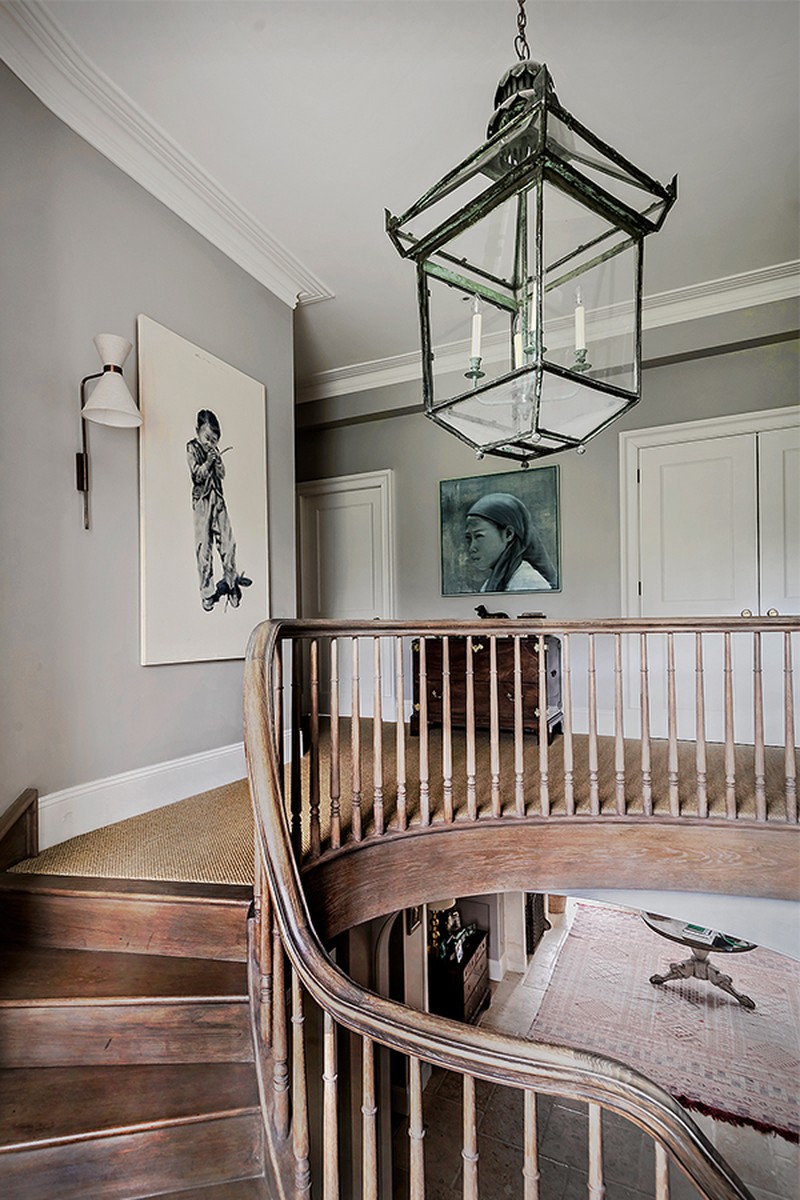
At the moment, we’re working on a Queen Anne country family house with original panelling and oak floorboards. The house has different levels which adds so much character. It's been a dream project, working with heavenly fabrics, clients and builders. The garden was designed by Arne Maynard to create different rooms within a walled garden.
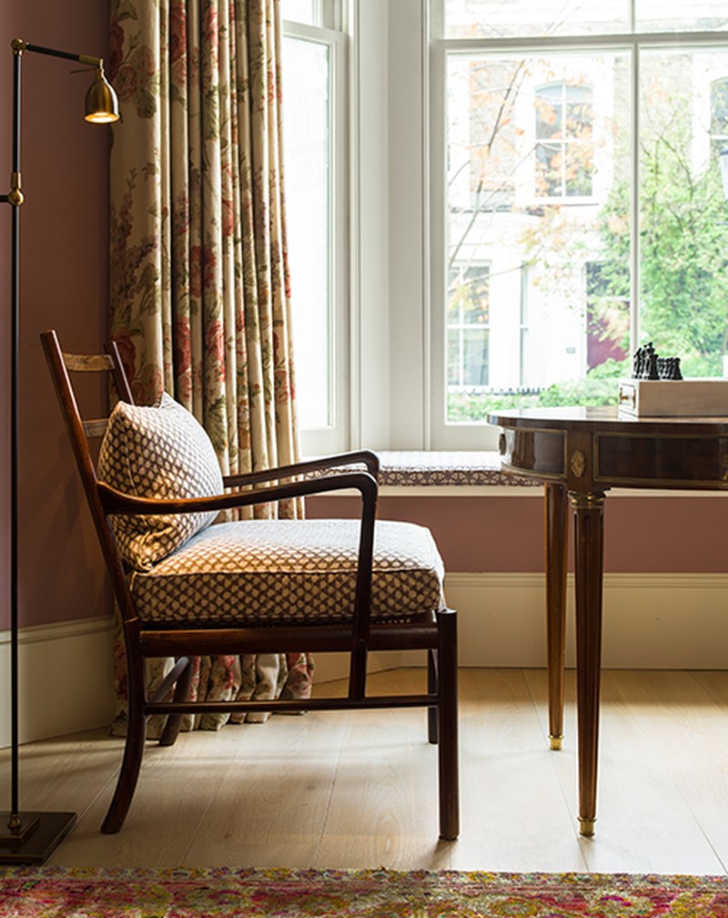
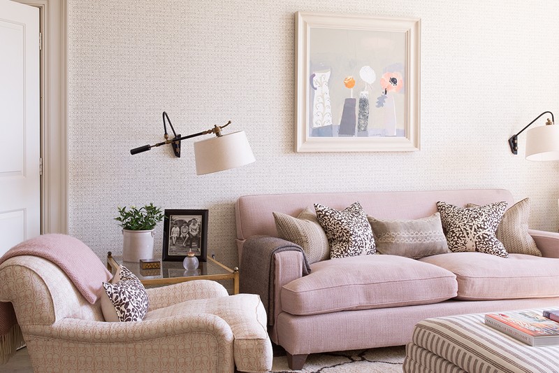
We love using pink but nothing too bright – think of Temple Pink from David Oliver. It works so well with yellows and browns. A top tip from the late Roger Banks Pye of Colefax & Fowler is to always have something black or dark brown in every room, be it an object d’art, picture frame or piece of furniture. It grounds the other colours.
Working on libraries is a joy because we enjoy designing beautiful and practical joinery. We also love books and all the colours they bring to a room, as well as the comfortable and functional furniture and the pictures that tell a story. These rooms can be used as a study, but they can also be used as places to relax, so we usually design and make comfortable upholstery for these schemes.
We look at work from designers not just in the UK but from around the world. We've always admired Sibyl Colefax and John Fowler, the epitome of Englishness, and of course, the master of contrasts, Veere Grenney, which is where Fi used to work. We've recently discovered Coote & Co from Australia, too, and Amber Interiors in the US. We're hugely influenced by Scandinavian design, too.
Inspiration comes to us in many guises. We buy so many books, not only on interior design but art, and books about furniture and textile design. Instagram is a fascinating tool and we often trawl the internet only to get lost! We go to exhibitions and galleries when we can and, of course, the world around us is always changing and captivating.
On Instagram we follow Modernity Ben Penreath, Marthe Armitage, Tarquin Bilgen, Tom Stuart Smith, Alice Sergeant, Vitrouvius, and Soane Britain
PLANNING
What the client already owns influences how we approach designing a room. Sometimes it might be a painting, sculpture or a piece of furniture they want to use. But we also consider the architecture of the house, where the room faces and how the space will function or flow. Having so many years of experience between us, we also take inspiration from previous jobs, while still making the project unique to each client.
When planning a small space, don’t be scared to fill them and make them work harder. We often panel rooms to make them feel taller or wider and give them more character. Mirrors and reflective surfaces help, too.
In a large, open-plan space, try to create rooms within the space, with comfortable seating areas, and depending on the function of the room, a desk or games area. This can be achieved by the placing of different furniture, bookcases, shelving, screens and clever use of colour, too.
DECORATING
We don’t have any rules about colour. The schemes come from conversations with our clients, although it’s always important to be sympathetic to the shape of the building, the position of the room within the house, the size, the height of the ceilings and so on.
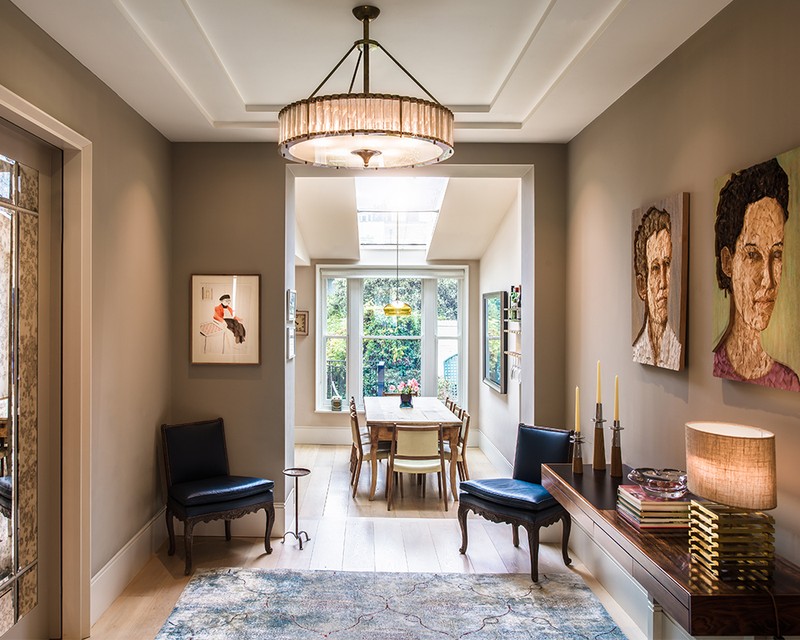
Normally, we wouldn’t use fewer than three colours, or more than five, to give depth to a design. Layering can also be achieved with cushions, lampshades, sculpture, rugs and art.
When using pattern, have one large design and then a mixture of plain and small prints to complement it. We love mixing textures to create movement in a room.
Styles and eras can be mixed together: the humble with the opulent, the classic with the modern. But try to exercise some restraint so as not to confuse things. Mahogany mixed with lacquer and glass furniture looks fabulous with only one or two other pieces – otherwise it starts to feel cluttered. Classic fabrics can look good on modern furniture, just as modern fabrics can look good on classic furniture.
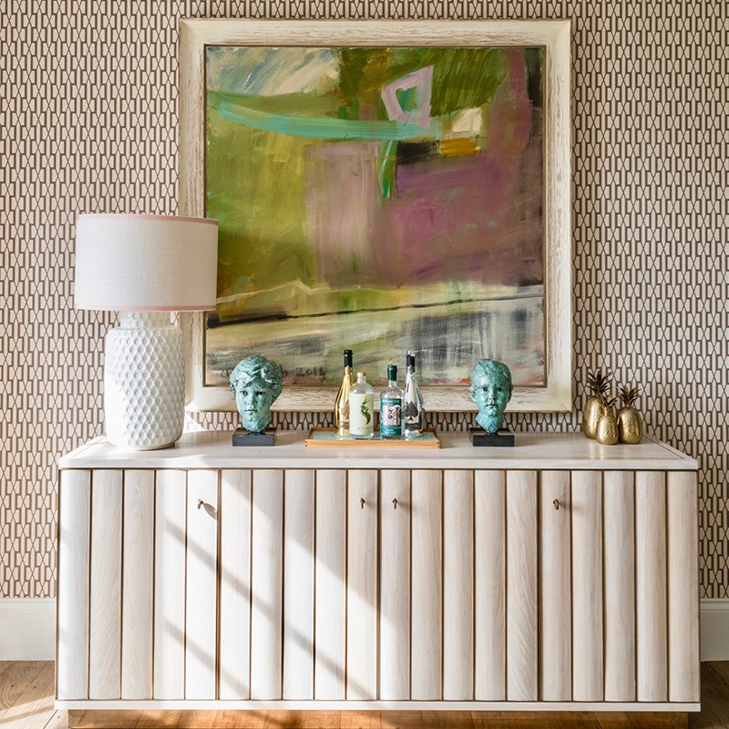
On one of our recent projects, we’ve really enjoyed using darker, stronger paint colours, as well as matt, eggshell and gloss finishes. We recently designed and commissioned our experienced furniture maker to produce some tables and chests of drawers all in lacquer and brass. We were delighted with the results and, thankfully, so were our clients.
If you’re able to splurge in your home, do so on art. It makes a house a home. There are always ways to save elsewhere. Just be sure to do your research. Go to antiques fairs, reclamation yards, auction houses and trawl the internet for good deals.
There are so many wonderful fabric houses which offer good prints and linens at reasonable prices; we sometimes use less expensive linens and have borders down the leading edge to add interest. There’s also so much choice in flooring now, which can be mixed with excellent joinery and upholstery to create a beautiful home. If you have a tight budget, prioritise well-designed furniture made by experienced joiners, as well as comfortable upholstery.
KITCHENS
We love to design kitchens, because they're often the most important room for families. There are so many different elements to consider: the flow, the practicality, the lighting, the textures and the comfort. The choices are endless, yet somehow we always manage to create an individual space for each client. Every kitchen is different. We love to work with Guild Anderson and Plain English.
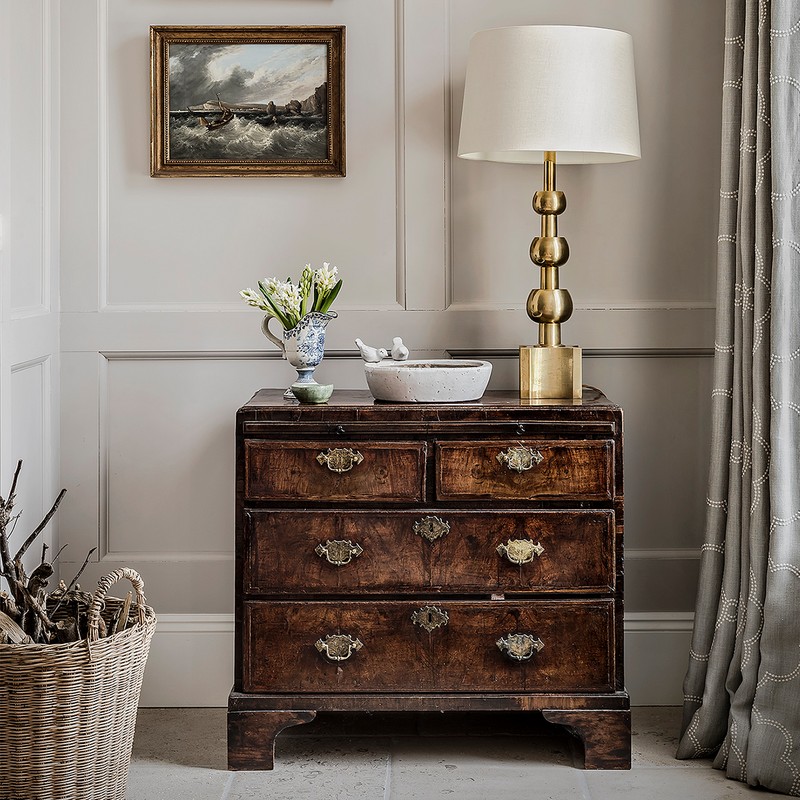
Storage and flow are so important, so don’t compromise on design in the name of practicality. To add character to a built in kitchen, we love to use antiques – a commode with a large lamp on it or a dresser filled with beautiful china softens the room. Getting the lighting right is crucial, too.
Flooring really depends on the room – we tend to use both stone and wood. Wood is softer and offers lots of beautiful colours, but it’s not as practical as stone. We love marble or limestone, although there are some great copies now in quartz and Silestone. Calcutta is our go to marble and never fails to impress.
LIGHTING
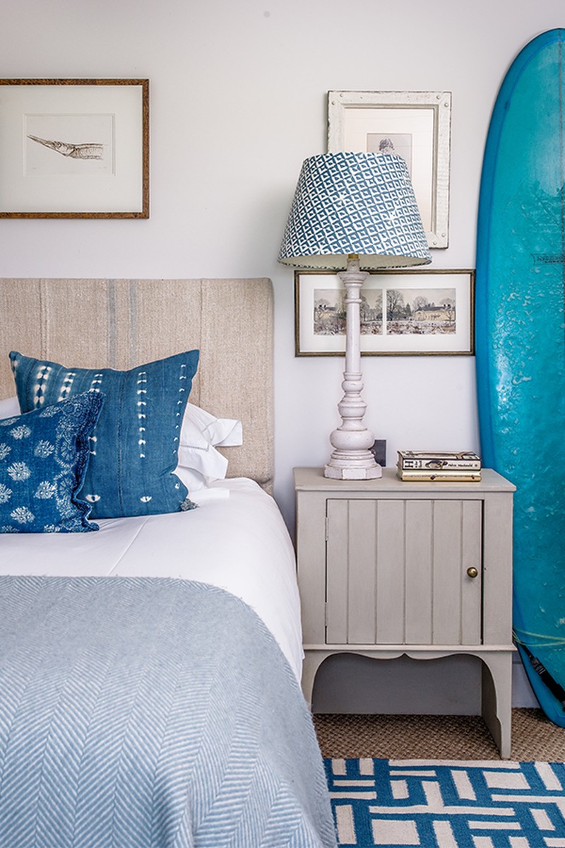
Use lighting to create different moods, and don’t forget the corners. It’s best not to use over lights in a bedroom or drawing room, so stick to low level lamps on bedside tables and chests of drawers, or a floor lamp by a chair in the corner.
Lighting can affect colours in a room by the very nature of the bulbs – warm white, day light and so on. Where the lights are positioned in the room can seriously alter dark colours, too. Space above freestanding bookcases or dressers can often look very dark, changing the wall colour, so consider putting uplighters hidden on the top to dramatically change this for the better.
Don’t use a pendant in a bedroom – the lighting in bedrooms should always be soft but practical, with reading lights at your bed.
The Suppliers Eadie and Crole Rely On Time And Again…
FURNITURE
Antique markets, Brownrigg & Lorfords, Julian Chichester, Soane, Fiona MacDonald, Carew Jones.
FABRICS
Claremont, The Fabric Collective, Tissus d’Helene, Pierre Frey, George Spencer.
JOINERY
We tend to use in house joiners on each project.
KITCHENS
Guild Anderson and Plain English.
BATHROOM
The Water Monopoly and Lefroy Brooks – buy cheap you buy a plumbing bill!
WALLPAPER
Philip Jefferies, The Fabic Collective, Marthe Armitage
PAINT
Papers & Paint; The Paint & Paper Library, Edward Bulmer
LIGHTING
Hector Finch, Vaughan, Pooky and Owl Lighting designers
FLOORING
Tim Page Carpets, Havwoods
TILES
Bert & May, Fired Earth, Tons of Tiles
KITCHEN & HARDWARE
Armac Martin, SDS London
Visit EadieAndCrole.com
DISCLAIMER: We endeavour to always credit the correct original source of every image we use. If you think a credit may be incorrect, please contact us at info@sheerluxe.com.
