
The Best Colour Combinations To Use In Your Home
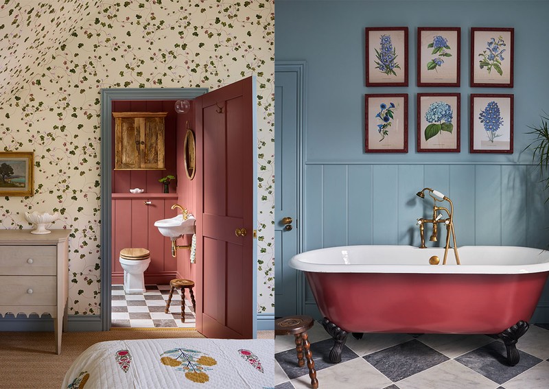
BLUE & RED
Laura Stephens says…
To balance red and blue, it’s about choosing the right shades and complementary colours. I’d recommend going with blue for your ‘base’ colour and then adding shots of red through either the architectural details, such as the dado rail, or the soft furnishings, such as on a chair or a lamp.
It’s important the blue has a softness to it. Too bold and it will feel like a primary-school colour. Some of my favourite soft blues are Spruce by Paint & Paper Library, Celestial Blue by Little Greene and Oval Room Blue by Farrow & Ball. My preference with red is either to go with quite a ‘brick’ red – like Mortlake Red by Mylands – or a ‘rich’ red such as Geisha by Paint & Paper Library.
We recently used a great wallpaper by Print Sisters Archive. Featuring a soft blue and soft red, it is a line-drawn mermaid pattern which is repeated to provide uniformity. We paired it with blue panelling to pull out the blue on the wallpaper and counteract the soft red.
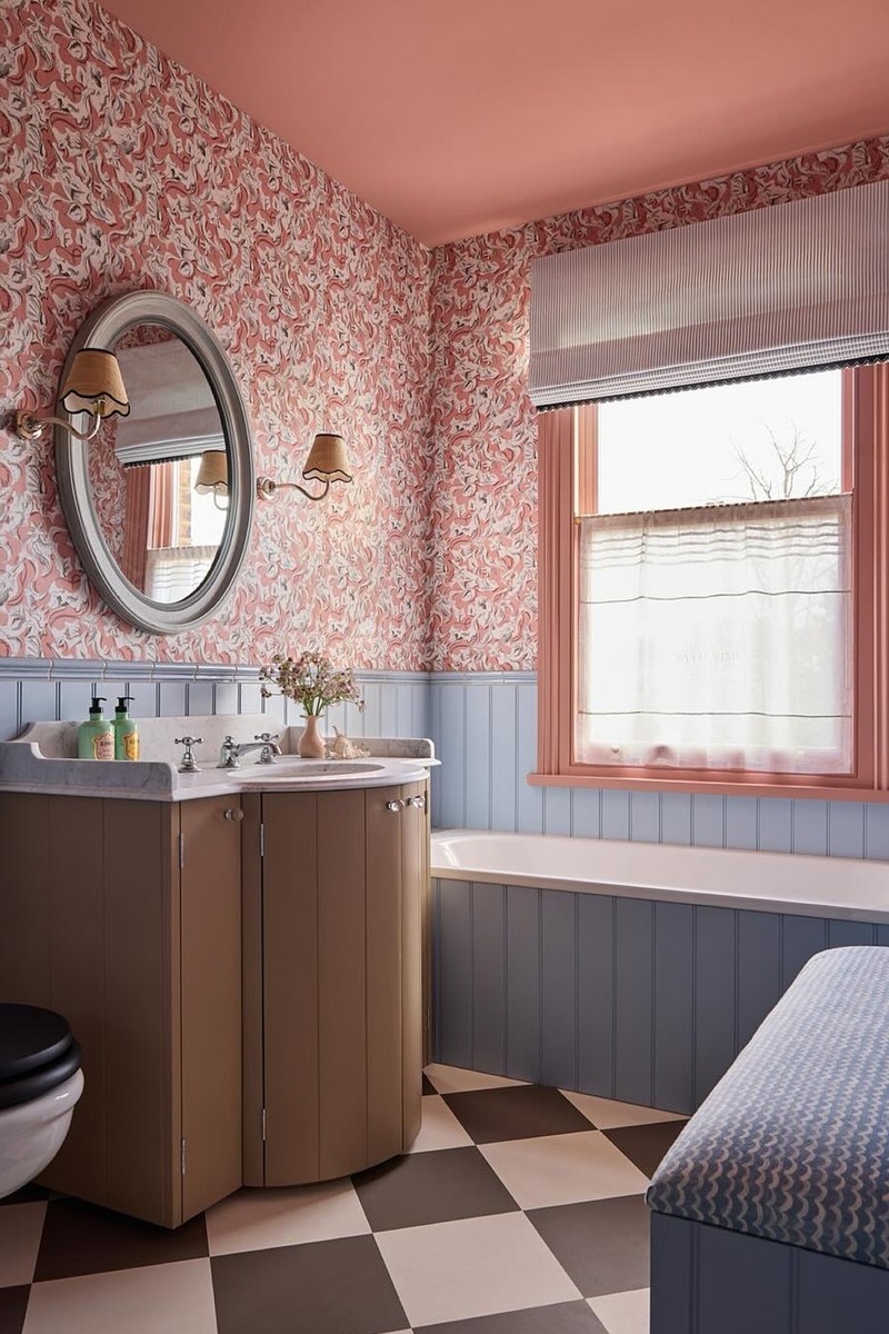
You can use both pattern and plain fabrics to introduce these colours. However, print is a great way to get a hint of red and blue without being too bold. In a bathroom project, we used a pinstripe blue (Jane Churchill) on the blind, which is a great way to introduce pattern that’s still easy on the eye. Similarly, the bench fabric (from Blithfield) has a soft painterly wave that breaks up what would be a solid colour. We also used a red stripe by Nobilis on the blind to add even more red to the scheme.
When using this much colour, it’s important to get the neutrals right. We used Lute by Edward Bulmer in this bathroom as it’s a great foil to the stronger tones of blue and red. Travertine by Little Greene and Jitney by Farrow & Ball are also great options.
Soft furnishings are the obvious way to introduce red and blue if you’re hesitant. But pushing the boundaries by, for example, using blue on the woodwork with neutral walls can look stunning. Take it over the architraves and the backs of the doors to add impact without it feeling overwhelming.
Uns Hobbs says…
Remember, red and blue are both dominant colours. So, you can either embrace their boldness for a striking scheme or balance their intensity by incorporating other shades. To soften the look, introduce neutrals, browns, greens and yellows. Natural elements and vintage pieces also help create harmony – rattan furniture and lighting are ways to add warmth and texture. The same goes for natural wood, marble, and aged brass with a rich patina. Plants are another great way to balance the space.
When choosing paint colours, consider the function of the room, the natural light and the desired mood. For example, in a bathroom where you want to feel energised, opt for uplifting blues with stronger reds. In a living space, a rusty red and muted blue – or even a soft, pale blue – can create a more relaxed feel. We are working on a project right now where we are using blue on the woodwork, and red prints and solids in the window treatments and sofas. Testing paint samples is essential, as natural light can reveal unexpected undertones.
Smaller-scale prints can add texture without overwhelming a space. If you're worried about a room feeling too busy, opt for these over large-scale patterns. That said, larger prints can still work if balanced with solid colours on curtains, sofas, and headboards to provide visual rest.
Always go for a mix of solids and print. Solids offer breathing space, while prints add depth. Stripes, florals and geometrics can be layered together for an eclectic yet cohesive look. To avoid an overly curated feel, introduce additional colours – browns and greens help ground the scheme. Sometimes, however, the best approach is to go all in, using just red and blue for a bold, primary statement. We did this in a bathroom project and the effect was definitely bold, albeit softened by plants, marble and an antique vanity unit.
Earthy neutrals like warm whites, soft beiges and muddy browns complement red and blue. Natural materials such as oak, rattan and aged brass help tone down bold colours. A sisal rug, an antique wooden table or green accents – whether through paint, fabrics, or plants – can subtly counterbalance the strength of red and blue.
If you’re hesitant, start small. Add red lampshades to blue lamp bases, introduce patterned cushions, or use a statement armchair with a red-and-blue print. Artwork is another easy way to bring in these colours – we often use picture frames to add playful pops of colour without overwhelming the space. A classic blue-and-red print we use a lot is GP & J Baker’s Poppy Sprig in denim, which works in nearly any scheme.
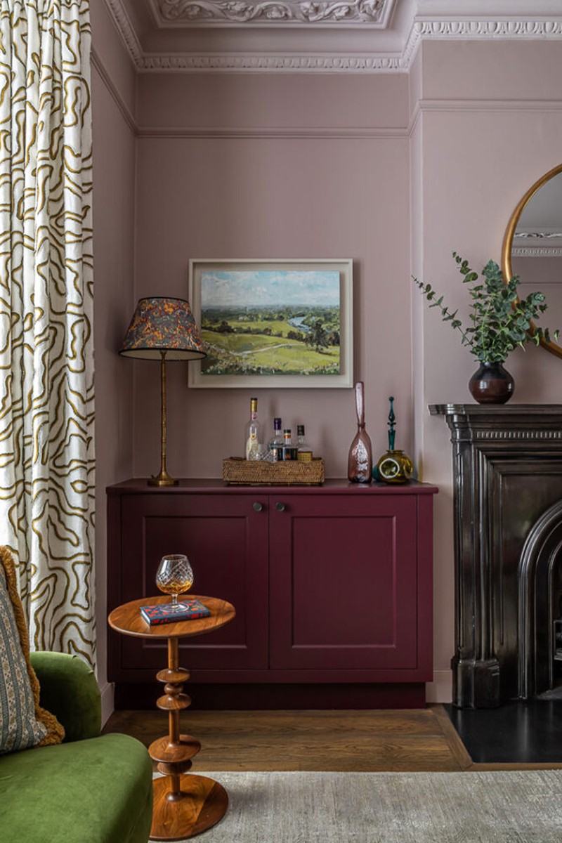
PINK & BURGUNDY
Alexandra Keith from Otta Design says…
Using a burgundy and pink with the same undertone will create harmony. In a recent living room scheme, we colour drenched the space using the pink on the skirting board, doors, walls and picture rail, and then used a lighter shade of the pink on the cornicing and ceiling. This gave the room an enveloping and cosy feel by minimising any contrasts. We then pulled the alcove joinery out in the darker-toned burgundy to add depth.
A small repeat pattern can feel surprisingly calm. In narrow hallways, for instance, they can elevate the space by adding texture and interest, while allowing for bolder artwork to be hung against them, creating a layered scheme in what could be a boring corridor. Checks and stripes are a more subtle way of introducing pattern. Their familiarity help them disappear into the background by providing a more textural quality. To add more depth and interest, mix them with a floral.
Mixing both blocks of colour and prints is the key to a layered scheme. Combining patterns with different scales will create balance. As a general principle, we would suggest choosing one 'star' large pattern fabric so the focus of the room is clear – it might be the sofa or the curtains. We often introduce small or medium-sized patterns through cushions, rugs or armchairs. But it is also important to break up the patterns with blocks of colour to give the eye a rest.
A neutral with a warm, pinky brown undertone will work well with burgundy and pink. In a recent cloakroom project, we chose not to use chrome or brass taps as these would provide too much contrast – instead we opted for a similarly topped copper.
If you’re nervous about using colour, look at small accessories – items such as cushions, lamps or shades, objets – or perhaps a fabric on larger pieces such as curtains, sofa or ottoman, where the background is neutral but there is a small pattern in burgundy and/or pink. As mentioned above, the uniformity and familiarity of small, scaled stripes and checks mean they are a gentle way to introduce colour and pattern without overwhelming the space.
Joa Studholme, colour curator at Farrow & Ball, says…
To balance the boldness of burgundy and pink, it’s a great idea to use burgundy up to a metre from the floor and soft pink above it, so the strongest colour is below eye level.
Remember that some shades of pink and burgundy have a blue base. In our range, Eating Room Red and Calamine will sit comfortably together, while others like Etruscan Red and Scallop have a much earthier base. You need to sample the colours on site at different times of day to ensure that the two will work as a cohesive scheme.
Burgundy and pink can be softened by warm naturals rather than bright white. If you’re going for wallpaper, use a burgundy and pink wallpaper above a dado rail or half-height panelling in a solid paint colour to stop the space feeling too busy. If you are wary of using strong colour, then pinks and burgundies are ideal on the interior of cupboards or kitchen dressers.
/https%3A%2F%2Fsheerluxe.com%2Fsites%2Fsheerluxe%2Ffiles%2Farticles%2F2025%2F03%2Fsl-050325-colour-combos-burgundy-pink-2.jpg)
WHITE & YELLOW
Lilian Aperghis, founder of 2711 Interiors, says…
You can create warm and inviting spaces by layering different shades of white and yellow. By choosing warm, creamy whites over stark tones and pairing them with muted or golden yellows, you get that soft, lived-in feel. For a kid’s room, we love Hay from Farrow & Ball. Texture also plays a crucial role: natural materials like linen, wool and aged wood add warmth, while subtle patterns introduce depth.
A modern emulsion delivers that rich, matte depth. To create contrast and elevate the space, we often pair a carefully selected yellow (bright and uplifting for morning rooms, or a softer, golden hue for cosier spaces) with a warm white in the same finish. This creates a seamless flow.
Choosing the right white is key to achieving harmony. For vibrant, sunny yellows, we opt for warm whites with creamy or beige undertones. For softer, pastel yellows, whites with a subtle taupe or greige base create a muted contrast that feels elegant. We avoid cool, blue-based whites in general, as they can feel too sharp against yellow’s warmth.
When incorporating yellow wallpaper, it’s important to maintain balance. By pairing it with neutral fabrics in natural materials such as linen, wool and bouclé, you can ensure a tactile contrast that feels inviting rather than overwhelming. Subtle pattern layering adds depth without competing with the wallpaper. By integrating vintage pieces, we create a space that feels cohesive.
Patterned fabrics are a great way to introduce depth and character, especially in a white and yellow colour scheme. The key is to balance scale and texture, combining fine patterns with more structured ones ensures visual interest. Keeping the colour palette soft and layered prevents the patterns from feeling overpowering. A bold stripe can be beautifully offset by a delicate floral or a subtle geometric weave, creating a sense of rhythm rather than visual clutter. We ensure cohesion by anchoring the patterns with soft, neutral tones and layering in natural materials.
DISCLAIMER: We endeavour to always credit the correct original source of every image we use. If you think a credit may be incorrect, please contact us at info@sheerluxe.com.
/https%3A%2F%2Fsheerluxe.com%2Fsites%2Fsheerluxe%2Ffiles%2Fwebsite-images%2F2025%2F03%2Fsign-up-pop-up.jpg)
