How To Decorate Using Terracotta & Blush
Why Do Terracotta & Blush Work So Well Together?
“Cooked earth or terracotta, as we know it, is one of the oldest building materials. The colour derives from the heating of the natural pigmentation in the earth. Earth is a different colour around the world and for millennia, we’ve used it to make pigment – usually those that are rich in iron ore and give us red and yellow ochres. These earth pigments are ideal for creating the most pleasing and flattering blush pinks, so essentially terracotta and blush derive from the same source, which is why they can be used together so successfully.” – Edward Bulmer, founder of Edward Bulmer Paint
“Blush and terracotta are almost analogous on the colour wheel, so they have a natural affinity together. As with most colour references, we all have our own perceived perception of them from delicate pink flesh tones to mid-bright pinks, blush, and sun-baked pale terracotta to the deeper brick red. Using them together is about balance – following the classic design rule of 60/30/10 will help you find the right proportions.” – Patrick O’Donnell, Brand Ambassador at Farrow & Ball
“If we think about terracotta, it’s a warm, dusky, muted shade of orange and blush is a lighter, sometimes dusky version of red and because red and orange sit next to each other on the colour wheel, they actually form the perfect partnership. You can achieve harmony in your home by using any combination of colour sat next to each other on the colour wheel – blues and greens, violets and pinks, reds and oranges –they all create failsafe schemes. The interesting thing about the terracotta and blush relationship is that they are different tones, the terracotta being the punchier, more saturated mid-tone and the blush being the lighter, more whimsical, airy counterpart. That’s what makes this pairing much more interesting.” – Stephanie King, Creative, Comms & Content specialist at Dulux
Within Those Colours, Are There Particular Tones To Avoid?
“It’ best to err on the browner side of both shades as they’re softer and easier to live with. Also, make sure the colours have a different weight, essentially playing with lighter versus dark. A perfect combination would be the walls in Farrow & Ball’s ‘Faded Terracotta’ teamed with an accent in ‘Fruit Fool’ from our archive; the latter colour could also be used as a pop of colour on the interior of a bookcase with the external frame painted in a rich, red-based chocolate tone, such as ‘London Clay’. Chocolate browns and gunmetal blues are ideal as additional accent partners.” – Patrick
What Other Colours Work Well With Them?
“You can create many beautiful schemes with a base of terracotta and pink. Sticking with our colour wheel, using similar warm shades such as comforting yellows or stronger autumnal reds will add to the cosy quality. You could also add a beautiful green (using opposites on the colour wheel). Having said all that, I’ve also seen these colours used to great effect with striking cobalt blue, which breaks all the ‘rules’ but definitely leaves an impression, so if you are brave enough, then definitely experiment to create a room you love.” – Stephanie
How Would You Use Them?
“We mix these two colours is a way that isn’t assertive or over-powering but to act as a backdrop that works like a neutral – they key is that there’s enough ‘brown’ in the hue. I tend to use the pinks for more intimate rooms and or rooms for entertaining, although the latter can also look great in terracotta when the furnishings are a bit richer.” – Edward
“Layering these colours together on a wall would work well, especially if you want to create a specific zone, such as behind a desk for a WFH space, using a layered geometric colour block design. You could also use these colours to play with illusion. If you are lucky enough to have high ceilings, then why not use the blush pink as a main wall colour and use the terracotta on the ceiling, bringing this down onto the walls slightly to create a pseudo picture rail? If you have lower ceilings, you might want to create more space above you by painting the lower half of your walls in the richer, darker terracotta with a lighter blush on the upper parts of the wall and ceiling. Then, add an accent – such as a green – to the wall as a painted horizon line around the room, and of course through the accessories.” – Stephanie
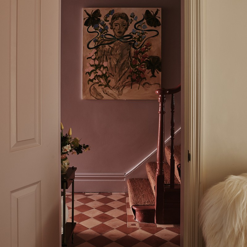
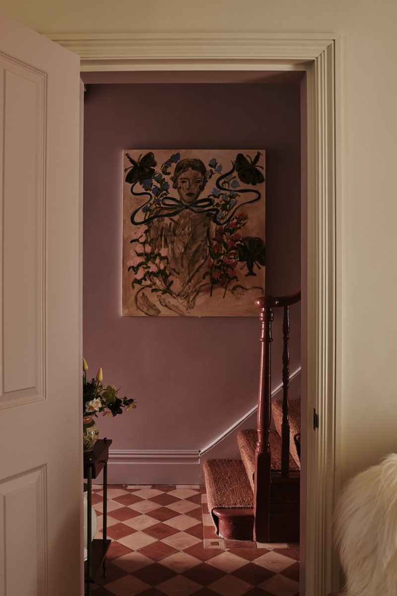
In Which Rooms Does The Pairing Work Best?
“This colour combination will come into its own in the bathroom. Blush tones will flatter every complexion – think Farrow & Ball ‘Pink Cup’ on the walls paired with hand-glazed tiles in the richest terracotta tones.” – Patrick
“Bathrooms are an obvious candidate as you might have the terracotta in a floor or wall tile rather than in a paint colour. Where there is a clear architectural division like a dado rail, you can use one with the other quite easily.” – Edward
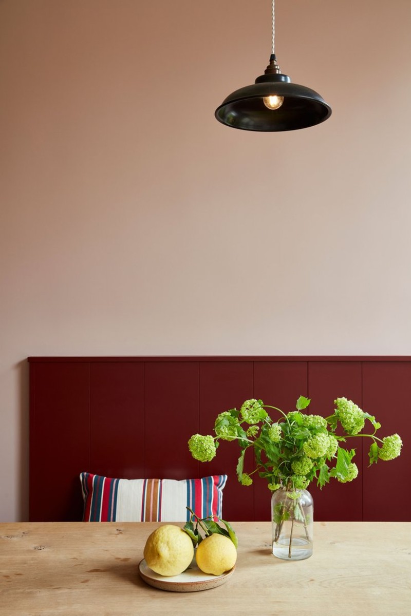
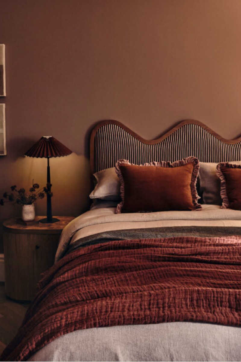
“As these colours tend to be on the warmer side of the spectrum, they would be great at creating a super cosy bedroom space or snug area. Reds and oranges are also good for stimulating the senses, so they would work well in rooms used for eating and socialising, like the kitchen or dining room.” – Stephanie
Any Top Tips?
“Really use those extra surfaces like ceilings, woodwork and furniture to add those layers of colour, it’s a missed opportunity not too. People often spend hours thinking about the wall colour and just neglect those other surfaces, which make up a huge proportion of the room. In my own home I don’t have any white ceilings or woodwork – they’re either features in their own right or blended in with the walls to create a smart and seamless look.” – Stephanie
Visit EdwardBulmerPaint.co.uk, Dulux.co.uk & Farrow-Ball.com
DISCLAIMER: We endeavour to always credit the correct original source of every image we use. If you think a credit may be incorrect, please contact us at info@sheerluxe.com.
/https%3A%2F%2Fsheerluxe.com%2Fsites%2Fsheerluxe%2Ffiles%2Fwebsite-images%2F2025%2F03%2Fsign-up-pop-up.jpg)
