The Interior Designer Who Makes Classic Country Style Desirable
STYLE & INSPIRATION
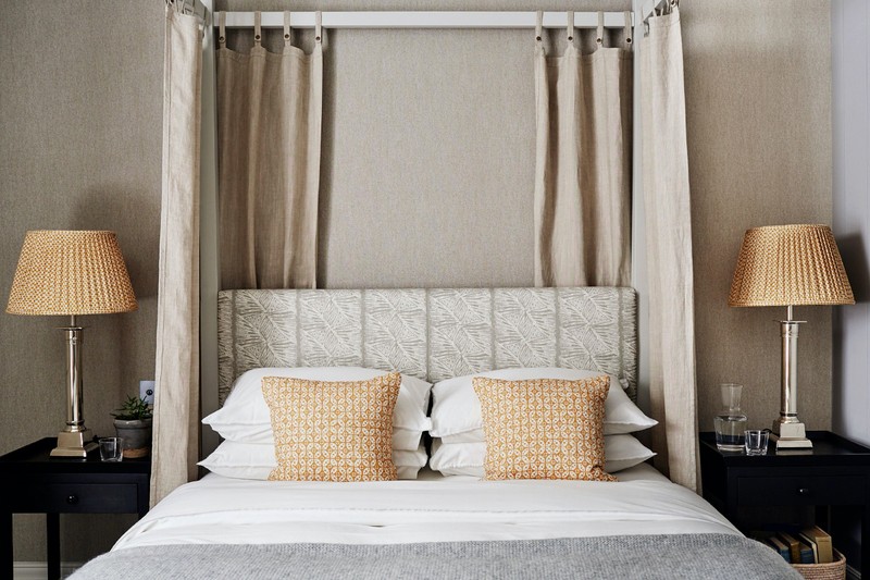
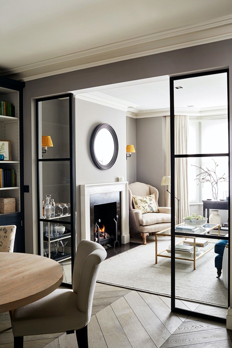
Sims Hilditch is well known for its relaxed, modern style. My team and I work on a variety of projects from city to beach houses, country estates to cosy cottages. We work collaboratively to introduce interiors that combine rural luxury with a sleek urban edge. A term which suits us is ‘rurban’ – an aesthetic that looks as good in London as it does in deepest Lincolnshire.
We bring function and form together in equal measure. The devil is in the detail and we are focused as much on interior architecture as we are on decoration. The perfect height for a shower head or the power drawer to charge devices in the kitchen are as important as the colour of the walls or the layers of fabrics that we build up in any scheme.
Restoring listed or historic buildings is a wonderful challenge. We worked on a 15th-century manor house in Dorset that had been frequented by Henry VIII and were able to bring the interiors up to date for modern family life. Space planning is so important in these old houses, which were never designed to be used in the way we want to live nowadays. We created a wonderful open-plan living-kitchen-dining room suitable for a large family.
I worked with my husband’s interiors company Neptune to create our own range of paints. The aim was to create paints that would look great in both contemporary and traditional houses. The blues and greens have a knocked-back tone but are still fresh. They work well in the British climate.
I am a huge fan of European travel. My husband and I love to soak up culture and both have a close affinity to Italy after our daughter Daisy studied fine art in Florence for four years. Italy has such a breadth of design inspiration, from the Palladian buildings of Venice to the Tuscan farmhouse architecture, the ski lodges of the Dolomites, and our favourite hotel Il Pellicano, where the sense of tradition and old-world charm takes you back to the 60s, sipping cocktails on the terrace listening to Bebel Gilberto.
I’m full of admiration for hotel designers. Olga Polizzi’s Tresanton and Endsleigh properties combine antiques, fine art and the comfort of a feather-and-down sofa in perfect proportions.
I enjoy following some great American designers. These include: Amber Interiors and Bungalow Classic, as well as an array of fabric companies including GP & J Baker and Wicklewood.
DESIGN & PLANNING
Every design starts with the property itself. I like to look to the interior architecture, the context and the history to inspire the designs. It’s also very important the design works for your lifestyle and needs, so we are very careful to build up a picture of how a room will be used before developing the aesthetic.
To enhance a small space, use the height of a room as well as its width. For example, if you have a smaller kitchen, add floating shelves to walls rather than wall units – it will open the space while ensuring there is much-needed storage. Also think about how a space can be multifunctional. In one of our London projects, we introduced a small utility area which was hidden away behind bi-folding doors in the study.
In a large, open-plan space, create zones. Think about how the room will be used and dedicate areas for cooking, eating, relaxing and so on. We quite enjoy asymmetry – a room does not always have to be uniform.
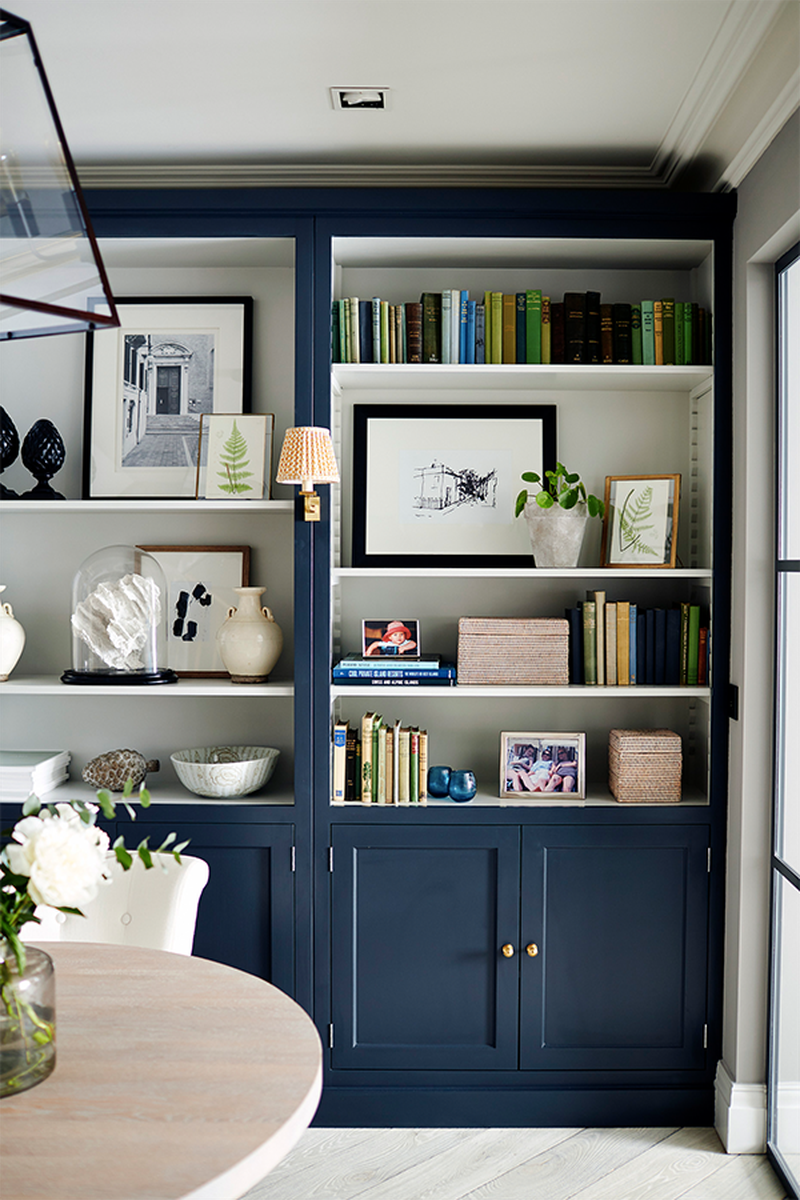
We are great believers in organisation. I love designing fitted joinery to suit the purpose of the room – it can make such an impact on a room, especially when painted in a contrasting colour. I am particularly fond of designing boot rooms and functional spaces which help organise busy, everyday living. A few years ago, we designed a boot room for a client with nine children – each person has a dedicated basket and hook for their sporting and school equipment.
A new kitchen is a big expense, so you want to get it right. Do not try to save money on cabinetry; budget melamine-lined cabinets are not robust and will fail over time. Well-made, solid timber cabinets are strong and, if they do become damaged, they are easy to repair. Also, you can repaint solid timber doors and change the handles to create a totally new look, giving the kitchen real longevity. If appliances are going to be integrated, do not feel obliged to invest in top-of-the-range makes. Since they are not going to be on sight, it is fine to choose any brand you like and trust.
For flooring, we often choose limestone. It is very forgiving for spillages and wears well over time. At Sims Hilditch we favour natural stone worktops. However, if you are opting for quartz, try an independent stonemason, which will usually have its own range that is cheaper than well-known brands.
COLOUR & PATTERN
Our approach to creating a colour scheme is much like an artist’s. We mix colours on a palette. We draw our inspiration from the world around us, discovering hues in art and nature, then translating them into a colour scheme that fits seamlessly into a home. The story of the home we are working on is also incredibly important – the interior must work with the exterior.
When it comes to colour, we don’t believe in rules. I often take inspiration from artwork or fabrics when putting together a colour scheme for a house. Greens look particularly great in a kitchen with off whites as they complement nature’s ingredients. Sage and French Grey from the Neptune range are two of my favourites.
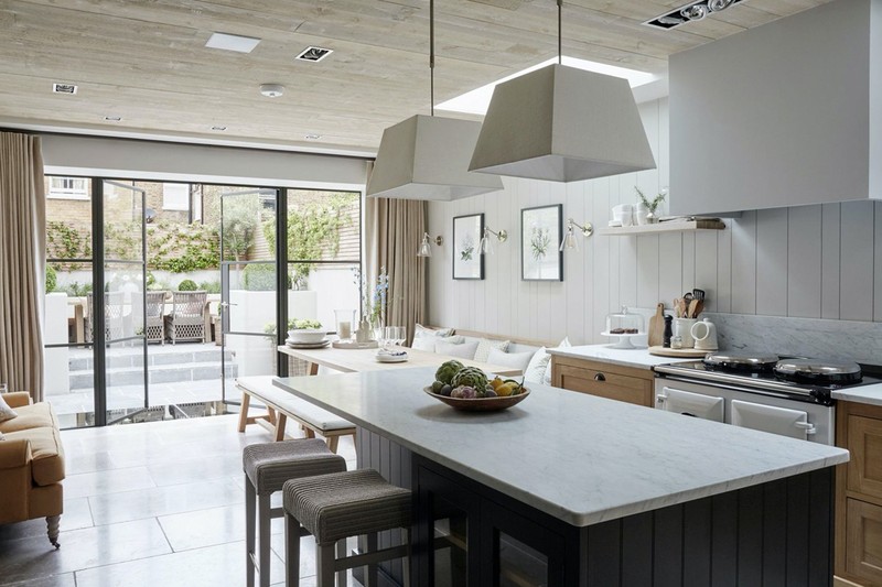
We often encourage clients to scale up. This can add a touch of drama to a room. For example, we hung two beautiful over-scale lanterns over a kitchen island. The client was initially apprehensive but agreed – the result was a real showstopper and it’s a favourite element in the house.
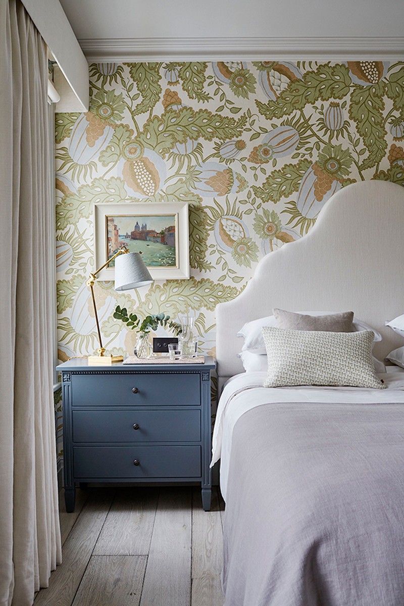
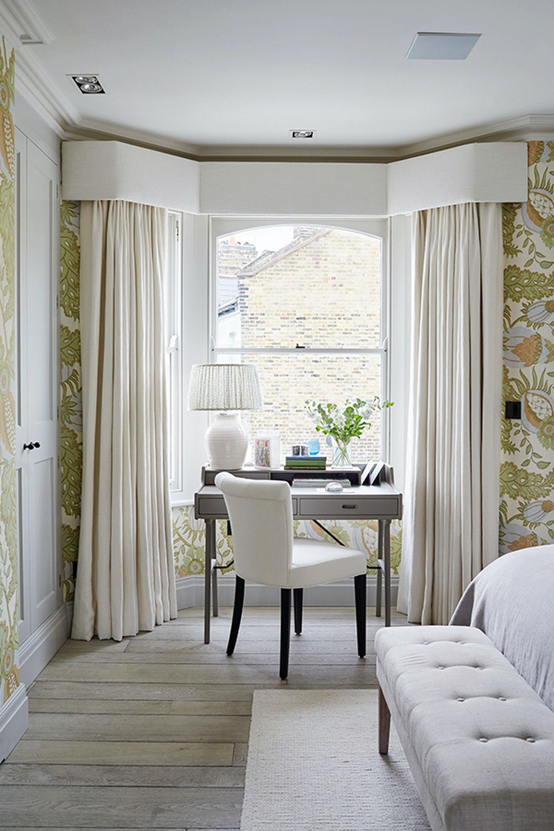
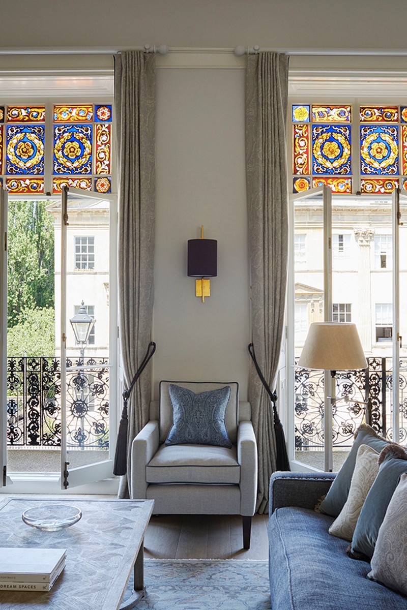
Have fun with prints and pair small scales with larger block prints. Recently, we collaborated with GP & J Baker for London Design Week using a variety of patterns. Consider using two contrasting patterns on a pair of curtains – something bold for the exterior and a subtle small print for the lining.
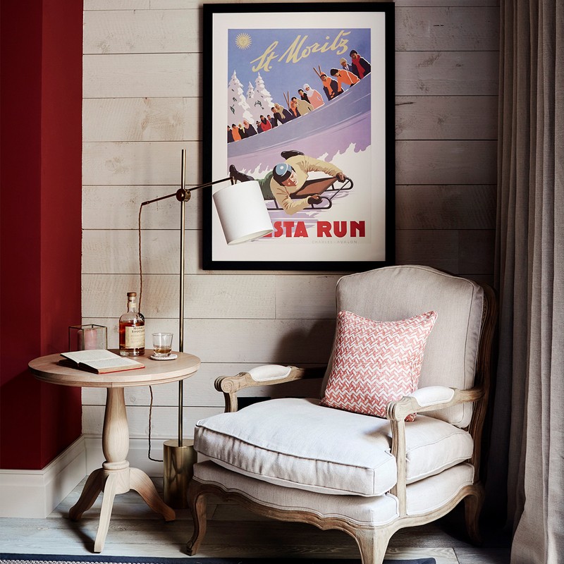
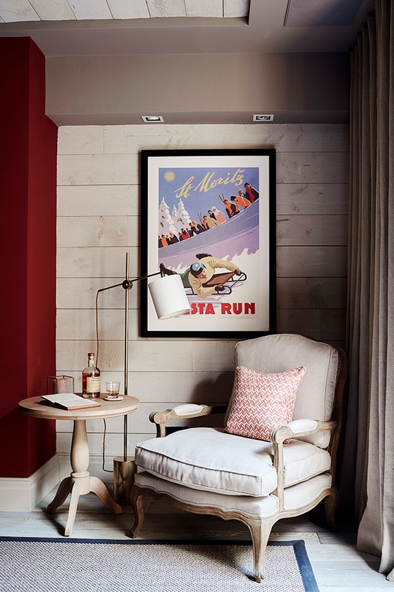
We mix antiques and rustic pieces with bespoke furniture designs. We do this for both city and country properties. The key difference is that a country home must have those strong pieces of furniture that are more defining of a country property. For the city, we pare it back but there is also licence to be a little more edgy. For example, a contemporary pattern on the floor rug suits a city home, but would look out of place in a timeless country library.
If you want to use your budget wisely, lighting, well-made furniture and artwork are the main things to spend on. You can pick up good-quality antiques from local markets which need not be expensive. Prioritise the rooms you spend the most time in – we would always advise investing in living spaces and bedrooms.
LIGHTING
We ensure there is a combination of different types. These not only build the atmosphere of a room, but provide varying options depending on the time of the day. Breakfast time around the table might lend itself to floods of natural light, which can help regulate our circadian rhythm. Come evening, we might want to lower the light level and enjoy dinner parties lit by a muted glow. We always look to use ambient general lighting to provide background light, then consider feature lighting. These light fittings add interest to a room, whether that’s decorative or scale wise.
Consider the direction the room faces. Natural lighting can have a huge effect on the colour of a room. For example, north-facing rooms have cooler light; south-facing ones are warmer, so research paint colours before painting an entire room. We often use large swatches and pin them to a wall, so a client can see the subtle changes throughout the day.
One of the most common mistakes is using a single lighting source. For example, overdoing down lighting – it can ruin the atmosphere of a room and end up looking like a sterile environment. If in doubt, speak with a lighting designer. It will be money well spent and avoid costly mistakes.
The Suppliers Sims Hilditch Rely On Time And Again…
FURNITURE
George Smith, Chelsea Textiles, Bespoke by Sims Hilditch, William Yeoward
FABRICS
GP & J Baker, Colefax & Fowler, De Le Cuona
KITCHENS
Neptune, Bespoke by Sims Hilditch
BATHROOMS
Victoria & Albert, CP Hart
WALLPAPER
Lewis & Wood
PAINT
Farrow & Ball, Neptune
LIGHTING
Vaughan, Fermoie (for lampshades)
FLOORING
Artisans of Devizes, Capitol Carpets
TILES
Bert & May
For more information visit SimsHilditch.com
DISCLAIMER: We endeavour to always credit the correct original source of every image we use. If you think a credit may be incorrect, please contact us at info@sheerluxe.com.
