Matthew Williamson's Tips For Pink Interiors

Pink is my favourite colour – it’s where I feel happiest. I’ve always been drawn to its charms, although I can’t quite pinpoint where my love affair with pink first began. Was it childhood sweets? Nowadays we often associate pink with girls and blue with boys, but interestingly, as recently as a hundred years ago this was the other way around, with pink seen as a strong and decisive colour appropriate for boys and blue a more dainty and delicate shade suitable for a girl. Frankly, both can be lovely, so I wouldn’t give too much thought to this sort of distinction.
Right now, it’s pretty clear that pink is having an interior renaissance. It may be in vogue, but we all know colours move in and out of fashion. For me though, a love of pink has endured for longer than a season or two, and it’s much more versatile than you might imagine. From rose to plaster, fuchsia to cerise, there’s unending scope with pink.
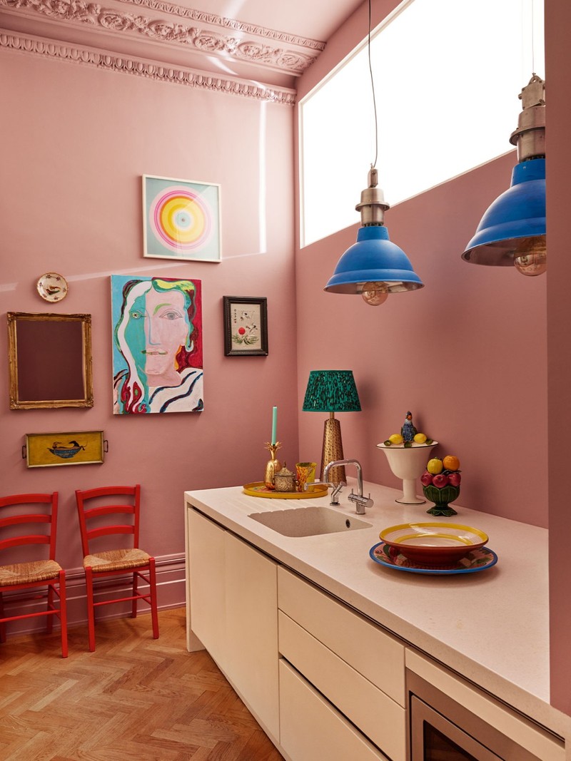
While studying in London and living in my bedsit in my early twenties, the first port of call was to give my lacklustre galley kitchen a lick of candy-floss pink. Sugary and sweet, it was certainly kitsch and whimsical. I remember it as a lively little box of happy student domesticity.
/https%3A%2F%2Fsheerluxe.com%2Fsites%2Fsheerluxe%2Ffiles%2Farticles%2F2023%2F09%2Fpinkp84.jpg)
In my biannual fashion shows that followed, I made sure there was at least one pink outfit in every collection. It became routine, a creative trademark if you like, and pink became far and away my favourite colour to work with. Later, when I started working in interiors, not much changed when it came to using pink, and I set about designing homeware products in all manner of pinks, whether lampshades or wallpapers, furniture or rugs. Commissions from hotels and homeowners alike also got the ‘pretty-in-pink’ treatment.
Pink can be super-elegant, chic and understated if you stick closely to the softer, more blush tones. Conversely, it can also have such a powerful impact if it’s dense and highly saturated. I love to use super-bright, almost neon tones of pink in interiors too – think magenta and cerise for areas crying out for some attention.
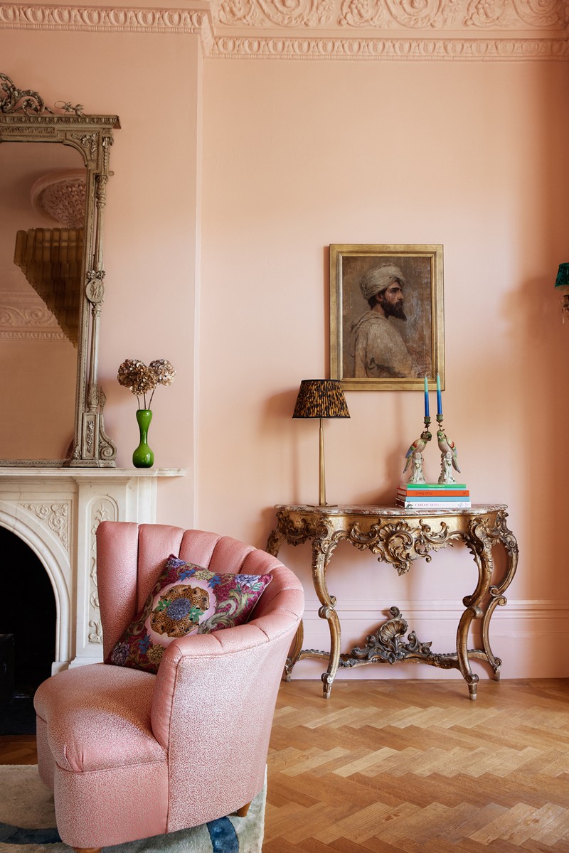
I’m drawn mostly to the softer end of the pink spectrum. Blush or plaster pink is my go-to neutral. It’s kinder and more forgiving than white, more fun than beige and warmer than grey. My lounge in London is a large room with high ceilings and lots of wall space. Recently, it’s been painted in a soft blush but there’s an understated earthiness to the shade that somehow makes it barely even pink. The colour makes the room feel delightfully decadent, yet comfy and cosy too.
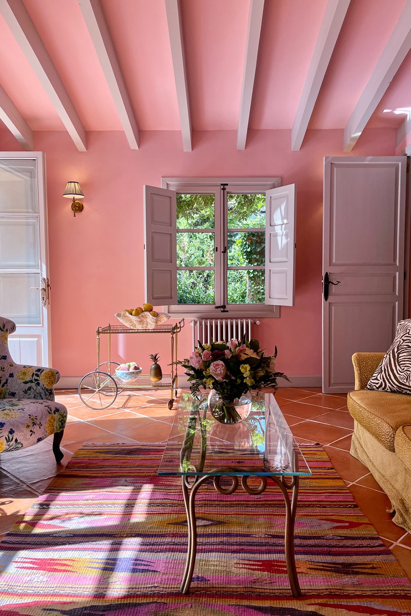
I designed a hotel suite with a pink lounge in a tone rosier than my own. Unlike when you’re working with a homeowner as a client, you can be a little more carefree and expressive and less prescriptive in a hotel, safe in the knowledge that there will be a never-ending stream of guests passing through. Guests at a hotel are there to relax and unwind and escape their everyday lives and one way to do that is through uplifting and unexpected colour. That’s where pink really comes into its own.
There are, as I mention in my new book, Living Bright, no rules for me when it comes to using colour in the home. But perhaps a steer rather than a rule, I’d always opt for a ‘knocked back’ shade of pink when covering large expanses. Think of setting plaster or a bruised pink and you get the idea – these shades can be moody yet equally as charming and characterful.
Living Bright is published on 7th September by Thames & Hudson
DISCLAIMER: We endeavour to always credit the correct original source of every image we use. If you think a credit may be incorrect, please contact us at info@sheerluxe.com.
/https%3A%2F%2Fsheerluxe.com%2Fsites%2Fsheerluxe%2Ffiles%2Fwebsite-images%2F2025%2F03%2Fsign-up-pop-up.jpg)
