Meet The Designers: Howark Design
Background
For Saskia and me, interiors have been in the blood from day one – both our parents had to put up with us rearranging their furniture and redecorating their rooms for years! We met when we were both working at Studio Reed and bonded over our shared love of architecture. Soon enough, we realised we wanted to start our own company.
Style & Ethos
Interior design should be a pleasure. We love getting to know our clients and believe the best way to get the most out of a project is to have a great working relationship with them. Being a small company, they always know who is at the end of the phone, and that Saskia and I are involved in every aspect of the work. It’s this approach that’s reflected in our designs, which are characterful, warm and inviting.
Colour & Pattern
We’re always led by the client’s preferences on colour – it’s often a great way to try new combinations and we’re certainly not shy about making a statement. I suppose neither of us are that into grey. We’re big fans of pattern at Howark, whether that’s on fabric, tiles or wallpaper. Clients can be wary about using bold pattern at first, but when we present the concept, they’re often quite excited at the prospect.
Materials
One of the wonderful things about the industry is the sheer variety of materials and options available. We tend to work with makers in the UK where possible, and making sustainable choices is really important to us. We recently designed a beautiful coffee table and chose individual pieces of timber that were grown in the UK before being hand-worked in Sussex. We use antiques in many of our projects, and have a trusted selection of dealers who we work with time and again. We tend to pair antiques with more contemporary elements to balance the overall look.
/https%3A%2F%2Fsheerluxe.com%2Fsites%2Fsheerluxe%2Ffiles%2Farticles%2F2023%2F01%2Fhowark-design33099-v6.png)
01
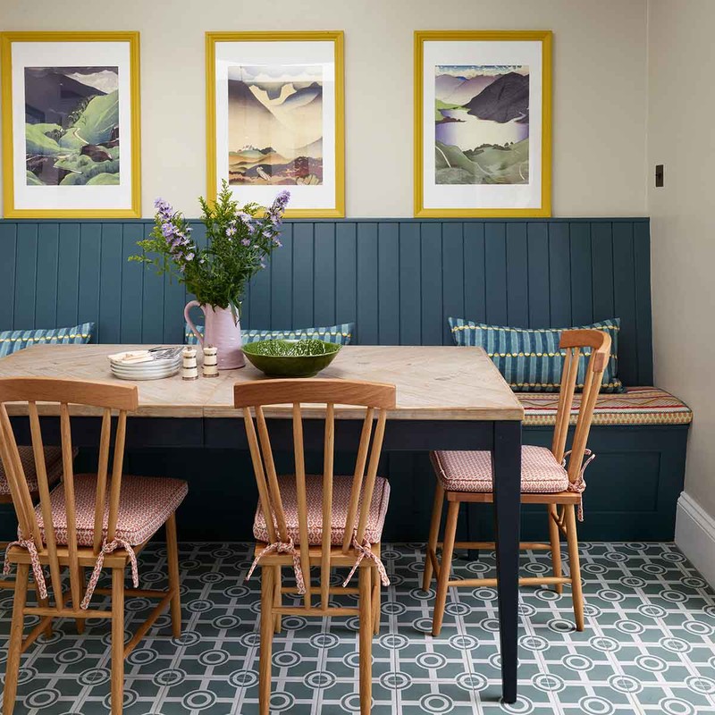
West London
We were appointed to refurbish this recently purchased property. The brief was to create a colourful, comfortable and interesting family home, without it feeling too formal. In particular, they wanted a smart living room and a fun, informal family room.
It was pretty much a blank canvas, but the house had great proportions and architectural details that we really wanted to highlight. The central room gets minimal natural light, so we wanted to cheer it up and create a cosy space for the children to play in and watch TV. The client’s favourite colour was blue, but we also introduced a lot of complementary colours so it wasn’t too one dimensional.
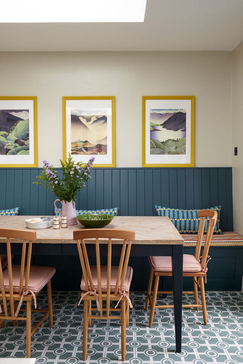
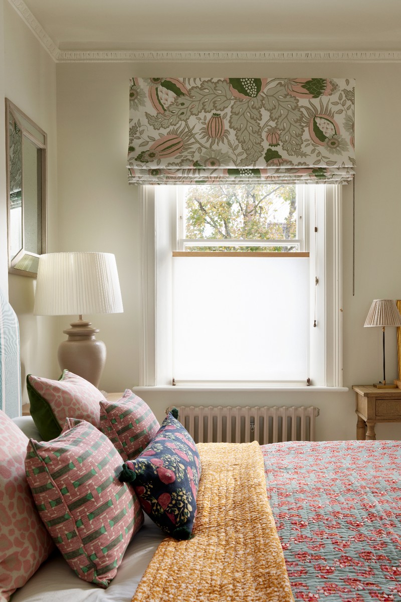
We refreshed the kitchen with new tiles, paintwork and flooring, as well as adding colour and pattern to the dining area. The family room needed more fun – hence the wide painted stripes in two complementary neutral tones. The living room was painted in a bright but warm blue (Sanderson ‘Blue Clay’) and there are complementary shades of blue in the rug, armchair and curtains. A zingy green sofa and a stripy red footstool in Soane's ‘Jajim’ fabric added warmth. We were so pleased with the living room – the blue on the walls was a bold move but it feels harmonious with the other furniture. We used softer colours in the main bedroom, dressing area and bathroom to create three distinct areas that worked together, and felt cosy and relaxing.
/https%3A%2F%2Fsheerluxe.com%2Fsites%2Fsheerluxe%2Ffiles%2Farticles%2F2023%2F01%2Fhowark-design-hugo-may.jpg)
02
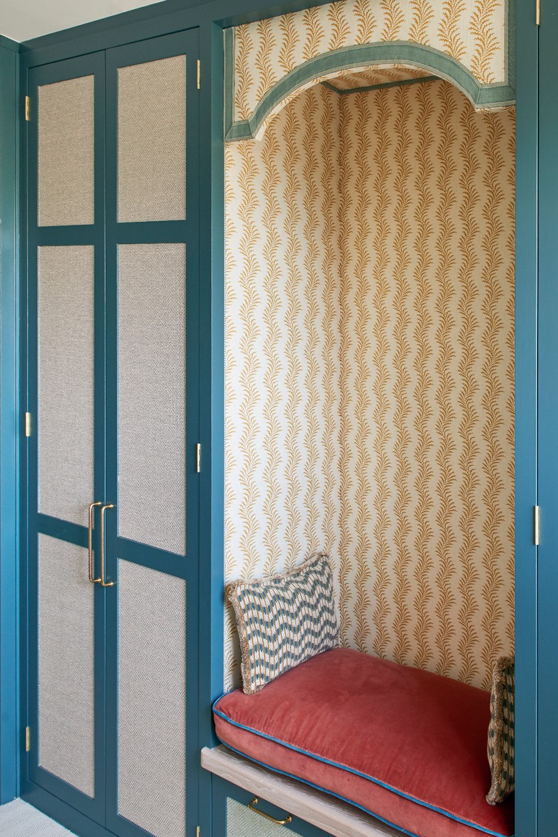
Wandsworth
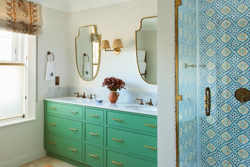
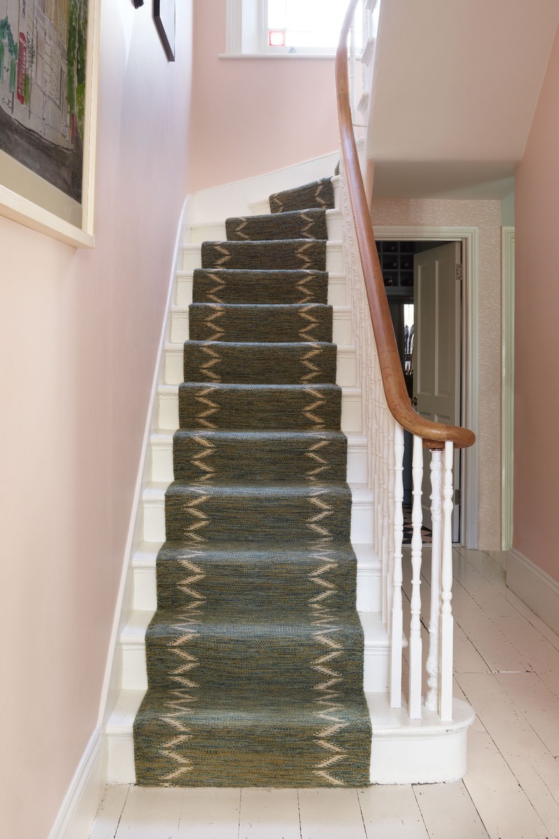
The client had purchased this four-storey new-build townhouse for the space and location, but it lacked character, colour and charm. We redesigned the layouts of the family living areas, kitchen and main suite to make the most of the space and add enough storage for a young family. The owners wanted a bright, cheerful space and cited the house in the Paddington films as their inspiration.
Making the rooms work on a practical level was key. We redesigned the kitchen to incorporate a beautiful glazed screen that siphons off the kitchen and dining area from the family area behind. As well as looking great, the screen houses the dining bench, which also offers useful hidden storage. We reconfigured the main bedroom suite, reallocating some space from the existing en-suite bathroom to create a larger and more practical dressing room.

The clients really wanted to go bold with colour throughout, but we wanted to ensure there was still cohesion within and between the schemes. We did this by using bold colours such as yellow (Farrow & Ball ‘Babouche’) on the kitchen cabinets, coral, azure blue and teal throughout. The house was furnished with bespoke joinery and furniture made in the UK, custom rugs and hand-painted tiles. We removed much of the harsh downlighting that is common in newbuilds, replacing it with a variety of layered lighting.
The eclectic mix of bold colour and pattern, including organic ikat and ethnic prints, stripes and florals, links all the rooms. While the design is playful, we took the practical requirements seriously to ensure it worked for everyday living. One of our favourite features is the cosy, upholstered niche in the dressing room. The client had wanted somewhere for her children to sit while she got ready, and it’s also used as a reading nook.
/https%3A%2F%2Fsheerluxe.com%2Fsites%2Fsheerluxe%2Ffiles%2Farticles%2F2023%2F01%2Fhowark-design-serifos.png)
03
Serifos, Greece
We were asked to modernise and refurbish this traditional home on the island of Serifos. The house is over 100 years old and has had various changes made to it over the years, so it was key to reconcile these while also making the most of the wonderful seafront location and original features.
The property required a sensitive approach to ensure it retained its unique charm. The aim was to keep original elements like the beautiful floor tiles and make it a wonderful holiday home for family and friends to enjoy. The whole property was gutted, down to rewiring and plumbing, but the original elements were carefully protected. Being in the Mediterranean, utilising the outside space as additional living space was so important, so we redesigned the courtyard garden into a beautiful seating area.
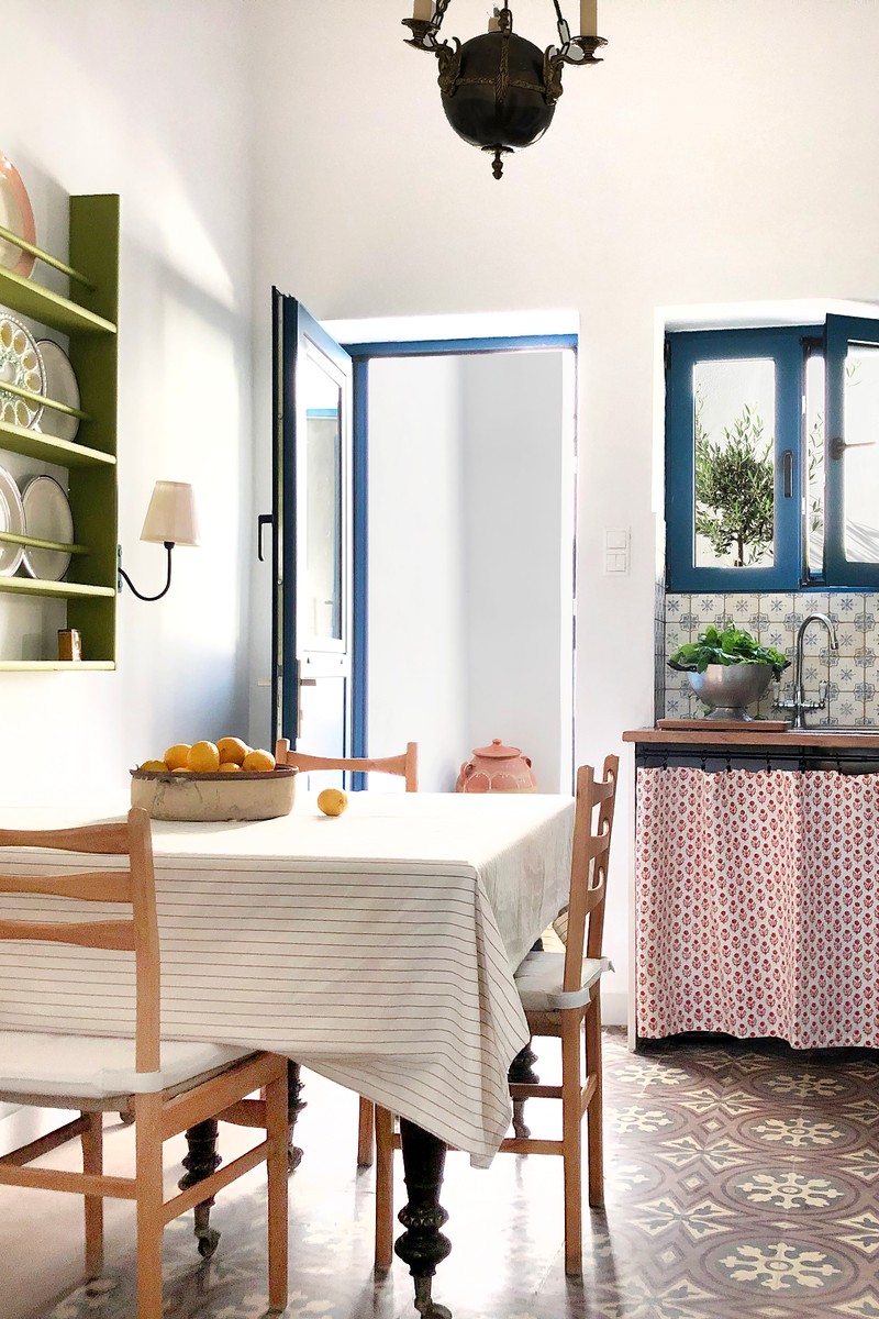
We were keen to avoid replicating a classic blue and white scheme, which is so often seen in the Greek islands. We wanted to reflect a less traditional choice of colours and fabrics, so we added splashes of deep red and zingy lime. We also sourced vintage furniture, lighting and ceramics from the antiques market in Athens, alongside bright fabrics to add layers of colour, texture and pattern. Our favourite room is the kitchen – contemporary yet authentic, the tiled floor, skirted cabinets and bold plate rack are a match made in heaven.
The balance of old and new really works: one example is the red bed frame which was new, but we had it painted, so people often think it is an antique. The island location posed a few logistical challenges but we had a great contractor and good communication ensured a successful outcome –any challenges were easily offset by the bonus of working next to the beach…
Visit Howark-Design.co.uk
DISCLAIMER: We endeavour to always credit the correct original source of every image we use. If you think a credit may be incorrect, please contact us at info@sheerluxe.com.
/https%3A%2F%2Fsheerluxe.com%2Fsites%2Fsheerluxe%2Ffiles%2Fwebsite-images%2F2025%2F03%2Fsign-up-pop-up.jpg)
