Meet The Interior Designer: Clara Ewart, Kitesgrove
The Background
A decade ago, I trained at KLC, before working for a developer and then moving onto Todhunter Earle. When it turned out Kitesgrove was hiring, it was the perfect next step. I’ve always loved the studio’s style DNA, as it’s very close to my own. The job came up on Instagram – a very modern way of applying – and I’ve been here for coming up to three years now. Originally, Kitesgrove was founded by Will Yerburgh eight years ago and as the business became more successful, Kitesgrove was established as an interior design studio. There’s now five of us altogether but because we’re more of a studio, we don’t have a ‘name’ to design to or for, which is a bit of a luxury.
Style & Ethos
That said, the Kitesgrove DNA runs throughout all our projects. We describe ourselves as a volume button – one you can dial up or down, depending on whether you want something pared back or colourful. More than anything, we’re nuanced and subtle. Our process is best described in three parts: our colour palette and preferred materials; the client’s design inspiration; and the building itself.


Colours & Materials
There is a Kitesgrove colour palette – teal, burgundy, plaster and eucalyptus are some of the main shades we work with. In terms of materials, we love burr oak for joinery, travertine, sisal and bauwerk (lime) paint. We try to focus on natural, non-toxic and sustainable materials – we’re even using lino in a current project. For the hard finishes we focus on texture, layers, and slightly more architectural finishes, but with fabrics and wallpapers we love a bit of colour and pattern.
Finishing Touches
Ceramics can add a lovely 3D element to a room – something you can only really otherwise achieve with lamps. We source pieces from lots of unknown artists and love adding them at the end of a project. We also love a drinks tray, lots of books and good artwork.
/https%3A%2F%2Fsheerluxe.com%2Fsites%2Fsheerluxe%2Ffiles%2Farticles%2F2022%2F04%2Fkitesgrove-body-layout-03-fb.jpg)
Collaborations
We recently joined forces with Jennifer Manners on a repurposed range of rugs made from plastic bottles. You can even use a Sharpie on them, and it’ll wash off! Practical, durable and recyclable, they’re launching later in the year and will be available for everyone. We also have a range of tiles with Bert & May. We’ve designed a suite at a Spanish hotel and these tiles are going in the bathroom. They have a polished plaster effect and because the pattern is a tessellation, they can be used in different ways. Finally, look out for Kitesgrove Teal at Farrow & Ball. It was a colour we felt was missing from the range and we needed it for a project, so we developed it with the team there.
Instragam Inspiration
/https%3A%2F%2Fsheerluxe.com%2Fsites%2Fsheerluxe%2Ffiles%2Farticles%2F2022%2F04%2Fkitesgrove-body-layout-04-nlw.jpg)
01
Hampstead Penthouse
We were appointed by an entrepreneurial, design-aware couple to transform their Hampstead apartment. The brief was to create a modern members’ club feel, one that fully embraced colour, texture and pattern and was complemented by antiques.
The clients shared our passion for beautiful design, craftsmanship and natural materials, so we had the opportunity to create several bespoke items for the project, as well as work with specialist interiors brands, such as Soane Britain, Pinch, Lewis & Wood, Guy Goodfellow, The Rug Company and Ochre.
The starting point for the reception room came from a palette of rich and fresh blue, green and pink. We used Farrow & Ball De Nimes on the walls to ground the light-filled space, while the pink hues from the B&B Italia sofa upholstered in Holland & Sherry Oshin Dusty Pink adds instant freshness. Finally, the green shades from the Soane Tendril Vine curtains and the ottoman in Holland & Sherry Quaintrelle Dandy II Teatime add some desaturated colour to the space. The silk yarns of The Rug Company’s Meridian Aqua sunburst complement the other tones in the room, while the bespoke sheepskin chair by Pandora Taylor adds some tactile warmth.


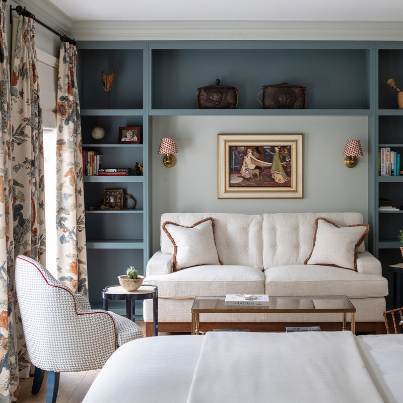
02
Dulwich House
I transformed my own townhouse in Dulwich in line with Kitesgrove’s core design principles – to create an informal, restful and inviting family home for myself and my husband to enjoy for years to come.
There is a strong emphasis on natural materials throughout, from the textural quarter sawn timber finish of the Sebastien Cox for Devol Kitchen to the live edge burr oak console shelf. The pale oak herringbone floor, sourced from Ted Todd, creates visual interest, while also unifying the open plan living and dining space. Bronze ironmongery, electrical hardware and light fittings were used throughout to create architectural consistency.
The colour palette is made up of earthy, neutral tones such as Hardwick White from Farrow & Ball in the master bedroom and Setting Plaster from Farrow & Ball in the guest bedroom. The large open plan living room was painted in Stone II from Paint & Paper Library to create a soft, calming backdrop for the furniture, art and lighting. The antique armchair in the master bedroom was upholstered in a Kitesgrove favourite bouclé – Esteban from Pierre Frey – and the Tansy Rust cushion from Robert Kime grounds the space.
/https%3A%2F%2Fsheerluxe.com%2Fsites%2Fsheerluxe%2Ffiles%2Farticles%2F2022%2F04%2Fkitesgrove-body-layout-07-fb.jpg)
The lighting is considered and layered, balancing practical task lighting (such as the contemporary bronze picture light in the reception room) with atmospheric, low-level lighting and additional wall lights, pendants and table lamps throughout (including the articulated bedside wall lights from Pooky with Matilda Goad rattan scalloped lampshades).
When it came to the finishing touches, combining antique one-off pieces, such as onyx eggs and mid-century ceramics with more contemporary items such as the ceramic candle holder from Zara Home, created a collected look. For the artwork, the vintage pressed flowers were sourced from Kempton Market and the antique Swedish abstract nude came from Medium Room, an independent vintage and antique art dealer in the Cotswolds.


03
Country Family Home
Set within gloriously landscaped gardens, we transformed this country house from a well-loved but dated property into a resplendent family home. Undertaking a complete renovation, we oversaw a two-wing extension as well as a full refurbishment, resulting in a rural retreat that cleverly merges traditional features with contemporary design.
We always prioritise nuance and originality in our work, and carefully sourced a mix of antiques and contemporary pieces to sit seamlessly alongside the furniture and artwork that had been in the family for generations. We worked closely with the clients to create a classic modern feel, with the kind of decorative style that will stand the test of time.
/https%3A%2F%2Fsheerluxe.com%2Fsites%2Fsheerluxe%2Ffiles%2Farticles%2F2022%2F04%2Fkitesgrove-body-layout-10-fb.jpg)
By interweaving complementary colours and rich tones throughout, we created a cohesive, calm home. In the dining room, we created an immersive and atmospheric space for entertaining by enveloping the walls and woodwork in Farrow & Ball’s Incharya Blue. We wanted the Devol kitchen to feel soft, so chose Paper & Paint Library’s Desert Rose pink, which has a subtle undertone of grey to help it shift during the day – it sits well against the chalkiness of the Portland stone countertop. Juxtaposed with the soft pendant lighting and fabric blinds, the original antique dining table and chairs add a sense of history to the space.
With the two main bedrooms located in the newly built glass and timber extension, overlooking the beautiful garden, these are spaces that reflect the changing seasons. The main bedroom especially feels as though it’s part of the garden, with two fully glazed walls offering views over the estate.


Visit Kitesgrove.com
DISCLAIMER: We endeavour to always credit the correct original source of every image we use. If you think a credit may be incorrect, please contact us at info@sheerluxe.com.
/https%3A%2F%2Fsheerluxe.com%2Fsites%2Fsheerluxe%2Ffiles%2Fwebsite-images%2F2025%2F03%2Fsign-up-pop-up.jpg)
