Mono-Pattern Schemes
Joanna Plant on her loft bedroom…
‘Mono-pattern’ describes this look very well. It’s a wonderful thing to live with – it’s enveloping and creates a unique atmosphere. Someone once said that it takes a lot of business to make a room feel restful, which is so right.
Much to people’s surprise, this technique can make a room feel bigger. If you want to use a paper up and over the ceiling, it’s best if the design is quite loose so you aren’t too aware of the meeting points, which can’t always be pattern matched. I would avoid geometrics, for example, which can be tricky to work with.
Generally, I use a slightly stronger colour palette – and different scales of pattern. There’s no point going maximalist if you’re nervous of colour. Having said that, using a single colour can be a little more relaxing. I love document designs from Pierre Frey and anything from Bennison.
Using this approach in rooms which lack architectural details is great. That’s because the pattern is doing all the work and ‘fudges’ everything else. I would also use it in rooms which have a good view, where you want to draw your eye out of the window rather than encouraging it to stay inside.
Visit JoannaPlantInteriors.com
/https%3A%2F%2Fsheerluxe.com%2Fsites%2Fsheerluxe%2Ffiles%2Farticles%2F2023%2F02%2Fplant-house-37911.jpg)
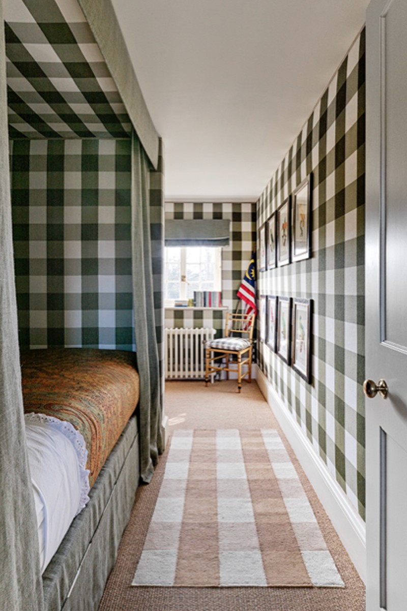
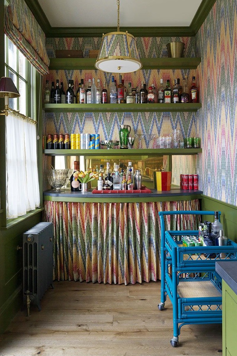
Salvesen Graham on a bold bedroom and a playful bar…
This technique can be very impactful. If you’re going down this route, you need to go all in and pick up the same colour on the woodwork, too. While it’s not subtle by any means, by repeating the pattern on multiple surfaces the finished result can often appear surprisingly restful.
There are any number of situations where you can use this look. Depending on the tone or boldness of the pattern, it will create a different feel. In this bar area, the effect is bright, fun and bold, whereas in the gingham bedroom the colours are muted for a calmer, more cocooning space.
The size of the room will dictate the scale of the pattern – smaller spaces lend themselves better to big patterns, but the fun is that the trend does suit all sorts of rooms. The only space I’d avoid doing it is the kitchen. When it comes to flooring, either continue the pattern or keep it simple so it doesn’t compete. We like to pull out colours from the print and use them in an eggshell or even a high gloss on the woodwork to add an extra dimension.
Visit SalvesenGraham.com
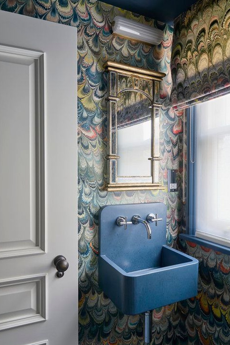
Olivia Emery on this bijou bathroom…
This look is a modern take on the toile de Jouy rooms of the 17th and 18th century. My client loved this wallpaper and wanted to use it in this small guest bathroom, so we thought we may as well use it everywhere to maximise the impact. If you’re going to use the same pattern all over, my advice would be to choose a bold one.
Using the same pattern can be very cocooning. Plus, you can enhance the look by pulling out one of the darker shades in the pattern for the woodwork. You do need to consider the size of the room when choosing your pattern – with a room like this, you don’t want a huge pattern. As for colour, there are a lot of factors at play here, such as the property, the room and the client’s taste. I tend to go for bolder colours but sometimes a room needs to be more muted.
You can be clever with lighting in a space like this. The lovely wall light with the ribbed borosilicate glass complements the antique mirror and lets out a soft light, while also picking up on the lines of the marbling in the wallpaper and fabric. We chose blue paintwork because we found this incredible sink which worked with the scheme and I wanted to continue that on the woodwork and ceiling.
Visit OliviaEmery.com
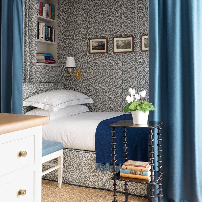
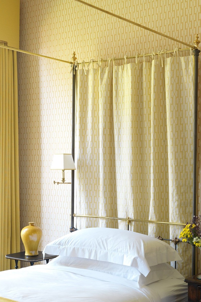
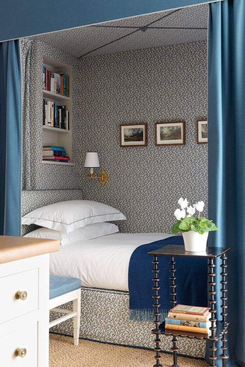
Natasha Greig of Veere Grenney on hideaway bedrooms...
Not only is this look very attractive and inviting, it makes a room feel spacious and ordered. There’s nothing nicer than when the curtains are drawn and everything feels cosy. It’s like you’re enveloped in pattern.
A small geometric pattern is our favourite – but there are no strict rules. We recently decorated a dining room with walls and curtains in a large chocolate and white damask, and it looked great because it was a small room that really added that gravitas of scale. However, I wouldn’t get too hung up on scale and pattern – it’s whatever feels appropriate for the room. And when it comes to colour, go bright and bold or muted and tonal – again, it just depends on the atmosphere you want to create.
My favourite place to use this technique is in a bedroom. While there are no rules around lighting, you need to consider how you will light the space. We prefer a soft yellow light as opposed to a harsh white light. Then, when it comes to paintwork, most people tend to use the predominant colour in the pattern but we would always veer towards a soft grey or off-white to pull things together.
Visit VeereGrenney.com
Or continue to comment as a Guest below
DISCLAIMER: We endeavour to always credit the correct original source of every image we use. If you think a credit may be incorrect, please contact us at info@sheerluxe.com.
/https%3A%2F%2Fsheerluxe.com%2Fsites%2Fsheerluxe%2Ffiles%2Fwebsite-images%2F2025%2F03%2Fsign-up-pop-up.jpg)
