SL Meets The Hotel Designer With Enduring Style
STYLE & INSPIRATION
One of the best things about my job is getting into the mindset of someone else – understanding their aspirations for a space and developing the design from there. I enjoy adapting my style to suit the architecture of a room and the brief from the client.
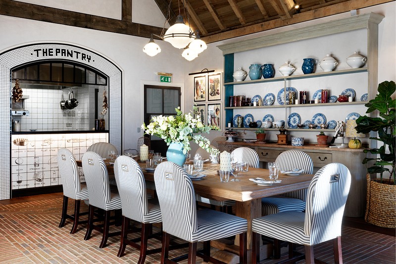
The priority is to create an interior which enhances the architecture of the space – be it a contemporary apartment, a country house or a buzzing bar or club. By working closely with architects, we collaborate to create something unique. It’s important the interior design has integrity, that every colour and piece makes sense and sits comfortably.
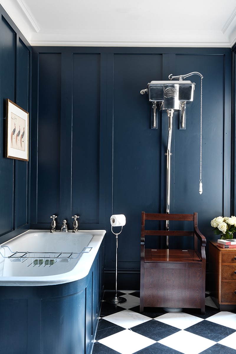
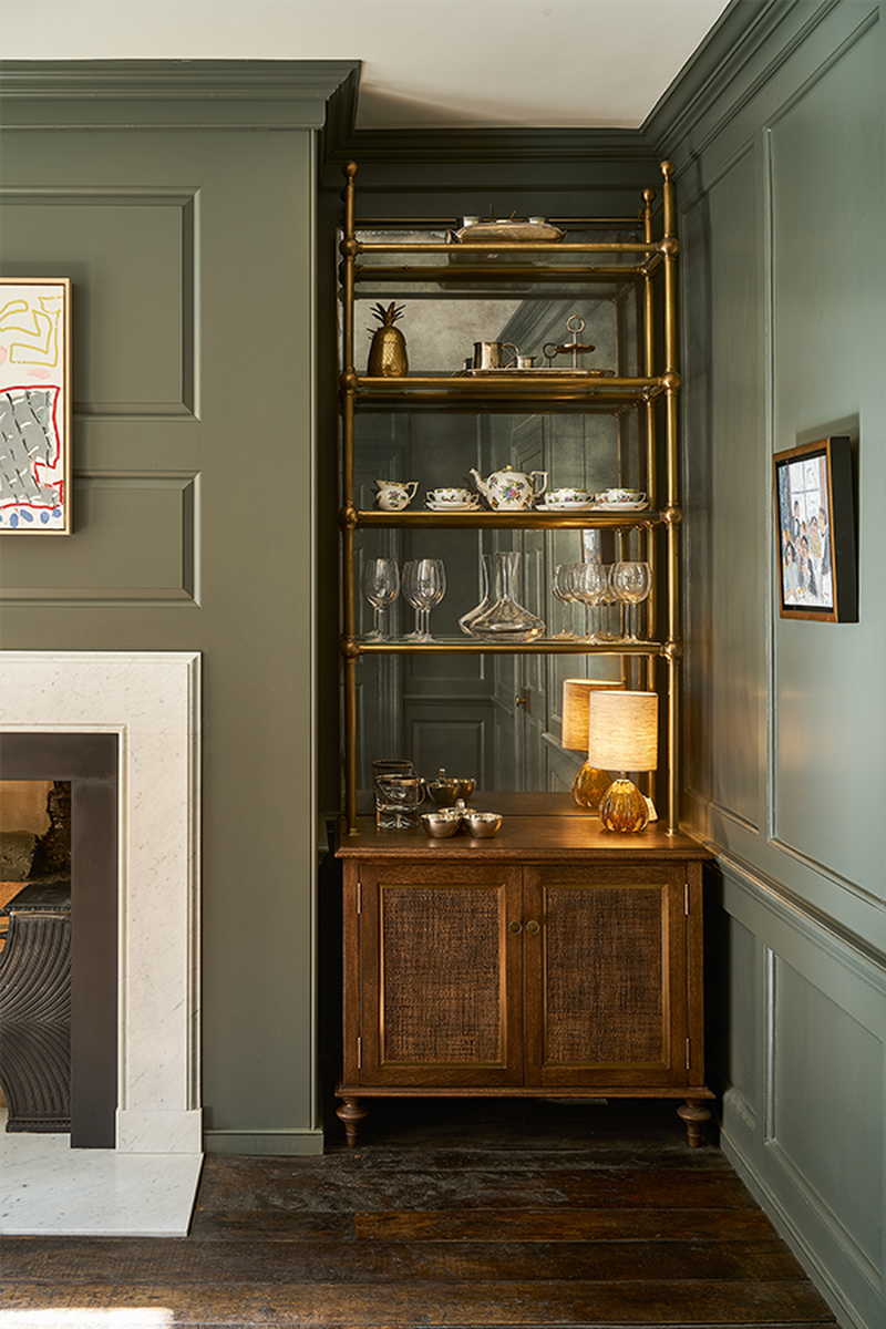
I like to focus on different textures – using natural materials such as wool, silk, linen, cotton, wood, stone or brass, and balancing cool and warm colours. The aim is always to create a space which is interesting, welcoming and individual to reflect the personalities of those living in or using the space.
When a new project comes in, I still get excited. Soho House Berlin was a favourite because of its scale. I was encouraged to really go for it and create something different to anything that had been seen in Berlin before. More recently, I completed a large and beautiful 1930s’ motor yacht. The brief stated the interior should reflect the age of the vessel, so we sourced many original fixtures and fittings, and appropriate furniture and lighting. It was a fantastic project to work on.
Recently I’ve been working on something in Mallorca – a country I’ve really fallen in love with. It’s quick and easy to get to, has plenty of sunshine, beaches and incredible mountains for walking or cycling. Then, of course, there’s the food...
Travelling always influences my thoughts and work. Getting out and about and seeing new things is stimulating and gets the creative juices flowing. With Mallorca, it’s the paired-back, simple, natural way of living that appeals. The villages, architecture, the coast line – I always discover something new when I visit. Most recently, it was a fantastic family-run Terrazzo company which makes the most beautiful floors and surfaces.
There are many designers who inspire me. Some of the first Interior designers I read about were John Fowler and Nancy Lancaster. Their work has always fascinated me. I’m also drawn to the Scandinavian designers, such as Josef Frank, Carl Larsson and Kaare Klint. I also have to mention Billy Baldwin and Dorothy Draper as they influenced my work on Soho House, Berlin.
I have an inquisitive mind and I’m always on the hunt for something new. I trawl the internet relentlessly – it’s something I do every day. Getting out and about – going to exhibitions and galleries; walking and being in the countryside; being surrounded by nature and using things in interiors that occur naturally – I find that really grounding and nurturing.
SPACE & PLANNING
My designs are intended to make people feel instantly relaxed. It’s the combination of colours, textures, and the choice of furniture and accessories which make a room work. Layering and details can help create an atmosphere which people don’t want to leave.
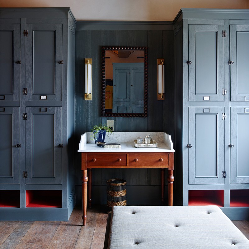
Designing small spaces is a joy. A cosy room or nook is always fun. Embrace the fact that it's small rather than trying to make it feel larger. Use warm, dark colours and furniture which is scaled correctly for the space. Alternatively, apply tongue and groove panelling to the walls and paint it a pale colour – it helps the back drop of the room look interesting and characterful.
A very large room can be challenging. I recently completed a project which had a 25sq metre room – that made me a little nervous! But after working on the plans, it became clear how to zone and ear-mark different areas for different uses. Screens, plants and artwork can divide up larger spaces to stop it feeling too vacuous.
DECORATING
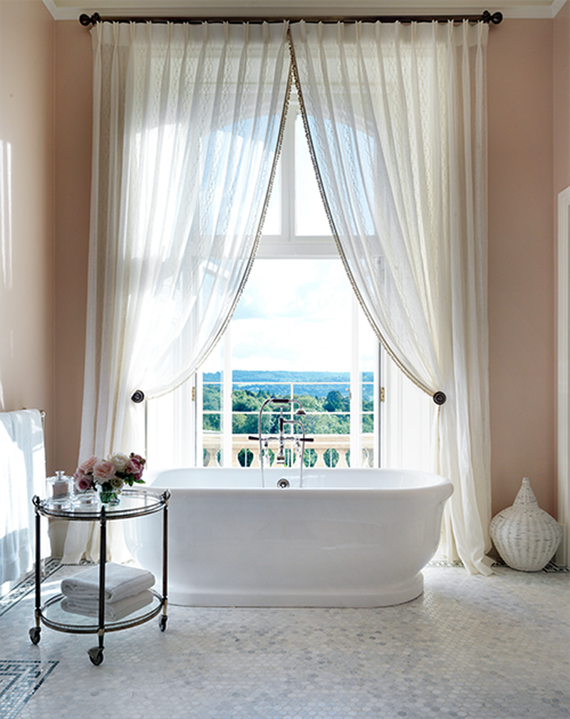
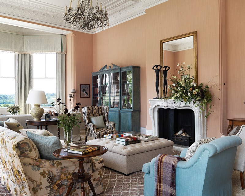
Pinks, whites, pale blues and minty greens... I’m very drawn to pale colours that create a feeling of calm. However, when designing the colour scheme for a room, the direction it faces and the light is always at the forefront of my mind. Not all colours work in every room.
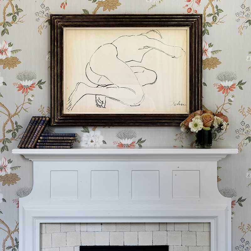
Don’t be afraid to use pattern in a room, especially florals, botanical prints, checks and stripes. Mixing these things together is very satisfying and can work really well as long as the scales don’t compete with each other. For example, if you’re using a large-scale floral, use a smaller scale stripe with it. If all the print scales are similar, it won't be successful. Mix things up and try not to be formulaic.
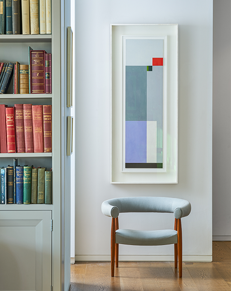
Mixing ages and styles of furniture is great, but a room shouldn't become a mis-match of lots of different things. You don’t want it to look like a jumble sale. Have one or two standout pieces and add antiques or your favourite heirlooms for extra character. We often re-upholster an antique chair with a modern fabric, or re-frame an old piece of art so it sits more comfortably in a contemporary setting.
Where possible, avoid trends as they can date quickly. That said, at the moment, I’m using more curvaceous upholstery pieces, such as sofas and armchairs with rounded backs and arms. Ceramics and glassware, too, are very current and can add reflection, light and cooler surfaces to a room. Add pops of colour through accessories – think candlesticks, bowls, vases and lots of basketry items for texture.
Spend money on the ‘bones’ of the house, if you’re planning to stay there for a long time. By that, I mean the interior architecture, the joinery and the fixed wall and floor finishes. These are the things which are difficult and costly to change further down the line. Curtains and furniture should always be secondary.
You can economise on fabrics and rugs. We often have restrictions on what we can spend on certain projects and, as designers, it’s important to fulfil a brief even on a tight budget. We've used dust sheets for curtains and also old army blankets with an interesting contrast stitch on the leading edge. I’ve used brown craft paper as a wallpaper, inexpensive ticking on sofas and chairs, and Ikea do fantastic sisal and jute rugs. Also, one of my absolute favourite things to do is to go to markets to pick up bargains – it’s amazing what you can find.
KITCHENS
The kitchen is my favourite room to design – it's the ‘heart’ of the home. For a commercial space it has to be the bar – the ‘heart’ of the hotel or club. These spaces are a focal point where people gather to eat, drink and enjoy themselves.
Family and friends tend to hang out in the kitchen to keep the cook company. So make it feel like a welcoming room rather than just a functional food prep space. An island unit acts as a barrier between the ‘chef’ and the family – but it also doubles up as a breakfast counter or a bar in the evening. Ensure you have comfortable dining chairs and if you can fit it in an armchair or sofa, this can help create a more informal and welcoming vibe.
Lighting in a kitchen is key and although functional spotlights are essential in some areas, think about installing evening lighting on a separate circuit – perhaps wall lights, uplighters in the reveals of windows or pendants over a table or island unit. Put them on a dimmer so you can change the mood easily.
Tiled floors in the ‘working’ kitchen area are preferable, but use wood everywhere else. Wood has a lovely acoustic and is nicer to walk on with bare feet. Practically, it’s better to have a hard and wipeable surface where there’s water and food preparation.
Opt for two or three different work surfaces in a kitchen, depending on the size. Calacatta marble looks fantastic and wood surfaces are also warmer and nice to lean on. I recently installed a lava stone work surface on an island in a beautiful soft blue/grey, which worked so well with the wood work surfaces elsewhere.
The Suppliers Susie Relies On Time And Again…
FURNITURE
Vinterior, Howe, Soane, Lillie Road and markets
FABRICS
Claremont, Penny Morrison, Pierre Frey, Abbot & Boyd, Holland and Sherry
KITCHENS
Devol, Plain English, Artichoke
KITCHEN HARDWARE
Labour & Wait, Divertimenti, The Conran Shop, Summerill & Bishop
BATHROOMS
TILES
WALLPAPER
Marthe Armitage, Tissus d’Helene, Cole & Son
PAINT
Papers & Paints, Zoffany, Marston & Langinger, Farrow & Ball, Paint Library
LIGHTING
Rose Uniake, Soane, Howe, Holloways of Ludlow, Vaughan, Porta Romana
FLOORING
Visit SusieAtkinson.com
DISCLAIMER: We endeavour to always credit the correct original source of every image we use. If you think a credit may be incorrect, please contact us at info@sheerluxe.com.
