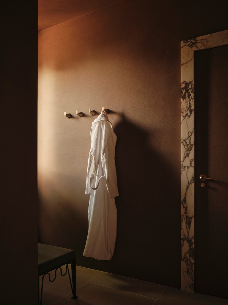
Interiors Trend Watch: Brown
Rooted In Nature
For Alice Gaskell, founder of Alice Grace, brown’s resurgence is directly tied to the renewed appreciation for natural materials. “The resurgence of brown partly comes down to a real focus on natural materials,” she explains. “Not only are we conscious about the ways in which we incorporate sustainable practices by buying high-quality, locally-made furniture but we’re also placing a real emphasis on floors and ceilings. These things are often made of wood – you’ll usually see wooden panels and beams included for aesthetic purposes – and those wood tones help create warm, textured and meaningful spaces.”
This connection to nature runs deep in the current design conversation. As Murude Katipoglu, founder of Murudé, notes: “Brown’s comeback is rooted in a broader movement toward grounding colours. People are drawn to warm, natural hues that create a sense of calm and comfort, particularly after years of cool greys and stark whites. There’s a desire to reconnect to nature, and brown – with its organic, earth-like qualities – does that so well.”
A Forgiving Shade
Beyond its natural appeal, brown is also one of the most adaptable colours to work with. Edward Bulmer, founder of Edward Bulmer Natural Paint, explains: “Brown is an incredibly flattering colour; you can combine all sorts of textures and other colours with it. It’s all around us in nature, so we find it comforting too. Some ‘brave’ designers use it to dramatic effect, but you don’t need to be courageous to do so.” From rich chocolate lacquers to softer taupes, the spectrum offers multiple options, all of which are forgiving enough to work with bolder accents or layered textures.
Playing With Neutrals
Neutrals have always been a natural partner for brown but now they’re being used in more nuanced ways. Alice explains: “Brown goes very well with warm neutrals – not only just in terms of neutral paint colour but also textured papers.” Murude agrees that tonal layering is key: “Pairing brown with lighter tones like beige, cream, or white helps to keep a space feeling light and airy. Incorporating different textures and finishes to break up the weight of the brown is also key. If I’m after a moodier effect, I like picking up on lighter tones of brown in the walls and darker tones in the upholstery. Right now, we’re also seeing a lot of deeper chocolate tones paired with muted, earthy shades like camel, mocha and taupe.”
Unexpected Pairings
Still, brown is far from limited to neutrals. Alice has long been a fan of pairing it with bolder shades: “Pairing a brown tone with something a little unexpected can be beautiful, particularly if you’re going for those warm, rich tones that remind you of autumn like reds and ambers. I have always been a big fan of brown with blue – they both offset each other perfectly. I've used them in papers, paints and furnishings.”
Murude also suggests nature-inspired palettes: “I love pairing browns with light okra, rusty muted oranges, deep greens and soft terracottas for a nature-inspired palette. If I am after a lighter and more contemporary feel, mixing browns with creams, dusty pinks or sage greens creates a sophisticated contrast.”
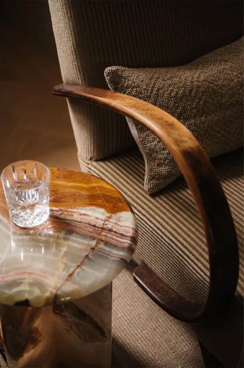
Texture & Depth
Brown’s staying power is also down to the way it interacts with texture and materials. Murude explains: “Brown works wonderfully with natural materials like wood, plaster and stone, such as heavy-vein marble or travertine. These materials complement the organic warmth of brown and bring texture and dimension to a room. I also love brown tones with aged brass and brown metals.” Edward takes it further: “Brown loves texture. Put brown paint with rush matting or brown velvet with blue walls and you can feel the fizz of the textural dialogue.”
/https%3A%2F%2Fsheerluxe.com%2Fsites%2Fsheerluxe%2Ffiles%2Farticles%2F2025%2F09%2Fsl-021025-interiors-brown-shot-23-709rt-full-bleed-2.jpg)
In Every Room
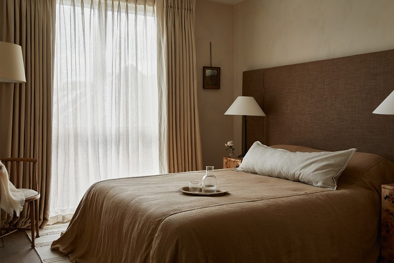
Designers agree brown can be used across the whole home. Edward says: “Brown works well in many spaces. In living rooms, it can create a cosy, inviting atmosphere, particularly when used in furniture or textiles. In bedrooms, soft browns add warmth and serenity. Even in kitchens, teaming brown cabinetry with lighter countertops and brass or bronze metal accents can add sophistication and depth.”
Smaller spaces can also benefit, as he adds: “Smaller spaces will normally benefit from choosing a slightly darker/muddy colour, so work with layering colours and textures to ‘break up’ the colour. If you are planning on painting a room dark brown, then you have to commit. Lighter browns tend not to overwhelm the room as they are in the neutral spectrum.”
Built To Last
Ultimately, brown’s strength lies in its timelessness. As Murude explains: “Brown is a colour that speaks to our growing desire for spaces that feel natural, grounding and timeless. As we move further into a design landscape that prioritises sustainability and wellness, brown will play a central role in shaping environments that are deeply connected to nature and evoke a sense of calm and comfort.”
Edward also sees its future as secure: “We believe we will see a rising trend of incorporating dramatic, dark browns as accent tones, paired with vibrant striking colours. This combination will blend traditional, rustic vibes with a fresh, modern aesthetic, creating spaces that feel both timeless and contemporary.”
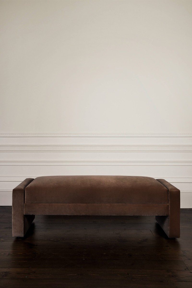
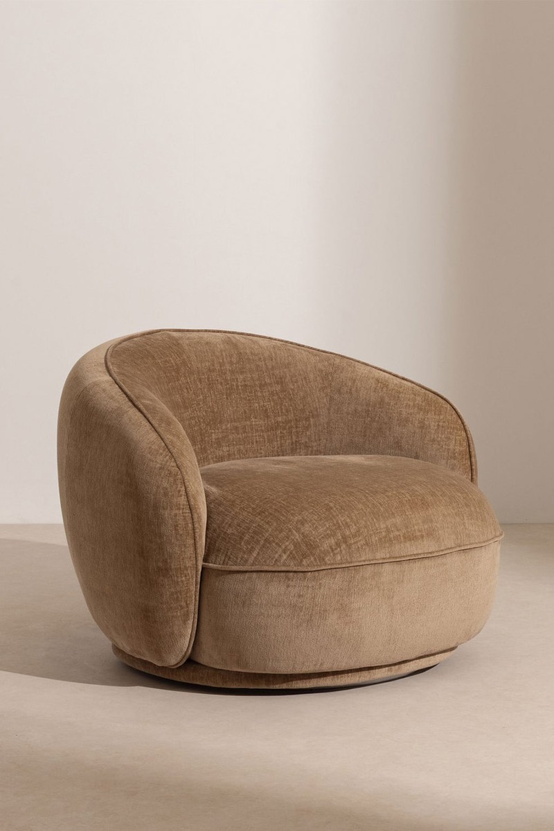
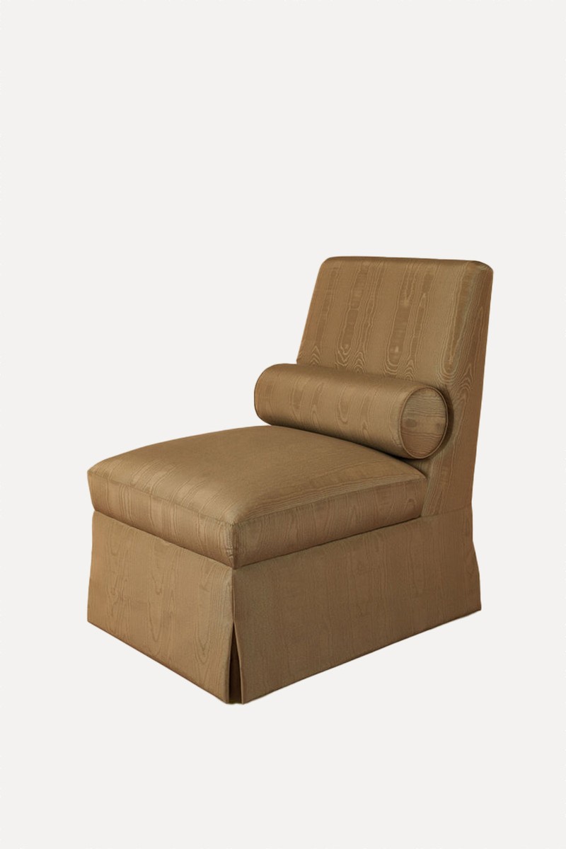
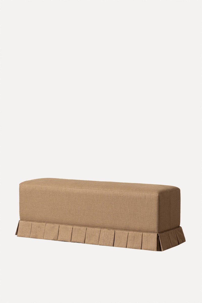
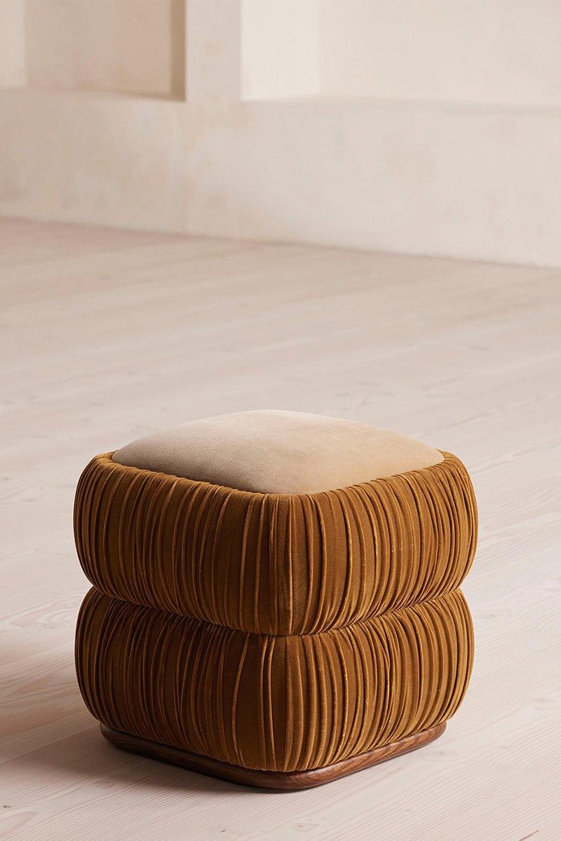
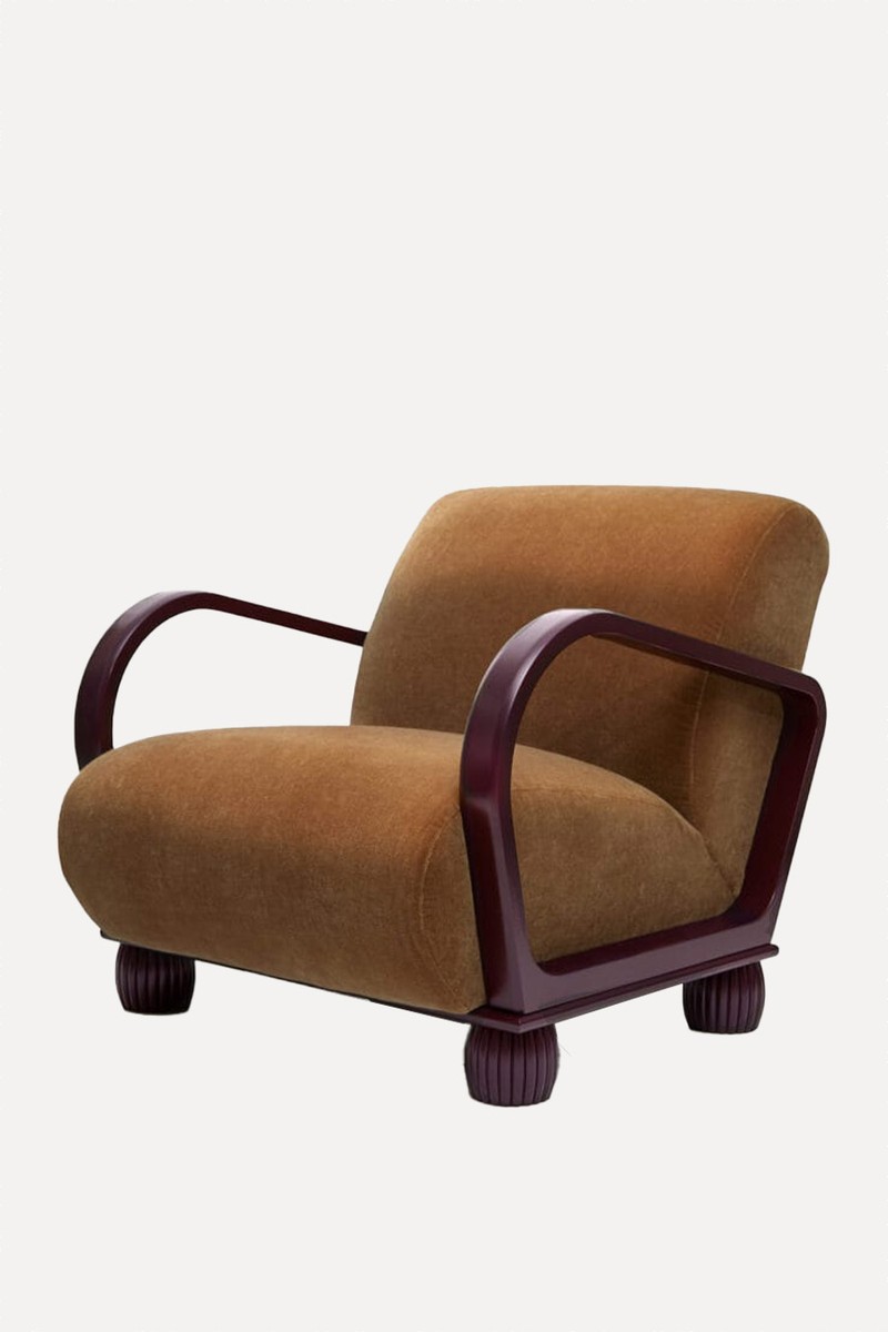
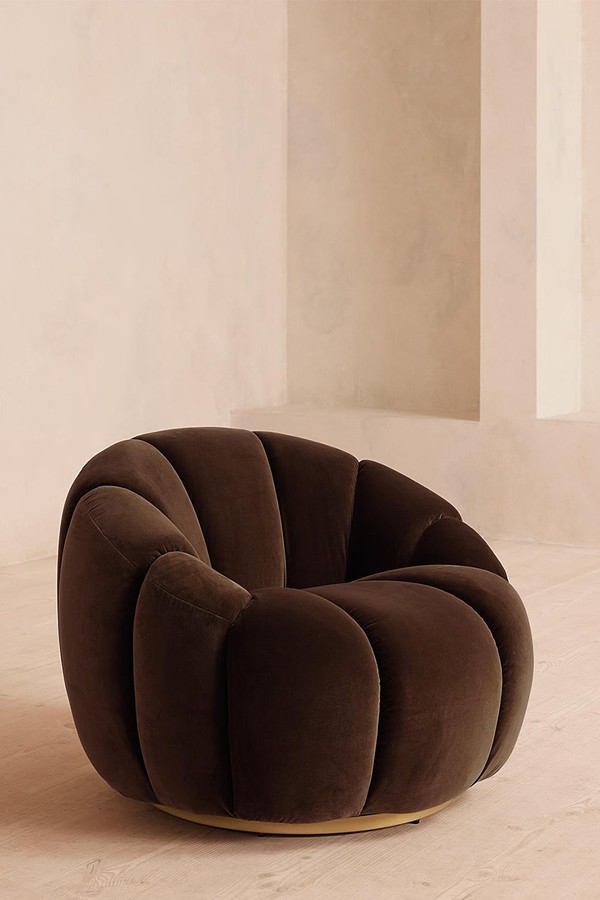
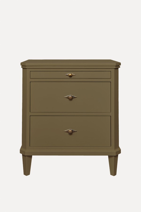
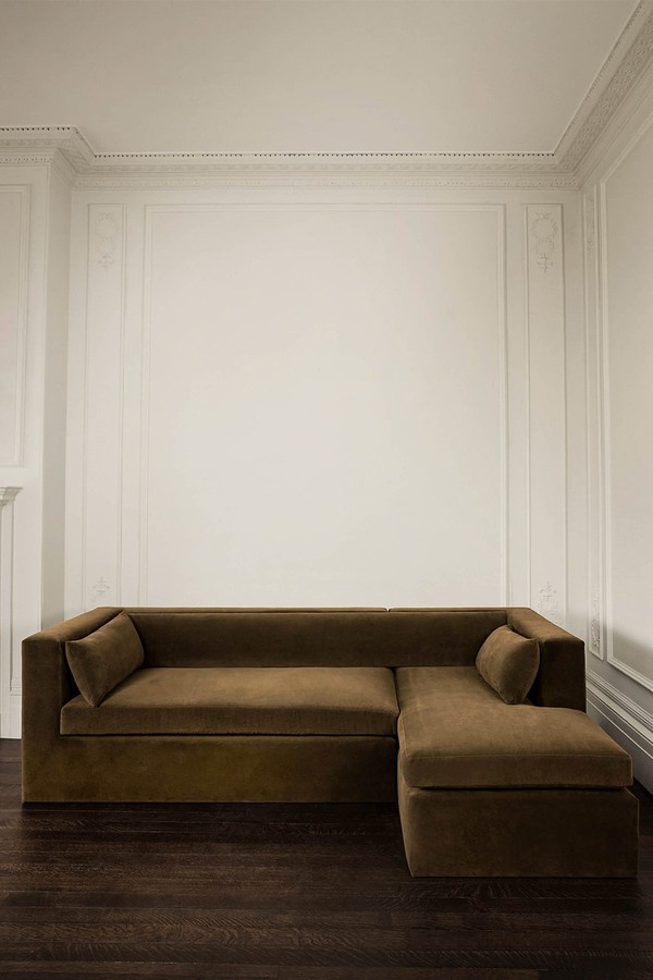
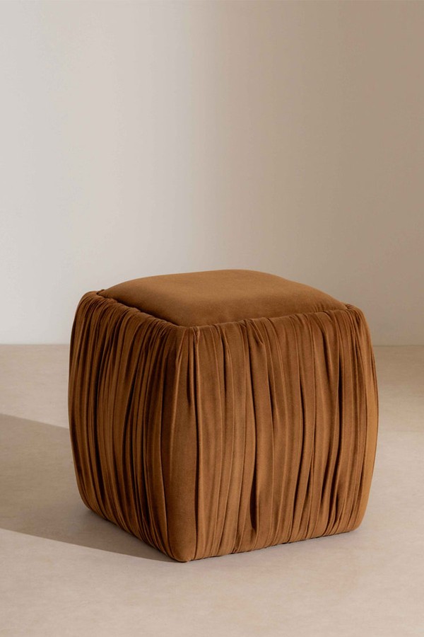
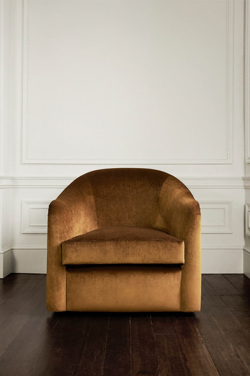
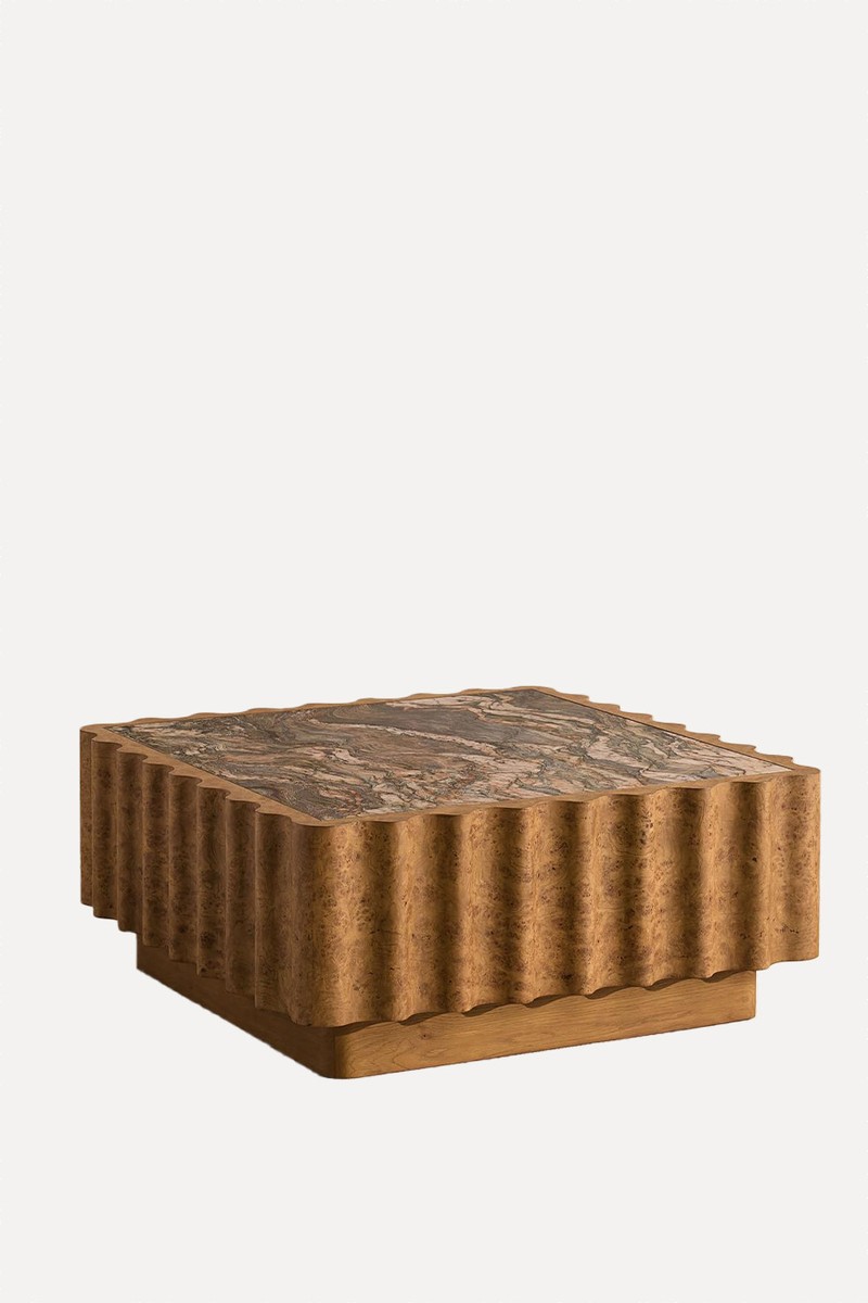
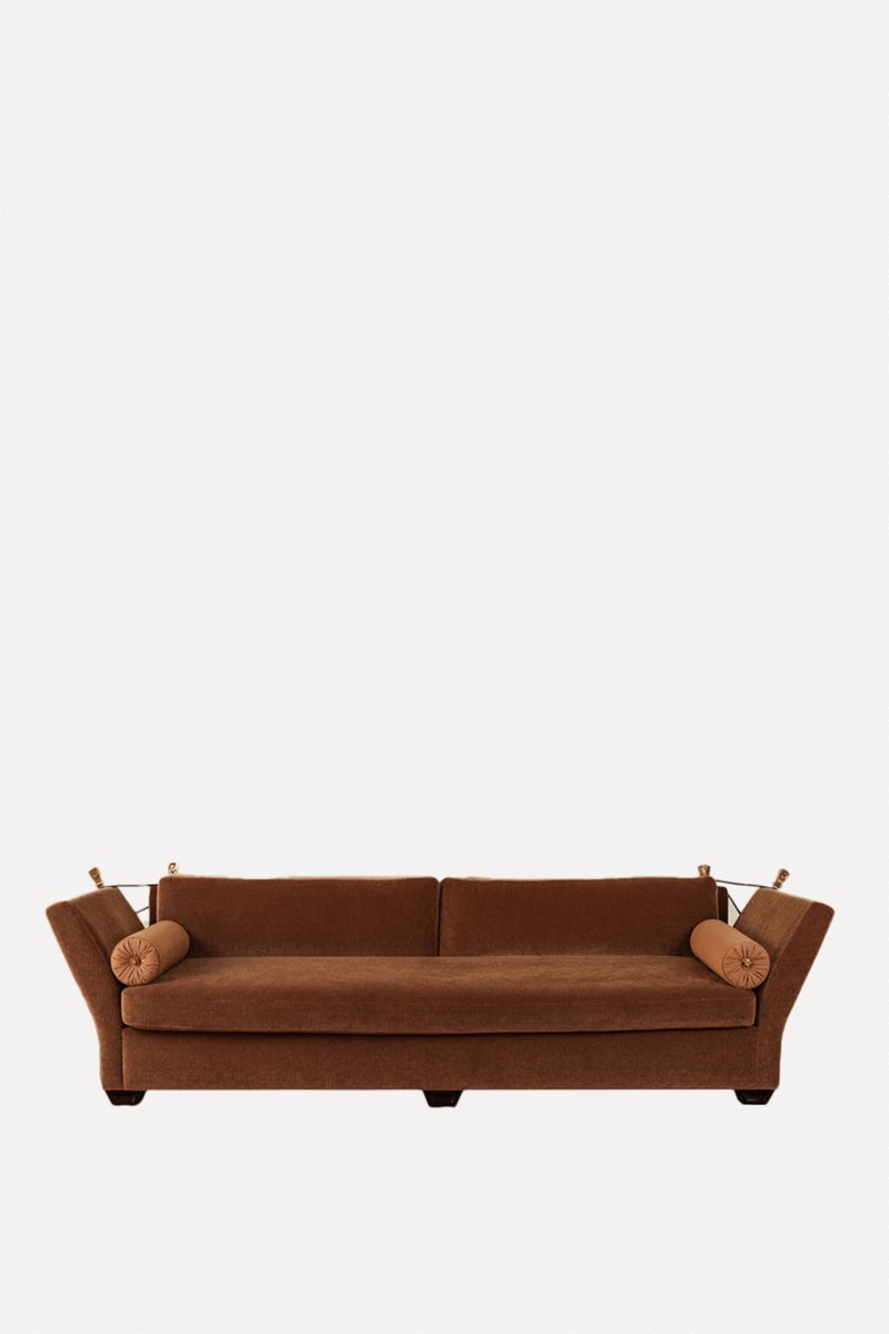
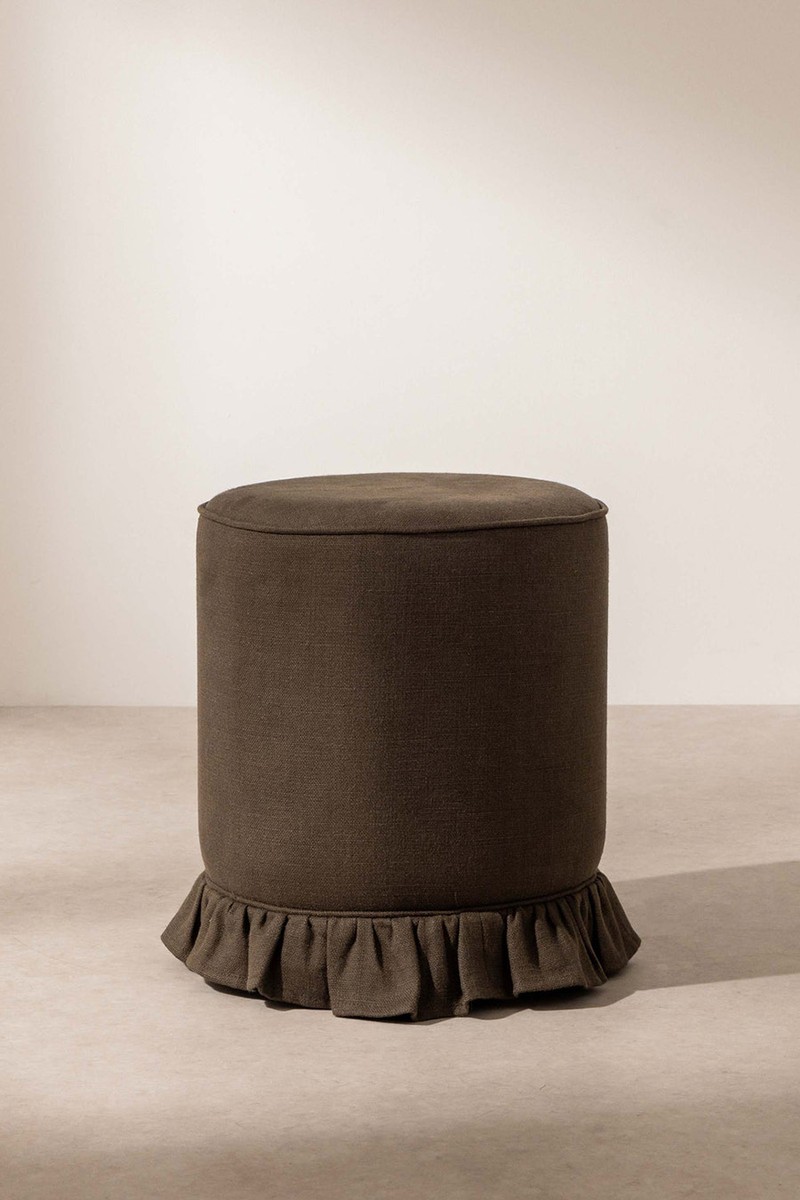
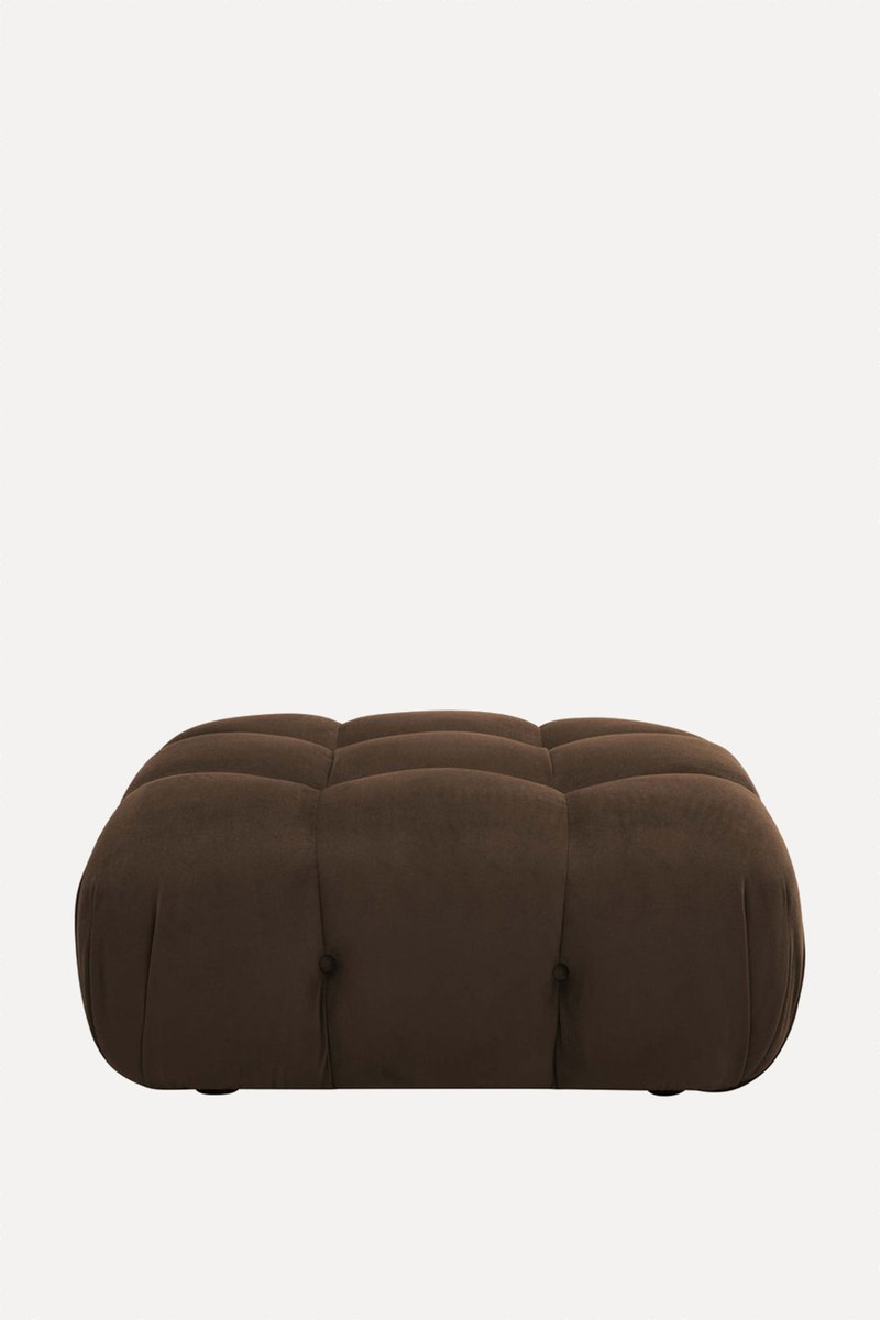
SHOP THE EDIT
Or continue to comment as a Guest below
DISCLAIMER: We endeavour to always credit the correct original source of every image we use. If you think a credit may be incorrect, please contact us at info@sheerluxe.com.
/https%3A%2F%2Fsheerluxe.com%2Fsites%2Fsheerluxe%2Ffiles%2Fwebsite-images%2F2025%2F03%2Fsign-up-pop-up.jpg)
