Interior Designer Jojo Barr Shares Her Inspiration & Favourite Projects
Style & Ethos
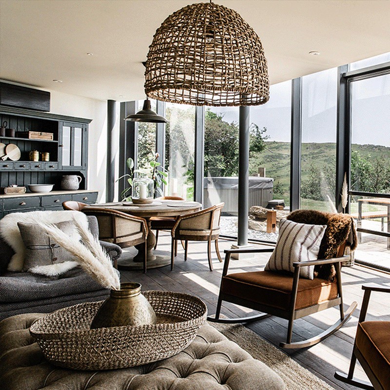
At House Nine, we create homes and interiors that are not just welcoming, but comfortable in every sense – that way they don’t feel forced or contrived, just easy and balanced. A house should always be a home, which requires a strong understanding of how interiors come together – from the architecture of a space to the furniture and soft furnishings that fill it. Each element is essential to creating one cohesive look that is both considered yet uncomplicated. Interiors should always feel grounded, comfortable and easy.
Design & Inspiration
My main source of inspiration usually comes from nature first. I love using raw, earthy and natural materials – be it in the fabrics through to the hard surfaces like stone, marbles and timber. Since the start of my career, some my main inspirations have included Ralph Lauren, American design, antique shops and fairs, mid-century design and art deco, Georgian architecture, English manor houses, country pubs, and French artists and framed oil paintings.
Colour & Materials
I tend to start with a neutral colour palette to ensure the tones are always easy to pair with. That said, I often steer away from greys and veer more towards the warm, neutral basics. From there I build in depth by introducing a single colour or shade on larger areas such as the joinery or ceilings. My signature colour would be green for its calming and balancing nature. On upholstery I prefer basic, solid shades such as olive greens, oatmeals, terracottas, burnt reds, and when it comes to pattern, unless it’s a stripe, I only use it sparingly.
One of my favourite fabric houses is Fermoie for its grown-up, yet playful prints. Natural elements form part of all of my designs, as they help to ground the scheme and add some substance. A sisal rug or water hyacinth basket will almost always appear somewhere…
Finishing Touches
Always invest in good quality upholstery. Buy cheap buy twice – whereas good upholstery can last you 20 years or more. Cushions add warmth, comfort, fun, softness, while antiques add that final layer of interest and intrigue. If it speaks to you, then buy it. Art is the string that pulls a scheme together and adds character and personality. Sometimes it’s worth using an art consultancy business to help collate an art wall or advise what art will complement the design. Try Cramer & Bell. I also use baskets in some shape or form in all of my projects to add a layer of texture and relax the eye.
Instagram Accounts To Follow
/https%3A%2F%2Fsheerluxe.com%2Fsites%2Fsheerluxe%2Ffiles%2Farticles%2F2021%2F06%2Fjojo-barr-layout01.png)
PROJECT ONE: Cornish Lodges

Inspiration
We were inspired by the Croatian mountain lodges designed by architect Tomislav Soldo. Going from the black larch cladding and clean linear angles of the exterior to the soft bright, inviting interior creates a direct contrast. The client’s brief requested a new breed of lodges that would sit naturally within the surrounding country landscape to make up this resort and spa destination. The master plan consisted of a range of architectural typologies, from leisure and hospitality buildings to various residential lodges, and these were designed to respect and enhance the local landscape while also providing variety and interest within the existing `setting.
Space & Planning
Where these lodges differ from a standard build is that they were built off-site as modular units which meant the designs had to fit meticulously within the criteria of pre-fabricated construction – in other words, there’s no margin for error, as each unit arrives fully complete. The attention to detail required is second to none. The space planning of the barns was also carefully arranged to respond to the juxtaposition between the public thoroughfares throughout the site and the dramatic vistas through the natural landscape. All of the living spaces were designed to maximise the view from the front of the lodges, with privacy for the bedrooms at the rear. We introduced vaulted boarded ceilings and roof lights where possible, to allow in as much natural light as possible, as well.
Colour Palette
We used a lot of very light neutral shades as our base and layered them with warmer natural colours – everything from oatmeals, deep greens and blues, to rusty reds. Although there’s a lot of colour throughout the lodges, the tones are subtle and calm. The bathrooms were where we had a little fun – we really went all out with the green tiles and paint, which for House Nine is a signature colour.
/https%3A%2F%2Fsheerluxe.com%2Fsites%2Fsheerluxe%2Ffiles%2Farticles%2F2021%2F06%2Fjojo-barr-layout03.png)
Materials
High-quality, natural and durable, the different materials used included panelled tongue and groove walls, encaustic tiles to the bathrooms, as well as different paint hues throughout, all in eggshell and matte to give the most natural feel. We used a lot of aged metals such as bronze and antique brass and we introduced a lot of natural aged oak and elm in the furnishings to ground the spaces and create a natural and organic feel. We also used heavily textured linens and hard-wearing velvets for the upholstery, and installed Crittal doors opening out onto the terraces for more architectural and industrial look. The artwork seen throughout is all original 18thth century prints of English birds, fish and seaweeds, all of which reference the Cornish landscape the lodges sit on.
Lighting
We tried to minimise the use of spotlights where possible, as we wanted the light to be low level and to feel natural. Operated by bronze dimmer switches, we lit the barns with aged brass bulkhead lights with ribbed glass to soften the output and used only single barn pendants in the rooms and bedside wall reading lights to create an inviting and cosy atmosphere throughout .
Sources
Lighting: Industville
Fabric: The Cloth Shop Fermoie
Upholstered Sofas, Beds And Bedsides Tables: all made bespoke by House Nine
Frame Bed: Feather & Black
/https%3A%2F%2Fsheerluxe.com%2Fsites%2Fsheerluxe%2Ffiles%2Farticles%2F2021%2F06%2Fjojo-barr-layout04.png)
PROJECT TWO: Devon Hotel

Inspiration
Gara Rock is perched on the edge of the sea, which means it’s really open to the elements. Sometimes you might get four seasons in one day, so the brief asked us to create a somewhere people could visit year-round and enjoy all weathers. Most of the inspiration came from the natural surroundings, and we wanted to bring the earthy raw nature of the landscape into the interiors, to help it feel as timeless and comfortable as possible. After meeting the team, most of whom were local, we learnt so much more of the heritage and history of the original building and the surrounding area – we ended up really wanting to draw on that.
Space & Planning
The brief actually evolved as Gara Rock started to come to life. The initial spec required us to refurbish the existing hotel, but it wasn’t long before we were designing a new spa, treatment rooms, a cosy boutique cinema and further hotel bedrooms – not to mention the secret suite, which was built into the side of a dramatic escarpment leading to the sea.
We were faced with many challenges as a result of having to design within the envelope of the existing building – so there was a lot of careful planning and consideration to be done. The ceiling had to be lowered in the main lounge and restaurant to allow for the new rooms above, so we boarded the entire ceiling to give the space the feeling of being on a boat. With the location being on a cliff edge, off the beaten track and miles from a nearby town, logistics were somewhat of an issue. During the winter months we were plagued by blizzards and snowstorms, so getting the supplies to site was, at times, very touch and go.
Colour Palette
By tuning in to the colours we see in the natural environment – from the local plant life to the rolling green hills and, of course, the views out to sea – we used a palette of warm, neutral earthy tones to capture all of these elements. We didn’t want to go down the route of just using generic blues with it being by the coast… sometimes this can feel quite cold and uninspiring.
/https%3A%2F%2Fsheerluxe.com%2Fsites%2Fsheerluxe%2Ffiles%2Farticles%2F2021%2F06%2Fjojo-barr-layout06.png)
Materials
We lined the walls with a combination of raw natural timber and painted tongue and groove boards. There are small nods to a nautical theme, which include brass ship lights and rope partitions and handrails, but mainly we wanted to bring the outside in, so we used real wood floors, sisal carpets and introduced raw linens to warm up the rooms, along with soft leathers and velvet furnishings.
Lighting
As with most of our projects, we try to reduce the need for spotlights wherever possible. Instead, we used small, aged brass bulkhead lights with very low wattage to offer lower-level light. In the bathrooms, we maximised the output to ensure guests could see properly around the vanity area, but still ensuring it felt flattering. With the hotel being on the coast, we used beautiful large round bulkhead fittings in bronze and aged brass around the perimeter of the hotel, too. We also sourced large green glass bottle lamps and added striped ticking shades for some interest and character. In the main restaurant, we hung large black fishing net lights over the tables in the window and in all of the rooms we used wicker basket shades to bring out the rustic and organic elements.
Sources
Lighting: Nkuku, Pooky
Carpet: Crucial Trading
Accessories: Sunbury Antiques
Fabric: The Cloth Shop
Upholstery & Beside Tables: Made bespoke by House Nine
/https%3A%2F%2Fsheerluxe.com%2Fsites%2Fsheerluxe%2Ffiles%2Farticles%2F2021%2F06%2Fjojo-barr-layout07.png)
PROJECT THREE: Mews House

Inspiration
This was my home until recently (we’ve just moved out to the country) and the concept was born out of our design experiences and the places we’ve visited. Being early members of Soho House, it was hard not to take inspiration from the various locations – especially Babington House and Electric House. Although this house was a complete renovation and stripped back to its bare bones, we restored all the original detailing and mouldings in all of the rooms, so you’d think they were the original features. The inspiration for the doors on the rear extension came from Belgium architecture and we installed palm trees to make the patio feel like a hybrid of an English country garden and an Ibizan terrace.
Space & Planning
With it being a small Victorian mews house in a conservation area, planning was required to carry out the rear mansard and kitchen extension. We ripped it clean apart and created a new master suite on the top floor, complete with marble shower en suite. The rather pokey ground floor and side galley kitchen were opened up to create a comfortable lateral living space that joined the beautiful open plan kitchen dining area, with extra wide double Crittal doors opening out onto the patio. We also built-in joinery where possible and made use of every nook and cranny for extra concealed storage.
/https%3A%2F%2Fsheerluxe.com%2Fsites%2Fsheerluxe%2Ffiles%2Farticles%2F2021%2F06%2Fjojo-barr-layout09.png)
Colour Palette
Not one room was the same colour. We went from strong white hues to cool greys, muddy greens, and blue greys. All the skirtings are in a contrasting colour and the doors were painted in Downpipe Grey from Farrow & Ball. The empty house felt muted and masculine in feel, but we added femininity and colour via the furniture, artwork and accessories. The red sofa in the living room was made from a beautiful faded Colefax fabric and as soon as it was in place, it felt like a light had been switched on in the space.
Materials
I’m never afraid to mix metals and this house was no exception. We carried bronze, brass, aged brass and nickel throughout the various light fittings, switch plates, kitchen taps and pendants. I also had a gold mirror commissioned for one of the bathrooms and we had an old utilitarian wash basin mounted on old industrial pipework in the downstairs loo. We bought, but also inherited, art and various antiques from our families, and paired these with the newer elements of the house.
Lighting
By combining feature wall lights with picture lights, pendants and low-level table lamps, we created optional lighting settings that could be easily set to create a warm and cosy atmosphere. I believe in traditional lighting circuits, with the option of turning on a light very simply with a dimmer or a toggle at the door. Ultimately, I don’t believe in lots of fancy, modern lighting controls.
Sources
Paints: Farrow & Ball
Carpet: Crucial Trading
Kitchen: Bespoke
Kitchen Tap: Waterworks
Lights: Felix of Bath
See more of Jojo's work at HouseNine.co.uk and follow @HouseNineDesign on Instagram.
Or continue to comment as a Guest below
DISCLAIMER: We endeavour to always credit the correct original source of every image we use. If you think a credit may be incorrect, please contact us at info@sheerluxe.com.
/https%3A%2F%2Fsheerluxe.com%2Fsites%2Fsheerluxe%2Ffiles%2Fwebsite-images%2F2025%2F03%2Fsign-up-pop-up.jpg)
