An Interior Designer Shows Us Her London Apartment
The Property
I moved into this dual aspect apartment next to Battersea Park in November 2017. It’s located on the doorstep of Battersea Park, which is where I spend my weekends, as well as over at the new complex at Battersea Power Station. Everything I need is within a square mile, so it feels very much like village life within a city.
What appealed to me most about this apartment was the mezzanine layout. Having grown up in the US, I’m used to space and light, and this feature maximises both of those elements, while also being architecturally interesting and a practical use of the space. It means the living space is perfect for entertaining with its double-height ceiling, while things like the study area above require little floor space but also benefit from that feeling of space and light.
The Living Space
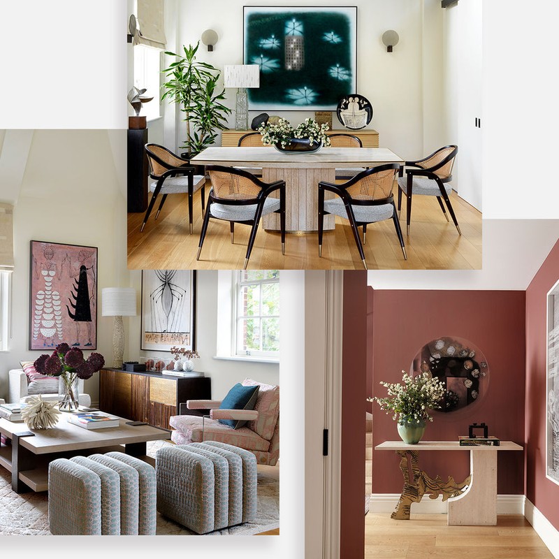
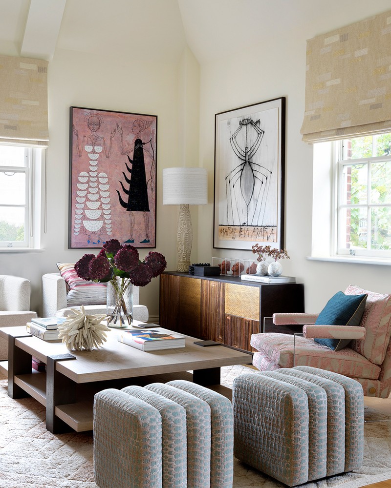
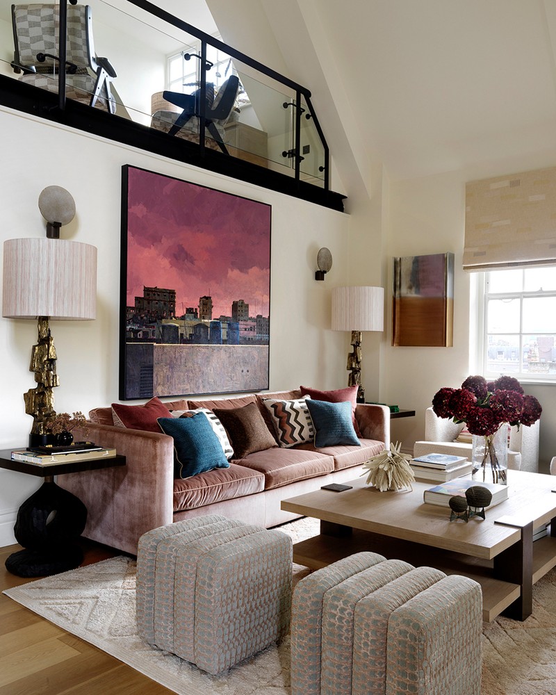
I wanted to experiment with different colour palettes across the whole space and for me, this is the signature room. I went for a pink shade range, which can present its own challenges in interior design – in the wrong hands it can look twee, but I wanted to show off a sophisticated version which was more personal and perhaps a bit more adventurous. My guests love this room – there is something very comforting and warm about it – and although there’s this feeling of space, it’s also very intimate.
The sofa is one of my own designs; the style is classical and it’s upholstered in a silk velvet. The coffee table I also designed many years ago for a different apartment – this is a scaled down version and it has a good contrast of materials which introduce another architectural element to the room. The stool is by Venezuelan artist Reinaldo Sanguino, which was bought from Design Miami a few years ago. I like to support artists from Cuba and Latin America as it’s where my family originate from, so they’re a reminder of home. The lamps are vintage from Talisman (which is now closed sadly), and the rug is Sinclair Till.
My personal art collection is growing, and this is the first time I’ve displayed it properly in my own home. All of the artwork in this space are originals – mostly by Cuban artists – and almost all bought directly from the artist themselves. The artwork over the sofa is by Gustavo Acosta – the pink Havana skyline creates a beautiful accent and works to bring together the colour scheme and different points of reference. There is also a wonderful romanticism to the way he composes his work. Another beautiful painting is by Carlos Estevez; he also has a very architectural approach to line drawing, which is then elevated by his use of colour.
The Mezzanine Study
When I’m not in Miami, I work from home in London. As a designer, I believe a home office should be both considered and inspiring, and hopefully with an uplifting view. My desk overlooks the main living space and there’s plenty of colourful art and accessories, and lots of interesting reference books, too. The space is filled with natural light, as well, which makes it a great place to work. The desk is my own design again; I wanted one with an organic shape, which was pretty from all angles – when I can’t find something I like, I make it myself. The chair is from Kristalia Design and the chunky textured rug is from Anthropologie. The hanging lamp is from The New Craftsman – it’s the perfect finishing touch. Finally, I like to place a lamp directly over a desk space to create a practical pool of light.
The beautiful lithograph on the end wall was given to me by my father. It is by the Mexican artist Rufino Tamayo, and my father bought one for me and one for my sister when we were little girls. The bronze dinosaur is from Tyson London and was made by my friend and long-time collaborator, Tyson Bennison. In fact, whenever I am on a call with my nephews, they always ask me to hold it up so they can see it. The ceramic vase on my desk is another piece by the Venezuelan artist Reinaldo Sanguino.
I always have plants in my office, be it in vases on the desk or on the floor. Things that are green and natural inspire me plus, it’s a great way to bring a bit of the outside in. I’m a big fan of the sculptural fiddle-leaf fig, maybe because they remind me of the tropics where I grew up.
Behind my desk is the bookshelf which was adapted to suit the space. It’s actually an off-the-shelf modular system and I added the black metal poles to personalise it. It provides lots of storage – I firmly believe storage can be both practical and beautiful, and always aim for both in my work.
The Dining Area & Kitchen
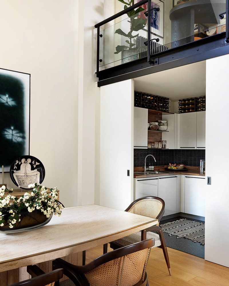
What I love about this kitchen is being able to close the doors on it when I’m entertaining. I also love dressing the table, lighting some candles and creating a beautiful evening atmosphere. I’m also a bit of a neat freak and don’t like to see plates stacked up at the end of the evening. In my Miami home, I have a large, open kitchen which is the hub of the home but in London, my lifestyle is busy and work-focused so my needs are different. I like open shelving where I can display crockery and interesting glassware, but otherwise, I try to keep it uncluttered. The rug adds a homely element, while the walnut worktop and shelving add an organic touch – my mantra is every space should reflect a little of your own style, no matter how small.
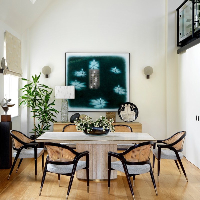
The dining table is a Willy Rizzo vintage piece which I found in a London antiques store. I really like its sculptural effect and it also offers a neutral backdrop for different table settings. I love creating different themes for special events of times of year. The artwork is by Arturo Cuenca, another Cuban artist. I bought it the year I started my company and hung it in my first London office.
The Hallway
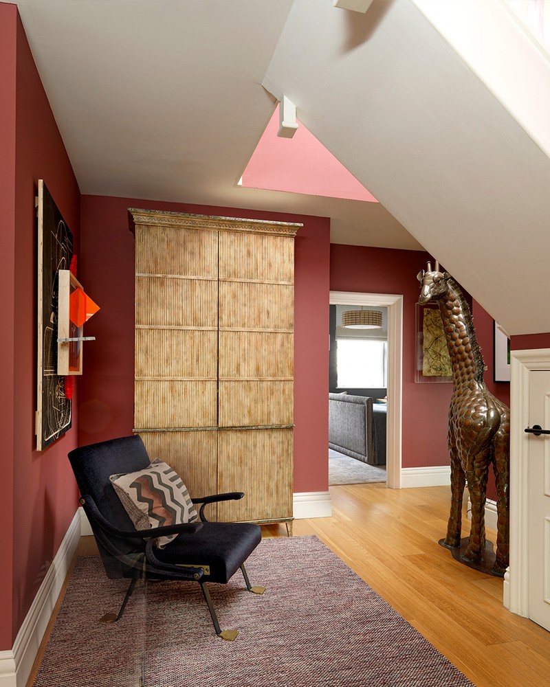
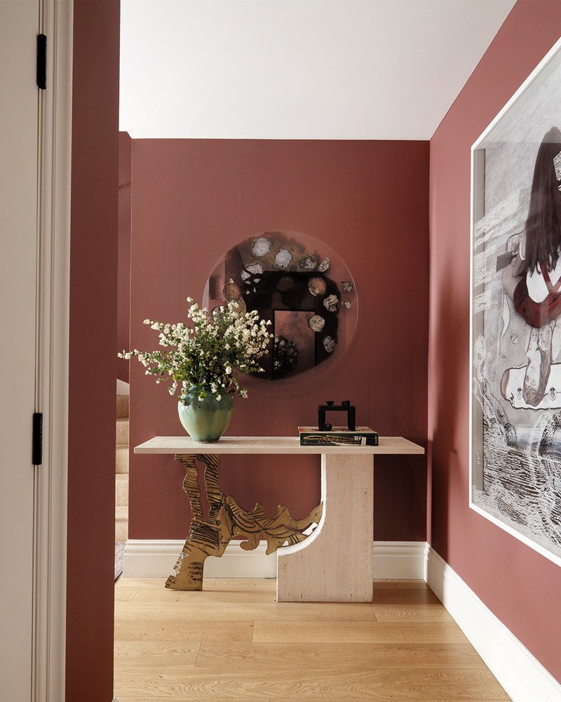
The entrance is a shade of raspberry red – it’s not a colour I’ve used before, so I tested six shades before choosing this one. It feels cosy and glamorous, and I wanted people to feel like they were stepping into a different space which was unique and distinct. Guests always remark on the colour – I hope I’ve inspired a few of them to try something new.
In the entrance hall you’ll find a vintage console from Miami. I changed the top from glass to travertine, as it worked better. The interesting mirror with slices of agate is by a New York artist, which I bought on a trip there.
The Bedroom
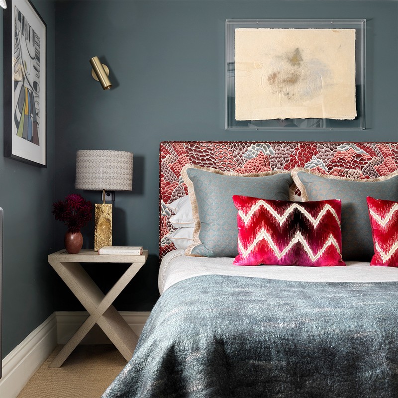
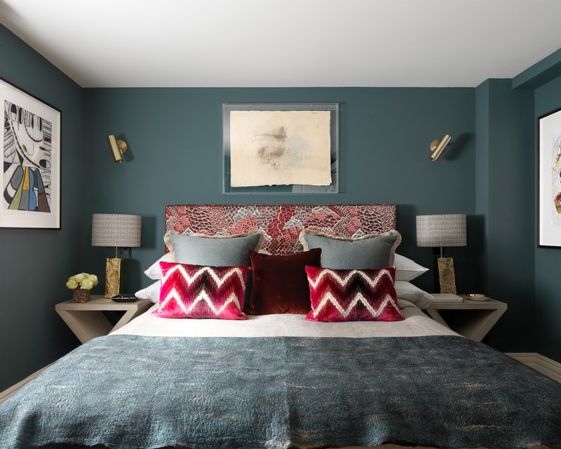
The fabric I used on the headboard is by Pierre Frey – one of my absolute favourites called Le Rocher from their Broderie collection. The zigzag cushions I had made in a fabric by Schumacher. I like having a moody bedroom – the walls are painted in Inchyra Blue from Farrow & Ball.
I like hanging art using Perspex against a dark wall; this framing technique adds a modern touch and really brings different pieces to life. The bedside tables are vintage from Talisman and the large square cushion fabric is Fortuny; it embodies everything I love about design. The linen feels casual, but they’re supremely luxurious. The reading light is the Heron Light from CTO Lighting – good lighting is so important, as is being able to adjust the light levels in a bedroom. I love these brass accents against the dark walls, and I also have them in the main bedroom. Finally, the throw on the bed is by Claudy Jongstra at Willer Gallery.
Visit NataliaMiyar.com
Photography By Simon Brown
INSPIRATION CREDITS: SIMON BROWN
DISCLAIMER: We endeavour to always credit the correct original source of every image we use. If you think a credit may be incorrect, please contact us at info@sheerluxe.com.
/https%3A%2F%2Fsheerluxe.com%2Fsites%2Fsheerluxe%2Ffiles%2Farticles%2F2021%2F04%2Fnatalia-miyar-atelier-contrasting-project-191202-1.jpg)
/https%3A%2F%2Fsheerluxe.com%2Fsites%2Fsheerluxe%2Ffiles%2Farticles%2F2021%2F04%2Fnatalia-miyar-atelier-contrasting-project-191202-9.jpg)
