A London Home Reimagined
The Property
This Chelsea project was something quite special. When we took it on, it was a house that had been untouched for 30 or 40 years. After stripping the original mock-traditional interior away from the 1950s build, we decided there was no point trying to hang onto the previous architect’s attempt at making this mid-century build into a classical building. The lower ceilings lend themselves much better to a more modern and streamlined interior, so the architectural language and our close working relationship with McGuinness Architects created a very clear direction and inspirational path for us to follow.
The house had a very outdated layout with the living room on the first floor and a large garage which overtook the ground floor plan. We decided to gut the entire house, removing the original staircase which created a lot of pinch points on each floor. In close collaboration with the architects we came up with a radical new layout to suit modern life, including several dedicated areas for working from home.
The Entrance Hall
The restrained colour palette was very much driven by the beautiful mature tree in the walled garden which forms the heart and sanctuary of the house. We provided touch points of natural colours with a strong focus on a gorgeous shade of green. This has been scattered throughout the house, along with black metalwork touches to tie in with the black windows throughout. I was happy to have a client open-minded enough to install black windows – I thought if I could make the front look like a Brooklyn townhouse, this would give the property a whole other level of interest and attraction.


The Living Space
The original garage was made into a study with a hallway to the right. Both rooms lead through glazed arched doorways into a large open-plan living and dining room with kitchen, with seamless access to the beautiful garden behind. The furniture pieces are comfortable yet lightweight, making them easily maneuverable for a transition space between the entrance hall and the kitchen.
I introduced curves everywhere: from the arc of the doors and the steel balustrade that wraps around the sitting room, to the details of the furniture, like the headboards and backs of the upholstered banquette seating. In terrace houses, there are so many angles everywhere, the curves make an interior feel more friendly and welcoming. We used a lot of limewashed oak veneer in the cabinetry. This was prompted by the timber floor. We didn’t want anything to be too jarring, so apart from the greens, we used a blended palette of neutrals. The black features fit with the modern architectural language while the bronze and brass bring a warming quality. We were conscious that the interior should be modern but not overly trendy, so in five years it will stand the test of time and not look dated.
/https%3A%2F%2Fsheerluxe.com%2Fsites%2Fsheerluxe%2Ffiles%2Farticles%2F2021%2F08%2Fgunter-chelsea-home-tour-living-space.gif)
The Study
We ran the floor planks diagonally in here, giving the impression that the house is wider than it actually is. We used bouclé wooden wall coverings to help keep noise levels low and add texture to the room.


The Kitchen
To add interest without taking away from the streamlined look of the kitchen, we added carved solid-timber cabinet doors to the wall-hung units as a nod to the many curves throughout the entire house. We used a combination of black recessed magnetic track lighting and trim-less white downlights for discrete task lighting, with mood lighting provided by a small selection of decorative pendants.
/https%3A%2F%2Fsheerluxe.com%2Fsites%2Fsheerluxe%2Ffiles%2Farticles%2F2021%2F08%2Fgunter-chelsea-home-tour-kitchen.jpg)
The Staircase
A new staircase leads up to the first floor, above which the second floor is accessed by a winding staircase. The arrangement allows light from a long skylight to penetrate the core of the house. The staircase balustrade was designed to become a transparent transition, continuing seamlessly from the staircase into the living room to create a more cosy feel and a separate identity from the kitchen-dining room.


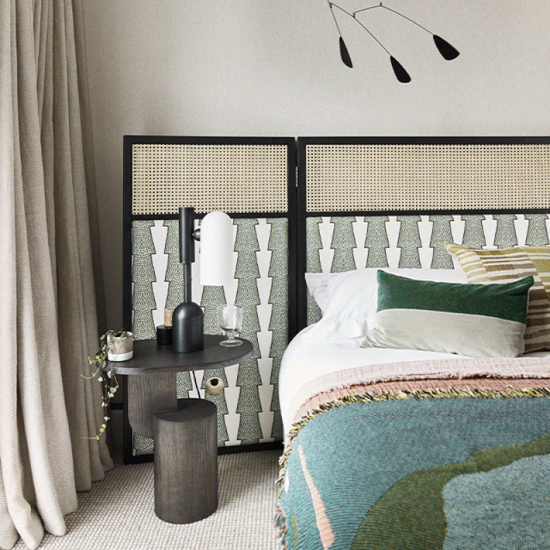
The Master Bedroom
We designed a bespoke wraparound headboard to create a cosseted feel, using fabric from Ottoline in a rattan and wood frame. We like the soft feeling of a wraparound fabric without the heaviness of a fully built-in structure (often reminiscent of hotels which we certainly didn’t want for this personal home). Creating a freestanding design was a novel way around this challenge. The heavy wool throw picks up on the greens throughout the house and adds plenty of texture and warmth to the scheme. The mobile above added another playful touch to this cheerful space.
The Ensuite Bathroom
Given the compact size of this room, we felt it would work well to have a tile wrapping around. We fell in love with this design early on in the project as it goes to the heart of the concept we had in mind, with natural green colours and playful curves. Knowing that the room would feature a long skylight, we knew it would be best to keep it simple and pure.
/https%3A%2F%2Fsheerluxe.com%2Fsites%2Fsheerluxe%2Ffiles%2Farticles%2F2021%2F08%2Fgunter-chelsea-home-tour-master-bedroom-ensuite.jpg)
The Second Bedroom
On the walls we went for an ochre seagrass wall covering. We thought it would work well with our schemes of neutrals and blacks. It was the starting point for the whole room and brings a warm and cosy feel. The bespoke bed is one of the few designs that we repeat in our work, having used it for the third time now. It was such a beautiful yet simple design, adding a lot of personality without taking up a lot of space – ideal for compact London properties.
/https%3A%2F%2Fsheerluxe.com%2Fsites%2Fsheerluxe%2Ffiles%2Farticles%2F2021%2F08%2Fgunter-chelsea-home-tour-bedroom-two.jpg)
The Bathroom
Due to the modern nature of the black full-height windows, we were keen to experiment with warmer materials. We introduced bespoke walnut and bronze panelling all around the room, which made it feel incredibly intimate and cosy, without losing its modern identity. The pocket crittal doors were a great way to add privacy without removing the light streaming into the adjacent bedroom.


Visit Gunther & Co
Photography by Mary Wadsworth
DISCLAIMER: We endeavour to always credit the correct original source of every image we use. If you think a credit may be incorrect, please contact us at info@sheerluxe.com.
/https%3A%2F%2Fsheerluxe.com%2Fsites%2Fsheerluxe%2Ffiles%2Fwebsite-images%2F2025%2F03%2Fsign-up-pop-up.jpg)
