Meet The Interior Designer: Kate Guinness

My Background
I was working in theatre set and costume design when I decided to switch careers. After retraining, my first job in interior design was at JR Design, where I worked for four years. Having only done a short course at KLC, I learnt even more while working with Jane – both in terms of the practicalities of working as a designer, and how to mix colour. I then briefly worked with Adam Bray – a brilliant colourist with a distinct and unique eye – and Howe London before starting KGD.
Style & Ethos
My team and I specialise in creating interiors that combine antiques, fabrics, colour and art, so they have that appearance of being gradually developed over time. Listening to our clients’ needs is really important – as is respecting the architectural integrity of each space. I would say our collaborative ethos ensures everyone’s needs are addressed, and the clients’ taste can still shine through.
Inspiration
I’m often inspired by the greats – specifically Chester Jones, Robert Kime, India Mahdavi. Jaime Parlade also had the most amazing sense of colour and created beautifully layered rooms. I was lucky enough to be brought up surrounded by beautiful interiors and my childhood in Ireland has heavily influenced my sense of colour and appreciation for Georgian country houses. It’s had a huge impact on my own colour palette. My mother, an erstwhile art dealer, also has a fantastic eye and created several homes layered with beautiful antiques, artwork, and African textiles.

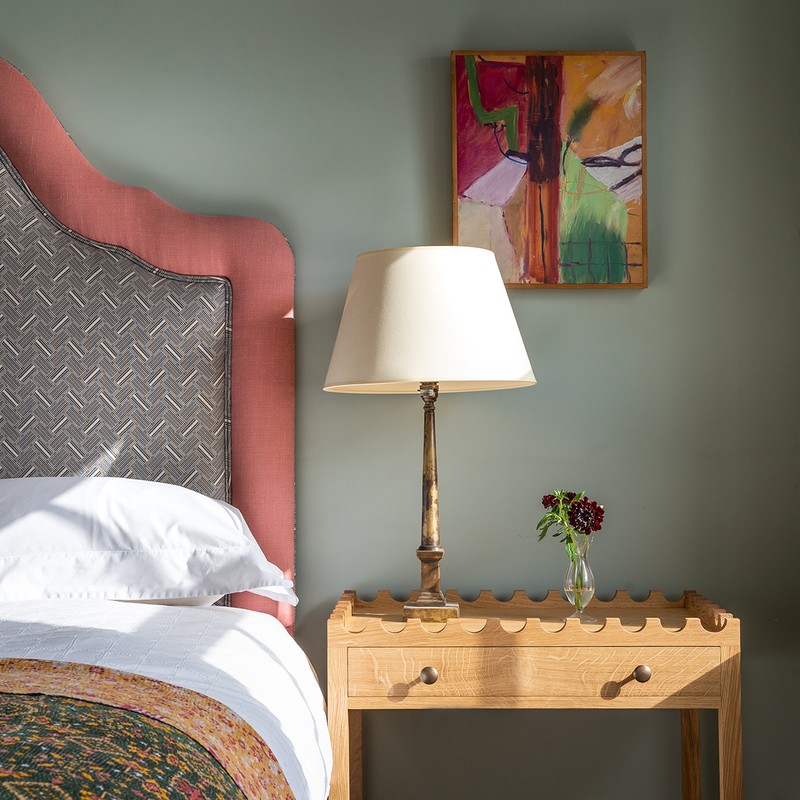
Approach To Colour
This varies from project to project, as we’re governed by different elements on each: the client and their taste, the building, and the natural light are just a few examples. Having said that, my favourite colour has to be the Apsley House railings, so much so that we’ve used it as our brand colour. I love it with plaster pink.
Choosing Materials
Again, our choice of materials is very much guided by the project we’re working on and the client we’re working with, but generally speaking, we love Zellige tiles for their perfectly imperfect quality; wood for the warmth and texture it brings to an interior and the numerous patinas and finishes there are to choose from; antique textiles for their unique qualities; unlacquered metal (we often use unlacquered metals for ironmongery and furniture details as they develop beautiful character and patina over time).
/https%3A%2F%2Fsheerluxe.com%2Fsites%2Fsheerluxe%2Ffiles%2Farticles%2F2022%2F07%2Fsl110722-kate-guinness-interior-design-contentmain-3.jpg)
Signature Touches
We love juxtaposing contemporary works of art and vintage textiles with antique and mid-century furniture to create rooms that feel lived in rather than styled. We also love to layer with textured and patterned soft furnishings, both of which make a room feel like its developed over time.
On Instagram I Follow…
/https%3A%2F%2Fsheerluxe.com%2Fsites%2Fsheerluxe%2Ffiles%2Farticles%2F2022%2F07%2Fsl110722-kate-guinness-interior-design-contentmain-4.jpg)
01
Hammersmith Terrace
The project is two adjacent 18th-century houses, 12 & 13 Hammersmith Terrace, which has since been converted into one dwelling. As listed buildings, there are lots of wonderful details throughout, including special finishes and techniques, beautiful gardens, views of the river. The ground floor living room is painted in Empire Red from Papers & Paints, and there is a jib door that connects this room to the other house beside the fireplace, on the left. A handmade shell mirror by Katherine Lloyd hangs above the chimneypiece and the ottoman is by Kate Guinness Design. The light-filled garden room is a special place to sit, with chairs from Matilda Goad and blinds in fabric from Claremont called 'Borgia Rojo'.


/https%3A%2F%2Fsheerluxe.com%2Fsites%2Fsheerluxe%2Ffiles%2Farticles%2F2022%2F07%2Fsl110722-kate-guinness-interior-design-contentmain-7.jpg)

02
Pied A Terre, Islington
The client was very traditional in his aesthetic, so it was a challenge to fuse his taste with the modern architecture of this London flat. However, the interior is now rich in decoration and there are some great key pieces throughout – both client's own and pieces we had made bespoke. In the reading room, the fabric used for both the walls and curtains evokes a joyous, spring-like mood, bringing the courtyard from the outside in.
To work with the curve of the room we created an octagonal footstool that focuses the furniture and brings the scheme together. In the kitchen, we had to utilise what was quite a tight space where the cooker used to sit. With the help of Uncommon Projects we turned the space around, creating a great kitchen with a larder cupboard. I think it’s the kitchen that most effectively bridges the gap between contemporary and traditional. Bespoke shelves frame the doorway which leads from the bedroom to a dressing room area, and the existing wardrobes were given definition with painted borders.


03
Family House, West London
Lovely colours, pretty patterns and an eclectic sourcebook of makers all contributed to the charm of my own family home. The project kicked off with the basement, which was rather grim. It was damp and down a dangerous set of stairs. Now it’s a lovely, clean laundry room. We decided, rather than have the kitchen at the back of the house, to move it to the middle room – a space which often doesn’t seem to get used at all in houses of this configuration. From there you have a full view of the dining room and living room either side.
/https%3A%2F%2Fsheerluxe.com%2Fsites%2Fsheerluxe%2Ffiles%2Farticles%2F2022%2F07%2Fsl110722-kate-guinness-interior-design-contentmain-12.jpg)
One of the defining features of my home is the paint colours chosen – I often opted for hues with historical significance. The custom-made kitchen units, for example, are the same green that’s now become part of my logo and it’s a signature in my work. My friend Adam Bray also suggested we use the colour matched to the railings at Apsley House – which is by Patrick Baty of Papers & Paints. The company does a lot of historical paint matching. Every space in the house has one piece that sets a whimsical tone, too. Given my background in set design for opera, I’d say my interiors always have a bit of dramatic flair, whether it’s from the artwork, fabrics or light fittings.


Visit KateGuinness.co.uk.
Photography by James Mcdonald, Sebastian Bottcher & Richard Round Turner
DISCLAIMER: We endeavour to always credit the correct original source of every image we use. If you think a credit may be incorrect, please contact us at info@sheerluxe.com.
/https%3A%2F%2Fsheerluxe.com%2Fsites%2Fsheerluxe%2Ffiles%2Fwebsite-images%2F2025%2F03%2Fsign-up-pop-up.jpg)
