SL Meets American Interior Designer Jonathan Adler
Style & Ethos
My entire design ethos is very simple and can be boiled down to just three words: modern American glamour.
Design & Inspiration
Nature is my primary source of inspiration. Having spent the majority of the past year isolating at my home in The Hamptons, I felt so lucky to be surrounded by nature. From sunsets to cloud formations, to the wild animals running around outside – I’ve never felt more inspired.
Other designers also inspire me. My holy trinity is David Hicks, Bonnie Cashin, and Alexander Girard. You really can’t beat any of them. As for travel, Capri is a forever muse. As are Tokyo, Palm Springs and Paris – I have to give a shout out to London, too. I’m a massive anglophile and can’t wait until it’s safe to cross the pond again.

Colour & Pattern
It’s no secret how much I love colour. Nobody wants to see an endless haze of beige. My equation when it comes to working with both colour and pattern is to start with a neutral base and then layer them in. Don’t worry too much about any so-called ‘rules’ – if you really love something, you’ll find a way to make it work.
Finishing Touches
I try to never take life too seriously, with the one exception being my work. But being serious about design doesn’t mean you can’t be humorous with it. My formula is 99% classic, 1% wit.
People always quote Coco Chanel saying to take one thing off before you leave the house. My philosophy is pretty much the exact opposite. Before I finish a project, I tend to layer in a few finishing touches – be it an acrylic obelisk, shiny lacquer stacking boxes or giant brass objets. More is more – you might not think you need an obelisk, but I’m here to tell you, you do.


Instagram Favourites
If you’re not already following my husband @SimonDoonan, you’re not living. I’m also obsessed with pop and country music – lately it’s been @MirandaLambert blasting through my AirPods, so I have to give a shout out to her. I also love @TonyMarklew – he creates the most incredible floral arrangements and uses my pottery to do so, which makes me love him all the more!
PROJECT ONE:
West Soho Apartment, NYC


Inspiration
West Soho is one of my favourite neighbourhoods in New York (and I’m not just saying that because my office is a block away). It’s got all of the charm of Soho, but with the space of Tribeca. As with most of my projects, it’s important to think about the person who lives there and design it for them. With this space, we matched uptown glamour with downtown cool. The end result was a casual-chic home.
Space & Planning
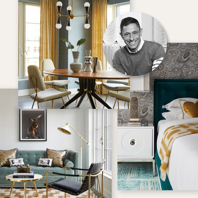
One of my favourite things about this apartment is its generous proportions – a rarity in New York. We wanted to make the most of that by adding pieces to create designated areas like an entryway, a dining nook (the Trocadero Dining Table and Maxime Dining Chairs are both by Jonathan Adler), and a hotel-style bedroom.
Colour Palette
If I had to pick a favourite colour when it comes to design, it would be blue. It’s just a marvel – every shade goes with every other shade. We outfitted the main space with a fabulous textured wallpaper that manages to both stay neutral and pack a punch at the same time.


Materials
We wanted the apartment to benefit from the same luxury finishes you’d expect to find on Park Avenue – while still reflecting the cool vibe of its downtown location. We used a lot of luxury metals and cushy velvet but paired them with natural linens and cosy throws to ensure it still felt like a home.
Lighting
When working with an open floor plan like this, lighting can help you define different zones. We used my Caracas Six Light Chandelier to highlight the dining space, so it feels cosy rather than stark.
PROJECT TWO:
Parker Palm Springs


Inspiration
With every project, my goal is to give it a sense of place. Palm Springs is one of those locations that just screams Hollywood glamour and hedonism. Ultimately, we wanted The Parker to reflect the quintessential spirit of the area.
Space & Planning
It’s quite a large property, so we had to think about how we wanted each space to feel. The Gene Autry residence feels like a Palm Springs fantasy, while the lobby makes a real statement, while still feeling warm and welcoming.
Colour Palette
When people think of The Parker, they often think of the iconic, orange front door. We wanted to carry this colour palette throughout the property – from the trippy carpet in the front lobby to the fabulous Maxime Dining Chairs in the private dining room.

Materials
I love the juxtaposition of natural materials like hand-loomed baby alpaca rugs and Mappa Burl furniture paired with brass and shiny nickel. In the living room, the Caine Sofa (which is no longer available) and Jacques Cocktail Table (by Jonathan Adler) demonstrate this combination so well.
Lighting
We sourced a lot of vintage pieces for this project, including the lighting. Vintage lights can be tricky – old wiring is never a safe bet – but when it works, it really works.
PROJECT THREE:
Manhattan Office


Inspiration
For this space we actually drew a lot of the inspiration from Powell’s logo and mascot, which is the Greek Goddess Athena, only glammed up a bit. Instead of a helmet, for example, Athena is wearing a tiara. We wanted the space to reflect the founders’ business expertise and to draw new clients in, while also being a comfortable workspace for the staff. The end result was neoclassic and glam, with an enduring sense of practicality.
Space & Planning
The space was originally used as a storage unit, so to say it was a little underwhelming at first is an understatement. We really wanted to make it light and airy. We used Austrian drapes to diffuse the light and accentuate the high ceilings and layered in some lush furniture pieces, including my Claridge Sofa Pompidou Chair and Grand Tour XL God/Godess Busts (both by Jonathan Adler).
Colour Palette
I always say start with a neutral base and then accessorise like crazy, and that was no different for this project. We used a neoclassic colour palette of black, white, and gold to refract the natural light coming in. The painting, ‘Courtney’ by Liz Markus in the meeting room works so well with the rest of the scheme.


Materials
Brass is a forever favourite – I don’t see it ever going out of style. We used a lot of brass (including the Scalinatella Cocktail Table) in this space, lucite, metallic geode wallpaper, and natural materials like hand-woven baby alpaca for the area rugs.
Lighting
I always say splurge on lighting: buy a chandelier that’s bigger than you need and more expensive than you can afford – you won’t regret it. We used a lot of statement chandeliers in this space – not only for impact, but to define the different areas around the office, too.
Visit JonathanAdler.com for more inspiration
Or continue to comment as a Guest below
DISCLAIMER: We endeavour to always credit the correct original source of every image we use. If you think a credit may be incorrect, please contact us at info@sheerluxe.com.
/https%3A%2F%2Fsheerluxe.com%2Fsites%2Fsheerluxe%2Ffiles%2Fwebsite-images%2F2025%2F03%2Fsign-up-pop-up.jpg)
