The Interior Design Couple Whose Style We Love

The Team
The couple met while studying at the KLC School of Design in 2009, although they didn’t work together until 2013 when Sophie was pregnant with their first son.
It was then that she helped Nicholas out on a project he was working on, prompting the couple to realise almost immediately that not only did they enjoy working together, they also complemented each other as designers. It’s what inspired them to start their own practice.
Style & Ethos
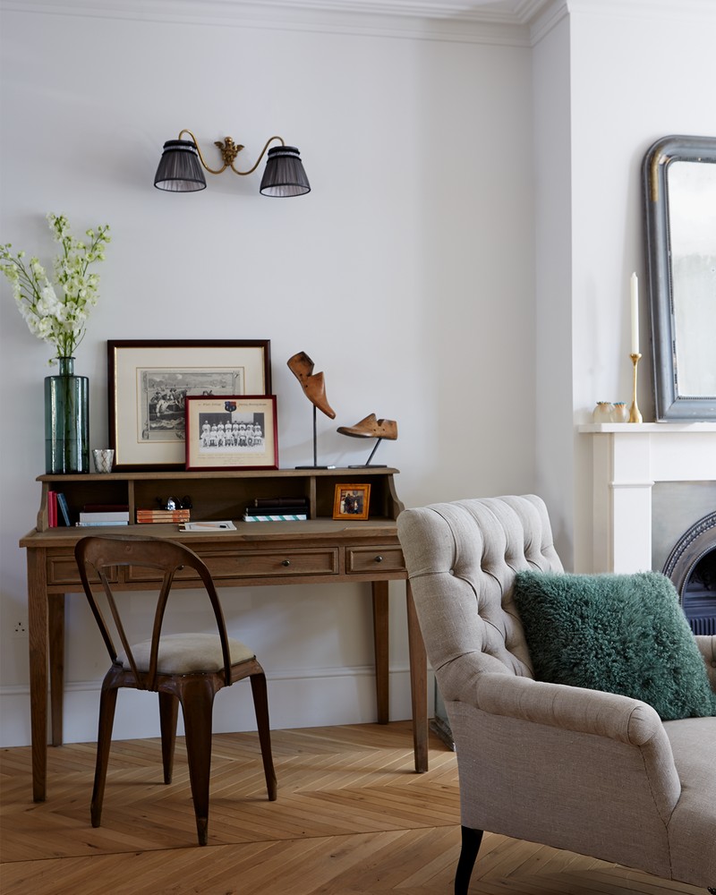
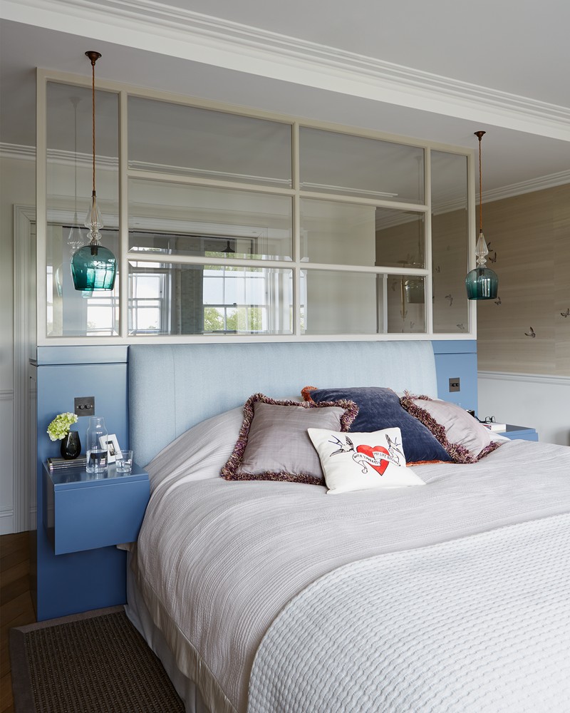
“Our style is contemporary, inventive and sophisticated,” says Sophie. “We also hold traditional values – but with an understated edge. Our ethos is craftsmanship, balance, integrity and intelligent design.” Nicholas loves to design spaces – like studies or bathrooms – where he can explore bolder and braver layering of the design elements available today, while Sophie prefers bedrooms and living rooms, where she blends beautiful fabrics, patterns and wallpapers to create a soft, subtle environment.
Design & Inspiration
“When it comes to our main sources of inspiration, it would certainly be the best production designers in film – plus Frank Lloyd Wright, Roman & Williams, Gilles & Boissier, and William Morris… to name a few. We're also inspired by old school Saville Row and Jermyn Street tailoring, modern day fashion, antique shops and fairs, industrial and product design, film and music, the countryside – as well as any dense metropolis. And the best of Georgian, Victorian, arts and crafts, deco and 60s design, too,” adds Sophie.
Colour & Pattern
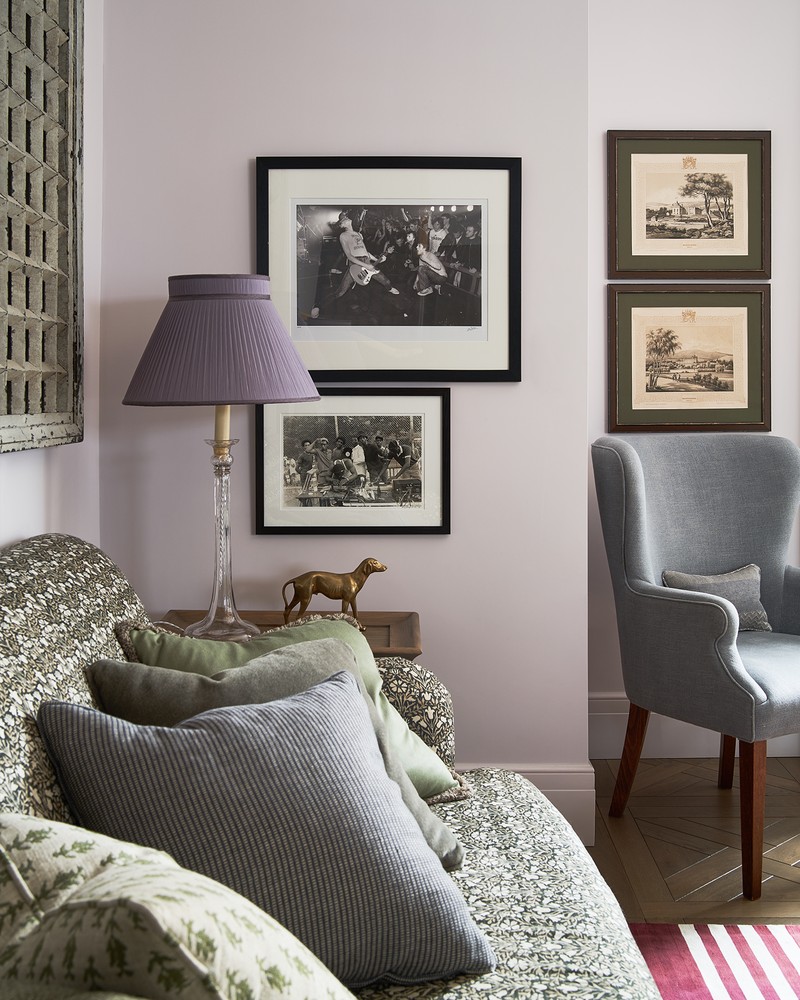
“We like to start with a style and colour concept – this gives us something to reference and not veer too far away from, even though our projects have a tendency to evolve naturally. We don’t follow any rules, but we love to layer multiple tones and colours,” explains Sophie. “It’s nice to have the same colour but used in various different shades, for example. Ours are typically laced with some grey – and neutrals always play an important part in our schemes.” When it comes to pattern, layering is always fun, but it depends on the house and the personality of the client. “Sometimes it’s nice to just play with scale, even if the pattern is very subtle.”
Finishing Touches
When it comes to the finishing touches, the duo recommends investing in good brassware in bathrooms, with quality components and ideally UK-based companies. “Sophisticated lighting can be costly too, but it’s super important, as are decorative features like wallpaper, ironmongery and, of course, antiques – because these add the perfect finishing touches to any texture and colour which has been carefully layered underneath,” explains Sophie. If budget is an issue, you can save some money by visiting warehouse sales and sample sales. “Most companies – from tiles and fabrics to lighting and furniture – have great deals to snap up,” Sophie adds.
Instagram Favourites
When it comes to finding inspiration online, these are some of Nicholas and Sophie’s favourite Instagram feeds:
Curious how Sophie & Nicholas design their schemes? Here, they tell us about three of their projects...
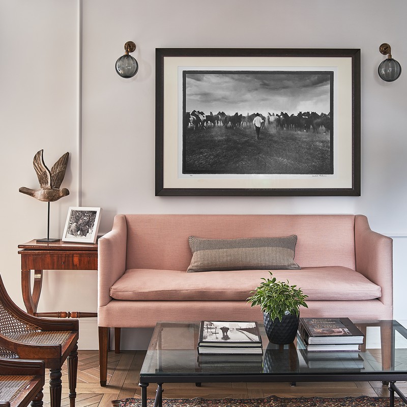
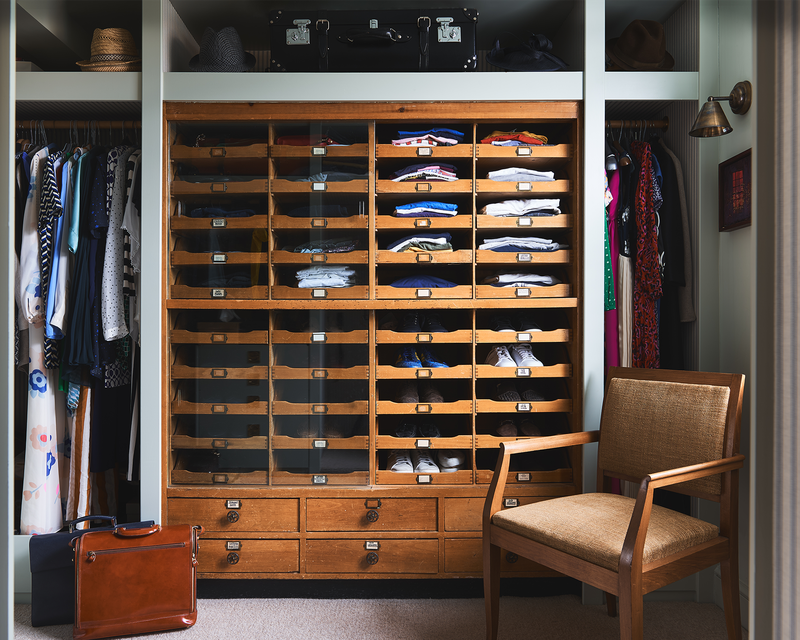
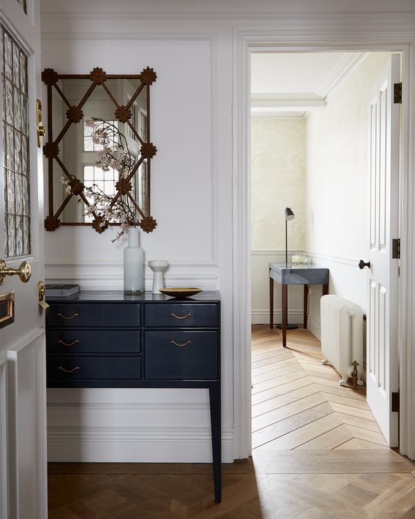
Project One: Their Family Home
/https%3A%2F%2Fsheerluxe.com%2Fsites%2Fsheerluxe%2Ffiles%2Farticles%2F2021%2F02%2Fspencerwedekindravenscourtpark3.png?itok=_xy3YYav)
Inspiration
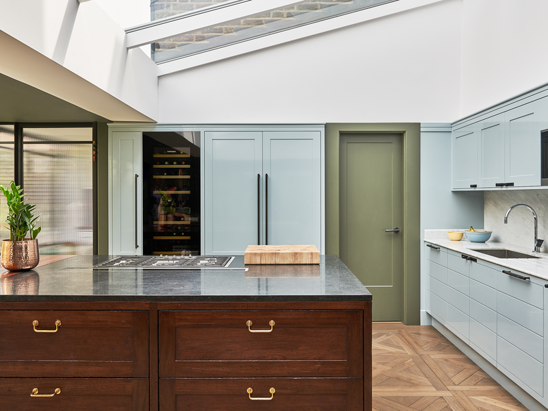
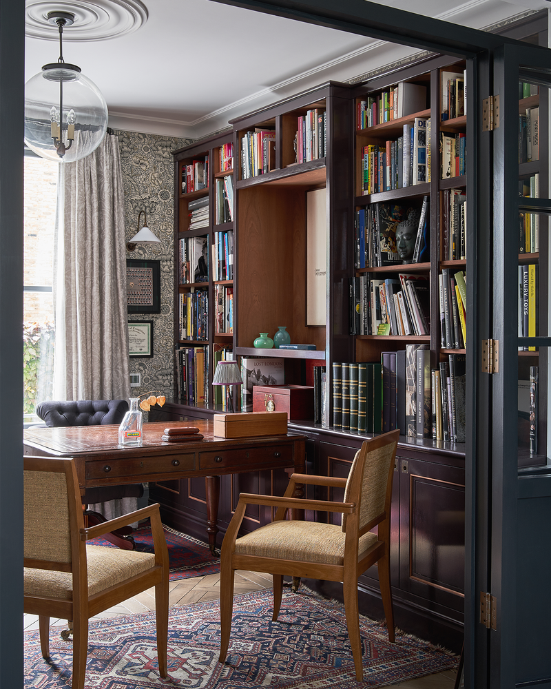
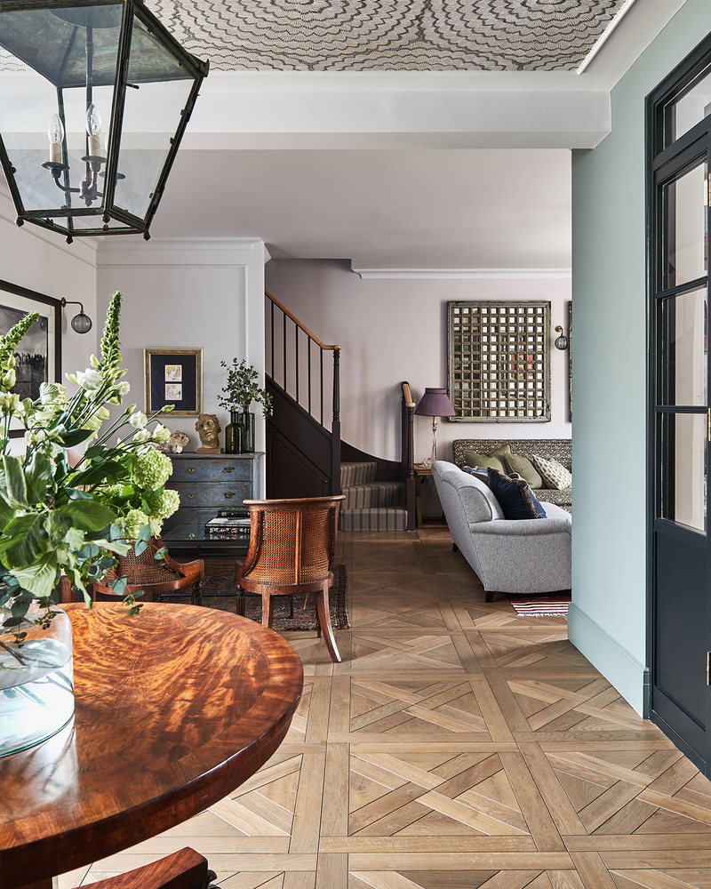
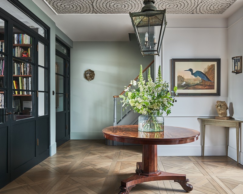
The concept was Sherlock Holmes' study meets modern Edwardian, mixed with industrial chic. We enjoy finding that fine balance between old and new, and we revel in the detail. Ultimately, we’re always aiming to produce inventive modern designs, but underpinned by traditional values.
Space & Planning
We amalgamated two houses in order to create beautiful lateral and open living spaces. It’s totally unexpected for a Victorian cottage. Everything branches out from the central foyer, with its circular mahogany table and central hanging pendant – to echo this we wallpapered the ceiling with a ripple-effect circular pattern. The two houses are connected on each floor by secret doorways, while also sharing the two original staircases on its flanks. Integrated joinery and a bespoke layout throughout helped achieve a fluent traffic flow, as well as the ability to have every space, nook and cranny accounted for with purpose.
Colour Palette
We used a lot of colour in the scheme – everything from blues and greens to pinks and whites, paired with mid to dark browns and soft greys. Although there’s a lot of colour, the tones are subtle, which is why they work harmoniously together.
Materials
The different materials include reeded glass, textured wallpaper and fabrics, as well as different paint finishes, such as high gloss, eggshell and matte. We love aged metals such as bronze, brass and pewter, and we also like to use lots of timber like walnut, oak and sapele, both for warmth and an organic feel. We installed a 10m span of Crittal doors opening onto the rear garden for an architectural and industrial chic look. We bought, but also inherited, art and various antiques from our families, and paired these with the newer elements of the house.
Lighting
We love using lots of different mood lighting to create a warm and cosy atmosphere, such as wall lights, picture lights, floor lamps and table lamps. We try to avoid littering the ceiling with spots. We installed a Lutron system on the ground floor only, so that – at a click of a button – the mood can be perfectly set.
Sources
Lighting: Hector Finch Lighting
Fabric & wallpaper: Lewis & Wood
Antiques: Brownrigg Antiques and many more in Tetbury
Sofa: Morris & Co Bellflowers fabric (now discontinued)
Dining t:able: Bullenberg
Dining table pendants: Hector Finch
Wallpaper (in the foyer): F Schumacher
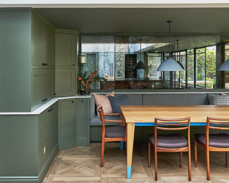
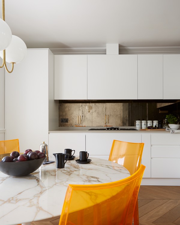
Project Two: Holland Park Penthouse
/https%3A%2F%2Fsheerluxe.com%2Fsites%2Fsheerluxe%2Ffiles%2Farticles%2F2021%2F02%2Fhollandparkpenthousephotographersarahhogan1new.png?itok=QXT6nRGN)
Inspiration
The inspiration behind this project was white Regency grandeur, but with a modern edge. The client came to us with these bright orange vintage Kartell chairs and a run-down old-fashioned Regency space, so we designed everything around those chairs and branched out from there. But we always kept them integral to our concept. We tried to create an understated, multi-layered and highly detailed home for this music mogul and her family.
Space & Planning
We stripped out the entire top floor flat of a Grade II-listed building and rebuilt it from within – with the kitchen, dining and living room all opening out onto each other to create a more balanced living space. We panelled and plaster moulded the entire home to bring back some of its heritage, while making sure everything was integrated among the contemporary joinery and furniture. We squeezed out every functional ounce of available space from a moderate-sized single floor in order to accommodate our client, her husband and two young children.
Colour Palette
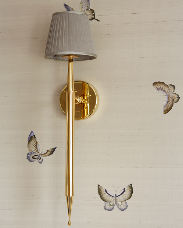
Mostly white, we painted nearly everything in Farrow & Ball Wevet and balanced this with the warmth of the smoked oak chevron flooring with bronze inlays, a large dividing wall in a beautiful blue/grey colour (BTWN Dog & Wolf from Paint & Paper Library) and silk wallpaper with embroidered butterflies by Fromental.
Materials
As mentioned above, we added beautiful oak chevron floors with bronze inlays, elegant walnut joinery, textured silk wallpaper, patterned encaustic floor tiles, plenty of interesting marble – plus, satin brassware and oil rubbed bronze fixtures throughout.
Lighting
To create ambience and atmosphere, we used lots of layered lighting on the walls, with chiffon gathered shades designed by us, along with aged brass picture lights – plus, a fabulous ball-pendant dining light by Michael Anastassiades.
Sources
Hardware: Beardmore Collection
Fabric: Besselink & Jones & Holland & Sherry for the window seats
Wallpaper: Fromental
The bath: The Water Monopoly
The taps: Samuel Heath
Kitchen Pendant: Michael Anastassiades
Paint: BTWN Dog & Wolf from Paint & Paper Library
Console: Chelsea Textiles
Coffee table: Julian Chichester
Project Three: Hammersmith Edwardian Cottage
/https%3A%2F%2Fsheerluxe.com%2Fsites%2Fsheerluxe%2Ffiles%2Farticles%2F2021%2F02%2Fbrackenburycottagephotographersarahhogan3.png?itok=2eA9Qxoe)
Inspiration
The approach here was to marry reclaimed materials with Edwardian chic. The house was in a terrible state when we started, as it had been stripped of all its original identity – the bathroom was lined with vinyl sheeting! We wanted to bring it back to life and resuscitate its charm and original character. We reinstated a traditional fireplace, as well as the dado rails, skirting and coving. We also put back the original doors and staircase. We recycled a lot and used reclaimed materials as much as possible. Almost all the handles were salvaged from various sites, including from an old theatre. Even the rear garden was decked in old scaffolding boards, sanded and oiled.
Space & Planning
We changed the ground floor layout from the typical double reception room and kitchen to a more modern and family-friendly layout – one single, but larger, reception room and one single, but larger, kitchen and dining area. These two areas are divided by two old, salvaged iron gates that we found, which were then stripped back and powder coated in off-black.
Colour Palette
Overall, the palette consisted mainly of blue hues and plenty of off-whites – Bone Chine Blue by Little Greene features heavily in this house, as does Strong White by Farrow & Ball. As always, everything was grounded by the earth tones of the oak flooring and walnut shelving – plus, touches of aged brass and bronze.
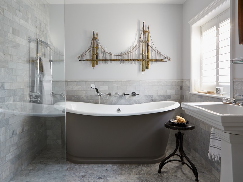
Materials
The other materials were mainly made up of reclaimed French oak chevron flooring with brass inlays – an effect we use regularly. Old scaffolding boards were then sanded and oiled for the garden. You’ll find grey Carrara marble in the bathroom and plenty of walnut throughout, too. We love to incorporate metals such as aged brass, bronze and plenty of nickel. As is the case on all our projects, the joinery was designed by us but this time we used reclaimed birch ply and oak veneers as interior carcases and hand-painted (rather than sprayed) everything.
Lighting
It’s interesting to use reclamation pieces or antique lighting, and here we used a lot of vintage lighting, opaline glass pendants and brass fixtures sourced from Retrovirus & Trainspotters.
Sources
Shutters: The Shutter Shop
Marble tiles: Fired Earth
Bathroom fixtures: Lefroy Brooks
Writing desk: OKA – now discontinued but similar white-washed oak available here
Accessories: All from the old cinema London
Visit SpencerAndWedekind.com or follow @SpencerAndWedekind on Instagram.
DISCLAIMER: We endeavour to always credit the correct original source of every image we use. If you think a credit may be incorrect, please contact us at info@sheerluxe.com.
/https%3A%2F%2Fsheerluxe.com%2Fsites%2Fsheerluxe%2Ffiles%2Fwebsite-images%2F2025%2F03%2Fsign-up-pop-up.jpg?itok=zlMvamfa)