The Right Way To Use Metro Tiles
Understand The Proportions
Knowing the difference between a metro (also known as subway) tile and a rectangular tile is important – not all rectangular tiles are metro tiles, but metro tiles are always rectangular. Confused? A quick history lesson courtesy of interior designer Christian Bense should help: “Metro tiles, used in the first New York subway station in 1904, were all 3in x6in. That's roughly 7.5cm x 15cm for those of us that use the metric system. You might think that’s all semantics, but you’d be wrong. The correct proportion of a metro tile is vital in any scheme.”
Choose Your Layout Carefully
It’s important to know some of the more unusual ways of laying out rectangular tiles simply won’t work with a metro tile. Longer, slimmer designs are more versatile for complicated geometric patterns, whereas the shorter proportions of traditional metro tiles don’t always translate. Christian also suggests you avoid a bevelled metro in a space with lots of corners or junctions. “Bevelled tiles (where the sides of the tile round up slightly) don't do well when two cut pieces have to butt up in a corner. Unsurprisingly, this is a common scenario in spaces like bathrooms. So, as a rule of thumb, with flat wall-to-wall areas, a bevel is perfectly fine. As for lots of corners and junctions, opt for a tile without a bevelled edge.”
Five ways to use a metro tile in your home…
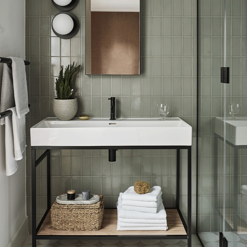
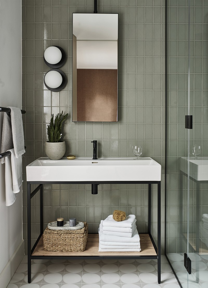
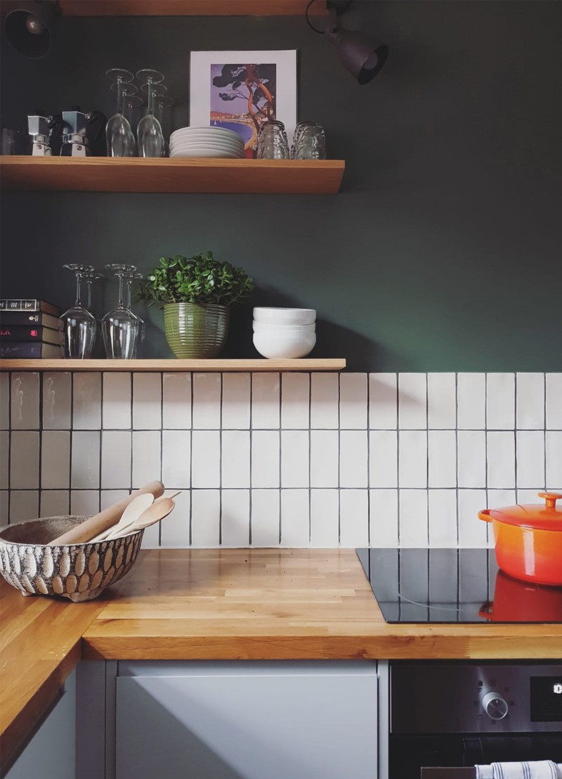
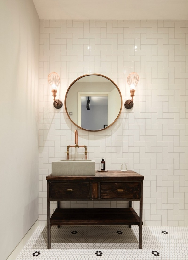
Vertically Or Horizontally Stacked
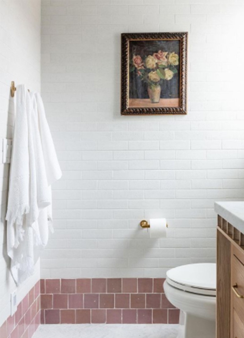
Staying true to the look of the subway tile but in a modern way, a horizontally stacked pattern is an updated take on the traditional staggered brick bond design – but one which still remains authentic to the origins of the look. A vertical stacked design is also easy to lay out, and suits a range of interiors – plus, it feels a little more unexpected than a horizontal stack.
Contrasting Grouting
Dark grouting has become a design statement in its own right – although beware, it isn’t forgiving unless your tiling technique is perfect. “If you want a darker grout, use your wall colour to determine the shade you use,” says Christian. “Generally, the darker the walls adjacent to the tiles, the darker grout you can use.”
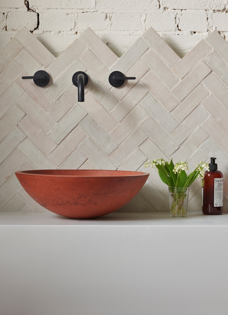
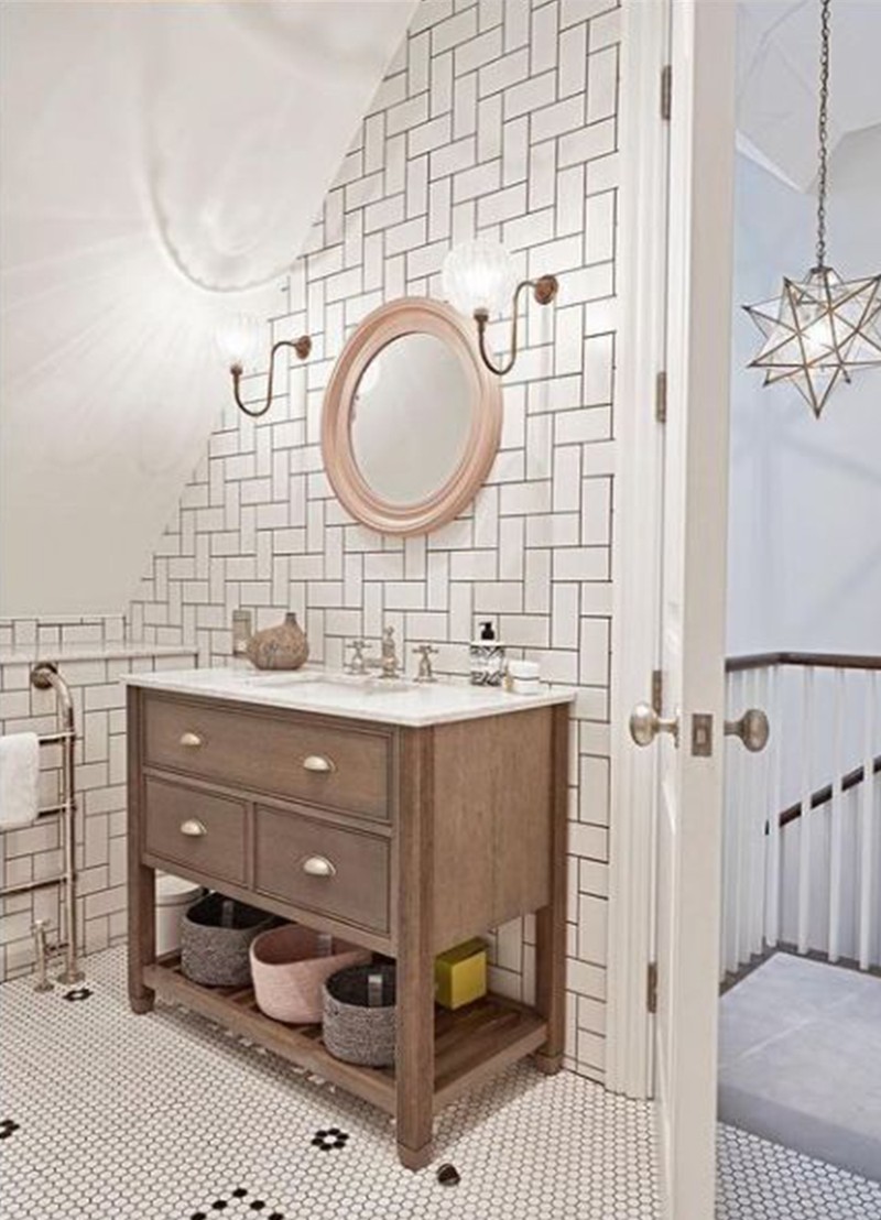
Herringbone
Perhaps one of the most complex tile layouts to tackle, herringbone is a popular style which looks great in white, but can really pop when done in a colourful, glossy finish. This just about works with a traditional size metro tile, but you may find a longer design is best- suited.
Add A Contrasting Band
Studio McGee really livened up this traditional brick bond design with a contrasting band in a different colour and finish. The satisfyingly mathematical, orderly characteristics of the authentic subway layout are emphasised through adding a handmade, rough-hewn artisan style beneath.
As A Splashback
The ultimate interesting splashback has to be a herringbone design. We love the zig-zag finish for a quirky, unusual line in a kitchen, where strong linear shapes dominate.
INSPIRATION CREDITS: Gunter & Co; Studio McGee
DISCLAIMER: We endeavour to always credit the correct original source of every image we use. If you think a credit may be incorrect, please contact us at info@sheerluxe.com.