
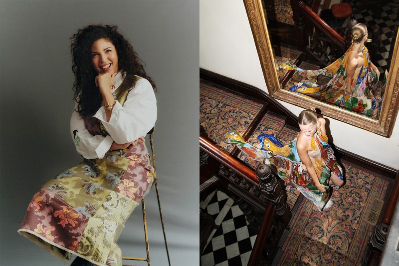
A Cool Fashion Founder Talks Colour, Print & Joyful Dressing
Try not to overthink print – especially when it comes to mixing or clashing them. Embrace the happy accident, trust your instinct and do what feels good. In my experience, when you feel confident in what you're wearing, people gravitate towards that energy.
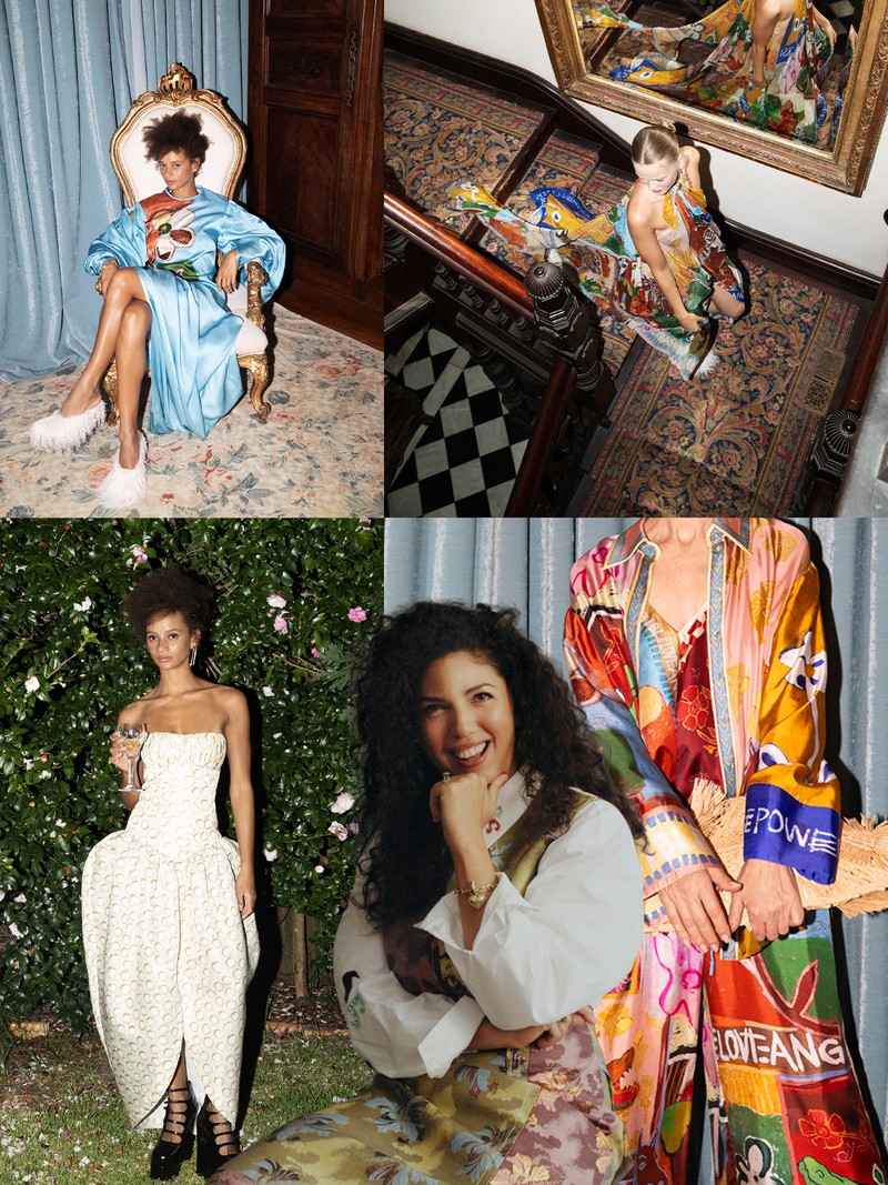
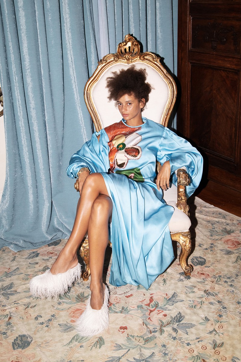
Focus less on a specific motif and more on a feeling. At Alémais, each artist's collaboration and source of inspiration take the brand on a different journey but the common thread lies in the approach to colour, the placement of the print on the garment and the small, often cheeky details added for the wearer to discover over time.
Know there are no rigid rules when it comes to proportion and silhouette. It's always more about how something makes you feel when you wear it than following a prescribed formula.
Choose a hero piece and build around it. If a printed skirt is the protagonist, pair it with a subdued stripe, an ombré or a scarf that picks up a tone from the print. Colours don't need to match exactly – they simply need to complement one another.
Make bold colours more wearable by toning everything else down and letting the colour sing. Commit to it. In an oversaturated market, originality comes from a purist interpretation of the initial inspiration. Whether it's a bathhouse in Budapest, the energy of a Mexican fiesta or a lyric in a Bowie song, that starting point acts as an anchor throughout the design process.
Balance statement pieces by anchoring them with something unexpected – whether that's a flip-flop worn with a cocktail dress or a delicate heel paired with something more relaxed. It keeps the overall look feeling undone and interesting.
Remember you're in control of the clothes. What makes an Alémais piece timeless is ultimately defined by the wearer. The goal is to create something that can move effortlessly between different moments – from weddings and holidays to everyday life – while still feeling relevant years later. Seeing women continue to wear pieces from the brand's earliest collections is one of my greatest validations.
Don't second-guess it – colour should feel fun. That said, to make bold shades feel more polished, I gravitate towards softer, quieter tones such as dirty olive, mustard yellow, brick red, dusty rose and dove blue. These colours still have depth but feel more grounded and elevated.
Recognise that colour is often where a look begins. Whether we're inspired by a place, memory or feeling, colour sets the tone at Alémais before we then develop the pieces through print, texture and silhouette. The aim is less about telling a literal story and more about creating an emotional landscape that the wearer can step into and make their own.
Visit ALEMAIS.COM
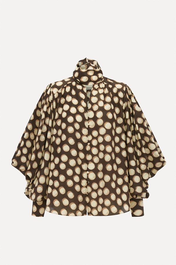
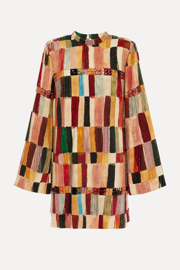
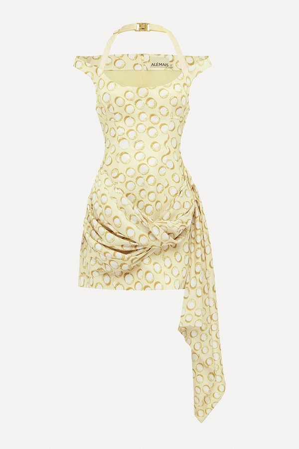
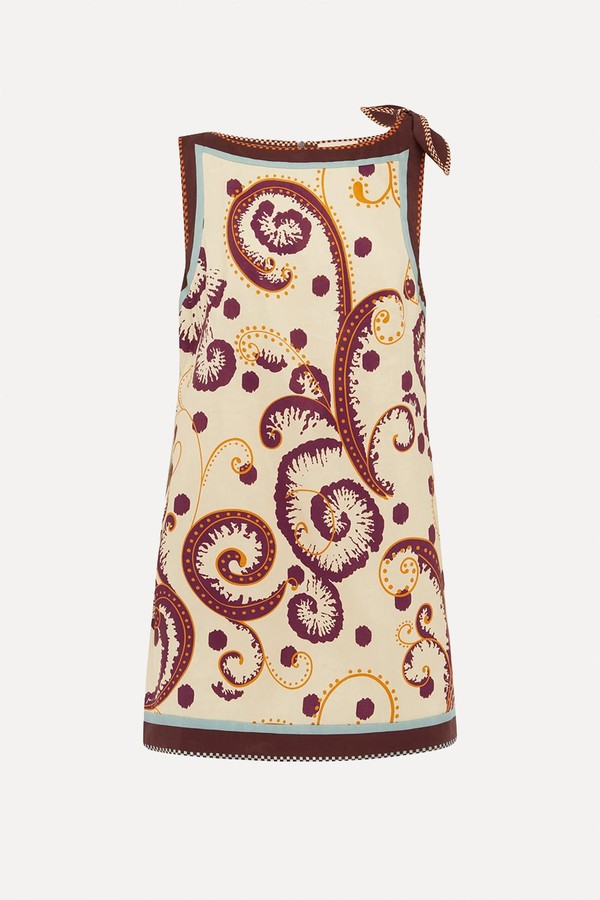
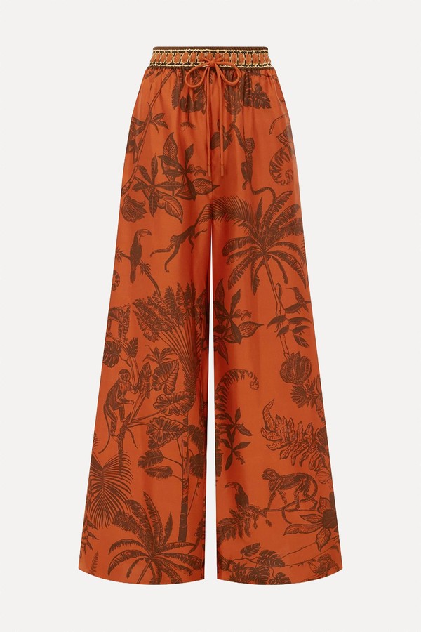
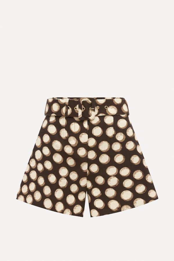
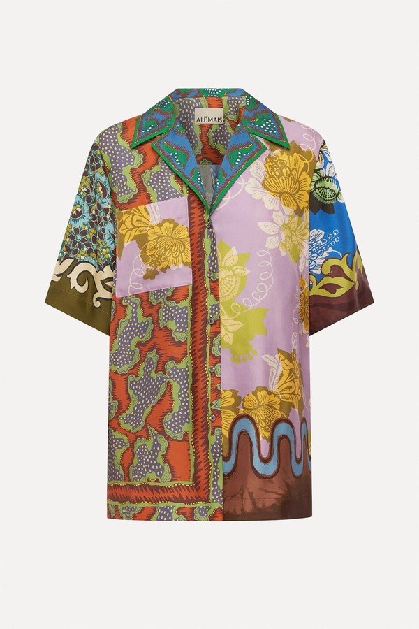
SHOP THE EDIT


Or continue to comment as a Guest below
DISCLAIMER: We endeavour to always credit the correct original source of every image we use. If you think a credit may be incorrect, please contact us at info@sheerluxe.com.
/https%3A%2F%2Fsheerluxe.com%2Fsites%2Fsheerluxe%2Ffiles%2Fwebsite-images%2F2025%2F03%2Fsign-up-pop-up.jpg)
