How To Recreate This Perfectly Balanced Living Room
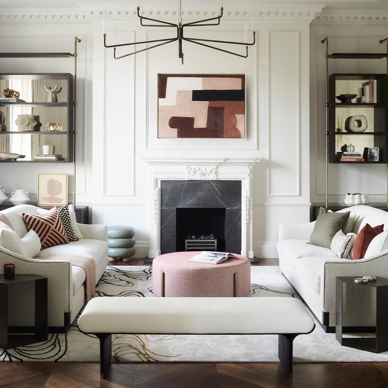
My inspiration for this living room was the property itself. Located in a Grade II-listed building overlooking Cavendish Square, the original features act as a rich backdrop to the more understated contemporary furniture and furnishings. Clean, simple lines don’t detract from the decorative fireplace, while soft curves allow the ornate ceiling and detailed mouldings to sing.
Texture is vitally important with a restrained colour palette. To stop this scheme from feeling sterile, we injected warmth via the bouclé wool fabric on the gently curved Stephenson Wright sofas and a luxuriously soft rug from London-based atelier Holland Cassidy. It was important the harder materials had some warmth about them, too – that’s why the woods are dark, and the metals and glass have aged finishes.
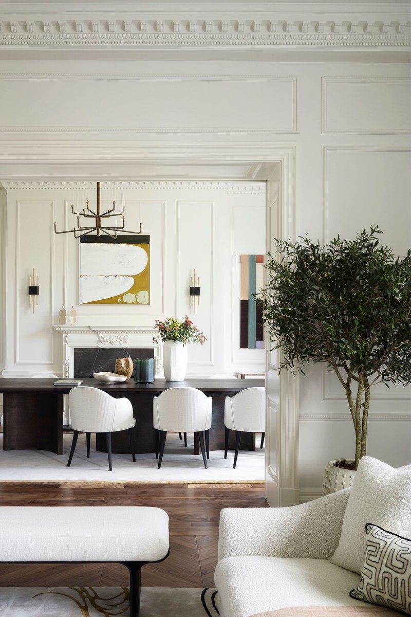
Pattern and colour have the power to add interest to a neutral scheme – just don’t overdo it. A splash here and there is all you need to draw the eye but not distract. I also recommend introducing one unexpected element. Here, an olive tree adds a more casual note, which contrasts beautifully with the more formal features, such as the panelling and original cornicing.
We deliberately chose artwork that wouldn’t overwhelm the space. If we’d chosen classical landscapes and still lives, it would have made the beautiful original features fade into the background. Instead, we chose abstract works, which make the pale walls more interesting without stealing the spotlight.
Never pick a pendant that delivers zero output. No matter the space you’re designing, it’s crucial to find a light fitting that works with the proportions as well. For instance, this is a Grade II-listed building with high ceilings. If we’d chosen one that was too small, it would have looked a little lost. But if we’d gone too big, it would have dominated. The minimalist Gallotti & Radice pendant here has clean, curving lines that gently contrast with the heavily decorative backdrop. Italians know exactly how to strike the perfect balance between proportion, shape and elegance without sacrificing the contemporary essence of the design.
Visit GunterAndCo.com
HERE'S HOW TO GET THE LOOK


DISCLAIMER: We endeavour to always credit the correct original source of every image we use. If you think a credit may be incorrect, please contact us at info@sheerluxe.com.
/https%3A%2F%2Fsheerluxe.com%2Fsites%2Fsheerluxe%2Ffiles%2Fwebsite-images%2F2025%2F03%2Fsign-up-pop-up.jpg)
