Interiors Get The Look: An Inviting Bedroom
How would you describe the look?
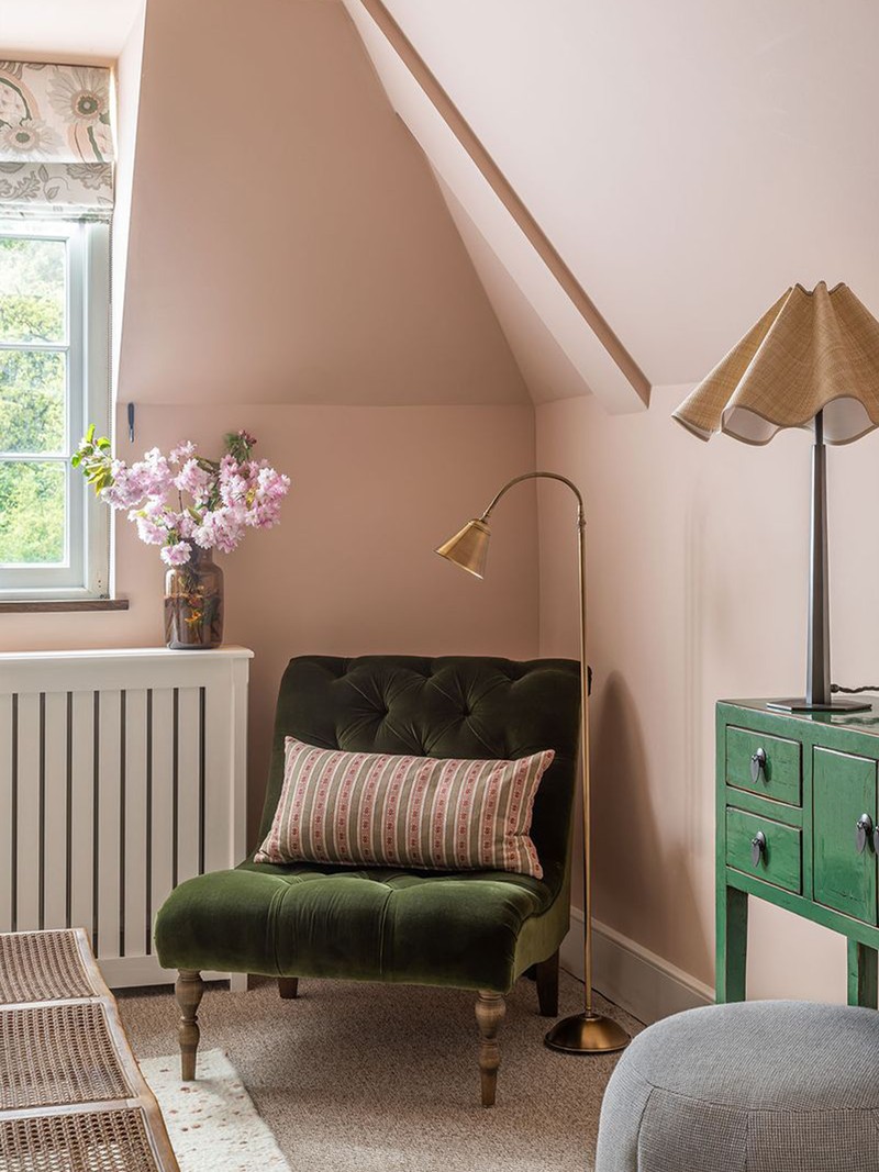
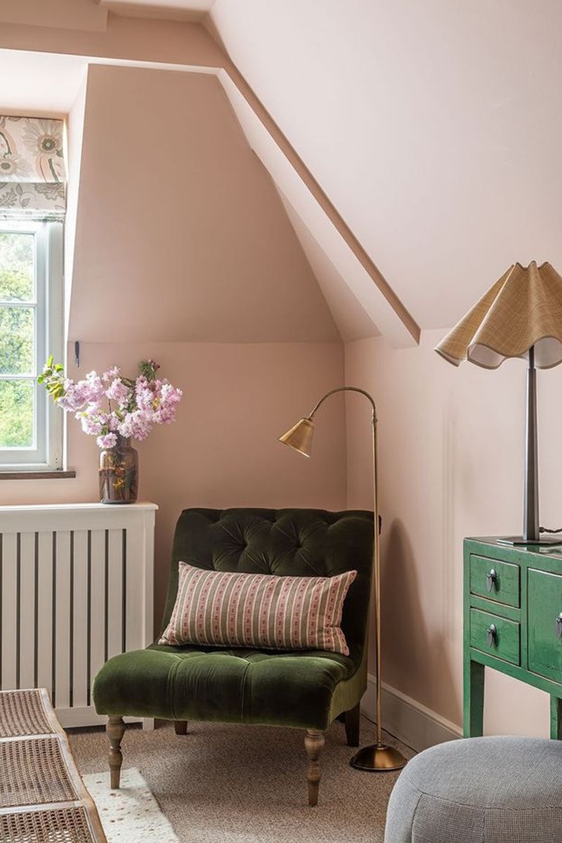
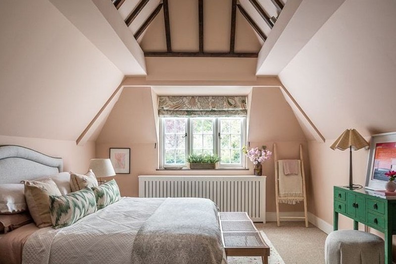
It’s a relaxing and feminine bedroom, without being overly girly and saccharine. The walls and ceiling are painted in Farrow & Ball’s ’Setting Plaster’, which was the perfect backdrop – a muted pink that doesn’t overwhelm the senses. We created a space that feels both luxurious and inviting by layering textures, lighting circuits, fabrics, materials and tones.
What was the brief?
It was really important to create a countryside bedroom that was both stylish and serene. She wanted a spot where she could relax and unwind when she left London – a retreat with a different feel to her city home. We took inspiration from nature and tried to bring the outdoors in – fresh flowers, floral motifs on the blind – but we wanted to balance this out with contemporary accents and colours.
Why does it work?
Pink and green is always a winning combination for a bedroom. Here, we layered some gentle pink and green patterns and tones with plenty of natural elements and the complementary woods found in some of the furniture finishes and the beams on the vaulted ceiling. We balanced the room by using a mix of UK and worldwide artisans and high-street furnishings, offsetting some of the more feminine patterns with some crisper design elements, like the lovely Mallorcan flame stitch fabric on the cushions.
How do you successfully combine patterns like this?
I always like to have a standout hero pattern. In this room it was a well-loved fabric,Carnival, on the blind by Christopher Farr. It’s been around for a long time but never dates and has some wonderful colour ways. From here, I took colour threads from that pattern, incorporating them into smaller patterns. Stripes, geometrics and animal prints work really well and the layers of different textures also help to pull the scheme together so it’s not one dimensional. Again, instead of using just one shade of green or pink, we have used a few, which adds to the successful layered effect. It’s also fun sometimes, once the room is complete, to throw in an unexpected colour on a small accessory or flowers as an element of surprise.
How do you add those personal finishing touches without creating clutter?
Personal touches are hugely important when it comes to finishing off a room. I love it when a client already has their own books, ceramics and other bits and bobs, but if not I will purchase these on their behalf to suit the space and their personality. What’s important is how you style and curate them, so it looks considered and not cluttered. I’m often asked back to clients’ houses to help with the styling a few years after a job is complete – when shelves and surfaces have got a bit out of hand.
Visit AliceLeigh.co.uk and follow @AliceLeighDesign on Instagram
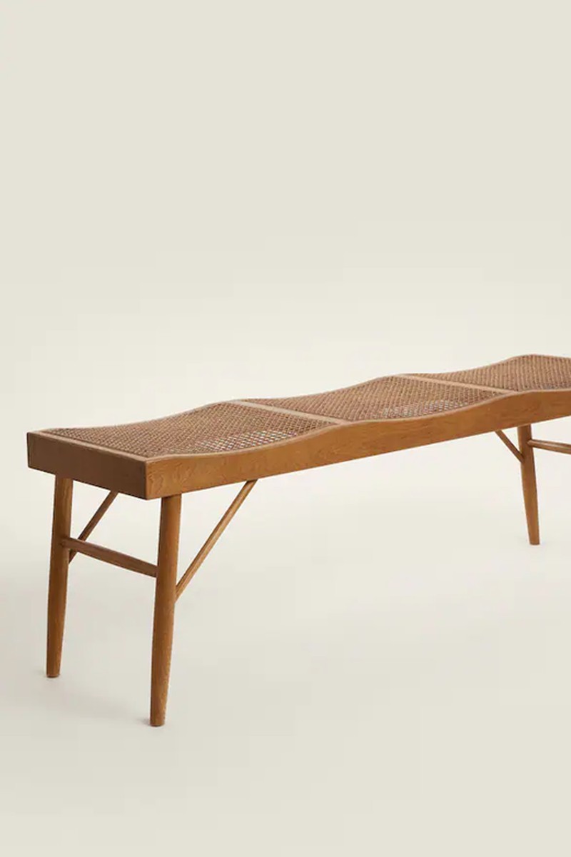
SHOP THE LOOK


DISCLAIMER: We endeavour to always credit the correct original source of every image we use. If you think a credit may be incorrect, please contact us at info@sheerluxe.com.
